通过css实现单选按钮效果
2018-04-03 17:31
615 查看
刚刚入门(可能还没入门)的小前端,遇见两次实现单选按钮的效果,如下:
现在总结一下实现这两种样式的代码。
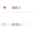
第一种:

这个是css中需要的图片。
第二种:<form action="#">
<div class="info">
<div class="radiobox">
<input type="radio" id="quest01-chose01" checked="checked" name="quest01" />
<span></span>
</div>
<p>28-35岁</p>
</div>
<div class="info">
<div class="radiobox">
<input type="radio" id="quest01-chose02" name="quest01" />
<span></span>
</div>
<p>18-28岁</p>
</div>


css中用到的图片
现在总结一下实现这两种样式的代码。
第一种:
<form action="#">
<div class=" info ">
    <div class="radiobox ">
<input type="radio" id="person1" checked="checked" name="userType" />
<span></span>
    </div>
    <p class="text">借款人</p>
</div>
<div class=" info">
    <div class="radiobox">
        <input type="radio" id="person2" name="userType" />
<span></span>
    </div>
    <p class="text">投资人</p>
</div>
</form>
.radiobox{ display: inline-block; position: relative; top: 46px; width: 13px; height: 13px; background: url(../img/chooseBtn.png) no-repeat;}
/* 单选框 */
.radiobox input{ opacity: 0; position: relative; top: -3px; left: 0; width: 100%; height: 100%; z-index: 100;}
.radiobox span{ /*display: block;*/ width: 7px; height: 7px; border-radius: 100%; position: absolute; background: #f24b41; top: 50%; left: 50%; margin: -4px 0 0 -3px; z-index: 1;}
.radiobox input[type="radio"] + span{ opacity: 0;}/* 这一行和下一行形成单选的效果 */
.radiobox input[type="radio"]:checked+span{ opacity: 1;}
.text{ position: relative; top: -25px; left: 5px; height: 14px; margin-left: 32px; padding-top: 46px; padding-bottom: 12px;  color: #816b6b; font-size: 14px;}
这个是css中需要的图片。
第二种:<form action="#">
<div class="info">
<div class="radiobox">
<input type="radio" id="quest01-chose01" checked="checked" name="quest01" />
<span></span>
</div>
<p>28-35岁</p>
</div>
<div class="info">
<div class="radiobox">
<input type="radio" id="quest01-chose02" name="quest01" />
<span></span>
</div>
<p>18-28岁</p>
</div>
</form>
.info {
line-height: 36px;
}
.radiobox {
position: relative;
top: 9px;
float: left;
width: 16px;
height: 16px;
border-radius: 100%;
}
.radiobox input {
position: relative;
top: -7px;
left: 0;
width: 100%;
height: 100%;
z-index: 100;
opacity: 0;
}
.radiobox span {
position: absolute;
top: 0;
width: 15px;
height: 15px;
border: 1px solid #666;
background: url(../img/radiobg02.png);
z-index: 1;
border-radius: 100%;
}

.radiobox input[type="radio"]:checked + span {
border-color: #ffbc03;
background: url(../img/radiobg.png);
}
.info p {
width: 565px;
line-height: 36px;
margin-left: 28px;
color: #666;
font-size: 14px;
}
css中用到的图片

相关文章推荐
- [ATL/WTL]_[中级]_[原生的复选框(checkbox button)和单选按钮(radio button)实现透明背景效果解决方案]
- 用CSS实现的一张图完成的按钮效果
- 用CSS实现的一张图完成的按钮效果
- 为DataGrid添加RadioButton按钮,实现单选效果
- Android通过Path实现复杂效果(搜索按钮+时钟的实现 +svg实现)
- Android通过Path实现搜索按钮和时钟复杂效果
- 通过CSS切换图片效果,点击这个图片可以实现连接功能,这里的图片在一张大图片中,每个并要切换的图片没有切换,通过disposition定位的方式做
- CSS实现自适应宽度的菜单按钮效果代码
- CSS实现五颜六色按钮组成的导航条效果代码
- [ATL/WTL]_[中级]_[原生的复选框(checkbox button)和单选按钮(radio button)实现透明背景效果解决方案]
- js通过更改按钮的显示样式实现按钮的滑动效果
- 使用CSS实现按钮点击波纹效果
- 用CSS实现的一张图完成的按钮效果
- 用CSS实现的一张图完成的按钮效果
- css实现按钮点击效果(超简单)
- atitit.按钮光标滑过高亮切换以及其他动态效果的实现css html js --attilax总结
- 通过css实现按钮的下拉
- 文字加下划线单选按钮效果,RadioGroup实现
- jquery实现选中单选按钮下拉伸缩效果
- 纯CSS实现3D按钮效果