You-need-to-know-css
2018-03-17 15:09
393 查看
半透明边框
背景知识: background-clip

<div class="main">
<input id="pb" type="checkbox" checked>
<label for="pb">padding-box</label>
<div class="clip">A paragraph of filler test,A paragraph of filler test</div>
</div>
.main{
width: 100%;
padding: 60px 80px 80px;
background: #b4a078;
}
.clip{
padding: 12px;
margin: 20px auto;
background: white;
border:10px solid hsla(0,0%,100%,.5)
}
label{
color: #f4f0ea;
}
input[id="pb"]:checked ~ div{
background-clip: padding-box;
}
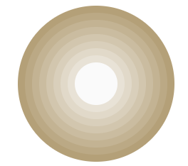
多重边框
box-shadow相信很多人都已经用透了,可用来给元素添加各种阴影效果,反过来,也只有我们需要实现阴影时才会想起它,其实,
box-shadow还接受第四个参数作为阴影扩张半径,当我们只设置扩张半径时,零偏移,零模糊,产生的效果其实相当于一条实线“边框”。
<div class="main_first"></div>
.main_first{
width: 60px;
height: 60px;
border-radius: 50%;
background: #fafafa;
margin: 105px 29px;
box-shadow: 0 0 0 10px #E8E2D6, 0 0 0 20px #E1D9C9, 0 0 0 30px #D9CFBB, 0 0 0 40px #D2C6AE, 0 0 0 50px #CABCA0, 0 0 0 60px #C3B393, 0 0 0 70px #BBA985, 0 0 0 80px #B4A078;
}
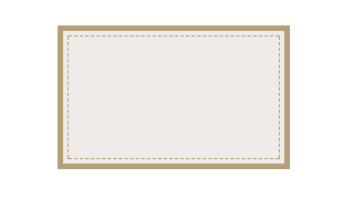
box-shadow只能模拟实线边框效果,某些情况下,我们可能需要生成虚线的边框效果,我们可以通过类似于
border的描边
outline和对应的描边偏移
outline-offset来实现。
<div class="main_second"></div>
.main_second {
width: 200px;
height: 120px;
background: #efebe9;
border: 5px solid #B4A078;
outline: #B4A078 dashed 1px;
outline-offset: -10px;
margin-bottom: 20px;
}
边框内圆角
我们知道
box-shadow是会紧贴
border-radius圆角边的,但是,描边
outline并不会与圆角边
border-radius贴合,我们可以将两者组合,通过
box-shadow去填补描边
outline所产生的间隙来达到我们想要的效果
<div class="first"></div>
.first {
width: 209px;
height: 209px;
margin: 29px auto;

border-radius: 8px;
background: #f4f0ea;
outline: 6px solid #b4a078;
box-shadow: 0 0 0 6px #b4a078;
}

背景定位
背景知识: background-position, background-origin
<div class="first"></div>
.first {
width: 229px;
height: 139px;
margin: auto;
color: #f4f0ea;
padding: 16px 29px 28px 20px;
background: #b4a078 url('img/logo.png') no-repeat bottom right;
background-origin: content-box;
}


相关文章推荐
- 转 译文:你需要知道的CSS3 动画技术 译自:What You Need To Know About Behavioral CSS
- WCF Essentials - What You Need To Know About One-Way Calls, Callbacks, And Events
- Top 10 New Things You Need to Know About Java 6
- 4k HDR – 8 bit, 10 bit, 12 bit, and all the bits you need to know
- [转]What you need to know about transimpedance amplifiers – part 1
- What you need to know about AllowUnsafeUpdates (Part 1) [转载]
- [翻译练习]密码学1小时入门 (Everything you need to know about cryptography in 1 hour)
- Almost everything you need to know to enter mobile game development on 2013 - See more at: http://ww
- 50 Kick-Ass Websites You Need to Know About
- What you need to know about AllowUnsafeUpdates (Part 2) [转载]
- 开发mobile要知道的六件事情(Six things you need to know about developing mobile applications)
- Everything You Need To Know To Start Programming 64-Bit Windows Systems
- The 9 Deep Learning Papers You Need To Know About
- Ajax: IE and Mozilla Errors you need to know about
- The 4 server logs you NEED to know to fix any IIS / ASP.NET error
- What you may need to know while calling Application Module methods from Java EE components such as E
- The 9 Deep Learning Papers You Need To Know About
- 5 Speaking Rules you need to know
- 11gR2 Clusterware and Grid Home - What You Need to Know
- DB2 System Catalog Views: Everything You Need to Know About Your DB Objects