The layout management of python
2018-03-10 13:50
316 查看
When we design the GUI of our application, we decide what widgets we will use and how we will organise those widgets in the application. To organise our widgets, we use specialised non-visible objects called layout managers.
There are two kinds of widgets: containers and their children. The containers group their children into suitable layouts.
Tkinter has three built-in layout managers: the
absolute.py
We use
style.configure("TFrame", background="#333")
We configure our frame to have a dark gray background using styles. bard = Image.open("bardejov.jpg")
bardejov = ImageTk.PhotoImage(bard)
We create an image object and a photo image object from an image in the current working directory. label1 = Label(self, image=bardejov)
We create a
We must keep the reference to the image to prevent image from being garbage collected. label1.place(x=20, y=20)
The label is placed on the frame at x=20 and y=20 coordinates.
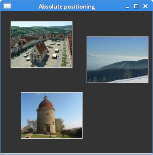
Figure: Absolute positioning
buttons.py
frame.pack(fill=BOTH, expand=True)
We create another
closeButton.pack(side=RIGHT, padx=5, pady=5)
A
The
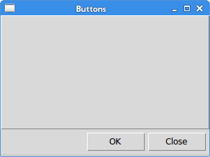
Figure: Buttons example
review.py
The first frame is the base frame, on which other frames are placed. Note that in addition to organising children within frames, we also manage the frames on the base frame. frame1 = Frame(self)
frame1.pack(fill=X)
lbl1 = Label(frame1, text="Title", width=6)
lbl1.pack(side=LEFT, padx=5, pady=5)
entry1 = Entry(frame1)
entry1.pack(fill=X, padx=5, expand=True)
The first two widgets are placed on the first frame. The entry is horizontally streched with the
frame3.pack(fill=BOTH, expand=True)
lbl3 = Label(frame3, text="Review", width=6)
lbl3.pack(side=LEFT, anchor=N, padx=5, pady=5)
txt = Text(frame3)
txt.pack(fill=BOTH, pady=5, padx=5, expand=True)
Inside the third frame, we place a label and a text widget. The label is anchored to the north. The text widget takes the whole remaining area.
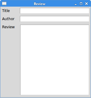
Figure: Review example
calculator.py
font='serif 10')
We configure the
...
self.rowconfigure(0, pad=3)
We use the
entry.grid(row=0, columnspan=4, sticky=W+E)
The
cls.grid(row=1, column=0)
The
The
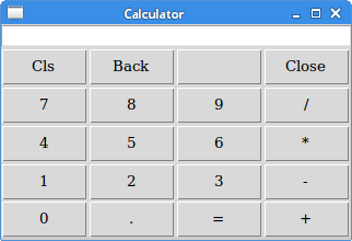
Figure: Calculator
windows.py
self.columnconfigure(3, pad=7)
self.rowconfigure(3, weight=1)
self.rowconfigure(5, pad=7)
We define some space among widgets in the grid. The
lbl.grid(sticky=W, pady=4, padx=5)
The label widget is created and put into the grid. If no column and row is specified, then the first column or row is assumed. The label sticks to the west and it has some padding around its borders. area = Text(self)
area.grid(row=1, column=0, columnspan=2, rowspan=4,
padx=5, sticky=E+W+S+N)
The text widget is created and starts from the second row and first column. It spans two columns and four rows. There is a 4 px space between the widget and the left border of the root window. Finally, the widget sticks to all the four sides. So when the window is resized, the text widget grows in all directions. abtn = Button(self, text="Activate")
abtn.grid(row=1, column=3)
cbtn = Button(self, text="Close")
cbtn.grid(row=2, column=3, pady=4)
These two buttons go next to the text widget. hbtn = Button(self, text="Help")
hbtn.grid(row=5, column=0, padx=5)
obtn = Button(self, text="OK")
obtn.grid(row=5, column=3)
These two buttons go below the text widget; the Help button takes the first column, the Ok Button takes the last column.
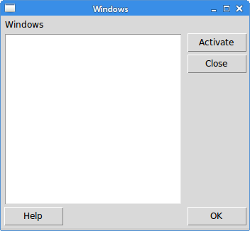
Figure: Windows exampleIn this part of the Tkinter tutorial, we mentioned layout management of widgets.
Layout management in Tkinter
In this part of the Tkinter programming tutorial, we introduce layout managers.When we design the GUI of our application, we decide what widgets we will use and how we will organise those widgets in the application. To organise our widgets, we use specialised non-visible objects called layout managers.
There are two kinds of widgets: containers and their children. The containers group their children into suitable layouts.
Tkinter has three built-in layout managers: the
pack,
grid, and
placemanagers. The
placegeometry manager positions widgets using absolute positioning. The
packgeometry manager organises widgets in horizontal and vertical boxes. The
gridgeometry manager places widgets in a two dimensional grid.
Absolute positioning
In most cases, programmers should use layout managers. There are a few situations where we could use absolute positioning. In absolute positioning, the programmer specifies the position and the size of each widget in pixels. The size and the position of a widget do not change if we resize a window. Applications look different on various platforms, and what looks OK on Linux, might not look OK on Mac OS. Changing fonts in our application might spoil the layout. If we translate our application into another language, we must redo our layout.absolute.py
#!/usr/bin/python3
# -*- coding: utf-8 -*-

"""
ZetCode Tkinter tutorial

In this script, we lay out images
using absolute positioning.

Author: Jan Bodnar
Last modified: July 2017
Website: www.zetcode.com
"""

from PIL import Image, ImageTk
from tkinter import Tk, BOTH
from tkinter.ttk import Frame, Label, Style

class Example(Frame):

def __init__(self):
super().__init__()

self.initUI()

def initUI(self):

self.master.title("Absolute positioning")
self.pack(fill=BOTH, expand=1)

Style().configure("TFrame", background="#333")

bard = Image.open("bardejov.jpg")
bardejov = ImageTk.PhotoImage(bard)
label1 = Label(self, image=bardejov)
label1.image = bardejov
label1.place(x=20, y=20)

rot = Image.open("rotunda.jpg")
rotunda = ImageTk.PhotoImage(rot)
label2 = Label(self, image=rotunda)
label2.image = rotunda
label2.place(x=40, y=160)

minc = Image.open("mincol.jpg")
mincol = ImageTk.PhotoImage(minc)
label3 = Label(self, image=mincol)
label3.image = mincol
label3.place(x=170, y=50)

def main():

root = Tk()
root.geometry("300x280+300+300")
app = Example()
root.mainloop()

if __name__ == '__main__':
main()
In this example, we place three images using absolute positioning. We use the place geometry manager. from PIL import Image, ImageTkWe use
Imageand
ImageTkfrom the Python Imaging Library (PIL) module. style = Style()
style.configure("TFrame", background="#333")
We configure our frame to have a dark gray background using styles. bard = Image.open("bardejov.jpg")
bardejov = ImageTk.PhotoImage(bard)
We create an image object and a photo image object from an image in the current working directory. label1 = Label(self, image=bardejov)
We create a
Labelwith an image. Labels can contain text or images. label1.image = bardejov
We must keep the reference to the image to prevent image from being garbage collected. label1.place(x=20, y=20)
The label is placed on the frame at x=20 and y=20 coordinates.
Figure: Absolute positioning
Pack manager
Thepackgeometry manager organises widgets in horizontal and vertical boxes. The layout is controlled with the
fill,
expand, and
sideoptions.
Buttons example
In the following example, we position two buttons in the bottom-right corner of the window. We use thepackmanager.
buttons.py
#!/usr/bin/python3
# -*- coding: utf-8 -*-

"""
ZetCode Tkinter tutorial

In this script, we use the pack manager
to position two buttons in the
bottom-right corner of the window.

Author: Jan Bodnar
Last modified: July 2017
Website: www.zetcode.com
"""

from tkinter import Tk, RIGHT, BOTH, RAISED
from tkinter.ttk import Frame, Button, Style

class Example(Frame):

def __init__(self):
super().__init__()

self.initUI()

def initUI(self):

self.master.title("Buttons")
self.style = Style()
self.style.theme_use("default")

frame = Frame(self, relief=RAISED, borderwidth=1)
frame.pack(fill=BOTH, expand=True)

self.pack(fill=BOTH, expand=True)

closeButton = Button(self, text="Close")
closeButton.pack(side=RIGHT, padx=5, pady=5)
okButton = Button(self, text="OK")
okButton.pack(side=RIGHT)

def main():

root = Tk()
root.geometry("300x200+300+300")
app = Example()
root.mainloop()

if __name__ == '__main__':
main()
We have two frames. There is the base frame and an additional frame, which expands in both directions and push the two buttons to the bottom of the base frame. The buttons are placed in a horizontal box and placed to the right of this box. frame = Frame(self, relief=RAISED, borderwidth=1)frame.pack(fill=BOTH, expand=True)
We create another
Framewidget. This widget takes the bulk of the area. We change the border of the frame so that the frame is visible; by default it is flat. closeButton = Button(self, text="Close")
closeButton.pack(side=RIGHT, padx=5, pady=5)
A
closeButtonis created. It is put into a horizontal box. The
sideparameter causes the button to be placed to the right of the horizontal. The
padxand the
padyparameters put some space between the widgets. The
padxputs some space between the button widgets and between the
closeButtonand the right border of the root window. The
padyputs some space between the button widgets and the borders of the frame and the borders of the root window. okButton.pack(side=RIGHT)
The
okButtonis placed next to the
closeButtonwith 5 px space between them.
Figure: Buttons example
Review example
Thepackmanager is a simple layout manager. It can be used to do simple layout tasks. In order to create more complicated layouts, we need to utilise more frames, each having its own pack manager.
review.py
#!/usr/bin/python3
# -*- coding: utf-8 -*-

"""
ZetCode Tkinter tutorial

In this script, we use the pack manager
to position two buttons in the
bottom-right corner of the window.

Author: Jan Bodnar
Last modified: July 2017
Website: www.zetcode.com
"""

from tkinter import Tk, Text, TOP, BOTH, X, N, LEFT
from tkinter.ttk import Frame, Label, Entry

class Example(Frame):

def __init__(self):
super().__init__()

self.initUI()

def initUI(self):

self.master.title("Review")
self.pack(fill=BOTH, expand=True)

frame1 = Frame(self)
frame1.pack(fill=X)

lbl1 = Label(frame1, text="Title", width=6)
lbl1.pack(side=LEFT, padx=5, pady=5)

entry1 = Entry(frame1)
entry1.pack(fill=X, padx=5, expand=True)

frame2 = Frame(self)
frame2.pack(fill=X)

lbl2 = Label(frame2, text="Author", width=6)
lbl2.pack(side=LEFT, padx=5, pady=5)

entry2 = Entry(frame2)
entry2.pack(fill=X, padx=5, expand=True)

frame3 = Frame(self)
d71d

frame3.pack(fill=BOTH, expand=True)

lbl3 = Label(frame3, text="Review", width=6)
lbl3.pack(side=LEFT, anchor=N, padx=5, pady=5)

txt = Text(frame3)
txt.pack(fill=BOTH, pady=5, padx=5, expand=True)

def main():

root = Tk()
root.geometry("300x300+300+300")
app = Example()
root.mainloop()

if __name__ == '__main__':
main()
The example shows how to create a more complex layout with multiple frames and pack managers. self.pack(fill=BOTH, expand=True)The first frame is the base frame, on which other frames are placed. Note that in addition to organising children within frames, we also manage the frames on the base frame. frame1 = Frame(self)
frame1.pack(fill=X)
lbl1 = Label(frame1, text="Title", width=6)
lbl1.pack(side=LEFT, padx=5, pady=5)
entry1 = Entry(frame1)
entry1.pack(fill=X, padx=5, expand=True)
The first two widgets are placed on the first frame. The entry is horizontally streched with the
filland the
expandparameters. frame3 = Frame(self)
frame3.pack(fill=BOTH, expand=True)
lbl3 = Label(frame3, text="Review", width=6)
lbl3.pack(side=LEFT, anchor=N, padx=5, pady=5)
txt = Text(frame3)
txt.pack(fill=BOTH, pady=5, padx=5, expand=True)
Inside the third frame, we place a label and a text widget. The label is anchored to the north. The text widget takes the whole remaining area.
Figure: Review example
Grid manager
The Tkinter'sgridgeometry manager is used to create a skeleton of a calculator.
calculator.py
#!/usr/bin/python3
# -*- coding: utf-8 -*-

"""
ZetCode Tkinter tutorial

In this script, we use the grid manager
to create a skeleton of a calculator.

Author: Jan Bodnar
Last modified: July 2017
Website: www.zetcode.com
"""

from tkinter import Tk, W, E
from tkinter.ttk import Frame, Button, Entry, Style

class Example(Frame):

def __init__(self):
super().__init__()

self.initUI()

def initUI(self):

self.master.title("Calculator")

Style().configure("TButton", padding=(0, 5, 0, 5),
font='serif 10')

self.columnconfigure(0, pad=3)
self.columnconfigure(1, pad=3)
self.columnconfigure(2, pad=3)
self.columnconfigure(3, pad=3)

self.rowconfigure(0, pad=3)
self.rowconfigure(1, pad=3)
self.rowconfigure(2, pad=3)
self.rowconfigure(3, pad=3)
self.rowconfigure(4, pad=3)

entry = Entry(self)
entry.grid(row=0, columnspan=4, sticky=W+E)
cls = Button(self, text="Cls")
cls.grid(row=1, column=0)
bck = Button(self, text="Back")
bck.grid(row=1, column=1)
lbl = Button(self)
lbl.grid(row=1, column=2)
clo = Button(self, text="Close")
clo.grid(row=1, column=3)
sev = Button(self, text="7")
sev.grid(row=2, column=0)
eig = Button(self, text="8")
eig.grid(row=2, column=1)
nin = Button(self, text="9")
nin.grid(row=2, column=2)
div = Button(self, text="/")
div.grid(row=2, column=3)

fou = Button(self, text="4")
fou.grid(row=3, column=0)
fiv = Button(self, text="5")
fiv.grid(row=3, column=1)
six = Button(self, text="6")
six.grid(row=3, column=2)
mul = Button(self, text="*")
mul.grid(row=3, column=3)

one = Button(self, text="1")
one.grid(row=4, column=0)
two = Button(self, text="2")
two.grid(row=4, column=1)
thr = Button(self, text="3")
thr.grid(row=4, column=2)
mns = Button(self, text="-")
mns.grid(row=4, column=3)

zer = Button(self, text="0")
zer.grid(row=5, column=0)
dot = Button(self, text=".")
dot.grid(row=5, column=1)
equ = Button(self, text="=")
equ.grid(row=5, column=2)
pls = Button(self, text="+")
pls.grid(row=5, column=3)

self.pack()

def main():

root = Tk()
app = Example()
root.mainloop()

if __name__ == '__main__':
main()
The grid manager is used to organize buttons in the frame container. Style().configure("TButton", padding=(0, 5, 0, 5),font='serif 10')
We configure the
Buttonwidget to have a specific font and to have some internal padding. self.columnconfigure(0, pad=3)
...
self.rowconfigure(0, pad=3)
We use the
columnconfigure()and the
rowconfigure()methods to define some space in grid columns and rows. This way we achieve that the buttons are separated by some space. entry = Entry(self)
entry.grid(row=0, columnspan=4, sticky=W+E)
The
Entrywidget is where the digits are displayed. The widget is placed in the first row and it spans all four columns. Widgets may not occupy all the space allotted by cells in the grid. The
stickyparameter expands the widget in a given direction. In our case we ensure that the entry widget is expanded from left to right. cls = Button(self, text="Cls")
cls.grid(row=1, column=0)
The
clsbutton is placed in the second row and first column. Note that the rows and columns start at zero. self.pack()
The
pack()method shows the frame widget and gives it initial size. If no other parameters are given, the size will be just enough to show all children. This method packs the frame widget to the toplevel root window, which is also a container. The
gridgeometry manager is used to organize buttons in the frame widget.
Figure: Calculator
Windows example
The following example creates the windows dialog using thegridgeometry manager.
windows.py
#!/usr/bin/python3
# -*- coding: utf-8 -*-

"""
ZetCode Tkinter tutorial

In this script, we use the grid
manager to create a more complicated
layout.

Author: Jan Bodnar
Last modified: July 2017
Website: www.zetcode.com
"""

from tkinter import Tk, Text, BOTH, W, N, E, S
from tkinter.ttk import Frame, Button, Label, Style

class Example(Frame):

def __init__(self):
super().__init__()

self.initUI()

def initUI(self):

self.master.title("Windows")
self.pack(fill=BOTH, expand=True)

self.columnconfigure(1, weight=1)
self.columnconfigure(3, pad=7)
self.rowconfigure(3, weight=1)
self.rowconfigure(5, pad=7)

lbl = Label(self, text="Windows")
lbl.grid(sticky=W, pady=4, padx=5)

area = Text(self)
area.grid(row=1, column=0, columnspan=2, rowspan=4,
padx=5, sticky=E+W+S+N)

abtn = Button(self, text="Activate")
abtn.grid(row=1, column=3)

cbtn = Button(self, text="Close")
cbtn.grid(row=2, column=3, pady=4)

hbtn = Button(self, text="Help")
hbtn.grid(row=5, column=0, padx=5)

obtn = Button(self, text="OK")
obtn.grid(row=5, column=3)

def main():

root = Tk()
root.geometry("350x300+300+300")
app = Example()
root.mainloop()

if __name__ == '__main__':
main()
In this example, we use a Labelwidget, a
Textwidget, and four buttons. self.columnconfigure(1, weight=1)
self.columnconfigure(3, pad=7)
self.rowconfigure(3, weight=1)
self.rowconfigure(5, pad=7)
We define some space among widgets in the grid. The
weightparameter makes the second column and fourth row growable. This row and column is occupied by the text widget, so all the extra space is taken by it. lbl = Label(self, text="Windows")
lbl.grid(sticky=W, pady=4, padx=5)
The label widget is created and put into the grid. If no column and row is specified, then the first column or row is assumed. The label sticks to the west and it has some padding around its borders. area = Text(self)
area.grid(row=1, column=0, columnspan=2, rowspan=4,
padx=5, sticky=E+W+S+N)
The text widget is created and starts from the second row and first column. It spans two columns and four rows. There is a 4 px space between the widget and the left border of the root window. Finally, the widget sticks to all the four sides. So when the window is resized, the text widget grows in all directions. abtn = Button(self, text="Activate")
abtn.grid(row=1, column=3)
cbtn = Button(self, text="Close")
cbtn.grid(row=2, column=3, pady=4)
These two buttons go next to the text widget. hbtn = Button(self, text="Help")
hbtn.grid(row=5, column=0, padx=5)
obtn = Button(self, text="OK")
obtn.grid(row=5, column=3)
These two buttons go below the text widget; the Help button takes the first column, the Ok Button takes the last column.
Figure: Windows exampleIn this part of the Tkinter tutorial, we mentioned layout management of widgets.

相关文章推荐
- PyCon 2011 - Hidden Treasures of the Python Standard Library - json序列化操作
- PyCon 2011 - Hidden Treasures of the Python Standard Library - 自定义交互模式表达式计数器
- weblogic Error [Management:141191]The prepare phase of the configuration update failed with an excep
- The default parameter of python functions
- The process that WPF determine the layout of UIelements
- 解决yum升级的问题“There was a problem importing one of the Python modules”
- The Zen of Python, by Tim Peters
- The Zen of Python
- windows安装python出现A program run as part of the setup did not finish as expected 的解决办法
- The Zen of Python
- The study of Class and Instance in Python(20170918)
- BPM Partners Launches 2011 BPM Pulse Survey -- Seeks the Holy Grail of Business Performance Management
- Python:WARNING: The version of Tcl/Tk (8.5.9) in use may be unstable.
- The Zen of Python, by Tim Peters
- The Light and Dark sides of Python name binding
- PyCon 2011 - Hidden Treasures of the Python Standard Library - 词法分析器分析命令行参数
- The layout of PID & PORT in the ERTS
- The layout of PID & PORT in the ERTS
- The Zen of Python
- What is the main goal of the Memory Management?