r语言 第14 天 画图 287页
2018-02-10 08:31
375 查看
1 画出新的图形 high level
plot函数
boxplot
hist 直方图
qqnorm 分位图
curve 函数图形
2 不画出新图形 low level
points Add points
lines Add lines
abline Add a straight line
segments Add line segments
polygon Add a closed polygon
text Add text
注意: 使用low level图形之前,要先画出high level
3 其他的包
zoo lattice ggplot2
画图1 散点图 需要是numeric
> plot(x, y)
2 添加元素
> plot(x, main="The Title", xlab="X-axis Label", ylab="Y-axis Label")
ann=FALSE 是抑制注释
> plot(x, ann=FALSE)
> title(main="The Title", xlab="X Axis Label", ylab="Y Axis Label")
3 添加网格
> plot(x, y, type="n") type=“n” 初始化图形,不导入数据
> grid()
> points(x, y)
4 多个组的散点图
> plot(x, y, pch=as.integer(f)) 根据f的分组,画出散点图 ?????
> with(iris, plot(Petal.Length, Petal.Width))
> with(iris, plot(Petal.Length, Petal.Width, pch=as.integer(Species)))
5 legend添加图例
Legend for points legend(x, y, labels, pch=c(pointtype1, pointtype2, ...))
Legend for lines according to line type legend(x, y, labels, lty=c(linetype1, linetype2, ...))
Legend for lines according to line width legend(x, y, labels, lwd=c(width1, width2, ...))
Legend for colors legend(x, y, labels, col=c(color1, color2, ...))
6 为散点图画线性回归线
> m <- lm(y ~ x)
> plot(y ~ x)
> abline(m)
7 对于dataframe也可以使用plot,即各列对各行分别画图
8 为每一个因素建一个散点图
> coplot(y ~ x | f)
9 barplot() 柱形图
还可以给柱形图添加置信区间 gplots包的barplot2函数可以添加置信区间
> library(gplots)
> barplot2(x, plot.ci=TRUE, ci.l=lower, ci.u=upper)
10 使用 col 参数 设置颜色
11 画线
> plot(x, y, type="l")
改变颜色,宽度,形式
• lty="solid" or lty=1 (default) • lty="dashed" or lty=2 • lty="dotted" or lty=3
• lty="dotdash" or lty=4 • lty="longdash" or lty=5 • lty="twodash" or lty=6
• lty="blank" or lty=0 (inhibits drawing)
使用 lwd 参数 设置宽度
12 绘制多个数据集 先用plot high level , 再用 low level
13 添加水平或者垂直线
> abline(v=x) # Draw a vertical line at x
> abline(h=y) # Draw a horizontal line at y
14 创建一个箱线图 barplot
15 为每一个factor创建一个箱线图
> boxplot(x ~ f)
16 给直方图加入一个密度估计
> hist(x, prob=T) # Histogram of x, using a probability scale
> lines(density(x)) # Graph the approximate density
prob=T 设置y轴为概率,必须的
17 创建离散直方图
> plot(table(x), type="h")
18 正态分位数
> qqnorm(x)
> qqline(x)
19 其他分部的分位数
ppoints 产生0-1间的点
20 颜色
> colors <- ifelse(x >= 0, "black", "gray")
> plot(x, type='h', lwd=3, col=colors)
21 给函数画图
> curve(sin, -3, +3) # Graph the sine function from -3 to +3
22 在绘制多个图的时候,暂停
> par(ask=TRUE) R会在画图时 停一下
> par(ask=FALSE) 不用暂停
23 一起展现多个图 按行填充
> par(mfrow=(c(N,M)) # Divide the graphics window into N x M matrix 分划图
然后开始画图
想要按列填充 > par(mfcol=c(3,3)) # mfcol, not mfrow
24 打开附加的图形窗口
> win.graph() 之后画的图就在新的窗口展示,原来的图也存在
> dev.set() 返回当前窗口数量
> win.graph(width=7.0, height=5.5) 还可以设置高和宽
25 保存图片到文件里
> savePlot(filename="filename.ext", type="type")
写入到当前的工作文件环境
> png("myPlot.png", width=648, height=432) # Or whatever dimensions work for you png可以更换
> plot(x, y, main="Scatterplot of X, Y")
> dev.off() 不要忘了关闭
26 图形参数改变
使用 par()函数,改变全局的环境参数
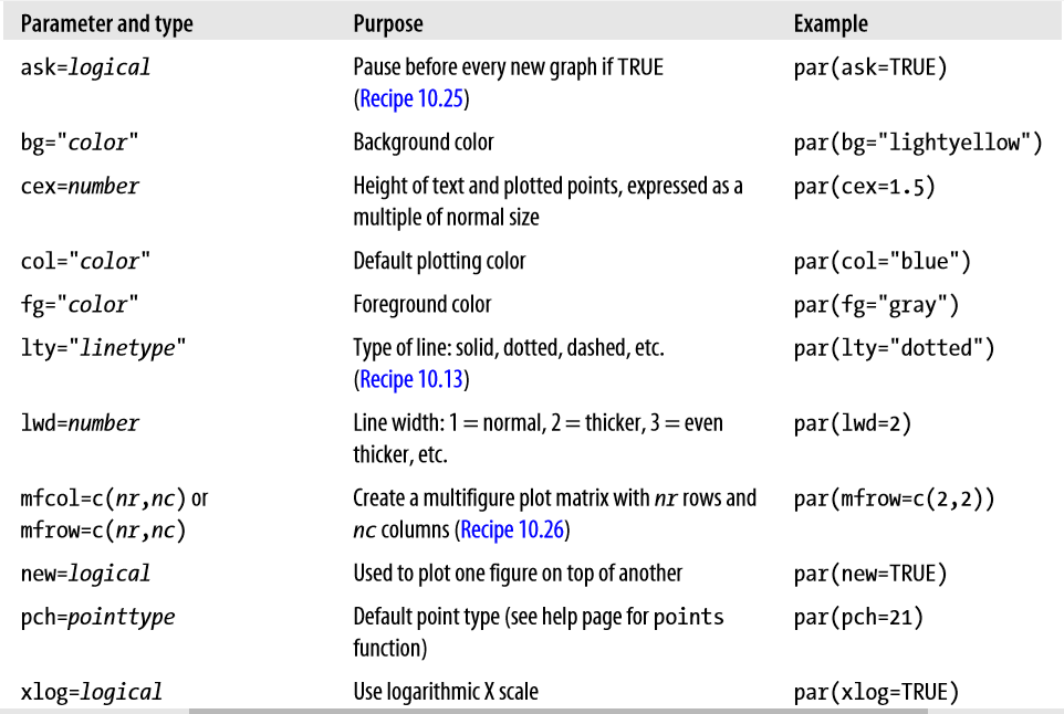
ylog=logical Use logarithmic Y scale par(ylog=TRUE)
plot函数
boxplot
hist 直方图
qqnorm 分位图
curve 函数图形
2 不画出新图形 low level
points Add points
lines Add lines
abline Add a straight line
segments Add line segments
polygon Add a closed polygon
text Add text
注意: 使用low level图形之前,要先画出high level
3 其他的包
zoo lattice ggplot2
画图1 散点图 需要是numeric
> plot(x, y)
2 添加元素
> plot(x, main="The Title", xlab="X-axis Label", ylab="Y-axis Label")
ann=FALSE 是抑制注释
> plot(x, ann=FALSE)
> title(main="The Title", xlab="X Axis Label", ylab="Y Axis Label")
3 添加网格
> plot(x, y, type="n") type=“n” 初始化图形,不导入数据
> grid()
> points(x, y)
4 多个组的散点图
> plot(x, y, pch=as.integer(f)) 根据f的分组,画出散点图 ?????
> with(iris, plot(Petal.Length, Petal.Width))
> with(iris, plot(Petal.Length, Petal.Width, pch=as.integer(Species)))
5 legend添加图例
Legend for points legend(x, y, labels, pch=c(pointtype1, pointtype2, ...))
Legend for lines according to line type legend(x, y, labels, lty=c(linetype1, linetype2, ...))
Legend for lines according to line width legend(x, y, labels, lwd=c(width1, width2, ...))
Legend for colors legend(x, y, labels, col=c(color1, color2, ...))
6 为散点图画线性回归线
> m <- lm(y ~ x)
> plot(y ~ x)
> abline(m)
7 对于dataframe也可以使用plot,即各列对各行分别画图
8 为每一个因素建一个散点图
> coplot(y ~ x | f)
9 barplot() 柱形图
还可以给柱形图添加置信区间 gplots包的barplot2函数可以添加置信区间
> library(gplots)
> barplot2(x, plot.ci=TRUE, ci.l=lower, ci.u=upper)
10 使用 col 参数 设置颜色
11 画线
> plot(x, y, type="l")
改变颜色,宽度,形式
• lty="solid" or lty=1 (default) • lty="dashed" or lty=2 • lty="dotted" or lty=3
• lty="dotdash" or lty=4 • lty="longdash" or lty=5 • lty="twodash" or lty=6
• lty="blank" or lty=0 (inhibits drawing)
使用 lwd 参数 设置宽度
12 绘制多个数据集 先用plot high level , 再用 low level
13 添加水平或者垂直线
> abline(v=x) # Draw a vertical line at x
> abline(h=y) # Draw a horizontal line at y
14 创建一个箱线图 barplot
15 为每一个factor创建一个箱线图
> boxplot(x ~ f)
16 给直方图加入一个密度估计
> hist(x, prob=T) # Histogram of x, using a probability scale
> lines(density(x)) # Graph the approximate density
prob=T 设置y轴为概率,必须的
17 创建离散直方图
> plot(table(x), type="h")
18 正态分位数
> qqnorm(x)
> qqline(x)
19 其他分部的分位数
ppoints 产生0-1间的点
20 颜色
> colors <- ifelse(x >= 0, "black", "gray")
> plot(x, type='h', lwd=3, col=colors)
21 给函数画图
> curve(sin, -3, +3) # Graph the sine function from -3 to +3
22 在绘制多个图的时候,暂停
> par(ask=TRUE) R会在画图时 停一下
> par(ask=FALSE) 不用暂停
23 一起展现多个图 按行填充
> par(mfrow=(c(N,M)) # Divide the graphics window into N x M matrix 分划图
然后开始画图
想要按列填充 > par(mfcol=c(3,3)) # mfcol, not mfrow
24 打开附加的图形窗口
> win.graph() 之后画的图就在新的窗口展示,原来的图也存在
> dev.set() 返回当前窗口数量
> win.graph(width=7.0, height=5.5) 还可以设置高和宽
25 保存图片到文件里
> savePlot(filename="filename.ext", type="type")
写入到当前的工作文件环境
> png("myPlot.png", width=648, height=432) # Or whatever dimensions work for you png可以更换
> plot(x, y, main="Scatterplot of X, Y")
> dev.off() 不要忘了关闭
26 图形参数改变
使用 par()函数,改变全局的环境参数
ylog=logical Use logarithmic Y scale par(ylog=TRUE)
