Python matplotlib作图案例
2018-02-01 15:06
357 查看
使用matplotlib自带的几种美化样式,就可以很轻松的对生成的图形进行美化。
可以使用matplotlib.pyplot.style.available获取所有的美化样式
[python]
view plain
copy
#!/usr/bin/python
#coding: utf-8
import numpy as np
import matplotlib.pyplot as plt
# 获取所有的自带样式
print plt.style.available
# 使用自带的样式进行美化
plt.style.use("ggplot")
fig, axes = plt.subplots(ncols = 2, nrows = 2)
# 四个子图的坐标轴赋予四个对象
ax1, ax2, ax3, ax4 = axes.ravel()
x, y = np.random.normal(size = (2, 100))
ax1.plot(x, y, "o")
x = np.arange(1, 10)
y = np.arange(1, 10)
# plt.rcParams['axes.prop_cycle']获取颜色的字典
# 会在这个范围内依次循环
ncolors = len(plt.rcParams['axes.prop_cycle'])
# print ncolors
# print plt.rcParams['axes.prop_cycle']
shift = np.linspace(1, 20, ncolors)
for s in shift:
# print s
ax2.plot(x, y + s, "-")
x = np.arange(5)
y1, y2, y3 = np.random.randint(1, 25, size = (3, 5))
width = 0.25
# 柱状图中要显式的指定颜色
ax3.bar(x, y1, width, color = "r")
ax3.bar(x + width, y2, width, color = "g")
ax3.bar(x + 2 * width, y3, width, color = "y")
for i, color in enumerate(plt.rcParams['axes.prop_cycle']):
xy = np.random.normal(size= 2)
for c in color.values():
ax4.add_patch(plt.Circle(xy, radius = 0.3, color= c))
ax4.axis("equal")
plt.show()
使用ggplot进行美化后的结果
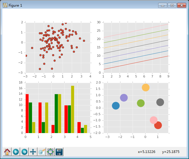

相关文章推荐
- Python量化分析—指数基金定投及Matplotlib作图: 实现双Y轴和中文显示
- python爬虫webdriver.Chrome 数据可视化简单案例matplotlib
- Python+pandas+matplotlib数据分析与可视化案例(附源码)
- Python高级数据处理与可视化(三)---- Matplotlib图像属性控制 & Pandas作图
- Python学习笔记(八)-(2)matplotlib作图之legend
- python-matplotlib-作图分析
- python matplotlib 机器学习,作图命令
- python中数据分析数据可视化作图matplotlib
- python 之 matplotlib 作图
- Python之路—matplotlib与云图
- python matplotlib从文件中读取数据绘制折线图
- python matplotlib 画图show()不显示图
- Python3.5安装Matplotlib
- Python实现在matplotlib中两个坐标轴之间画一条直线光标的方法
- Python seaborn matplotlib 对数据进行图表分析
- python—matplotlib数据可视化实例注解系列-----之函数填充
- Python实现在matplotlib中两个坐标轴之间画一条直线光标的方法
- python matplotlib绘图时图例显示问题
- Python使用matplotlib绘制三维曲线
- 用Python的Matplotlib模块进行基本的图像操作