合格前端系列第八弹-造一个属于自己的 UI 库
2017-12-14 22:45
633 查看
一、项目介绍

vui : 一个私人的vue ui 组件库(移动端为主)
文档官网
已有组件
swiperscroller
search
message
modal
table
picker
select
dropdown
二、安装下载
npm install x-vui -S
三、快速开始
3.1 构建项目(配合vue-cli)
# 全局安装 vue-cli
npm install --global vue-cli
# 创建一个基于 webpack 模板的新项目
vue init webpack my-vui-project
# 安装依赖,并下载x-vui
cd my-vui-project
npm install && npm install x-vui
# 项目启动 默认端口localhost:8080
npm run dev
3.2 引入vui组件库
你可以引入整个 vui,或是根据需要仅引入部分组件。我们先介绍如何引入完整的 vui。3.2.1 完整引入
在main.js中写入import Vue from 'vue' import vui from 'x-vui' import 'x-vui/lib/vui-css/index.css'; Vue.use(vui)
3.2.2 按需部分引入
在main.js中写入(假如我只需要Scroller和Select组件)import Vue from 'vue'
import {
Scroller,
Select
// ...
} from 'x-vui'
import 'x-vui/lib/vui-css/scroller.css';
import 'x-vui/lib/vui-css/select.css';
Vue.component(Scroller.name, Scroller)
Vue.component(Select.name, Select)3.2.3 全局注册vui插件
注:完整引入了vui,则无需再注册插件import Vue from 'vue';
import {
$Toast,
$Dialog
// ...
} from 'x-vui';
Vue.prototype.$toast = $Toast
Vue.prototype.$dialog = $Dialog
四、组件用法
4.1 swiper
可以自己调配自己想要的swiper,不一定得是轮播图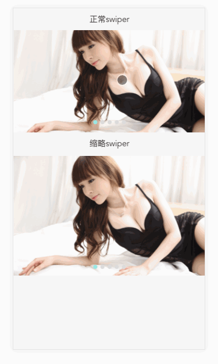
4.1.1 Attributes
| 参数 | 说明 | 类型 | 可选值 | 默认值 |
|---|---|---|---|---|
| type | swiper类型 | string | swiper(正常)/thum(缩略) | swiper |
| auto | 自动播放时长 | number | — | 5000 |
| items | swiper展示的列表 | array | — | [] |
| showIndicators | 是否展示swiper小圆点 | boolean | — | true |
| styles | swiper样式控制 | object | — | {} |
| resetTitle | 重置title内容 | string | — | — |
4.1.2 Events
| 事件名称 | 说明 | 回调参数 |
|---|---|---|
| change | swiper滑动回调 | 当前swiper item索引 |
4.1.3 用法
<template>
<div class="swiper-page">
<p>正常swiper</p>
<x-swiper type='swiper' :items='items' :styles="{height: '180px'}"></x-swiper>
<p>缩略swiper</p>
<x-swiper type='swiper' :items='items' :type="'thum'" :styles="{height: '208px'}"></x-swiper>
</div>
</template>

<script>
export default {
data () {
return {
items: [
require('assets/beauty_1.png'),
require('assets/beauty_2.png'),
require('assets/beauty_3.png'),
require('assets/beauty_4.png'),
require('assets/beauty_5.png')
],
}
}
}
</script>

<style lang="stylus" scoped>
.swiper-page {
height auto
}
</style>
4.2 scroller(下拉刷新上拉加载)
4.2.1 Attributes
| 参数 | 说明 | 类型 | 可选值 | 默认值 |
|---|---|---|---|---|
| onRefresh | 下拉回调 | function | — | — |
| onInfinite | 上拉回调 | function | — | — |
| width | scroller宽度 | string | — | 100% |
| height | scroller高度 | string | — | 100% |
| isLoadMore | 是否展示上拉加载 | boolean | — | true |
| refreshText | 下拉文本内容 | string | — | 下拉刷新 |
| noDataText | 无数据文本 | string | — | 没有更多数据啦~ |
| refreshLayerColor | 下拉文本颜色 | string | — | #AAA |
| loadingLayerColor | 上拉文本颜色 | string | — | #AAA |
| animating | 是否有动画 | boolean | — | true |
| animationDuration | 动画间隔 | number | — | 250 |
| bouncing | 是否有反弹效果 | string | — | true |
| cssClass | content css class | string | — | — |
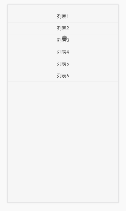
4.2.2 用法
<style scoped>
.scroller-page {
height: 330px
}
ul {
padding: 20px 0
}
li {
width: 100%;
height: 35px;
line-height: 35px;
border-bottom: 1px solid #eee;
text-align: center;
}
</style>

<template>
<div class="scroller-page">
<x-scroller
:on-refresh="refresh"
:on-infinite="infinite"
:noDataText="noDataText"
>
<!-- content is here -->
<ul>
<li>数据1</li>
<li>数据2</li>
<li>数据3</li>
<li>数据4</li>
<li>数据5</li>
<li>数据6</li>
</ul>
</x-scroller>
</div>
</template>

<script>
export default {
data () {
return {
noDataText: '没有更多数据啦~'
}
},
methods: {
refresh (done) {
setTimeout(done, 1000)
this.noDataText = ''
console.log('refresh');
},
infinite (done) {
setTimeout(done, 1000, true)
this.noDataText = '没有更多数据啦~'
console.log('infinite');
}
}
}
</script>
4.3 search

4.3.1 Attributes
| 参数 | 说明 | 类型 | 可选值 | 默认值 |
|---|---|---|---|---|
| async | 是否进行节流 | boolean | — | true |
| timeout | 搜索节流时长 | number | — | 100 |
| styles | search样式 | object | — | — |
| placeholder | placeholder | string | — | '搜索' |
| autofocus | 是否自动聚焦(iOS端autofocus无效) | boolean | — | — |
| clear | 进行搜索是否清空search框内容 | boolean | — | false |
4.3.2 Events
| 事件名称 | 说明 | 回调参数 |
|---|---|---|
| search | search搜索回调 | 搜索文本 |
| enter | enter时搜索回调 | 搜索文本 |
| close | 点击搜索关闭按钮回调 | '' |
4.3.3 用法
只有搜索框<style lang="stylus">
.search-page {
padding: 0 10px;
margin-top: 10px;
}
</style>
<template>
<div>
<x-search
placeholder="请输入搜索关键字"
@search="searchFn"
@enter="searchEnter"
@close="closeFn"
></x-search>
</div>
</template>
<script>
export default {
methods: {
searchFn (query) {
console.log('search', query)
},
searchEnter (query) {
console.log('enter', query)
},
closeFn (query) {
console.log('close', query)
}
}
}
</script>拥有默认的搜索结果列表
<style lang="stylus">
.search-page {
padding: 0 10px;
margin-top: 10px;
}
</style>
<template>
<div class="search-page" v-title data-title="search">
<x-search
placeholder="请输入搜索关键字"
:autofocus="true"
:async="false"
@search="searchFn"
@enter="searchEnter"
@close="closeFn"
>
<x-search-list :result="filterResult" @listSearch="listSearch" v-show="visible"></x-search-list>
</x-search>
</div>
</template>

<script>
export default {
data () {
return {
keyword: '',
visible: false, // 点击列表,列表是否消失
defaultResult: [
'Apple',
'Banana',
'Orange',
'Durian',
'Lemon',
'Peach',
'Cherry',
'Berry',
'Core',
'Fig',
'Haw',
'Melon',
'Plum',
'Pear',
'Peanut',
'Other'
]
}
},
watch: {
keyword (val) {
if (!val) {
this.visible = false;
}
}
},
methods: {
searchFn (query) {
this.keyword = query;
this.visible = true;
console.log('search', query)
},
searchEnter (query) {
this.keyword = query;
console.log('enter', query)
},
closeFn (query) {
this.keyword = query;
console.log('close', query)
},
listSearch (index) {
this.visible = false;
console.log(index, this.defaultResult[index])
}
},
computed: {
filterResult() {
return this.defaultResult.filter(item => new RegExp(this.keyword, 'i').test(item));
}
}
}
</script>
定制化结果列表,关键字高亮匹配
<style lang="stylus">
.search-page {
padding: 0 10px;
margin-top: 10px;

.search-result {
position: relative;
overflow: hidden;
.l {
width: 100%;
margin-bottom: 5px;
}
.r {
position: absolute;
right: 0;
top: 50%;
margin-top: -10px;
line-height: 20px;
}
.price {
color: #ff6f5c;
}
.gray {
font-size: 12px;
}
}
}
</style>
<template>
<div class="search-page" v-title data-title="search">
<x-search
placeholder="请输入搜索关键字"
:autofocus="true"
:async="false"
@search="searchFn"
@enter="searchEnter"
@close="closeFn"
>
<x-search-list :result="filterResult" @listSearch="listSearch" v-show="visible">
<div class="search-result" slot="list-item" slot-scope="props">
<p class="l" v-html="props.slotValue.name"></p>
<p class="gray" v-show="props.slotValue.price">¥{{props.slotValue.price}}/斤</p>
<div class="gray r" v-show="props.slotValue.amount">剩余{{props.slotValue.amount}}斤</div>
</div>
</x-search-list>
</x-search>
</div>
</template>

<script>
export default {
data () {
return {
keyword: '',
visible: false,
defaultResult: [
{name: 'Apple', price: 5, amount: 20},
{name: 'Banana', price: 5, amount: 30},
{name: 'Orange', price: 3, amount: 10},
{name: 'Durian', price: 10, amount: 25},
{name: 'Lemon', price: 4, amount: 30},
{name: 'Peach', price: 5, amount: 40},
{name: 'Cherry', price: 20, amount: 50},
{name: 'Berry', price: 15, amount: 60},
{name: 'Core', price: 10, amount: 21},
{name: 'Fig', price: 10, amount: 22},
{name: 'Haw', price: 10, amount: 23},
{name: 'Melon', price: 10, amount: 24},
{name: 'Plum', price: 10, amount: 25},
{name: 'Pear', price: 10, amount: 26},
{name: 'Peanut', price: 10, amount: 27},
{name: 'Other'}
],
// 防止defaultResult值被污染
copy: []
}
},
watch: {
keyword (val) {
if (!val) {
this.visible = false;
}
}
},
methods: {
searchFn (query) {
this.keyword = query;
this.visible = true;
console.log('search', query)
},
searchEnter (query) {
this.keyword = query;
console.log('enter', query)
},
closeFn (query) {
this.keyword = query;
console.log('close', query)
},
listSearch (index) {
this.visible = false;
console.log(index, this.defaultResult[index].name)
}
},
computed: {
filterResult() {
// i 忽略大小写
let result = this.defaultResult.filter(item => new RegExp(this.keyword, 'i').test(item.name));
// 关键字高亮匹配
this.copy = JSON.parse(JSON.stringify(result))
this.copy.forEach((item, index) => {
let name = item.name, word = this.keyword;
name = name.toLowerCase();
word = word.toLowerCase();

if (word && name.indexOf(word) !== -1) {
let arr    = item.name.split('')
let i      = name.indexOf(word);
let len    = word.length;
let active = '<span class="price">' + arr.splice(i, len).join('') + '</span>';
arr.splice(i, 0, active);
item.name  = arr.join('');
}
})
return this.copy;
}
}
}
</script>
4.4 dialog
4.4.1 Attributes
message
| 参数 | 说明 | 类型 | 可选值 | 默认值 |
|---|---|---|---|---|
| msg | msg文本内容 | string | — | — |
| timeout | msg显示时长 | number | — | 2000 |
| callback | 回调函数 | function | — | — |
| icon | 特殊icon | string | — | — |
modal
| 参数 | 说明 | 类型 | 可选值 | 默认值 |
|---|---|---|---|---|
| show | modal是否显示 | boolean | — | — |
| title | modal标题 | string | — | — |
| content | modal内容 | string | — | — |
| onOk | 确定按钮回调 | function | — | — |
| onCancel | 取消按钮回调 | function | — | — |
| okText | 确定按钮内容 | string | — | — |
| cancelText | 取消按钮内容 | string | — | — |
| showCloseIcon | 是否显示关闭icon | boolean | — | true |
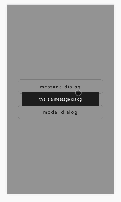
4.4.2 用法
msg
this.$dialog.msg({msg: 'hello message components ~'})modal(插件)
this.$dialog.modal({
title: 'Demo Modal',
cancelText: '取消',
okText: '确定',
content: '测试,测试,测试,测试,测试,测试,测试,测试,测试',
onOk () {
console.log('click ok btn to do someting');
},
onCancel () {
console.log('click cancel btn to do someting');
}
})
modal(组件)
<style lang="stylus">
.dialog-page {
.dialog-btn {
width 100%
position absolute
top 50%
left 0
transform translateY(-50%)
> p {
width 80%
height 50px
line-height 50px
margin 40px auto 0
border 1px solid #CCC
border-radius 10px
font-size 16px
font-weight bold
letter-spacing 2px
text-align center
&:first-child {
margin-top 0
}
}
}
.modal-text {
text-align: center;
}
}
</style>
<template>
<div class="dialog-page">
<div class="dialog-btn">
<p @click="message">message dialog</p>
<p @click="open">modal dialog</p>
</div>
<x-modal title="Demo Modal" cancelText="取消" :onCancel="close" :show="selectModel" okText="确认" :onOk="close">
<p class="modal-text">modal components test is awesome!!!</p>
</x-modal>
</div>
</template>

<script>
export default {
data () {
return {
selectModel: false
}
},
methods: {
message () {
return this.$dialog.msg({msg: 'this is a message dialog'})
},
open () {
this.selectModel = true
},
close () {
this.selectModel = false
}
}
}
</script>
4.5 table
4.5.1 Attributes
| 参数 | 说明 | 类型 | 可选值 | 默认值 |
|---|---|---|---|---|
| tableData | table数据 | array | — | — |
| label | thead标题(TableColum) | — | — | |
| prop | 绑定的数据 | string | — | — |
4.5.2 用法
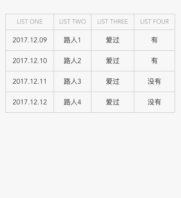
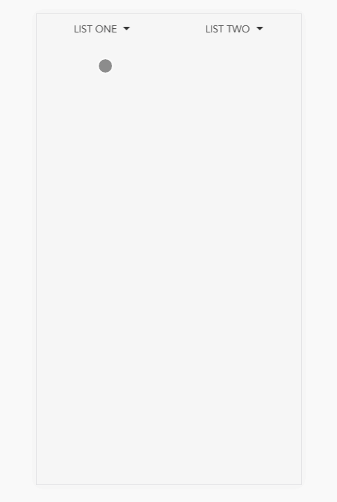
配合scroller进行展示(注:目前table较为简单,后期将进行完善,使得其可以应对不同场景)<template>
<div class="table" v-title data-title="table">
<x-scroller
:on-refresh="refresh"
:on-infinite="infinite"
:noDataText="noDataText"
class="table-content"
>
<x-table :tableData="items">
<x-table-column prop="list_1" label="LIST ONE"></x-table-column>
<x-table-column prop="list_2" label="LIST TWO"></x-table-column>
<x-table-column prop="list_3" label="LIST THREE"></x-table-column>
<x-table-column prop="list_4" label="LIST FOUR"></x-table-column>
</x-table>
</x-scroller>
</div>
</template>
<script>
export default {
data () {
return {
items: [
{
list_1: '2017.12.09',
list_2: '路人1',
list_3: '爱过',
list_4: '有'
},
{
list_1: '2017.12.10',
list_2: '路人2',
list_3: '爱过',
list_4: '有'
},
{
list_1: '2017.12.11',
list_2: '路人3',
list_3: '爱过',
list_4: '没有'
},
{
list_1: '2017.12.12',
list_2: '路人4',
list_3: '爱过',
list_4: '没有'
}
],
noDataText: '没有更多数据啦~'
}
},
methods: {
refresh (done) {
setTimeout(done, 1000)
this.noDataText = ''
console.log('refresh');
},
infinite (done) {
setTimeout(done, 1000, true)
this.noDataText = '没有更多数据啦~'
console.log('infinite');
}
}
}
</script>4.6 picker
4.6.1 Attributes
| 参数 | 说明 | 类型 | 可选值 | 默认值 |
|---|---|---|---|---|
| default | picker默认选中的值 | string/number | — | — |
| type | picker类型 | string | date/time/datetime/custom | datetime |
| title | 选择器弹窗标题 | string | — | — |
| placeholder | placeholder | string | — | 请选择时间 |
| timeStep | 时间选择粒度(有分钟的选择器) | number | — | 1 |
| startYear | 起始年份 | number/string | — | 今年 |
| endYear | 结束年份 | number/string | — | 10年的范围 |
| startDate | 起始日期 | string | — | — |
| endDate | 结束日期 | string | — | — |
| startHour | 起始时间 | number/string | — | 0 |
| endHour | 结束时间 | number/string | — | 23 |
| startMinute | 起始分钟 | number/string | — | 0 |
| endMinute | 结束分钟 | number/string | — | 59 |
| yearFormat | “年“的格式化 | string | — | '{value}年' |
| monthFormat | “月“的格式化 | string | — | '{value}月' |
| dayFormat | “日“的格式化 | string | — | '{value}日' |
| hourFormat | “时“的格式化 | string | — | '{value}时' |
| minuteFormat | “分“的格式化 | string | — | '{value}分' |
4.6.2 用法
<style lang="stylus">
.picker-page {
.x-list {
padding: 0 0.32rem;
background: #fff;
color: #333;
font-size: 14px;
> li {
min-height: 60px;
padding-top: 21px;
border-bottom: 1px solid #f2f2f2;
overflow: hidden;
> label {
float: left;
}
> div {
float: right;
}
.x-list-arrow {
min-width: 100px;
margin-right: 10px;
position: relative;
> div {
float: right;
text-align: right;
margin-right: 10px;
}
&:after {
content: '';
position: absolute;
top: 4px;
right: -5px;
width: 10px;
height: 10px;
border-top: 1px solid #ccc;
border-right: 1px solid #ccc;
transform: rotate(45deg);
-webkit-transform: rotate(45deg);
}
}
}
}
}
</style>
<template>
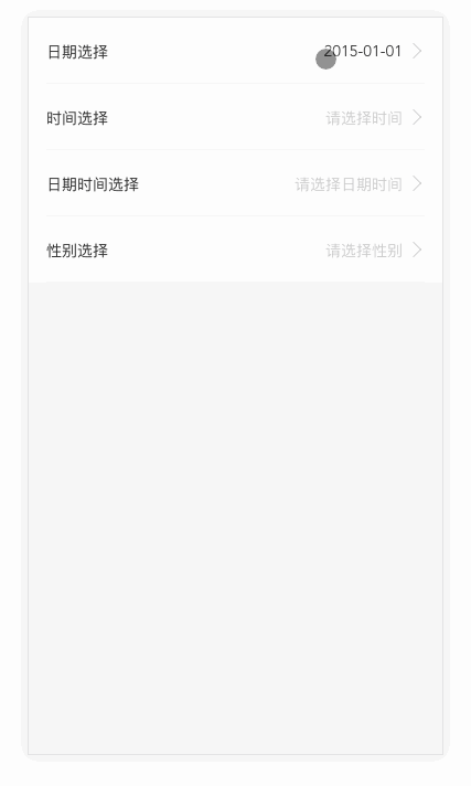
<div class="picker-page" v-title data-title="picker">
<ul class='x-list'>
<li>
<label>日期选择</label>
<div class="x-list-arrow">
<x-picker title="选择日期" startYear="2016" startDate="2015-01-01" endDate="2019-12-01" placeholder="请选择日期" v-model="now_date" type="date"></x-picker>
</div>
</li>
<li>
<label>时间选择</label>
<div class="x-list-arrow">
<x-picker title="选择时间" placeholder="请选择时间" startMinute="2" endMinute="30" v-model="now_time" type="time"></x-picker>
</div>
</li>
<li>
<label>日期时间选择</label>
<div class="x-list-arrow">
<x-picker title="选择日期时间" placeholder="请选择日期时间" v-model="now_datetime" :timeStep="20" type="datetime"></x-picker>
</div>
</li>
<li>
<label>性别选择</label>
<div class="x-list-arrow">
<x-picker v-model="gender.value" placeholder="请选择性别" :default="gender.default" title="选择性别" type="custom"></x-picker>
</div>
</li>
</ul>
</div>
</template>
<script>
export default {
data() {
return {
gender: {
default: -1,
value: [
{
name: "保密",
value: 0
},
{
name: "男",
value: 1
},
{
name: "女",
value: 2
}
]
},
now_date: null,
now_time: null,
now_datetime: null // new Date().getTime()/1000
};
}
};
</script>4.7 select
4.7.1 Attributes
| 参数 | 说明 | 类型 | 可选值 | 默认值 |
|---|---|---|---|---|
| selectData | 下拉数据 | array | — | [] |
| title | 默认显示的标题 | string | — | '' |
| alwaysShowTitle | 是否一直显示默认标题 | boolean | — | false |
| defaultValue | 默认选中的值 | number/string | — | 0 |
| width | select组件的宽度 | string | — | '100%' |
| ellipsisWidth | select文字超过多出省略号的宽度 | string | — | '120px' |
4.7.2 Events
| 事件名称 | 说明 | 回调参数 |
|---|---|---|
| search | select 选择时的回调函数 | 参数1:索引,参数2:所中项的id值 |
4.7.3 用法
<template>
<div class="select-page" v-title data-title="select">
<x-select
@search="searchFn"
:selectData="selectData"
title="LIST ONE"
:alwaysShowTitle="false"
width="50%"
defaultValue="0"
></x-select>
<x-select
@search="searchFn1"
:selectData="selectData1"
title="LIST TWO"
width="50%"
ellipsisWidth="65px"
defaultValue="1"
></x-select>
</div>
</template>

<script>
export default {
data() {
return {
selectData: [
{ id: 1, name: "LIST ONE 1" },
{ id: 2, name: "LIST ONE 2" },
{ id: 3, name: "LIST ONE 3" },
{ id: 4, name: "LIST ONE 4" },
{ id: 5, name: "LIST ONE 5" }
],
selectData1: [
{ id: 1, name: "LIST TWO 1" },
{ id: 2, name: "LIST TWO 2" },
{ id: 3, name: "LIST TWO 3" },
{ id: 4, name: "LIST TWO 4" },
{ id: 5, name: "LIST TWO 5" }
]
};
},
methods: {
searchFn(index, id) {
console.log(index, id);
},
searchFn1(index, id) {
console.log(index, id);
}
}
};
</script>
4.8 dropdown
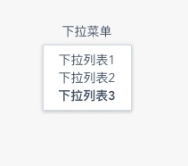
这个下拉菜单偏PC端的这里就不多做介绍了
<template>
<div class="test">
<x-dropdown trigger="click" @command="commandHandle" :hide-on-click="true">
<span class="drop-down_link">下拉菜单</span>
<x-dropdown-menu>
<x-dropdown-list command="a">下拉列表1</x-dropdown-list>
<x-dropdown-list command="b">下拉列表2</x-dropdown-list>
<x-dropdown-list command="c"><h4>下拉列表3</h4></x-dropdown-list>
</x-dropdown-menu>
</x-dropdown>
</div>
</template>

<script>
export default {
name: 'Dropdown',
methods: {
commandHandle (command, instance) {
console.log(command, instance);
}
}
}
</script>
以上组件便是目前vui所有的组件了,后期会不断的进行维护并进行新组件的开发。
vui github传送门:https://github.com/Brickies/vui
vui npm传送门:https://www.npmjs.com/package/x-vui
如果小伙伴们喜欢我的vui,欢迎star。
如果有什么问题欢迎小伙伴们随时提issue
如果有好的组件欢迎小伙伴们随时提pr,我会不定期进行merge

相关文章推荐
- 合格前端系列第三弹-实现一个属于我们自己的简易MVVM库
- 合格前端系列第五弹-Virtual Dom && Diff
- 一个前端UI资源共享网站
- 合格前端系列第六弹-从指向看JavaScript
- 做一个合格的前端,gulp自动化构建工具入门教程
- 一入前端深似海,从此红尘是路人系列第八弹之浅析Vue组件开发
- Atiitt 前端技术点清单列表 attilax总结 v2 s11.docx 1. ui与前端系列 类库与api 3 1.1. 概念性技术 4 1.2. 运行环境 4 1.3. Ui技术点 4 1
- 来测测你是不是一个合格的前端工程师
- 30天了解30种技术系列---(20)React .js 一个比较有意思的前端框架
- 一个新奇的前端UI框架——layui
- [后端人员耍前端系列]AngularJs篇:使用AngularJs打造一个简易权限系统
- Lance老师UI系列教程第八课->新浪新闻SlidingMenu界面的实现
- 一个没有专职架构师,产品经理,前端,UI和测试的小公司技术团队的修养
- Lance老师UI系列教程第八课->新浪新闻SlidingMenu界面的实现
- Lance老师UI系列教程第八课->新浪新闻SlidingMenu界面的实现
- 造一个属于自己的 UI 库
- 发布一个win8 UI风格的前端开发者网址导航
- 合格前端系列第七弹-移动端开发踩过的一些坑
- 合格前端系列第十弹-揭秘组件库一二事(上中)