鼠标悬停旋转的图标按钮特效(纯CSS)
2017-12-01 11:44
411 查看
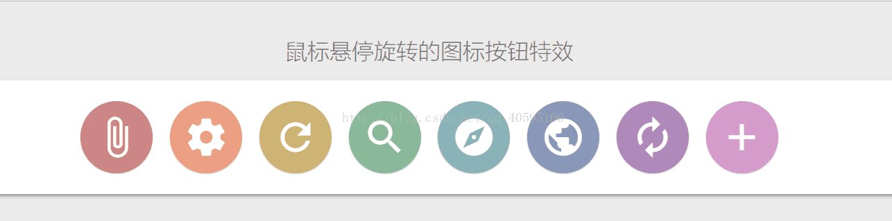
效果图如下:
CSS如下:
<style type="text/css">
@font-face {
font-family: 'Material Icons';
font-style: normal;
font-weight: 400;
src: url(https://fonts.gstatic.com/s/materialicons/v31/2fcrYFNaTjcS6g4U3t-Y5ZjZjT5FdEJ140U2DJYC3mY.woff2) format('woff2');
}
.material-icons {
font-family: 'Material Icons';
font-weight: normal;
font-style: normal;
font-size: 24px;
line-height: 1;
letter-spacing: normal;
text-transform: none;
display: inline-block;
white-space: nowrap;
word-wrap: normal;
direction: ltr;
-webkit-font-feature-settings: 'liga';
-webkit-font-smoothing: antialiased;
}
* {
font-family: 'Microsoft YaHei','Lantinghei SC','Open Sans',Arial,'Hiragino Sans GB','STHeiti','WenQuanYi Micro Hei','SimSun',sans-serif;
}
body {
font-size: 1rem;
background-color: #ebebeb;
padding: 20px;
text-align: center;
}
h1 {
font-weight: 100;
color: #777;
}
.main-wrapper {
border-radius: 4px;
background-color: white;
padding: 20px;
box-shadow: 0 3px 6px rgba(0, 0, 0, 0.16), 0 3px 6px rgba(0, 0, 0, 0.23);
position: relative;
}
i.material-icons {
font-size: 1.5rem;
color: white;
position: relative;
border-radius: 50%;
padding: 5px;
margin: 3px;
box-shadow: 0 1px 3px rgba(0, 0, 0, 0.12), 0 1px 2px rgba(0, 0, 0, 0.24);
transition: color 0.2s ease, background-color 0.2s ease, transform 0.3s ease;
}
i.material-icons:after {
content: "";
width: 100%;
height: 100%;
border: solid 2px;
transform: scale(0.8);
position: absolute;
top: -2px;
left: -2px;
border-radius: 50%;
transition: all 0.3s ease;
}
i.material-icons:hover:after {
transform: scale(1);
box-shadow: 10px 0 20px rgba(0, 0, 0, 0.19), 6px 0 6px rgba(0, 0, 0, 0.23);
}
i.material-icons:nth-of-type(4) {
background-color: #88b999;
}
i.material-icons:nth-of-type(4):hover {
color: #88b999;
}
i.material-icons:nth-of-type(4):after {
border-color: #88b999;
}
i.material-icons:nth-of-type(5) {
background-color: #88b2b9;
}
i.material-icons:nth-of-type(5):hover {
color: #88b2b9;
}
i.material-icons:nth-of-type(5):after {
border-color: #88b2b9;
}
i.material-icons:nth-of-type(6) {
background-color: #8897b9;
}
i.material-icons:nth-of-type(6):hover {
color: #8897b9;
}
i.material-icons:nth-of-type(6):after {
border-color: #8897b9;
}
i.material-icons:nth-of-type(7) {
background-color: #af88b9;
}
i.material-icons:nth-of-type(7):hover {
color: #af88b9;
}
i.material-icons:nth-of-type(7):after {
border-color: #af88b9;
}
i.material-icons:nth-of-type(8) {
background-color: #d59acb;
}
i.material-icons:nth-of-type(8):hover {
color: #d59acb;
}
i.material-icons:nth-of-type(8):after {
border-color: #d59acb;
}
i.material-icons:nth-of-type(1) {
background-color: #cd8484;
}
i.material-icons:nth-of-type(1):hover {
color: #cd8484;
}
i.material-icons:nth-of-type(1):after {
border-color: #cd8484;
}
i.material-icons:nth-of-type(2) {
background-color: #ec9f83;
}
i.material-icons:nth-of-type(2):hover {
color: #ec9f83;
}
i.material-icons:nth-of-type(2):after {
border-color: #ec9f83;
}
i.material-icons:nth-of-type(3) {
background-color: #cdb274;
}
i.material-icons:nth-of-type(3):hover {
color: #cdb274;
}
i.material-icons:nth-of-type(3):after {
border-color: #cdb274;
}
i.material-icons:hover {
background-color: transparent;
transform: rotate(90deg);
cursor: pointer;
box-shadow: none;
}
p {
color: #999;
font-weight: 300;
margin-top: 20px;
}
@media (min-width:601px) {
i.material-icons {
padding:10px;
margin:5px;
font-size:2rem;
}
}
@media (min-width:993px) {
i.material-icons {
padding:20px;
margin:10px;
font-size:4rem;
}
i.material-icons:after {
border-width:3px;
top:-3px;
left:-3px;
}
}
</style>
HTML如下:
<body>
<h1>鼠标悬停旋转的图标按钮特效</h1>
<div class="main-wrapper">
<i class="material-icons">attach_file</i>
<i class="material-icons">settings</i>
<i class="material-icons">refresh</i>
<i class="material-icons">search</i>
<i class="material-icons">explore</i>
<i class="material-icons">public</i>
<i class="material-icons">autorenew</i>
<i class="material-icons">add</i>
</div>
</body>

相关文章推荐
- css实现鼠标上移图标旋转效果
- 按钮实现鼠标悬停背景色渐变的动画特效
- 一些简单的特效 鼠标悬停 鼠标移动 和 图标特效
- [封装插件]Jquery中的CSS处理一览以及回到顶部按钮和鼠标悬停获取坐标的案例
- 一款css实现的鼠标经过按钮的特效
- 鼠标悬停,图片旋转360°特效代码
- jquery制作图标导航插件鼠标悬停放大显示特效代码
- 9款基于CSS3 Transitions实现的鼠标经过图标悬停特效
- 9款基于CSS3 Transitions实现的鼠标经过图标悬停特效
- 常用的css3鼠标悬停按钮动画特效
- Jquery鼠标悬停按钮图标动态变化效果
- 鼠标悬停,会变亮的CSS按钮
- CSS3鼠标滑过渐变颜色旋转图标特效
- 【Html/CSS】CSS鼠标悬停特效实现 仿微信网页版
- js文本框或者按钮鼠标悬停提示说明文字
- css实现鼠标悬停图片放大显示
- 纯DIV+CSS圆角背景随按钮文字增多而增宽自适应,鼠标经过背景变化按钮型模块。
- Jquery幻灯片特效代码分享--鼠标滑过按钮时切换(2)
- 20行html代码加40行css代码实现照片墙页面(鼠标hover实现旋转缩放)
- 【css3】鼠标悬停图片旋转效果