Android ConstraintLayout属性详解
2017-08-31 12:37
471 查看
ConstraintLayout, 即约束布局, 在2016年由Google I/O推出. 从支持力度而言, 将成为主流布局样式, 完全代替其他布局, 减少布局的层级, 优化渲染性能. 在新版Android Studio中, ConstraintLayout已替代RelativeLayout, 成为HelloWorld项目的默认布局. ConstraintLayout作为非绑定(Unbundled)的支持库, 命名空间是
即来源于本地的包命名空间. 最新版本是1.0.1(2017.4.21), 在项目的
1.相对位置
这个相对位置的设置有点类似RelativeLayout的layout_toLeftOf、alignParentLeft等这些属性。
ConstraintLayout一共支持相对位置的属性在此:
layout_constraintLeft_toLeftOf
layout_constraintLeft_toRightOf
layout_constraintRight_toLeftOf
layout_constraintRight_toRightOf
layout_constraintTop_toTopOf
layout_constraintTop_toBottomOf
layout_constraintBottom_toTopOf
layout_constraintBottom_toBottomOf
layout_constraintBaseline_toBaselineOf
layout_constraintStart_toEndOf
layout_constraintStart_toStartOf
layout_constraintEnd_toStartOf
layout_constraintEnd_toEndOf
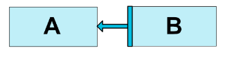
拿第一个属性来说,layout_constraintLeft_toLeftOf=”@+id/id_first”,表示当前View的左边界与id_first的View的做边界对齐。其实这个属性翻译成中文就是:当前view的左边对齐与引用view的左边
<Button android:id="@+id/buttonA" ... />
<Button android:id="@+id/buttonB" ...
app:layout_constraintLeft_toRightOf="@+id/buttonA" />效果如下:
当然,这些属性也支持设置为对齐父布局的左右前后。
<Button android:id="@+id/buttonB" ...
app:layout_constraintLeft_toLeftOf="parent" />这样,buttonB就依附在父布局的左边。类似Realitelayout的alignParentLeft。
2.margin属性
这个属性跟其他布局的margin属性差不多。支持的属性如下:
android:layout_marginStart
android:layout_marginEnd
android:layout_marginLeft
android:layout_marginTop
android:layout_marginRight
android:layout_marginBottom
这里写图片描述
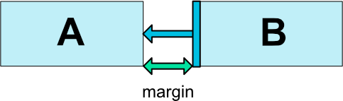
注意:如上图,假如A紧贴父布局的左侧,B距离A 100dp,A设置为gone后,则B距离父布局的左侧100dp。
goneMargin属性
这个布局比较有意思,还是拿上面的那副图做示例,假设我们现在有这样一个需求:假设A设置为gone,后,B需要距离父布局的左侧200dp,怎么办?这时候,goneMargin属性就派上用场啦,只要设置B的layout_goneMarginLeft=200dp即可。这样,A不为gone的时候,B距离A 100dp,A为gone时,B距离父布局左侧200dp。
一共支持的属性如下:
layout_goneMarginStart
layout_goneMarginEnd
layout_goneMarginLeft
layout_goneMarginTop
layout_goneMarginRight
layout_goneMarginBottom
Centering positioning and bias ,设置居中或者按比例偏移。
假设我们要设置一个控件居中怎么办?很简单,利用上面介绍过的属性就可以办到。
<android.support.constraint.ConstraintLayout ...>
<Button android:id="@+id/button" ...
app:layout_constraintHorizontal_bias="0.3"
app:layout_constraintLeft_toLeftOf="parent"
app:layout_constraintRight_toRightOf="parent/>bias支持的属性如下:
layout_constraintHorizontal_bias
layout_constraintVertical_bias
ConstraintLayout本身支持minHeight、minWidht属性,没啥好说的。
注意ConstraintLayout不支持match_parent属性,要用0dp代替,在加上设置特性的约束属性,即可实现match_parent的效果。
Ratio 设置宽高比。
属性如下:app:layout_constraintDimensionRatio=””
当前控件宽或高其一确定的话,可以使用ration属性,根据确定的宽或高确定另外高或宽的大小
layout_constraintDimensionRatio接受的值是两个float类型的比例,代表的含义是width:height。
ration属性还支持这样设置:
<Button android:layout_width="0dp"
android:layout_height="0dp"
app:layout_constraintDimensionRatio="H,16:9"
app:layout_constraintBottom_toBottomOf="parent"
app:layout_constraintTop_toTopOf="parent"/>假设比例设置为a:b ,如果前面是H,不论哪一边确定,另外一边的大小都是确定边的b/a倍;如果前面是W,不论哪一边确定,另外一边的大小都是确定边的a/b倍。
3.Chains 链状结构。
看图如下:
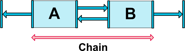
这里写图片描述
Chain Style
要想chain style生效,必须设置当前链方向的边为wrap_content,比如上面的水平链,宽设为wrap_content。还有就是控件要相互引用,比如A的右边依赖B的左边,B的左边依赖A的右边,都是设置。
chain style设置在第一个控件上
这里写图片描述
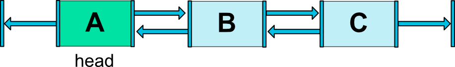
即设置在head上。
属性有两个:
layout_constraintHorizontal_chainStyle
layout_constraintVertical_chainStyle
支持的值有三个:
CHAIN_SPREAD:均匀分布控件。
CHAIN_SPREAD_INSIDE,同上,但是边上的控件不均匀分布。
CHAIN_PACKED:控件紧挨在一起。还可以通过bias属性设置偏移量。
根据字面意思这三个属性好理解,效果如下:
这里写图片描述
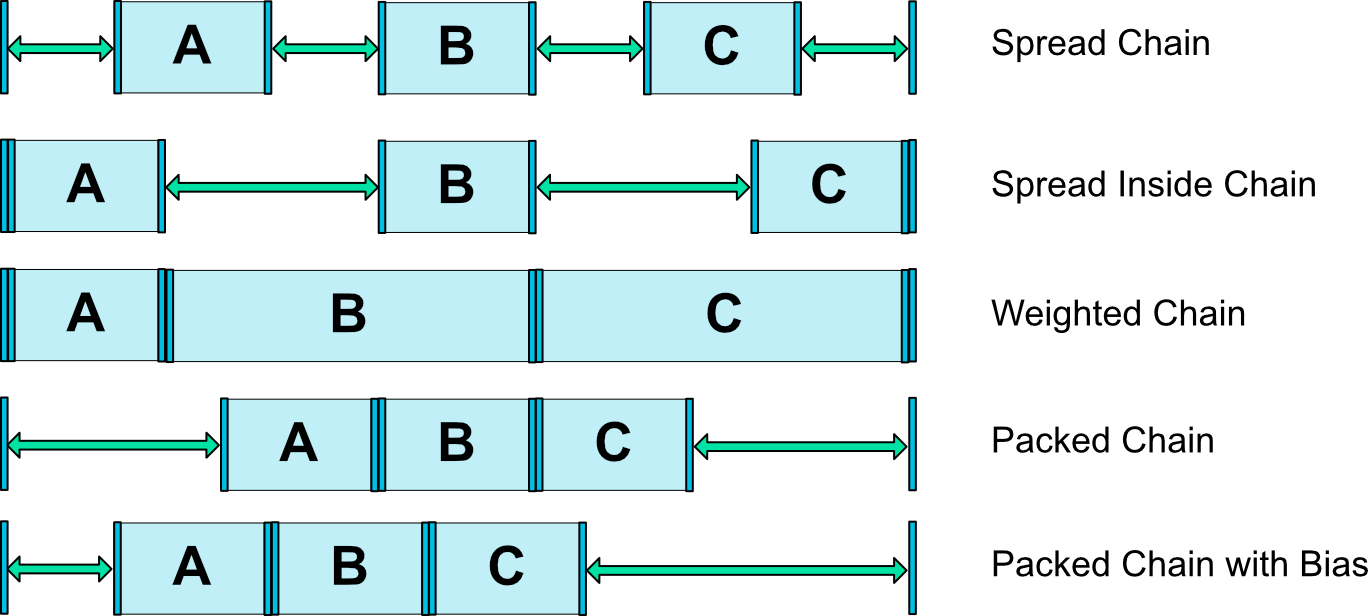
Weighted chains:
app:layout_constraintHorizontal_weight
app:layout_constraintVertical_weight
跟线性布局的weight差不多,layout_constraintHorizontal_weight需要设置width=0dp,控件的大小根据设置的weight比例进行设置。
4.Guideline
Guideline是一条隐形的线,这条线可作为准线,根据此准线设置其他控件的位置
<android.support.constraint.ConstraintLayout
xmlns:android="http://schemas.android.com/apk/res/android"
xmlns:app="http://schemas.android.com/apk/res-auto"
xmlns:tools="http://schemas.android.com/tools"
android:layout_width="match_parent"
android:layout_height="match_parent">
<android.support.constraint.Guideline
android:layout_width="wrap_content"
android:layout_height="wrap_content"
android:id="@+id/guideline"
app:layout_constraintGuide_begin="100dp"
android:orientation="vertical"/>
<Button
android:text="Button"
android:layout_width="wrap_content"
android:layout_height="wrap_content"
android:id="@+id/button"
app:layout_constraintLeft_toLeftOf="@+id/guideline"
android:layout_marginTop="16dp"
app:layout_constraintTop_toTopOf="parent" />
</android.support.constraint.ConstraintLayout>上面代码:guideline控件是一条隐形垂直的线,距离左边距100dp,Button由于设置了left_toLeft,所以也距离左边距100dp。
GuideLine支持的属性:
layout_constraintGuide_begin:距离left或top的大小
layout_constraintGuide_end:距离right或bottom的大小
layout_constraintGuide_percent:float类型。距离left或top的大小的比例。
layout_constraintGuide_percent=”0.5” android:orientation=”vertical” ,那么guideline距离左侧的距离为父布局宽度的一半。
参考 http://blog.csdn.net/u013706904/article/details/52957946
app:,
即来源于本地的包命名空间. 最新版本是1.0.1(2017.4.21), 在项目的
build.gradle中声明.
dependencies {
compile 'com.android.support.constraint:constraint-layout:1.0.1'
}
1.相对位置
这个相对位置的设置有点类似RelativeLayout的layout_toLeftOf、alignParentLeft等这些属性。
ConstraintLayout一共支持相对位置的属性在此:
layout_constraintLeft_toLeftOf
layout_constraintLeft_toRightOf
layout_constraintRight_toLeftOf
layout_constraintRight_toRightOf
layout_constraintTop_toTopOf
layout_constraintTop_toBottomOf
layout_constraintBottom_toTopOf
layout_constraintBottom_toBottomOf
layout_constraintBaseline_toBaselineOf
layout_constraintStart_toEndOf
layout_constraintStart_toStartOf
layout_constraintEnd_toStartOf
layout_constraintEnd_toEndOf
拿第一个属性来说,layout_constraintLeft_toLeftOf=”@+id/id_first”,表示当前View的左边界与id_first的View的做边界对齐。其实这个属性翻译成中文就是:当前view的左边对齐与引用view的左边
<Button android:id="@+id/buttonA" ... />
<Button android:id="@+id/buttonB" ...
app:layout_constraintLeft_toRightOf="@+id/buttonA" />效果如下:
当然,这些属性也支持设置为对齐父布局的左右前后。
<Button android:id="@+id/buttonB" ...
app:layout_constraintLeft_toLeftOf="parent" />这样,buttonB就依附在父布局的左边。类似Realitelayout的alignParentLeft。
2.margin属性
这个属性跟其他布局的margin属性差不多。支持的属性如下:
android:layout_marginStart
android:layout_marginEnd
android:layout_marginLeft
android:layout_marginTop
android:layout_marginRight
android:layout_marginBottom
这里写图片描述
注意:如上图,假如A紧贴父布局的左侧,B距离A 100dp,A设置为gone后,则B距离父布局的左侧100dp。
goneMargin属性
这个布局比较有意思,还是拿上面的那副图做示例,假设我们现在有这样一个需求:假设A设置为gone,后,B需要距离父布局的左侧200dp,怎么办?这时候,goneMargin属性就派上用场啦,只要设置B的layout_goneMarginLeft=200dp即可。这样,A不为gone的时候,B距离A 100dp,A为gone时,B距离父布局左侧200dp。
一共支持的属性如下:
layout_goneMarginStart
layout_goneMarginEnd
layout_goneMarginLeft
layout_goneMarginTop
layout_goneMarginRight
layout_goneMarginBottom
Centering positioning and bias ,设置居中或者按比例偏移。
假设我们要设置一个控件居中怎么办?很简单,利用上面介绍过的属性就可以办到。
<android.support.constraint.ConstraintLayout ...>
<Button android:id="@+id/button" ...
app:layout_constraintHorizontal_bias="0.3"
app:layout_constraintLeft_toLeftOf="parent"
app:layout_constraintRight_toRightOf="parent/>bias支持的属性如下:
layout_constraintHorizontal_bias
layout_constraintVertical_bias
ConstraintLayout本身支持minHeight、minWidht属性,没啥好说的。
注意ConstraintLayout不支持match_parent属性,要用0dp代替,在加上设置特性的约束属性,即可实现match_parent的效果。
Ratio 设置宽高比。
属性如下:app:layout_constraintDimensionRatio=””
当前控件宽或高其一确定的话,可以使用ration属性,根据确定的宽或高确定另外高或宽的大小
<Button android:layout_width="wrap_content"
android:layout_height="0dp"
app:layout_constraintDimensionRatio="1:2" />
当前Button的width已经确定,height根据设置的比例=2×width
layout_constraintDimensionRatio接受的值是两个float类型的比例,代表的含义是width:height。
ration属性还支持这样设置:
<Button android:layout_width="0dp"
android:layout_height="0dp"
app:layout_constraintDimensionRatio="H,16:9"
app:layout_constraintBottom_toBottomOf="parent"
app:layout_constraintTop_toTopOf="parent"/>假设比例设置为a:b ,如果前面是H,不论哪一边确定,另外一边的大小都是确定边的b/a倍;如果前面是W,不论哪一边确定,另外一边的大小都是确定边的a/b倍。
3.Chains 链状结构。
看图如下:
这里写图片描述
Chain Style
要想chain style生效,必须设置当前链方向的边为wrap_content,比如上面的水平链,宽设为wrap_content。还有就是控件要相互引用,比如A的右边依赖B的左边,B的左边依赖A的右边,都是设置。
chain style设置在第一个控件上
这里写图片描述
即设置在head上。
属性有两个:
layout_constraintHorizontal_chainStyle
layout_constraintVertical_chainStyle
支持的值有三个:
CHAIN_SPREAD:均匀分布控件。
CHAIN_SPREAD_INSIDE,同上,但是边上的控件不均匀分布。
CHAIN_PACKED:控件紧挨在一起。还可以通过bias属性设置偏移量。
根据字面意思这三个属性好理解,效果如下:
这里写图片描述
Weighted chains:
app:layout_constraintHorizontal_weight
app:layout_constraintVertical_weight
跟线性布局的weight差不多,layout_constraintHorizontal_weight需要设置width=0dp,控件的大小根据设置的weight比例进行设置。
4.Guideline
Guideline是一条隐形的线,这条线可作为准线,根据此准线设置其他控件的位置
<android.support.constraint.ConstraintLayout
xmlns:android="http://schemas.android.com/apk/res/android"
xmlns:app="http://schemas.android.com/apk/res-auto"
xmlns:tools="http://schemas.android.com/tools"
android:layout_width="match_parent"
android:layout_height="match_parent">
<android.support.constraint.Guideline
android:layout_width="wrap_content"
android:layout_height="wrap_content"
android:id="@+id/guideline"
app:layout_constraintGuide_begin="100dp"
android:orientation="vertical"/>
<Button
android:text="Button"
android:layout_width="wrap_content"
android:layout_height="wrap_content"
android:id="@+id/button"
app:layout_constraintLeft_toLeftOf="@+id/guideline"
android:layout_marginTop="16dp"
app:layout_constraintTop_toTopOf="parent" />
</android.support.constraint.ConstraintLayout>上面代码:guideline控件是一条隐形垂直的线,距离左边距100dp,Button由于设置了left_toLeft,所以也距离左边距100dp。
GuideLine支持的属性:
layout_constraintGuide_begin:距离left或top的大小
layout_constraintGuide_end:距离right或bottom的大小
layout_constraintGuide_percent:float类型。距离left或top的大小的比例。
layout_constraintGuide_percent=”0.5” android:orientation=”vertical” ,那么guideline距离左侧的距离为父布局宽度的一半。
参考 http://blog.csdn.net/u013706904/article/details/52957946

相关文章推荐
- android:layout_weight属性详解
- android:layout_weight属性详解 (转)
- android -------- ConstraintLayout 约束属性(二)
- Android ConstraintLayout 约束布局详解
- Android利用ConstraintLayout实现漂亮的动画详解
- ConstraintLayout 属性详解 和Chain的使用
- android:layout_alignleft layout_toleftof 使用,详解RelativeLayout布局属性 ,搜索xm布局
- android:layout_weight属性详解
- android:layout_weight属性详解(转)
- ConstraintLayout 属性详解 和Chain的使用
- 详解 Android Views 元素的 layout_weight 属性
- Android 布局详解 -三表格布局(TableLayout)以及重要属性
- Android layout 布局 属性详解
- Android之layout_weight属性详解
- android:layout_weight属性详解
- android:layout_weight属性详解
- Android 布局详解 -三表格布局(TableLayout)以及重要属性
- Android ConstraintLayout图文并茂详解(二)
- Android布局属性详解之RelativeLayout
- 详解 android layout布局属性