Python-Matplotlib(1)画折线图
2017-08-13 11:01
302 查看
import pandas as pd
unrate = pd.read_csv('unrate.csv')
unrate['DATE'] = pd.to_datetime(unrate['DATE'])
print(unrate.head(12))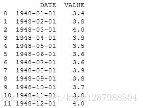
import matplotlib.pyplot as plt
#%matplotlib inline
#Using the different pyplot functions, we can create, customize, and display a plot. For example, we can use 2 functions to :
plt.plot()
plt.show()
first_twelve = unrate[0:12]
plt.plot(first_twelve['DATE'], first_twelve['VALUE'])
plt.show()
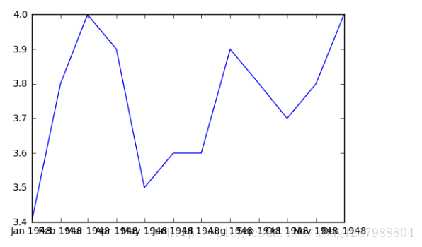
#While the y-axis looks fine, the x-axis tick labels are too close together and are unreadable
#We can rotate the x-axis tick labels by 90 degrees so they don't overlap
#We can specify degrees of rotation using a float or integer value.
plt.plot(first_twelve['DATE'], first_twelve['VALUE'])
plt.xticks(rotation=45)
#print help(plt.xticks)
plt.show()
#xlabel(): accepts a string value, which gets set as the x-axis label.
#ylabel(): accepts a string value, which is set as the y-axis label.
#title(): accepts a string value, which is set as the plot title.
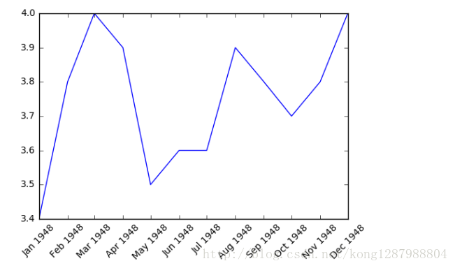
plt.plot(first_twelve['DATE'], first_twelve['VALUE'])
plt.xticks(rotation=90)
plt.xlabel('Month')
plt.ylabel('Unemployment Rate')
plt.title('Monthly Unemployment Trends, 1948')
plt.show()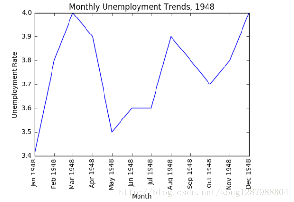

相关文章推荐
- Python数据可视化:Matplotlib 直方图、箱线图、条形图、热图、折线图、散点图。。。
- python matplotlib从文件中读取数据绘制折线图
- Python3 使用 matplotlib 画折线图
- python.matplotlib/datatime/CSV学习范例-读取CSV格式文件生成折线图
- python使用matplotlib模块绘制多条折线图、散点图
- Python学习笔记(4)--Matplotlib同时画柱状图与折线图
- 【Python-3.5】matplotlib绘制气温折线图
- python数据分析——matplotlib生成折线图,散点图和直方图
- Python 画多个曲线的折线图(matplotlib.pyplot.plot)
- 使用python的matplotlib(pyplot)画折线图和柱状图
- python 数据可视化 matplotlib学习二 : 对折线图使用颜色映射
- Python进阶(三十八)-数据可视化の利用matplotlib 进行折线图,直方图和饼图的绘制
- Python 数据分析之matplotlib
- python知识(4)----Ubantu14.04 下pip安装Numpy,SciPy和MatplotLib
- 基于Python实现matplotlib中动态更新图片(交互式绘图)
- Python绘图教程——Matplotlib文档(详细版)后半部分
- 【python笔记】使用matplotlib,pylab进行python绘图
- Python配置matplotlib--no module named six matplotlib
- python2.7中Matplotlib的安装和应用
- python matplotlib