Android 活用提示窗Toast和Snackbar
2017-08-02 22:13
274 查看
原文地址:http://blog.csdn.net/aqi00/article/details/54342019
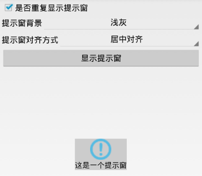
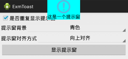
下面是自定义提示窗的两个截图,分别展示了不同背景与不同对齐方式下的界面效果:
下面是自定义提示窗的代码例子:
[java] view
plain copy
Toast toast = new Toast(this);
View vv = LayoutInflater.from(this).inflate(R.layout.toast_hint, null);
TextView tv_toast = (TextView) vv.findViewById(R.id.tv_toast);
tv_toast.setText(text);
LinearLayout ll_toast = (LinearLayout) vv.findViewById(R.id.ll_toast);
ll_toast.setBackgroundColor(mBackground);
toast.setView(vv);
toast.setGravity(mGravity, 0, 0);
toast.setDuration(duration);
toast.show();
使用Snackbar需要导入android-support-design,同时design库依赖于android-support-v7-appcompat,所以design库与appcompat库要同时导入到工程中。另外,Snackbar最好配合控件CoordinatorLayout使用,因为这样Snackbar才能够像通知那样通过右滑手势取消。
Snackbar的用法与Toast类似,常用方法说明如下:
make : 构造一个Snackbar对象。可指定提示条的上级视图、提示消息文本、显示时长等信息。
setText : 设置提示消息的文本内容。
setAction : 设置交互按钮的文本与点击监听器。
setActionTextColor : 设置交互按钮的文本颜色。
setDuration : 设置提示消息的显示时长。
show : 显示提示条。
下面是演示提示条的两个截图,分别展示了滑动取消提示条效果,以及点击交互按钮的界面效果:


下面是演示用的布局文件内容:
[html] view
plain copy
<RelativeLayout xmlns:android="http://schemas.android.com/apk/res/android"
android:layout_width="match_parent"
android:layout_height="match_parent"
android:padding="5dp" >
<LinearLayout
android:layout_width="match_parent"
android:layout_height="wrap_content"
android:orientation="vertical" >
<LinearLayout
android:layout_width="match_parent"
android:layout_height="wrap_content"
android:orientation="horizontal" >
<Button
android:id="@+id/btn_snackbar_simple"
android:layout_width="0dp"
android:layout_height="wrap_content"
android:layout_weight="1"
android:gravity="center"
android:text="显示简单提示条"
android:textColor="@color/black"
android:textSize="17sp" />
<Button
android:id="@+id/btn_snackbar_action"
android:layout_width="0dp"
android:layout_height="wrap_content"
android:layout_weight="1"
android:gravity="center"
android:text="显示可交互提示条"
android:textColor="@color/black"
android:textSize="17sp" />
</LinearLayout>
</LinearLayout>
<TextView
android:id="@+id/tv_hint"
android:layout_width="match_parent"
android:layout_height="wrap_content"
android:layout_alignParentBottom="true"
android:layout_marginBottom="30dp"
android:textColor="@color/black"
android:textSize="17sp" />
<android.support.design.widget.CoordinatorLayout
android:id="@+id/cl_container"
android:layout_width="match_parent"
android:layout_height="wrap_content"
android:layout_alignParentBottom="true" />
</RelativeLayout>
下面是演示用的代码例子片段:
[java] view
plain copy
public void onClick(View v) {
if (v.getId() == R.id.btn_snackbar_simple) {
Snackbar.make(cl_container, "把我往右滑动看看会发生什么事", Snackbar.LENGTH_LONG).show();
} else if (v.getId() == R.id.btn_snackbar_action) {
Snackbar.make(cl_container, "这是一个可交互的提示条", Snackbar.LENGTH_LONG)
.setAction("点我", new View.OnClickListener() {
@Override
public void onClick(View v) {
tv_hint.setText(Utils.getNowTime()+" 您轻轻点了一下Snackbar");
}
}).setActionTextColor(Color.YELLOW).show();
}
}
提示窗Toast
大家平时都经常用Toast,可是你是否发现,系统默认的Toast样式太过单调乏味呢?其实Toast的界面也允许开发者自行定制,只要定义好提示窗的布局文件,即可调用Toast类的setView方法设置自定义窗口画面。包括背景、对齐方式、窗口内部控件等等界面元素,均可由你自己定制。下面是自定义提示窗的两个截图,分别展示了不同背景与不同对齐方式下的界面效果:
下面是自定义提示窗的代码例子:
[java] view
plain copy
Toast toast = new Toast(this);
View vv = LayoutInflater.from(this).inflate(R.layout.toast_hint, null);
TextView tv_toast = (TextView) vv.findViewById(R.id.tv_toast);
tv_toast.setText(text);
LinearLayout ll_toast = (LinearLayout) vv.findViewById(R.id.ll_toast);
ll_toast.setBackgroundColor(mBackground);
toast.setView(vv);
toast.setGravity(mGravity, 0, 0);
toast.setDuration(duration);
toast.show();
提示条Snackbar
Snackbar是Android Support Design Library库的一个新控件,与Toast相比,Snackbar不仅仅用来提示消息,还允许进行交互,从而改善了用户体验。使用Snackbar需要导入android-support-design,同时design库依赖于android-support-v7-appcompat,所以design库与appcompat库要同时导入到工程中。另外,Snackbar最好配合控件CoordinatorLayout使用,因为这样Snackbar才能够像通知那样通过右滑手势取消。
Snackbar的用法与Toast类似,常用方法说明如下:
make : 构造一个Snackbar对象。可指定提示条的上级视图、提示消息文本、显示时长等信息。
setText : 设置提示消息的文本内容。
setAction : 设置交互按钮的文本与点击监听器。
setActionTextColor : 设置交互按钮的文本颜色。
setDuration : 设置提示消息的显示时长。
show : 显示提示条。
下面是演示提示条的两个截图,分别展示了滑动取消提示条效果,以及点击交互按钮的界面效果:
下面是演示用的布局文件内容:
[html] view
plain copy
<RelativeLayout xmlns:android="http://schemas.android.com/apk/res/android"
android:layout_width="match_parent"
android:layout_height="match_parent"
android:padding="5dp" >
<LinearLayout
android:layout_width="match_parent"
android:layout_height="wrap_content"
android:orientation="vertical" >
<LinearLayout
android:layout_width="match_parent"
android:layout_height="wrap_content"
android:orientation="horizontal" >
<Button
android:id="@+id/btn_snackbar_simple"
android:layout_width="0dp"
android:layout_height="wrap_content"
android:layout_weight="1"
android:gravity="center"
android:text="显示简单提示条"
android:textColor="@color/black"
android:textSize="17sp" />
<Button
android:id="@+id/btn_snackbar_action"
android:layout_width="0dp"
android:layout_height="wrap_content"
android:layout_weight="1"
android:gravity="center"
android:text="显示可交互提示条"
android:textColor="@color/black"
android:textSize="17sp" />
</LinearLayout>
</LinearLayout>
<TextView
android:id="@+id/tv_hint"
android:layout_width="match_parent"
android:layout_height="wrap_content"
android:layout_alignParentBottom="true"
android:layout_marginBottom="30dp"
android:textColor="@color/black"
android:textSize="17sp" />
<android.support.design.widget.CoordinatorLayout
android:id="@+id/cl_container"
android:layout_width="match_parent"
android:layout_height="wrap_content"
android:layout_alignParentBottom="true" />
</RelativeLayout>
下面是演示用的代码例子片段:
[java] view
plain copy
public void onClick(View v) {
if (v.getId() == R.id.btn_snackbar_simple) {
Snackbar.make(cl_container, "把我往右滑动看看会发生什么事", Snackbar.LENGTH_LONG).show();
} else if (v.getId() == R.id.btn_snackbar_action) {
Snackbar.make(cl_container, "这是一个可交互的提示条", Snackbar.LENGTH_LONG)
.setAction("点我", new View.OnClickListener() {
@Override
public void onClick(View v) {
tv_hint.setText(Utils.getNowTime()+" 您轻轻点了一下Snackbar");
}
}).setActionTextColor(Color.YELLOW).show();
}
}

相关文章推荐
- Android开发笔记(一百二十七)活用提示窗Toast和Snackbar
- APP开发实战150-Android 提示功能设计(AlertDialog、Toast和Snackbar的使用)
- Android开发笔记:类似Toast的提示控件:SnackBar
- Android 信息提示Dialog、Toast和Snackbar
- Android开发中的三种提示(Dialog,Toast,Snackbar)实现
- [原]Android用户界面之提示信息(Toast)
- web 弹出框 类似 android的toast的信息提示
- Android弹框使用:Dialog&Toast&Snackbar
- android开发-使用Toast显示提示信息框
- android开发-使用Toast显示提示信息框
- Android中多次弹出相同Toast提示框长时间不消失
- Cocos2dx杂记:仿Android提示Toast
- 提示代码Android之Toast简单实现不循环提示
- Android-自定义圆角Toast提示框
- Android用户界面之提示信息(Toast)
- 【Android开发】toast提示
- Android开发必知--自定义Toast提示
- 【安卓开发】可爱的android开发者们,给跳出小提示窗控件取名为Toast(吐司面包)的详解
- Android Study Material Design 五 之:自定义Toast以及玩转SnackBar
- Android 使用Toast显示提示信息框