Android封装一个自定义标题栏
2017-07-19 14:56
459 查看
标题栏是Android开发最基础的一个组件,但是应用也多种多样,因为应对需求的多样化,想要做一个万能的标题栏基本是不可能,因此跟大家分享一下自己简易封装的标题栏,并不具备多大含金量,应对于以下一些样式。
1:
2:
3:
4:
5:
其实很好理解,就是左图,左标题,标题,右标题,右图的一些属性设置。
第一步:
在values下面新建attrs文件,设置属性
主要设置内容,颜色,图片等
第二步:
设置标题栏的布局文件
这里的布局文件是通用的布局文件,需要对此布局根据自己的需求进行配置,这个就需要自定义View了
第三步:
自定义TitleBar,主要进行引用布局,初始化view,拿到自定义属性进行相应配置
然后我们需要添加左侧,右侧的点击事件,由于一般反馈点击范围太小,导致点击灵敏性较差,所以这里全部设置对左侧,右侧布局进行监听,而不是单个控件
设置回调接口
在调用的时候拿到自定义view对象setOnViewClick即可
全部代码如下:
如何引用呢?
效果:

代码中调用:
效果:
到这里就结束了,基本上可以满足大多数需求
代码链接:
http://pan.baidu.com/s/1qXH7nWg
1:
2:
3:
4:
5:
其实很好理解,就是左图,左标题,标题,右标题,右图的一些属性设置。
第一步:
在values下面新建attrs文件,设置属性
<?xml version="1.0" encoding="utf-8"?>
<resources>
<declare-styleable name="TitlebarView">
<attr name="leftText" format="string"/>
<attr name="leftTextColor" format="color"/>
<attr name="centerTextColor" format="color"/>
<attr name="centerTitle" format="string"/>
<attr name="rightTextColor" format="color"/>
<attr name="rightText" format="string"/>
<attr name="leftDrawble" format="reference"/>
<attr name="rightDrawable" format="reference"/>
</declare-styleable>
</resources>
主要设置内容,颜色,图片等
第二步:
设置标题栏的布局文件
<?xml version="1.0" encoding="utf-8"?>
<RelativeLayout xmlns:android="http://schemas.android.com/apk/res/android"
android:id="@+id/layout_title"
android:layout_width="match_parent"
android:layout_height="wrap_content"
android:background="@android:color/transparent"
android:orientation="vertical">

<LinearLayout
android:id="@+id/layout_left"
android:layout_width="wrap_content"
android:layout_height="match_parent"
android:layout_alignParentLeft="true"
android:gravity="center"
android:orientation="horizontal"
android:paddingLeft="@dimen/size_8"
android:paddingRight="@dimen/size_8">

<ImageView
android:id="@+id/iv_left"
android:layout_width="wrap_content"
android:layout_height="wrap_content"
android:contentDescription="@null"
android:scaleType="centerInside" />

<TextView
android:id="@+id/tv_left"
android:layout_width="wrap_content"
android:layout_height="wrap_content"
android:maxLength="4"
android:maxLines="1"
android:paddingLeft="@dimen/size_8" />
</LinearLayout>

<TextView
android:id="@+id/tv_title"
android:layout_width="wrap_content"
android:layout_height="wrap_content"
android:layout_centerInParent="true"
android:gravity="center"
android:maxLength="10"
android:maxLines="1" />

<LinearLayout
android:id="@+id/layout_right"
android:layout_width="wrap_content"
android:layout_height="match_parent"
android:layout_alignParentRight="true"
android:gravity="center"
android:paddingLeft="@dimen/size_8"
android:paddingRight="@dimen/size_8">

<TextView
android:id="@+id/tv_right"
android:layout_width="wrap_content"
android:layout_height="wrap_content"
android:maxLines="1" />

<ImageView
android:id="@+id/iv_right"
android:layout_width="wrap_content"
android:layout_height="wrap_content"
android:contentDescription="@null"
android:scaleType="centerInside" />
</LinearLayout>
</RelativeLayout>
这里的布局文件是通用的布局文件,需要对此布局根据自己的需求进行配置,这个就需要自定义View了
第三步:
自定义TitleBar,主要进行引用布局,初始化view,拿到自定义属性进行相应配置
public TitlebarView(final Context context, AttributeSet attrs, int defStyleAttr) {
super(context, attrs, defStyleAttr);
LayoutInflater.from(context).inflate(R.layout.layout_title, this);
initView();
TypedArray array = context.obtainStyledAttributes(attrs, R.styleable.TitlebarView, defStyleAttr, 0);
int count = array.getIndexCount();
for (int i = 0; i < count; i++) {
int attr = array.getIndex(i);
switch (attr) {
case R.styleable.TitlebarView_leftTextColor:
tv_left.setTextColor(array.getColor(attr, Color.BLACK));
break;
case R.styleable.TitlebarView_leftDrawble:
iv_left.setImageResource(array.getResourceId(attr, 0));
break;
case R.styleable.TitlebarView_leftText:
tv_left.setText(array.getString(attr));
break;
case R.styleable.TitlebarView_centerTextColor:
tv_title.setTextColor(array.getColor(attr, Color.BLACK));
break;
case R.styleable.TitlebarView_centerTitle:
tv_title.setText(array.getString(attr));
break;
case R.styleable.TitlebarView_rightDrawable:
iv_right.setImageResource(array.getResourceId(attr, 0));
break;
case R.styleable.TitlebarView_rightText:
tv_right.setText(array.getString(attr));
break;
case R.styleable.TitlebarView_rightTextColor:
tv_right.setTextColor(array.getColor(attr, Color.BLACK));
break;
}
}
array.recycle();

}
然后我们需要添加左侧,右侧的点击事件,由于一般反馈点击范围太小,导致点击灵敏性较差,所以这里全部设置对左侧,右侧布局进行监听,而不是单个控件
设置回调接口
private onViewClick mClick;

public void setOnViewClick(onViewClick click) {
this.mClick = click;
}

public interface onViewClick {
void leftClick();

void rightClick();
}
在调用的时候拿到自定义view对象setOnViewClick即可
全部代码如下:
package com.example.testing.mycustomview;

import android.content.Context;
import android.content.res.TypedArray;
import android.graphics.Color;
import android.text.TextUtils;
import android.util.AttributeSet;
import android.util.TypedValue;
import android.view.LayoutInflater;
import android.view.View;
import android.widget.ImageView;
import android.widget.LinearLayout;
import android.widget.RelativeLayout;
import android.widget.TextView;

/**
* Created by Administrator on 2017/7/18.
*/

public class TitlebarView extends RelativeLayout {
private LinearLayout layout_left, layout_right;
private TextView tv_left, tv_title, tv_right;
private ImageView iv_left, iv_right;
private onViewClick mClick;

public TitlebarView(Context context) {
this(context, null);
}

public TitlebarView(Context context, AttributeSet attrs) {
this(context, attrs, 0);
}

public TitlebarView(final Context context, AttributeSet attrs, int defStyleAttr) {
super(context, attrs, defStyleAttr);
LayoutInflater.from(context).inflate(R.layout.layout_title, this);
initView();
TypedArray array = context.obtainStyledAttributes(attrs, R.styleable.TitlebarView, defStyleAttr, 0);
int count = array.getIndexCount();
for (int i = 0; i < count; i++) {
int attr = array.getIndex(i);
switch (attr) {
case R.styleable.TitlebarView_leftTextColor:
tv_left.setTextColor(array.getColor(attr, Color.BLACK));
break;
case R.styleable.TitlebarView_leftDrawble:
iv_left.setImageResource(array.getResourceId(attr, 0));
break;
case R.styleable.TitlebarView_leftText:
tv_left.setText(array.getString(attr));
break;
case R.styleable.TitlebarView_centerTextColor:
tv_title.setTextColor(array.getColor(attr, Color.BLACK));
break;
case R.styleable.TitlebarView_centerTitle:
tv_title.setText(array.getString(attr));
break;
case R.styleable.TitlebarView_rightDrawable:
iv_right.setImageResource(array.getResourceId(attr, 0));
break;
case R.styleable.TitlebarView_rightText:
tv_right.setText(array.getString(attr));
break;
case R.styleable.TitlebarView_rightTextColor:
tv_right.setTextColor(array.getColor(attr, Color.BLACK));
break;
}
}
array.recycle();
layout_left.setOnClickListener(new OnClickListener() {
@Override
public void onClick(View view) {
mClick.leftClick();
}
});
layout_right.setOnClickListener(new OnClickListener() {
@Override
public void onClick(View view) {
mClick.rightClick();
}
});

}

private void initView() {
tv_left = findViewById(R.id.tv_left);
tv_title = findViewById(R.id.tv_title);
tv_right = findViewById(R.id.tv_right);
iv_left = findViewById(R.id.iv_left);
iv_right = findViewById(R.id.iv_right);
layout_left = findViewById(R.id.layout_left);
layout_right = findViewById(R.id.layout_right);
}

public void setOnViewClick(onViewClick click) {
this.mClick = click;
}

//设置标题
public void setTitle(String title) {
if (!TextUtils.isEmpty(title)) {
tv_title.setText(title);
}
}

//设置左标题
public void setLeftText(String title) {
if (!TextUtils.isEmpty(title)) {
tv_left.setText(title);
}
}

//设置右标题
public void setRightText(String title) {
if (!TextUtils.isEmpty(title)) {
tv_right.setText(title);
}
}

//设置标题大小
public void setTitleSize(int size) {
if (tv_title != null) {
tv_title.setTextSize(TypedValue.COMPLEX_UNIT_SP, size);
}
}

//设置左标题大小
public void setLeftTextSize(int size) {
if (tv_left != null) {
tv_left.setTextSize(TypedValue.COMPLEX_UNIT_SP, size);
}
}

//设置右标题大小
public void setRightTextSize(int size) {
if (tv_right != null) {
tv_right.setTextSize(TypedValue.COMPLEX_UNIT_SP, size);
}
}

//设置左图标
public void setLeftDrawable(int res) {
if (iv_left != null) {
iv_left.setImageResource(res);
}
}

//设置右图标
public void setRightDrawable(int res) {
if (iv_right != null) {
iv_right.setImageResource(res);
}
}

public interface onViewClick {
void leftClick();

void rightClick();
}

}
如何引用呢?
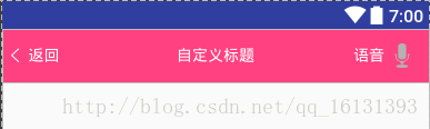
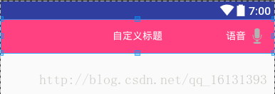
<com.example.testing.mycustomview.TitlebarView
android:id="@+id/title"
android:layout_width="match_parent"
android:layout_height="48dp"
android:background="@color/colorAccent"
app:centerTitle="自定义标题"
app:centerTextColor="#FFF"
app:leftDrawble="@drawable/ic_write_back"
app:leftTextColor="#FFF"
app:leftText="返回"
app:rightDrawable="@android:drawable/ic_btn_speak_now"
app:rightText="语音"
app:rightTextColor="#FFF"
/>
效果:
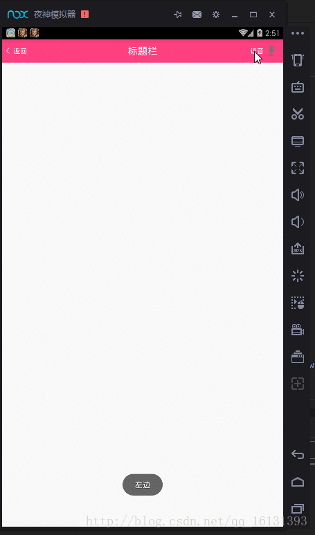
代码中调用:
TitlebarView titlebarView= (TitlebarView) findViewById(R.id.title);
titlebarView.setTitleSize(20);
titlebarView.setTitle("标题栏");
titlebarView.setOnViewClick(new TitlebarView.onViewClick() {
@Override
public void leftClick() {
Toast.makeText(MainActivity.this,"左边",Toast.LENGTH_SHORT).show();
}
@Override
public void rightClick() {
Toast.makeText(MainActivity.this,"右边",Toast.LENGTH_SHORT).show();
}
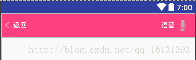
});效果:
到这里就结束了,基本上可以满足大多数需求
代码链接:
http://pan.baidu.com/s/1qXH7nWg

相关文章推荐
- Android网络开发回顾之旅 ② 新年新气象,封装一个esp8266一键配网XSmartConfig , 支持自定义回调。(附带Demo)
- Android 自定义的一个带有标题栏的相对布局
- 一个android自定义对话框的封装
- Android开发-如何去掉一个页面的标题栏和状态栏
- Android学习之Toast的自定义_标题栏的隐藏
- Android之自定义标题栏(组合控件)
- Android 快速开发(二),封装一个 BottomTabBaseActivity
- Android自定义一个播放器控件
- Android 自定义标题栏BaseActivity
- Android自定义标题栏
- 【Android】如何设置一个自定义的Button
- 自定义Android标题栏修改TitleBar的布局
- 一个带按钮的自定义Android通知栏DEMO
- Android 自定义标题栏Title Bar
- Android开发之——自定义标题栏titlebar
- Android自定义View之popupwindow进阶封装:高仿ios “item动画弹出”效果的popupwindow。
- Android 自定义dialog,实现右上角显示一个控件按钮
- Android开发中ListView自定义adapter的封装
- android开发中标题栏的封装
- Android自定义View分享——一个时钟