快速使用CSS 弹性盒子
2017-07-18 00:00
381 查看
布局的传统解决方案,基于盒状模型,依赖 display属性 + position属性 + float属性。它对于那些特殊布局非常不方便,比如,垂直居中就不容易实现;2009年,W3C提出了一种新的方案—-Flex布局,可以简便、完整、响应式地实现各种页面布局。目前,它已经得到了所有浏览器的支持,这意味着,现在就能很安全地使用这项功能。
弹性盒子是 CSS3 的一种新的布局模式,是一种当页面需要适应不同的屏幕大小以及设备类型时确保元素拥有恰当的行为的布局方式。
引入弹性盒布局模型的目的是提供一种更加有效的方式来对一个容器中的子元素进行排列、对齐和分配空白空间。:
弹性容器通过设置 display 属性的值为 flex 或 inline-flex将其定义为弹性容器。
弹性容器内包含了一个或多个弹性子元素。
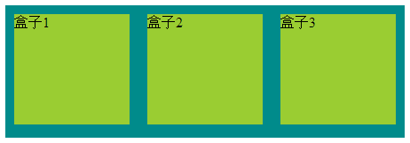
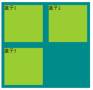
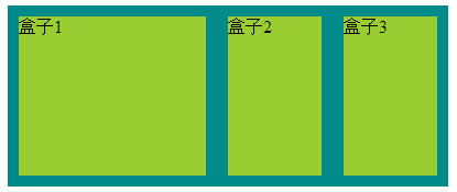
1:最基本的
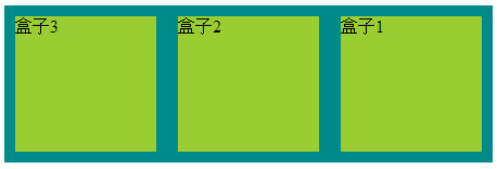
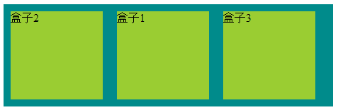
2:flex-direction使用(弹性子元素在父容器中的位置)
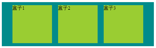
3:justify-content 的使用(弹性子元素在父容器中的位置) 如下:盒子居中显示
4:align-items的使用(设置或检索弹性盒子元素在侧轴(纵轴)方向上的对齐方式)如下:从底部开始显示
5:flex-wrap的使用(定弹性盒子的子元素换行方式)如下:自动换行
6:order的使用(定弹性盒子的子元素的排列顺序)如下:居中
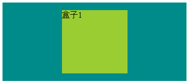
7:margin 属性,完美居中
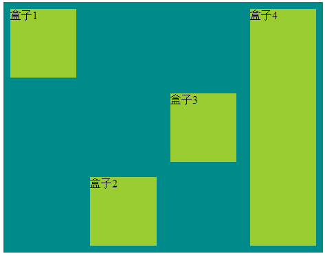
8:align-self 属性用于设置弹性元素自身在侧轴(纵轴)方向上的对齐方式。
9:flex 用于指定弹性子元素如何分配空间。
弹性盒子在开发中常常用得到,前端,app端;弹性盒布局模型可以作为 Web 开发人员工具箱中的一个很好的工具。通过以上学习,希望你能更好的学习弹性盒子。9:flex 用于指定弹性子元素如何分配空间。
弹性盒子是 CSS3 的一种新的布局模式,是一种当页面需要适应不同的屏幕大小以及设备类型时确保元素拥有恰当的行为的布局方式。
引入弹性盒布局模型的目的是提供一种更加有效的方式来对一个容器中的子元素进行排列、对齐和分配空白空间。:
CSS3 弹性盒子内容
弹性盒子由弹性容器(Flex container)和弹性子元素(Flex item)组成。弹性容器通过设置 display 属性的值为 flex 或 inline-flex将其定义为弹性容器。
弹性容器内包含了一个或多个弹性子元素。
1:最基本的
<style>
/*body {
direction: rtl;/*设置 direction 属性为 rtl (right-to-left),
弹性子元素的排列方式也会改变 ,整体从右到左
}*/

.flex-container{
display: flex;
display: -webkit-flex;
width: 450px;
height: 150px;
background-color: darkcyan;
}

.flex-item{
width: 130px;
height: 125px;
margin: 10px;
background-color: yellowgreen;
}

</style>

<body>
<div class="flex-container">
<div class="flex-item one">盒子1</div>
<div class="flex-item tow">盒子2</div>
<div class="flex-item three">盒子3</div>
</div>
</body>
2:flex-direction使用(弹性子元素在父容器中的位置)
<style>
/*flex-direction的值有:
row:横向从左到右排列(左对齐),默认的排列方式。
row-reverse:反转横向排列(右对齐,从后往前排,最后一项排在最前面。
column:纵向排列。
column-reverse:反转纵向排列,从后往前排,最后一项排在最上面。
*/

.flex-container{
display: flex;
display: -webkit-flex;
width: 450px;
background-color: darkcyan;
flex-direction: row-reverse;
}

.flex-item{
width: 130px;
height: 125px;
margin: 10px;
background-color: yellowgreen;
}

</style>

<body>
<div class="flex-container">
<div class="flex-item one">盒子1</div>
<div class="flex-item tow">盒子2</div>
<div class="flex-item three">盒子3</div>
</div>
</body>
3:justify-content 的使用(弹性子元素在父容器中的位置) 如下:盒子居中显示
<style>
/*justify-content属性
flex-start:从左到右排列
flex-end:从右到左排列
center:中间开始排列
space-between:平分
space-around:平分,且两边占1/2
*/

.flex-container{
display: flex;
display: -webkit-flex;
width: 500px;
background-color: darkcyan;
justify-content: center;
}

.flex-item{
width: 130px;
height: 125px;
margin: 10px;
background-color: yellowgreen;
}

</style>

<body>
<div class="flex-container">
<div class="flex-item one">盒子1</div>
<div class="flex-item tow">盒子2</div>
<div class="flex-item three">盒子3</div>
</div>
</body>
4:align-items的使用(设置或检索弹性盒子元素在侧轴(纵轴)方向上的对齐方式)如下:从底部开始显示
<style>
/*align-items 属性:侧轴(纵轴)方向上的对齐方式。
flex-start: 顶部开始
flex-end: 低部开始
center 居中
baseline 弹性盒子元素的行内轴与侧轴为同一条
stretch
*/

.flex-container{
display: flex;
display: -webkit-flex;
width: 500px;
height: 211px;
background-color: darkcyan;
align-items: flex-end;
}

.flex-item{
width: 130px;
height: 125px;
margin: 10px;
background-color: yellowgreen;
}

</style>

<body>
<div class="flex-container">
<div class="flex-item one">盒子1</div>
<div class="flex-item tow">盒子2</div>
<div class="flex-item three">盒子3</div>
</div>
</body>
5:flex-wrap的使用(定弹性盒子的子元素换行方式)如下:自动换行
<style>
/*flex-wrap 属性
nowrap - 默认, 弹性容器为单行。该情况下弹性子项可能会溢出容器。
wrap - 弹性容器为多行。该情况下弹性子项溢出的部分会被放置到新行,子项内部会发生断行
wrap-reverse -反转 wrap 排列。
*/

.flex-container{
display: flex;
display: -webkit-flex;
width: 300px;
background-color: darkcyan;
flex-wrap:wrap;
}

.flex-item{
width: 130px;
height: 125px;
margin: 10px;
background-color: yellowgreen;
}

</style>

<body>
<div class="flex-container">
<div class="flex-item one">盒子1</div>
<div class="flex-item tow">盒子2</div>
<div class="flex-item three">盒子3</div>
</div>
</body>
6:order的使用(定弹性盒子的子元素的排列顺序)如下:居中
<style>
/*order 属性
用整数值来定义排列顺序,数值小的排在前面。可以为负值
*/
.flex-container{
display: flex;
display: -webkit-flex;
width: 465px;
-webkit-flex-wrap: wrap;
flex-wrap: wrap;
background-color: darkcyan;
align-content: center;
-webkit-align-content:  center;
}

.flex-item{
width: 130px;
height: 125px;
margin: 10px;
background-color: yellowgreen;
}

.tow{
order: -1;
-webkit-order: -1;
}

</style>

<body>
<div class="flex-container">
<div class="flex-item one">盒子1</div>
<div class="flex-item tow">盒子2</div>
<div class="flex-item three">盒子3</div>
</div>
</body>
7:margin 属性,完美居中
<style>
/*margin 属性
完美居中
*/
.flex-container{
display: flex;
display: -webkit-flex;
width: 365px;
background-color: darkcyan;
height: 155px;
}

.flex-item{
width: 130px;
height: 125px;
margin: auto;
background-color: yellowgreen;
}

</style>

<body>
<div class="flex-container">
<div class="flex-item one">盒子1</div>
</div>
</body>
8:align-self 属性用于设置弹性元素自身在侧轴(纵轴)方向上的对齐方式。
<style>
/*align-self 属性用于设置弹性元素自身在侧轴(纵轴)方向上的对齐方式。
*
flex-start:弹性盒子元素的侧轴(纵轴)起始位置的边界紧靠住该行的侧轴起始边界。
flex-end:弹性盒子元素的侧轴(纵轴)起始位置的边界紧靠住该行的侧轴结束边界。
center:弹性盒子元素在该行的侧轴(纵轴)上居中放置。(如果该行的尺寸小于弹性盒子元素的尺寸,则会向两个方向溢出相同的长度)。
baseline:如弹性盒子元素的行内轴与侧轴为同一条,则该值与'flex-start'等效。其它情况下,该值将参与基线对齐。
stretch:如果指定侧轴大小的属性值为'auto',则其值会使项目的边距盒的尺寸尽可能接近所在行的尺寸,但同时会遵照'min/max-width/height'属性的限制。

*/
.flex-container{
display: flex;
display: -webkit-flex;
width: 465px;
height: 365px;
background-color: darkcyan;
}

.flex-item{
width: 130px;
min-height: 100px;
margin: 10px;
background-color: yellowgreen;
}

.one{
align-self: flex-start;
}
.tow{
align-self: flex-end;
}
.three{
align-self: center;
}
.four{
align-self: stretch;
}

</style>

<body>
<div class="flex-container">
<div class="flex-item one">盒子1</div>
<div class="flex-item tow">盒子2</div>
<div class="flex-item three">盒子3</div>
<div class="flex-item four">盒子4</div>
</div>
</body>
9:flex 用于指定弹性子元素如何分配空间。
<style>
/*flex 属性用于指定弹性子元素如何分配空间。
比例分配
*/
.flex-container{
display: flex;
display: -webkit-flex;
width: 400px;
height: 165px;
background-color: darkcyan;
}

.flex-item{
margin: 10px;
background-color: yellowgreen;
}

.one{
flex: 2;
-webkit-flex: 2;
}
.tow{
flex: 1;
-webkit-flex: 1;
}
.three{
flex: 1;
-webkit-flex: 1;
}

</style>

<body>
<div class="flex-container">
<div class="flex-item one">盒子1</div>
<div class="flex-item tow">盒子2</div>
<div class="flex-item three">盒子3</div>
</div>
</body>
弹性盒子在开发中常常用得到,前端,app端;弹性盒布局模型可以作为 Web 开发人员工具箱中的一个很好的工具。通过以上学习,希望你能更好的学习弹性盒子。9:flex 用于指定弹性子元素如何分配空间。

相关文章推荐
- 快速使用CSS 弹性盒子
- 快速使用CSS 弹性盒子
- 使用css弹性盒子模型
- 彻底弄懂CSS盒子模式(DIV布局快速入门)
- CSS 弹性盒子
- CSS 弹性盒子模式
- 使用HTML,CSS快速导出数据到Excel
- 使用 sass/scss 编写CSS 快速上手
- CSS3中弹性盒子Flex使用
- Flexible 弹性盒子模型之CSS flex-direction
- CSS学习3-div的使用以及盒子
- CSS3中弹性盒子Flex使用详解
- 彻底弄懂CSS盒子模式(DIV布局快速入门)
- 使用CSS实现弹性视频html5案例实践
- 【css】盒子模型 之 弹性盒模型
- 使用HTML,CSS快速导出数据到Excel数据格式化问题
- 彻底弄懂CSS盒子模式(DIV布局快速入门)(转载)
- 【翻译】Microsoft Ajax Minifier 快速使用指南(与VS集成使用) 编译后直接压缩项目的JS或CSS文件
- css中的行高,盒子模型(边框,内边距,外边距),以及firework的基本使用
- Flexible 弹性盒子模型之CSS align-items 属性