Android界面设计语言Material Design的一些用法
2017-06-08 20:11
417 查看
看完郭大神介绍的Material Design,感受到了Material Design的强大,同时也对自己今天所学做个总结;下面所写demo利用了Design Support库、support-v4库、appcompat-v7库,及一些开源项目库,如CircleImageView库等;对这些开源库的使用使的我们即加快了项目进程,同时也节省了开发时间。
下面介绍几个常用的Material控件:
1、ToolBar和滑动菜单
相比ActionBar来说,还是比较陌生的,由于官方现在不建议使用ActionBar,所以下面介绍一下ToolBar的使用;
ToolBar不仅继承了ActionBar的所有功能,而且灵活性很高,可以配合其它控件完成一些Material Design的效果;使用谷歌提供的DrawerLayout控件,可以简单方便的做出滑动菜单效果;
做出的效果如下:
android:theme=”@style/AppTheme”指定了AppTheme的主题,修改styles.xml中AppTheme的parent主题为:Theme.AppCompat.Light.NoActionBar或Theme.AppCompat.NoActionBar这两种;如下所示:
主布局文件中加入Toolbar,里面的各种属性值设定,这里不介绍了,下面是加入所有控件后全部的主布局文件:
修改MainActivity中的代码:
2、NavigationView控件
NavigationView控件是Design Support库中提供的一个控件,使的我们可以将滑动菜单页面实现的好看,同时实现也不是很难;
下面是文章中demo所依赖的所有库:
其中CircleImageView是一个开源项目,可以轻松实现图片圆形化的功能;
NavigationView头部所需的布局文件,加入CircleImageView控件,实现图片的圆角化;
NavigationView控件在DrawerLayout中的效果如下:

3、悬浮按钮和可交互提示
Material Design中具有立面设计效果的就是悬浮按钮FloatingActionButton,这种按钮不属于主界面的一部分,而是位于另外一个维度,因此给人产生悬浮的效果;可交互提示Snackbar允许在提示中加入一个可交互按钮,当用户点击按钮的时候可以执行一些额外的逻辑操作,和Toast有所不同,Toast是用来告诉用户现在发生了什么事;
效果展示如下:

细心的你会发现,Snackbar弹出时,FloatingActionButton自适应的向上移动,Snackbar消失时,FloatingActionButton向下移动,这是因为使用了Design Support库中的CoordinatorLayout这个加强版的FrameLayout,CoordinatorLayout可以监听其所有子控件的各种事件,然后自动帮我们做出最为合理的响应;
4、卡片式布局
卡片式布局可以让页面中的元素看起来就像在卡片中,并且还能拥有圆角和投影;CardView是appcompat-v7库提供的用于实现卡片式布局效果的控件,它也是一个FrameLayout,只是额外提供了圆角和阴影等效果;
CardView的基本用法如下:
fruit_item.xml的代码如下:
上面自定义的布局作为RecyclerView的子项布局,ImageView中我们使用Glide开源库 和OkHttp开源库 来加载图片,首先调用Glide.with()方法并传入一个Context、Activity或Fragment参数,然后调用load()方法去加载图片,可以是一个URL地址,也可以是一个本地路径,或是一个资源id,最后调用into()方法将图片设置到ImageView中;上面的演示动画中,美女图片就是展示在CardView控件中;
5、AppBarLayout和SwipeRefreshLayout
Design Support库中提供的另外一个工具——AppBarLayout,AppBarLayout是一个垂直方向的LinearLayout,它在内部做了很多滚动事件的封装,并应用了一些Material Design的设计理念;
SwipeRefreshLayout是由support-v4库提供的用于实现下拉刷新功能的核心类,我们要想实现下拉刷新功能的控件放置到SwipeRefreshLayout中,就可以让SwipeRefreshLayout中的控件支持下拉刷新;
AppBarLayout的使用如下:
效果展示如下:
6、CollapsingToolbarLayout
CollapsingToolbarLayout是一个由Design Support库提供的作用于Toolbar基础之上的布局,可以让Toolbar的效果变的更加丰富,不仅仅是展示一个标题栏,而是能够实现非常华丽的效果;
CollapsingToolbarLayout是不能独立存在的,它在设计的时候就被限定只能作为AppBarLayout的直接子布局使用,而AppBarLayout又必须是CollapsingToolbarLayout的子布局;
此外借助android:fitsSystemWindows这个属性来实现背景图和系统状态栏融合,在CoordinatorLayout、AppBarLayout、CollapsingToolbarLayout这种嵌套布局中,将android:fitsSystemWindows这个属性指定为true,就表示该控件会出现在系统状态里;
NestedScrollView布局,NestedScrollView是在ScrollView基础之上还增加了嵌套响应滚动事件的功能,而且不管是ScrollView还是NestedScrollView,它们的内部都只允许存在一个直接子布局,所以我们在内部可以嵌套其它的布局,如LinearLayout等;
CollapsingToolbarLayout的使用如下:
效果展示如下:
完整代码:
更多效果展示及笔者demo的源代码,可以去笔者的GitHub中查看,欢迎大家下载;
源代码地址:https://github.com/henryneu/MyMaterialTest
下面介绍几个常用的Material控件:
1、ToolBar和滑动菜单
相比ActionBar来说,还是比较陌生的,由于官方现在不建议使用ActionBar,所以下面介绍一下ToolBar的使用;
ToolBar不仅继承了ActionBar的所有功能,而且灵活性很高,可以配合其它控件完成一些Material Design的效果;使用谷歌提供的DrawerLayout控件,可以简单方便的做出滑动菜单效果;
做出的效果如下:
<application
android:allowBackup="true"
android:icon="@mipmap/ic_launcher"
android:label="@string/app_name"
android:roundIcon="@mipmap/ic_launcher_round"
android:supportsRtl="true"
<!--指定AppTheme的主题-->
android:theme="@style/AppTheme">
...
</application>
android:theme=”@style/AppTheme”指定了AppTheme的主题,修改styles.xml中AppTheme的parent主题为:Theme.AppCompat.Light.NoActionBar或Theme.AppCompat.NoActionBar这两种;如下所示:
<resources>

<!-- Base application theme. -->
<!-- 修改为Light.NoActionBar -->
<style name="AppTheme" parent="Theme.AppCompat.Light.NoActionBar">
<!-- Customize your theme here. -->
<item name="colorPrimary">@color/colorPrimary</item>
<item name="colorPrimaryDark">@color/colorPrim
4000
aryDark</item>
<item name="colorAccent">@color/colorAccent</item>
</style>

<style name="FruitActivityTheme" parent="AppTheme"></style>

</resources>
主布局文件中加入Toolbar,里面的各种属性值设定,这里不介绍了,下面是加入所有控件后全部的主布局文件:
<?xml version="1.0" encoding="utf-8"?>
<android.support.v4.widget.DrawerLayout xmlns:android="http://schemas.android.com/apk/res/android"
xmlns:app="http://schemas.android.com/apk/res-auto"
android:id="@+id/drawer_layout"
android:layout_width="match_parent"
android:layout_height="match_parent">

<android.support.design.widget.CoordinatorLayout
android:layout_width="match_parent"
android:layout_height="match_parent">

<android.support.design.widget.AppBarLayout
android:layout_width="match_parent"
android:layout_height="wrap_content">

<!-- 加入Toolbar控件 -->
<android.support.v7.widget.Toolbar
android:id="@+id/toolbar"
android:layout_width="match_parent"
android:layout_height="?attr/actionBarSize"
android:background="?attr/colorPrimary"
android:theme="@style/ThemeOverlay.AppCompat.Dark.ActionBar"
app:layout_scrollFlags="scroll|enterAlways|snap"
app:popupTheme="@style/ThemeOverlay.AppCompat.Light" />

</android.support.design.widget.AppBarLayout>

<android.support.v4.widget.SwipeRefreshLayout
android:id="@+id/swipe_refresh"
android:layout_width="match_parent"
android:layout_height="match_parent"
app:layout_behavior="@string/appbar_scrolling_view_behavior">

<android.support.v7.widget.RecyclerView
android:id="@+id/recycler_view"
android:layout_width="match_parent"
android:layout_height="match_parent">
</android.support.v7.widget.RecyclerView>

</android.support.v4.widget.SwipeRefreshLayout>

<android.support.design.widget.FloatingActionButton
android:id="@+id/floating_action_button"
android:layout_width="wrap_content"
android:layout_height="wrap_content"
android:layout_gravity="bottom|end"
android:layout_margin="16dp"
android:elevation="8dp"
android:src="@drawable/ic_done" />

</android.support.design.widget.CoordinatorLayout>

<!-- 加入NavigationView控件 -->
<android.support.design.widget.NavigationView
android:id="@+id/nav_view"
android:layout_width="match_parent"
android:layout_height="match_parent"
android:layout_gravity="start"
<!-- 引入NavigationView头部所需的布局文件 -->
app:headerLayout="@layout/nav_header"
<!-- 引入NavigationView菜单所需的布局文件 -->
app:menu="@menu/nav_menu" />

</android.support.v4.widget.DrawerLayout>
修改MainActivity中的代码:
public class MainActivity extends AppCompatActivity {
private DrawerLayout mDrawerLayout;
private SwipeRefreshLayout mSwipeRefreshLayout;
private RecyclerView mRecyclerView;
private FruitAdapter fruitAdapter;
private GirlAdapter girlAdapter;
private List<Fruit> fruitLists = new ArrayList<>();
private List<BeautifulGirl> girlLists = new ArrayList<>();
private Fruit[] fruits = {new Fruit(R.drawable.apple, "Apple"), new Fruit(R.drawable.banana, "Banana"),
new Fruit(R.drawable.orange, "Orange"), new Fruit(R.drawable.watermelon, "Watermelon"),
new Fruit(R.drawable.pear, "Pear"), new Fruit(R.drawable.grape, "Grape"),
new Fruit(R.drawable.pineapple, "Pineapple"), new Fruit(R.drawable.strawberry, "Strawberry"),
new Fruit(R.drawable.cherry, "Cherry"), new Fruit(R.drawable.mango, "Mango")};
@Override
protected void onCreate(Bundle savedInstanceState) {
super.onCreate(savedInstanceState);
setContentView(R.layout.activity_main);
initFruitLists();
mDrawerLayout = (DrawerLayout) findViewById(R.id.drawer_layout);
mSwipeRefreshLayout = (SwipeRefreshLayout) findViewById(R.id.swipe_refresh);
mSwipeRefreshLayout.setColorSchemeResources(R.color.colorPrimary);
mSwipeRefreshLayout.setOnRefreshListener(new SwipeRefreshLayout.OnRefreshListener() {
@Override
public void onRefresh() {
//refreshFruits();
new GetData().execute("http://gank.io/api/data/福利/10/3");
}
});
mRecyclerView = (RecyclerView) findViewById(R.id.recycler_view);
fruitAdapter = new FruitAdapter(fruitLists);
GridLayoutManager layoutManager = new GridLayoutManager(this, 2);
mRecyclerView.setLayoutManager(layoutManager);
new GetData().execute("http://gank.io/api/data/福利/10/2");
//mRecyclerView.setAdapter(fruitAdapter);
final NavigationView navView = (NavigationView) findViewById(R.id.nav_view);
Toolbar toolbar = (Toolbar) findViewById(R.id.toolbar);
FloatingActionButton floatingActionButton = (FloatingActionButton) findViewById(R.id.floating_action_button);
floatingActionButton.setOnClickListener(new View.OnClickListener() {
@Override
public void onClick(View v) {
//Toast.makeText(MainActivity.this, "FloatingActionButton clicked", Toast.LENGTH_SHORT).show();
Snackbar.make(v, "Data deleted", Snackbar.LENGTH_LONG).setAction("Undo", new View.OnClickListener() {
@Override
public void onClick(View v) {
Toast.makeText(MainActivity.this, "FloatingActionButton clicked", Toast.LENGTH_SHORT).show();
}
}).show();
}
});
setSupportActionBar(toolbar);
ActionBar actionBar = getSupportActionBar();
if (actionBar != null) {
actionBar.setDisplayHomeAsUpEnabled(true);
actionBar.setHomeAsUpIndicator(R.drawable.ic_menu);
}
navView.setCheckedItem(R.id.nav_call);
navView.setNavigationItemSelectedListener(new NavigationView.OnNavigationItemSelectedListener() {
@Override
public boolean onNavigationItemSelected(MenuItem item) {
mDrawerLayout.closeDrawers();
return true;
}
});
}
@Override
public boolean onCreateOptionsMenu(Menu menu) {
getMenuInflater().inflate(R.menu.toolbar, menu);
return true;
}
@Override
public boolean onOptionsItemSelected(MenuItem item) {
switch (item.getItemId()) {
case android.R.id.home:
mDrawerLayout.openDrawer(GravityCompat.START);
break;
case R.id.backup:
Toast.makeText(this, "you clicked backup", Toast.LENGTH_SHORT).show();
break;
case R.id.delete:
Toast.makeText(this, "you clicked delete", Toast.LENGTH_SHORT).show();
break;
case R.id.settings:
Toast.makeText(this, "you clicked settings", Toast.LENGTH_SHORT).show();
break;
default:
break;
}
return true;
}
/**
* 初始化fruitlists
*/
private void initFruitLists() {
fruitLists.clear();
for (int i = 0; i < 50; i++) {
Random random = new Random();
int index = random.nextInt(fruits.length);
fruitLists.add(fruits[index]);
}
}
private class GetData extends AsyncTask<String, Integer, String> {
@Override
protected void onPreExecute() {
super.onPreExecute();
//设置swipeRefreshLayout为刷新状态
mSwipeRefreshLayout.setRefreshing(true);
}
@Override
protected String doInBackground(String... params) {
return MyOkhttp.get(params[0]);
}
protected void onPostExecute(String result) {
11446
super.onPostExecute(result);
if (!TextUtils.isEmpty(result)) {
JSONObject jsonObject;
Gson gson = new Gson();
String jsonData = null;
try {
jsonObject = new JSONObject(result);
jsonData = jsonObject.getString("results");
} catch (JSONException e) {
e.printStackTrace();
}
if (girlLists == null || girlLists.size() == 0) {
girlLists = gson.fromJson(jsonData, new TypeToken<List<BeautifulGirl>>() {
}.getType());
} else {
List<BeautifulGirl> girls = gson.fromJson(jsonData, new TypeToken<List<BeautifulGirl>>() {
}.getType());
girlLists.addAll(girls);
}
if (girlAdapter == null) {
girlAdapter = new GirlAdapter(girlLists);
mRecyclerView.setAdapter(girlAdapter);
} else {
girlAdapter.notifyDataSetChanged();
}
}
//停止swipeRefreshLayout加载动画
mSwipeRefreshLayout.setRefreshing(false);
}
}
private void refreshFruits() {
new Thread(new Runnable() {
@Override
public void run() {
try {
Thread.sleep(2000);
} catch (InterruptedException e) {
e.printStackTrace();
}
runOnUiThread(new Runnable() {
@Override
public void run() {
initFruitLists();
fruitAdapter.notifyDataSetChanged();
mSwipeRefreshLayout.setRefreshing(false);
}
});
}
}).start();
}
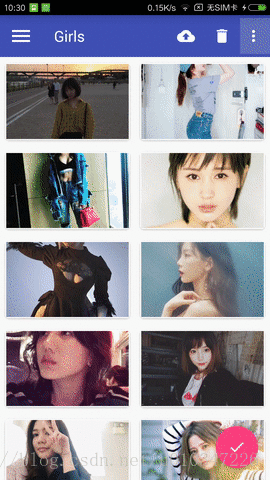
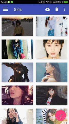
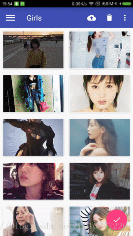
}2、NavigationView控件
NavigationView控件是Design Support库中提供的一个控件,使的我们可以将滑动菜单页面实现的好看,同时实现也不是很难;
下面是文章中demo所依赖的所有库:
其中CircleImageView是一个开源项目,可以轻松实现图片圆形化的功能;
dependencies {
compile fileTree(dir: 'libs', include: ['*.jar'])
androidTestCompile('com.android.support.test.espresso:espresso-core:2.2.2', {
exclude group: 'com.android.support', module: 'support-annotations'
})
compile 'com.android.support:appcompat-v7:25.3.1'
compile 'com.android.support.constraint:constraint-layout:1.0.2'
testCompile 'junit:junit:4.12'
compile 'com.android.support:design:25.3.1'
compile 'de.hdodenhof:circleimageview:2.1.0'
compile 'com.android.support:recyclerview-v7:25.3.1'
compile 'com.android.support:cardview-v7:25.3.1'
compile 'com.github.bumptech.glide:glide:4.0.0-RC0'
compile 'com.squareup.okhttp3:okhttp:3.8.0'
compile 'com.google.code.gson:gson:2.7'
}
NavigationView头部所需的布局文件,加入CircleImageView控件,实现图片的圆角化;
<?xml version="1.0" encoding="utf-8"?>
<RelativeLayout xmlns:android="http://schemas.android.com/apk/res/android"
android:layout_width="match_parent"
android:layout_height="180dp"
android:background="?attr/colorPrimary"
android:padding="10dp">

<de.hdodenhof.circleimageview.CircleImageView
android:id="@+id/icon_image"
android:layout_width="96dp"
android:layout_height="96dp"
android:layout_centerInParent="true"
android:src="@drawable/nav_icon" />

<TextView
android:id="@+id/username"
android:layout_width="wrap_content"
android:layout_height="wrap_content"
android:layout_alignParentBottom="true"
android:text="neuyimi@gmail.com"
android:textColor="#FFF"
android:textSize="14sp" />

<TextView
android:id="@+id/mail"
android:layout_width="wrap_content"
android:layout_height="wrap_content"
android:layout_above="@+id/username"
android:text="Neu Henry"
android:textColor="#FFF"
android:textSize="14sp" />

</RelativeLayout>
NavigationView控件在DrawerLayout中的效果如下:
3、悬浮按钮和可交互提示
Material Design中具有立面设计效果的就是悬浮按钮FloatingActionButton,这种按钮不属于主界面的一部分,而是位于另外一个维度,因此给人产生悬浮的效果;可交互提示Snackbar允许在提示中加入一个可交互按钮,当用户点击按钮的时候可以执行一些额外的逻辑操作,和Toast有所不同,Toast是用来告诉用户现在发生了什么事;
floatingActionButton.setOnClickListener(new View.OnClickListener() {
@Override
public void onClick(View v) {
//Toast.makeText(MainActivity.this, "FloatingActionButton clicked", Toast.LENGTH_SHORT).show();
Snackbar.make(v, "Data deleted", Snackbar.LENGTH_LONG).setAction("Undo", new View.OnClickListener() {
@Override
public void onClick(View v) {
Toast.makeText(MainActivity.this, "FloatingActionButton clicked", Toast.LENGTH_SHORT).show();
}
}).show();
}
});
效果展示如下:
细心的你会发现,Snackbar弹出时,FloatingActionButton自适应的向上移动,Snackbar消失时,FloatingActionButton向下移动,这是因为使用了Design Support库中的CoordinatorLayout这个加强版的FrameLayout,CoordinatorLayout可以监听其所有子控件的各种事件,然后自动帮我们做出最为合理的响应;
4、卡片式布局
卡片式布局可以让页面中的元素看起来就像在卡片中,并且还能拥有圆角和投影;CardView是appcompat-v7库提供的用于实现卡片式布局效果的控件,它也是一个FrameLayout,只是额外提供了圆角和阴影等效果;
CardView的基本用法如下:
fruit_item.xml的代码如下:
<android.support.v7.widget.CardView     xmlns:android="http://schemas.android.com/apk/res/android"
xmlns:app="http://schemas.android.com/apk/res-auto"
android:layout_width="match_parent"
android:layout_height="wrap_content"
android:layout_margin="5dp"
app:cardCornerRadius="4dp">

<LinearLayout
android:layout_width="match_parent"
android:layout_height="wrap_content"
android:orientation="vertical">

<ImageView
android:id="@+id/fruit_image"
android:layout_width="match_parent"
android:layout_height="100dp"
android:scaleType="centerCrop" />

<TextView
android:id="@+id/fruit_name"
android:layout_width="wrap_content"
android:layout_height="wrap_content"
android:layout_gravity="center_horizontal"
android:layout_margin="5dp"
android:textSize="16sp"/>

</LinearLayout>

</android.support.v7.widget.CardView>
上面自定义的布局作为RecyclerView的子项布局,ImageView中我们使用Glide开源库 和OkHttp开源库 来加载图片,首先调用Glide.with()方法并传入一个Context、Activity或Fragment参数,然后调用load()方法去加载图片,可以是一个URL地址,也可以是一个本地路径,或是一个资源id,最后调用into()方法将图片设置到ImageView中;上面的演示动画中,美女图片就是展示在CardView控件中;
Glide.with(mContext).load(beautifulGirl.getUrl()).into(holder.imageView);
5、AppBarLayout和SwipeRefreshLayout
Design Support库中提供的另外一个工具——AppBarLayout,AppBarLayout是一个垂直方向的LinearLayout,它在内部做了很多滚动事件的封装,并应用了一些Material Design的设计理念;
SwipeRefreshLayout是由support-v4库提供的用于实现下拉刷新功能的核心类,我们要想实现下拉刷新功能的控件放置到SwipeRefreshLayout中,就可以让SwipeRefreshLayout中的控件支持下拉刷新;
AppBarLayout的使用如下:
<android.support.design.widget.AppBarLayout
android:layout_width="match_parent"
android:layout_height="wrap_content">

<!--加入Toolbar控件-->
<android.support.v7.widget.Toolbar
android:id="@+id/toolbar"
android:layout_width="match_parent"
android:layout_height="?attr/actionBarSize"
android:background="?attr/colorPrimary"
android:theme="@style/ThemeOverlay.AppCompat.Dark.ActionBar"
app:layout_scrollFlags="scroll|enterAlways|snap"
app:popupTheme="@style/ThemeOverlay.AppCompat.Light" />

</android.support.design.widget.AppBarLayout>

<android.support.v4.widget.SwipeRefreshLayout
android:id="@+id/swipe_refresh"
android:layout_width="match_parent"
android:layout_height="match_parent"
app:layout_behavior="@string/appbar_scrolling_view_behavior">

<android.support.v7.widget.RecyclerView
android:id="@+id/recycler_view"
android:layout_width="match_parent"
android:layout_height="match_parent">
</android.support.v7.widget.RecyclerView>

</android.support.v4.widget.SwipeRefreshLayout>
效果展示如下:
6、CollapsingToolbarLayout
CollapsingToolbarLayout是一个由Design Support库提供的作用于Toolbar基础之上的布局,可以让Toolbar的效果变的更加丰富,不仅仅是展示一个标题栏,而是能够实现非常华丽的效果;
CollapsingToolbarLayout是不能独立存在的,它在设计的时候就被限定只能作为AppBarLayout的直接子布局使用,而AppBarLayout又必须是CollapsingToolbarLayout的子布局;
此外借助android:fitsSystemWindows这个属性来实现背景图和系统状态栏融合,在CoordinatorLayout、AppBarLayout、CollapsingToolbarLayout这种嵌套布局中,将android:fitsSystemWindows这个属性指定为true,就表示该控件会出现在系统状态里;
NestedScrollView布局,NestedScrollView是在ScrollView基础之上还增加了嵌套响应滚动事件的功能,而且不管是ScrollView还是NestedScrollView,它们的内部都只允许存在一个直接子布局,所以我们在内部可以嵌套其它的布局,如LinearLayout等;
CollapsingToolbarLayout的使用如下:
<android.support.design.widget.CoordinatorLayout xmlns:android="http://schemas.android.com/apk/res/android"
xmlns:app="http://schemas.android.com/apk/res-auto"
android:layout_width="match_parent"
android:layout_height="match_parent"
android:fitsSystemWindows="true">

<android.support.design.widget.AppBarLayout
android:id="@+id/app_bar_layout"
android:layout_width="match_parent"
android:layout_height="250dp"
android:fitsSystemWindows="true">

<android.support.design.widget.CollapsingToolbarLayout
android:id="@+id/collapsing_toolbar"
android:layout_width="match_parent"
android:layout_height="match_parent"
android:fitsSystemWindows="true"
android:theme="@style/ThemeOverlay.AppCompat.Dark.ActionBar"
app:contentScrim="?attr/colorPrimary"
app:layout_scrollFlags="scroll|exitUntilCollapsed">

<ImageView
android:id="@+id/fruit_image_view"
android:layout_width="match_parent"
android:layout_height="match_parent"
android:fitsSystemWindows="true"
android:scaleType="centerCrop"
app:layout_collapseMode="parallax" />

<android.support.v7.widget.Toolbar
android:id="@+id/toolbar"
android:layout_width="match_parent"
android:layout_height="?attr/actionBarSize"
app:layout_collapseMode="pin">

</android.support.v7.widget.Toolbar>

</android.support.design.widget.CollapsingToolbarLayout>

</android.support.design.widget.AppBarLayout>

<android.support.v4.widget.NestedScrollView
android:layout_width="match_parent"
android:layout_height="match_parent"
app:layout_behavior="@string/appbar_scrolling_view_behavior">

<LinearLayout
android:layout_width="match_parent"
android:layout_height="wrap_content"
android:orientation="vertical">

<android.support.v7.widget.CardView
android:layout_width="match_parent"
android:layout_height="wrap_content"
android:layout_marginBottom="15dp"
android:layout_marginLeft="15dp"
android:layout_marginRight="15dp"
android:layout_marginTop="35dp"
app:cardCornerRadius="4dp">

<TextView
android:id="@+id/fruit_content_text"
android:layout_width="match_parent"
android:layout_height="wrap_content"
android:layout_margin="10dp" />

</android.support.v7.widget.CardView>
</LinearLayout>
</android.support.v4.widget.NestedScrollView>

<android.support.design.widget.FloatingActionButton
android:id="@+id/floating_action_button_comment"
android:layout_width="wrap_content"
android:layout_height="wrap_content"
android:layout_margin="16dp"
android:src="@drawable/ic_comment"
app:layout_anchor="@id/app_bar_layout"
app:layout_anchorGravity="bottom|end" />

</android.support.design.widget.CoordinatorLayout>
效果展示如下:
完整代码:
更多效果展示及笔者demo的源代码,可以去笔者的GitHub中查看,欢迎大家下载;
源代码地址:https://github.com/henryneu/MyMaterialTest

相关文章推荐
- android界面设计语言Material Design---可折叠式标题栏
- android 5.0设计语言 直接拿来用!十大Material Design开源项目
- Android移动开发-在Android项目里实现仿QQ界面的 Material Design 设计开发
- Android新浪微博开发(二)界面设计之低版本实现Material Design效果
- 关于Android的一些界面设计
- Material Design----全新的界面设计语言(一)
- Android设计风向标Material design语言
- Material Design设计语言(Android5.X)
- Android界面设计工具droiddraw
- 易语言界面库的实现(三)对话框的设计。
- 界面设计-中英繁多国语言实现(PB)
- 使用AIDL(AndRoid接口描述语言)设计和使用远程接口
- Android(OPhone) 学习笔记 - 界面设计工具
- 吸墨网Android手机客户端界面设计
- 可以用javascript语言实现登录界面的一些功能
- 搜集了一些android intent在程序中的常用的用法
- Android UI开发专题(一) 之界面设计
- Android UI开发专题(一) 之界面设计
- Android组件界面设计工具 DroidDraw
- 矩阵的一些运算(数学c语言课程设计)