echarts图表插件的使用
2017-04-18 15:38
288 查看
1.折线图
option = {
title: {
text: '数据操作统计'
},
tooltip: {
trigger: 'axis'
},
legend: {
data: ['数据操作统计']
},
grid: {
left: '3%',
right: '4%',
bottom: '3%',
containLabel: true
},
toolbox: {
feature: {
saveAsImage: {}
}
},
xAxis: {
show: 'true',
type: 'category',
boundaryGap: false,
data: ['1月', '2月', '3月', '4月', '5月', '6月', '7月', '8月', '9月', '10月', '11月', '12月']  //x轴
},
yAxis: {
type: 'value',
        axisLabel: {
                 formatter: '{value} 个'  //y轴格式化
               }
},
series: [
{
name: '数据操作',
type: 'line',
stack: '总量',
itemStyle : {
normal: {
color:'#3d9c24',//折点颜色
lineStyle:{
color:'#3d9c24' //折线颜色
}
}
},
data: [20, 32, 11, 34, 9, 23, 21, 12, 11, 11, 11, 44]  //数据
}
]
};

var myChart = echarts.init(document.getElementById(放置折线图的div));//div需有宽高,且不能是百分比
myChart.setOption(option);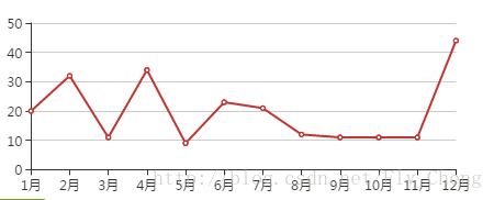
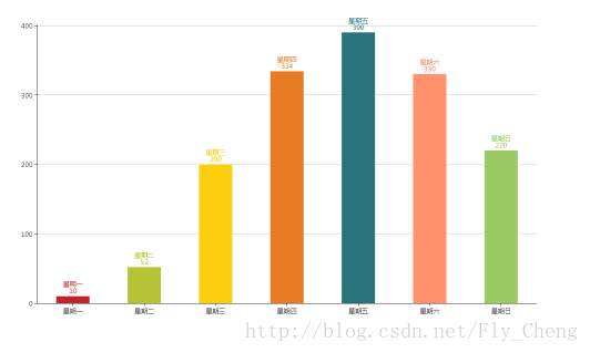
2.柱状图
option2 = {
color: ['#3398DB'],
tooltip: {
trigger: 'axis',
axisPointer: { // 坐标轴指示器,坐标轴触发有效
type: 'shadow' // 默认为直线,可选为:'line' | 'shadow'
}
},
grid: {
left: '3%',
right: '4%',
bottom: '3%',
containLabel: true
},
xAxis: [
{
type: 'category',
data: ['星期一', '星期二', '星期三', '星期四', '星期五', '星期六', '星期日'], //x轴
axisTick: {
alignWithLabel: true
}
}
],
yAxis: [
{
type: 'value'
}
],
series: [
{
name: '直接访问',
type: 'bar',
barWidth: '60px', //z柱宽
itemStyle: {
normal: {
color: function (params) {
// build a color map as your need.
var colorList = [
'#C1232B', '#B5C334', '#FCCE10', '#E87C25', '#27727B', //柱颜色
'#FE8463', '#9BCA63'];
return colorList[params.dataIndex]
}, //以下为是否显示,显示位置和显示格式的设置了
label: {
show: true,
position: 'top',
// formatter: '{c}'
formatter: '{b}\n{c}'
}
}
},
data: [10, 52, 200, 334, 390, 330, 220] //数据
}
]
};
var myChart2 = echarts.init(document.getElementById('chart2'));
myChart2.setOption(option2);
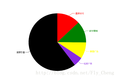
3.饼图
option3 = {
title: {
text: '某站点用户访问来源',
subtext: '纯属虚构',
x: 'center'
},
tooltip: {
trigger: 'item',
formatter: "{a} <br/>{b} : {c} ({d}%)"
},
legend: {
orient: 'vertical',
left: 'left',
data: ['直接访问', '邮件营销', '联盟广告', '视频广告', '搜索引擎']
},
series: [
{
name: '访问来源',
type: 'pie',
radius: '55%',
center: ['50%', '60%'],
data: [
{ value: 335, name: '直接访问' },
{ value: 310, name: '邮件营销' },
{ value: 234, name: '联盟广告' },
{ value: 135, name: '视频广告' },
{ value: 1548, name: '搜索引擎' }
],
itemStyle: {
emphasis: {
shadowBlur: 10,
shadowOffsetX: 0,
shadowColor: 'rgba(0, 0, 0, 0.5)'
}
}
}
],
color: ['red', 'green', 'yellow', 'blueviolet','black'] //饼颜色
};
var myChart3 = echarts.init(document.getElementById('chart3'));
myChart3.setOption(option3);

相关文章推荐
- iOS 使用百度图表插件Echarts
- 百度Echarts图表JS插件的使用
- 【ECharts】百度图表插件ECharts使用
- ECharts 图表插件使用整理(图表配置实现)
- Vue 爬坑之路(八)—— 使用 Echarts 创建图表
- 使用echarts插件画折线图,及echarts配置项解释
- 使用jQuery图表插件Sparklines来开发一个实用的网站PV(page view)实时监控应用
- 使用ECharts实现数据图表分析
- flot - jQuery 图表插件(jquery.flot)使用
- 如何快速使用ECharts绘制可视化图表
- 如何快速使用ECharts绘制可视化图表
- eCharts使用总结:属性解释+修改+效果展示+多个图表切换
- ECharts3笔记--使用Java快速开发ECharts图表
- 百度数据图表插件Echarts
- highCharts图表插件的使用
- flot - jQuery 图表插件(jquery.flot)使用
- flot - jQuery 图表插件(jquery.flot)使用-2
- echarts页面图表工具的使用实例
- Echarts使用及动态加载图表数据
- 百度Echarts图表简单使用