Android 各种按钮点击效果以及兼容性问题总结
2017-04-07 16:18
381 查看
转载请标明出处:
http://blog.csdn.net/tyzlmjj/article/details/50096777
本文出自:【M家杰的博客】
概述
点击效果在安卓的原生开发中无处不见,主要是为了对用户的操作在视觉上进行反馈。这个反馈很平常也很重要。而安卓5.0开始引入的全新设计Material Design真的超赞!特别是触摸反馈的波纹效果,可惜这个波纹效果只支持5.0及以上的版本,应该是出于性能的考虑!坑爹啊!
但是既然5.0以上可以用酷炫的点击效果,那就不能浪费要用起来,这篇博客前面先讲下Button和ImageView点击效果的基本实现,然后再讲下我个人如何处理兼容Material 设计效果
drawable文件的写法很多,这里就拿官方的例子拿来讲解,如下:
btn_default.xml
2
3
4
5
6
7
8
9
10
11
12
13
14
15
16
17
18
19
20
21
22

1
2
3
4
5
6
7
8
9
10
11
12
13
14
15
16
17
18
19
20
21
22
上面代码中
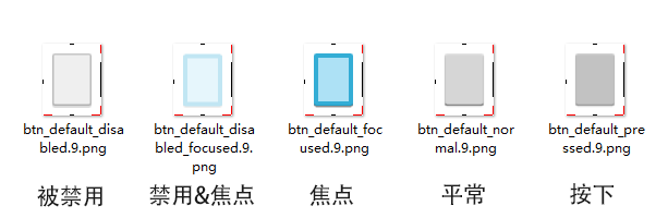
这份XML代码非常细致的区分出了5种状态并对应5张图片:
以上5张图片和btn_default.xml实现的按钮效果如下:
2
3
4
5
6
7
8
1
2
3
4
5
6
7
8
下面代码是继承ImageView然后重写了onTouchEvent方法,不想用自定义View也可以外面监听onTouch
ClickIma
e60b
geView.Java
2
3
4
5
6
7
8
9
10
11
12
13
14
15
16
17
18
19
20
21
22
23
24
25
26
1
2
3
4
5
6
7
8
9
10
11
12
13
14
15
16
17
18
19
20
21
22
23
24
25
26
然后直接在布局文件中使用这个自定义View就行了
2
3
4
5
1
2
3
4
5
效果图:

2
3
4
1
2
3
4
2
3
4
5
6
7
8
9
10
11
12
13
14
15
16
17
18
19
20
21
22
23
24
25
26
27
28
29
30
31
1
2
3
4
5
6
7
8
9
10
11
12
13
14
15
16
17
18
19
20
21
22
23
24
25
26
27
28
29
30
31
5.0及以上版本的效果
这两个属性都可以直接设置在
5.0以下版本的效果
5.0及以上版本的效果
button_state_list_anim_material.xml
2
3
4
5
6
7
8
9
10
11
12
13
14
15
16
17
18
19
20
21
22
23
24
25
26
27
28
29
30
31
32
33
34
35
36
37
38
39
40
41
1
2
3
4
5
6
7
8
9
10
11
12
13
14
15
16
17
18
19
20
21
22
23
24
25
26
27
28
29
30
31
32
33
34
35
36
37
38
39
40
41
其实就是写了几个AnimatorSet动画集合,之前点击是图片现在替换成动画而已。更多关于StateListAnimator的讲解:点我
这里我引入了CardView和RecyclerView做了个列表来演示这个点击动画的效果,如下:
【GitHub】
http://blog.csdn.net/tyzlmjj/article/details/50096777
本文出自:【M家杰的博客】
概述
点击效果在安卓的原生开发中无处不见,主要是为了对用户的操作在视觉上进行反馈。这个反馈很平常也很重要。而安卓5.0开始引入的全新设计Material Design真的超赞!特别是触摸反馈的波纹效果,可惜这个波纹效果只支持5.0及以上的版本,应该是出于性能的考虑!坑爹啊!
但是既然5.0以上可以用酷炫的点击效果,那就不能浪费要用起来,这篇博客前面先讲下Button和ImageView点击效果的基本实现,然后再讲下我个人如何处理兼容Material 设计效果
按钮点击效果基本实现
Button点击
Button的点击效果最简单的实现方法就是为Android:background属性设置drawable文件。
drawable文件的写法很多,这里就拿官方的例子拿来讲解,如下:
btn_default.xml
<selector xmlns:android="http://schemas.android.com/apk/res/android">
<item android:state_window_focused="false" android:state_enabled="true"
android:drawable="@drawable/btn_default_normal" />

<item android:state_window_focused="false" android:state_enabled="false"
android:drawable="@drawable/btn_default_disabled" />

<item android:state_pressed="true"
android:drawable="@drawable/btn_default_pressed" />

<item android:state_focused="true" android:state_enabled="true"
android:drawable="@drawable/btn_default_focused" />

<item android:state_enabled="true"
android:drawable="@drawable/btn_default_normal" />

<item android:state_focused="true"
android:drawable="@drawable/btn_default_disabled_focused" />

<item
android:drawable="@drawable/btn_default_disabled" />
</selector>
1
2
3
4
5
6
7
8
9
10
11
12
13
14
15
16
17
18
19
20
21
22
1
2
3
4
5
6
7
8
9
10
11
12
13
14
15
16
17
18
19
20
21
22
上面代码中
selector用于建立状态列表,里面的每个
<item>用于说明状态并给予图像(这里是用9png图片)。其实就是
else if语句写了好几个,从上往下当某个
<item>条件满足时就会应用它,后面的
<item>就不管了,所以
<item>的顺序也是很重要的。有关状态列表的更多信息:点我
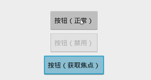
这份XML代码非常细致的区分出了5种状态并对应5张图片:
以上5张图片和btn_default.xml实现的按钮效果如下:
点击效果简版
在实际开发中,其实并不需要上面这样细致的状态区分,可能只需要正常状态和按下的状态。那么可以把上面的btn_default.xml修改如下,这样图片也只需要2张减轻设计人员的压力!<selector xmlns:android="http://schemas.android.com/apk/res/android"> <item android:state_pressed="true" android:drawable="@drawable/btn_default_pressed" /> <item android:drawable="@drawable/btn_default_normal" /> </selector>1
2
3
4
5
6
7
8
1
2
3
4
5
6
7
8
ImageView点击
ImageView比较特殊,如果想让ImageView有点击效果,设置android:background是没用的,因为一般都会被图片挡住。我的解决办法是重写或者监听触摸事件,然后设置ImageView的滤色。
下面代码是继承ImageView然后重写了onTouchEvent方法,不想用自定义View也可以外面监听onTouch
ClickIma
e60b
geView.Java
public class ClickImageView extends ImageView{

public ClickImageView(Context context) {
super(context);
}
public ClickImageView(Context context, AttributeSet attrs) {
super(context, attrs);
}
public ClickImageView(Context context, AttributeSet attrs, int defStyleAttr) {
super(context, attrs, defStyleAttr);
}
@Override
public boolean onTouchEvent(MotionEvent event) {

switch (event.getAction()) {
case MotionEvent.ACTION_DOWN:
this.setColorFilter(0x99000000);
return true;
case MotionEvent.ACTION_UP:
case MotionEvent.ACTION_CANCEL:
this.setColorFilter(null);
break;
}
return super.onTouchEvent(event);
}
}12
3
4
5
6
7
8
9
10
11
12
13
14
15
16
17
18
19
20
21
22
23
24
25
26
1
2
3
4
5
6
7
8
9
10
11
12
13
14
15
16
17
18
19
20
21
22
23
24
25
26
然后直接在布局文件中使用这个自定义View就行了
<com.mjj.buttons.view.ClickImageView
android:layout_width="wrap_content"
android:layout_height="wrap_content"
android:src="@drawable/ic_launcher"
/>
1
2
3
4
5
1
2
3
4
5
效果图:
Material Design点击效果
注意:如果要使用Material 风格的按钮,这里需要引入V7兼容包。并且使用AppCompat类的主题(例如:Theme.AppCompat.Light.DarkActionBar)。Button
使用Material 风格按钮的话,drawable文件或者图片什么的都不需要了。我们只需要使用AppCompat类主题,那么按钮就自动变成Material 风格了。然后我们可以通过修改主题属性(theme)和样式(style)来更改按钮的颜色。主题
如下的主题(在styles.xml中),我修改了2个颜色值,可以全局使用,也可以单独为某个布局使用,只要设置android:theme属性即可
<style name="ButtonTheme" parent="@style/Theme.AppCompat.Light.DarkActionBar">
<item name="colorButtonNormal">#FF4081</item><!--正常状态下的颜色  -->
<item name="colorControlHighlight">#22000000</item><!--覆盖色,按下的颜色  -->
</style>
1
2
3
4
1
2
3
4
样式
样式可以通过设置style属性生效,其实也可以写在主题中,但是区分开来更加灵活,官方已经为我们提供了蛮多样式,如下:
| 样式名 | 说明 |
|---|---|
| Widget.AppCompat.Button | 正常 |
| Widget.AppCompat.Button.Small | 小按钮 |
| Widget.AppCompat.Button.Borderless | 无背景 |
| Widget.AppCompat.Button.Borderless.Colored | 无背景有预设文本颜色 |
| Widget.AppCompat.Button.Colored | 有预设文本颜色 |
使用
通过设置android:theme和
style应用上面说到的主题和样式
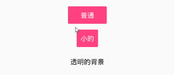
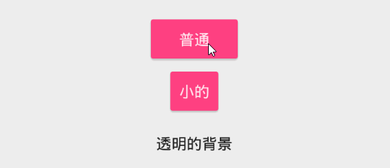
<?xml version="1.0" encoding="utf-8"?>
<LinearLayout xmlns:android="http://schemas.android.com/apk/res/android"
android:layout_width="match_parent"
android:layout_height="match_parent"
android:orientation="vertical"
android:gravity="center"
android:theme="@style/ButtonTheme"
>
<Button
android:layout_width="wrap_content"
android:layout_height="wrap_content"
android:text="普通"
android:textColor="#DDFFFFFF"
style="@style/Widget.AppCompat.Button"/>

<Button
android:layout_width="wrap_content"
android:layout_height="wrap_content"
android:text="小的"
android:textColor="#DDFFFFFF"
style="@style/Widget.AppCompat.Button.Small"
/>

<Button
android:layout_width="wrap_content"
android:layout_height="wrap_content"
android:text="透明的背景"
style="@style/Widget.AppCompat.Button.Borderless"
android:theme="@style/Theme.AppCompat.Light"
/>
</LinearLayout>
1
2
3
4
5
6
7
8
9
10
11
12
13
14
15
16
17
18
19
20
21
22
23
24
25
26
27
28
29
30
31
1
2
3
4
5
6
7
8
9
10
11
12
13
14
15
16
17
18
19
20
21
22
23
24
25
26
27
28
29
30
31
效果图
5.0以下版本的效果5.0及以上版本的效果
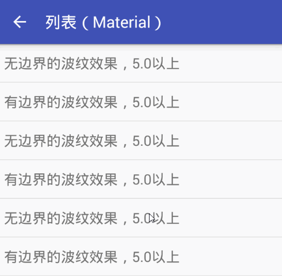
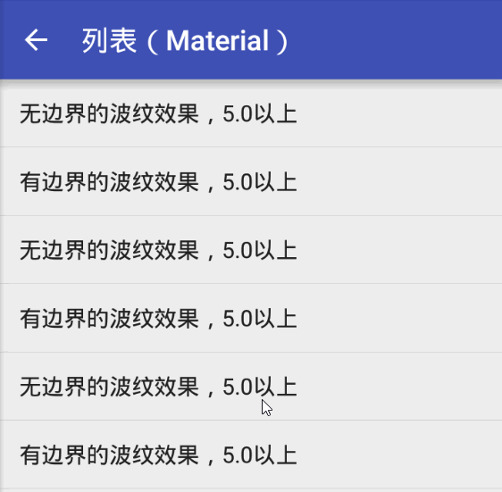
列表点击
除了兼容性主题提供的按钮波纹效果外,官方还提供了两个可以给任意具备点击事件的布局设置点击效果的属性:?attr/selectableItemBackground有边界的波纹
?attr/selectableItemBackgroundBorderless无边界的波纹
这两个属性都可以直接设置在
android:background中,如果是ListView就设置
android:listSelector。很简单,直接上效果图看看。
5.0以下版本的效果
5.0及以上版本的效果
Z轴动画
5.0开始引入的向上抬升的动画,5.0以上默认给所有按钮都设置了这个动画,所以点击的时候会有抬升的感觉,不想要这个动画可以这样设置android:stateListAnimator="@null",就是把这个动画置空,那么自己设置动画也是设置这个属性。这里需要给一个动画状态列表,还是拿一个官方的例子来看看怎么写的:
button_state_list_anim_material.xml
<?xml version="1.0" encoding="utf-8"?>
<selector xmlns:android="http://schemas.android.com/apk/res/android">
<item android:state_pressed="true" android:state_enabled="true">
<set>
<objectAnimator android:propertyName="translationZ"
android:duration="100"
android:valueTo="4dp"
android:valueType="floatType"/>
<objectAnimator android:propertyName="elevation"
android:duration="0"
android:valueTo="2dp"
android:valueType="floatType"/>
</set>
</item>
<!-- base state -->
<item android:state_enabled="true">
<set>
<objectAnimator android:propertyName="translationZ"
android:duration="100"
android:valueTo="0"
android:startDelay="100"
android:valueType="floatType"/>
<objectAnimator android:propertyName="elevation"
android:duration="0"
android:valueTo="2dp"
android:valueType="floatType" />
</set>
</item>
<item>
<set>
<objectAnimator android:propertyName="translationZ"
android:duration="0"
android:valueTo="0"
android:valueType="floatType"/>
<objectAnimator android:propertyName="elevation"
android:duration="0"
android:valueTo="0"
android:valueType="floatType"/>
</set>
</item>
</selector>
1
2
3
4
5
6
7
8
9
10
11
12
13
14
15
16
17
18
19
20
21
22
23
24
25
26
27
28
29
30
31
32
33
34
35
36
37
38
39
40
41
1
2
3
4
5
6
7
8
9
10
11
12
13
14
15
16
17
18
19
20
21
22
23
24
25
26
27
28
29
30
31
32
33
34
35
36
37
38
39
40
41
其实就是写了几个AnimatorSet动画集合,之前点击是图片现在替换成动画而已。更多关于StateListAnimator的讲解:点我
这里我引入了CardView和RecyclerView做了个列表来演示这个点击动画的效果,如下:
Demo下载
【CSDN】【GitHub】

相关文章推荐
- Android 各种按钮点击效果以及兼容性问题总结
- Android 各种按钮点击效果以及兼容性问题总结
- Android 各种按钮点击效果以及兼容性问题总结
- Android 各种按钮点击效果以及兼容性问题总结
- Android按钮的点击效果的总结
- android按钮点击动画特效,有关注按钮点击效果,有收藏按钮,点赞按钮,评论按钮等各种效果
- Android XML中实现按钮点击效果以及背景平铺
- android selector设置button点击效果(详细)以及常见问题
- android selector设置button点击效果(具体)以及常见问题
- android ListView各种效果实现总结,持续更新...
- 仿QQ新浪主界面底部导航与中间按钮点击弹出以及返回键点击返回效果
- android中ListView点击和里边按钮或ImageView点击不能同时生效问题解决
- Android studio中怎么将方形按钮设置成圆角以及渐变效果
- android checkBox背景样式及用颜色值实现按钮点击效果
- Android屏幕分辨率和运行系统兼容性问题-总结
- android中ListView点击和里边按钮点击不能同时生效问题解决
- 【Android】Intent 页面跳转问题以及 会跳刷新 等各种问题汇总
- android可能遇到问题,以及找到的解决方法小总结!
- AndroidStudio Toolbar 滑动隐藏以及返回按钮点击事件
- 一次和别人争吵一个按钮,点击后显示导航;再点击不显示的效果,是否一定以及必须用js?