Android -- 自定义ViewGroup实现FlowLayout效果
2017-03-27 14:22
411 查看
1,在开发的时候,常在我们的需求中会有这种效果,添加一个商品的一些热门标签,效果图如下:
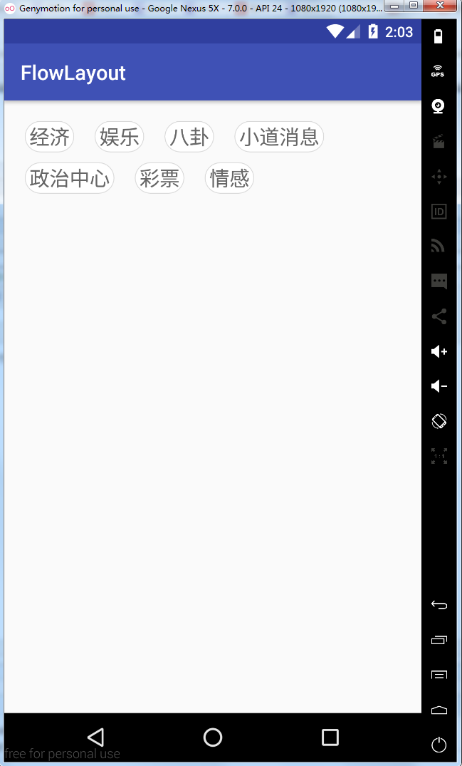
2,从上面效果可以看得出来,这是一个自定义的ViewGroup,然后实现换行效果,让我们一起来实现一下
自定义属性
从上面的效果来看,我们需要动态的设置每个lable的宽度和高度,所以我们编写如下的自定义属性
在布局文件中使用
在类中获取自定义属性
初始化数据数据源
向FlowLayout类中添加数据
下面的代码是textview的背景选择器
重写onMeasure方法
本布局在宽度上是使用的建议的宽度(填充父窗体或者具体的size),如果需要wrap_content的效果,还需要重新计算,当然这种需求是非常少见的,所以直接用建议宽度即可;布局的高度就得看其中的标签需要占据多少行(row ),那么高度就为row * 单个标签的高度+(row -1) * 行距,代码如下:
重写OnLayout方法
onLayout(boolean changed, int l, int t, int r, int b)方法是一个抽象方法,自定义ViewGroup时必须实现它,用于给布局中的子控件分配位置,其中的参数l,t,r,b分别代表本ViewGroup的可用空间(除去margin和padding后的剩余空间)的左、上、右、下的坐标(相对于自身),相当于一个约束,如果子控件摆放的位置超过这个范围,超出的部分将不可见。
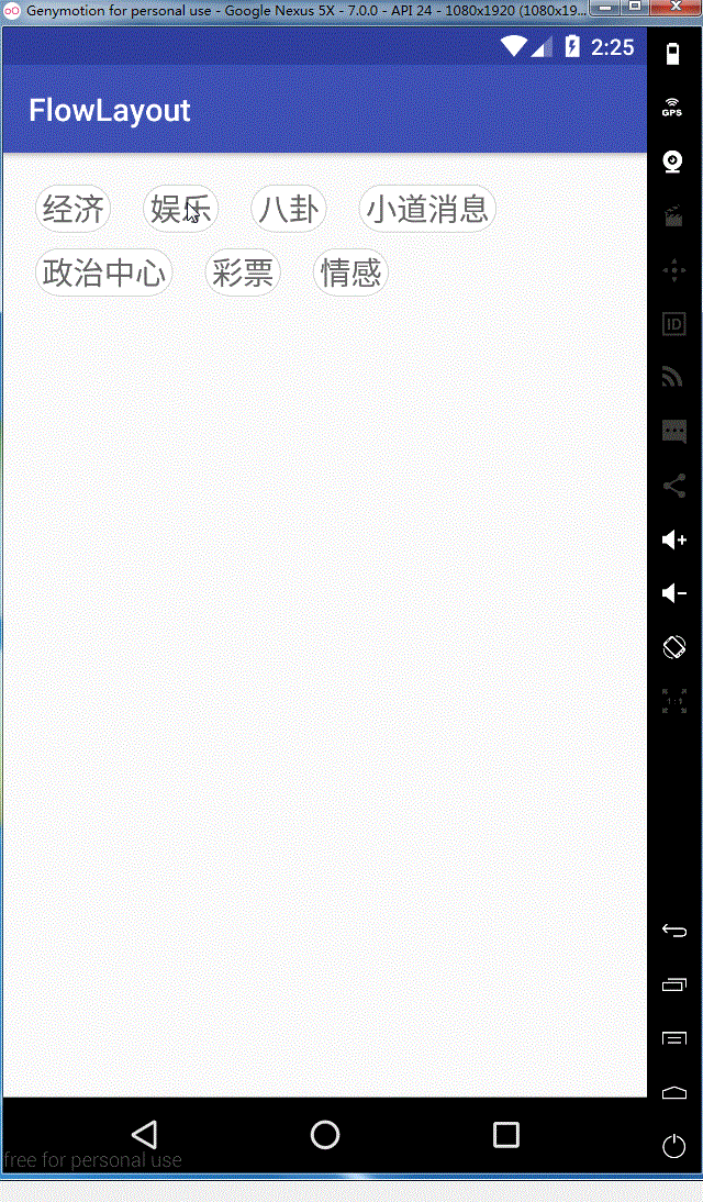
看一下实现的效果图
ok,这样我们就全部实现了,需要源码的同学可以在这里去下载
2,从上面效果可以看得出来,这是一个自定义的ViewGroup,然后实现换行效果,让我们一起来实现一下
自定义属性
从上面的效果来看,我们需要动态的设置每个lable的宽度和高度,所以我们编写如下的自定义属性
<?xml version="1.0" encoding="utf-8"?>
<resources>
<declare-styleable name="FlowLayout">
<!--    标签之间的间距-->
<attr name="lineSpace" format="dimension"/>
<!--    每一行之间的间距-->
<attr name="rowSpace" format="dimension"/>
</declare-styleable>
</resources>
在布局文件中使用
<?xml version="1.0" encoding="utf-8"?>
<LinearLayout xmlns:android="http://schemas.android.com/apk/res/android"
xmlns:app="http://schemas.android.com/apk/res-auto"
xmlns:flowlayout="http://schemas.android.com/apk/res-auto"
android:layout_width="match_parent"
android:layout_height="match_parent">
<com.qianmo.flowlayout.FlowLayout
android:id="@+id/flowLayout"
android:layout_width="match_parent"
android:layout_height="wrap_content"
android:layout_margin="20dip"
flowlayout:lineSpace="20dip"
flowlayout:rowSpace="10dip"/>
</LinearLayout>
在类中获取自定义属性
public class FlowLayout extends ViewGroup {
private static String TAG = "FlowLayout";

//自定义属性
private int LINE_SPACE;
private int ROW_SPACE;

//放置标签的集合
private List<String> lables;
private List<String> lableSelects;

public FlowLayout(Context context) {
this(context, null);
}

public FlowLayout(Context context, AttributeSet attrs) {
this(context, attrs, 0);
}

public FlowLayout(Context context, AttributeSet attrs, int defStyleAttr) {
super(context, attrs, defStyleAttr);

//获取自定义属性
TypedArray a = context.obtainStyledAttributes(attrs, R.styleable.FlowLayout);
LINE_SPACE = a.getDimensionPixelSize(R.styleable.FlowLayout_lineSpace, 10);
ROW_SPACE = a.getDimensionPixelSize(R.styleable.FlowLayout_rowSpace, 10);
a.recycle();

}
}
初始化数据数据源
向FlowLayout类中添加数据
/**
* 添加标签
*
* @param lables 标签集合
* @param isAdd  是否添加
*/
public void setLables(List<String> lables, boolean isAdd) {
if (this.lables == null) {
this.lables = new ArrayList<>();
}
if (this.lableSelects == null) {
this.lableSelects = new ArrayList<>();
}
if (isAdd) {
this.lables.addAll(lables);
} else {
this.lables.clear();
this.lables = lables;
}
if (lables != null && lables.size() > 0) {
for (final String lable : lables) {
final TextView tv = new TextView(getContext());
tv.setLayoutParams(new LayoutParams(LayoutParams.WRAP_CONTENT,
LayoutParams.WRAP_CONTENT));
tv.setText(lable);
tv.setTextSize(20);
tv.setBackgroundResource(R.drawable.shape_item_lable_bg);
tv.setTextColor(Color.BLACK);
tv.setGravity(Gravity.CENTER);
tv.setPadding(12, 5, 12, 5);

//判断是否选中
if (lableSelects.contains(lable)) {
tv.setSelected(true);
tv.setTextColor(getResources().getColor(R.color.tv_blue));
} else {
tv.setSelected(false);
tv.setTextColor(getResources().getColor(R.color.tv_gray));
}

//点击之后选中标签
tv.setOnClickListener(new OnClickListener() {
@Override
public void onClick(View v) {
tv.setSelected(tv.isSelected() ? false : true);
if (tv.isSelected()) {
tv.setTextColor(getResources().getColor(R.color.tv_blue));
lableSelects.add(lable);
} else {
tv.setTextColor(getResources().getColor(R.color.tv_gray));
lableSelects.remove(lable);
}
}
});

//添加到容器中
addView(tv);
}
}
}
下面的代码是textview的背景选择器
<?xml version="1.0" encoding="utf-8"?>
<selector xmlns:android="http://schemas.android.com/apk/res/android" >
<!--选中效果-->
<item android:state_selected="true">
<shape >
<solid android:color="#ffffff" />
<stroke android:color="@color/tv_blue"
android:width="2px"/>
<corners android:radius="10000dip"/>
</shape>
</item>
<!--默认效果-->
<item>
<shape >
<solid android:color="#ffffff" />
<stroke android:color="@color/divider_gray"
android:width="2px"/>
<corners android:radius="10000dip"/>
</shape>
</item>
</selector>
重写onMeasure方法
本布局在宽度上是使用的建议的宽度(填充父窗体或者具体的size),如果需要wrap_content的效果,还需要重新计算,当然这种需求是非常少见的,所以直接用建议宽度即可;布局的高度就得看其中的标签需要占据多少行(row ),那么高度就为row * 单个标签的高度+(row -1) * 行距,代码如下:
/**
* 通过测量子控件高度,来设置自身控件的高度
* 主要是计算
*
* @param widthMeasureSpec
* @param heightMeasureSpec
*/
@Override
protected void onMeasure(int widthMeasureSpec, int heightMeasureSpec) {
//测量所有子view的宽高
measureChildren(widthMeasureSpec, heightMeasureSpec);

//获取view的宽高测量模式
int widthMode = MeasureSpec.getMode(widthMeasureSpec);
int widthSize = MeasureSpec.getSize(widthMeasureSpec);

int heightMode = MeasureSpec.getMode(heightMeasureSpec);
int heightSize = MeasureSpec.getSize(heightMeasureSpec);

//这里的宽度建议使用match_parent或者具体值,当然当使用wrap_content的时候没有重写的话也是match_parent所以这里的宽度就直接使用测量的宽度
int width = widthSize;

int height;
//判断宽度
if (heightMode == MeasureSpec.EXACTLY) {
height = heightSize;
} else {
int row = 1;
int widthSpace = width; //宽度剩余空间
for (int i = 0; i < getChildCount(); i++) {
View view = getChildAt(i);
//获取标签宽度
int childW = view.getMeasuredWidth();
//判断剩余宽度是否大于此标签宽度
if (widthSpace >= childW) {
widthSpace -= childW;
} else {
row++;
widthSpace = width - childW;
}
//减去两边间距
widthSpace -= LINE_SPACE;
}
//获取子控件的高度
int childH = getChildAt(0).getMeasuredHeight();
//测算最终所需要的高度
height = (childH * row) + (row - 1) * ROW_SPACE;
}

//保存测量高度
setMeasuredDimension(width, height);
}
重写OnLayout方法
onLayout(boolean changed, int l, int t, int r, int b)方法是一个抽象方法,自定义ViewGroup时必须实现它,用于给布局中的子控件分配位置,其中的参数l,t,r,b分别代表本ViewGroup的可用空间(除去margin和padding后的剩余空间)的左、上、右、下的坐标(相对于自身),相当于一个约束,如果子控件摆放的位置超过这个范围,超出的部分将不可见。
/**
* 摆放子view
*
* @param changed
* @param l
* @param t
* @param r
* @param b
*/
@Override
protected void onLayout(boolean changed, int l, int t, int r, int b) {
int row = 0;
int right = 0;
int bottom = 0;
for (int i = 0; i < getChildCount(); i++) {
View chileView = getChildAt(i);
int childW = chileView.getMeasuredWidth();
int childH = chileView.getMeasuredHeight();
right += childW;
bottom = (childH + ROW_SPACE) * row + childH;
if (right > (r - LINE_SPACE)) {
row++;
right = childW;
bottom = (childH + ROW_SPACE) * row + childH;
}
chileView.layout(right - childW, bottom - childH, right, bottom);
right += LINE_SPACE;
}
}
看一下实现的效果图
ok,这样我们就全部实现了,需要源码的同学可以在这里去下载

相关文章推荐
- Android自定义控件系列五:自定义ViewGroup(一)实现ViewPager效果
- Android 自定义viewGroup学习之FlowLayout的实现
- Android 自定义ViewGroup 实战篇 -> 实现FlowLayout
- Android开发 自定义ViewGroup 实现微信九格图功能(图片不同排布不同) 和 一种图片点击变暗效果
- Android 自定义ViewGroup 实战篇 -> 实现FlowLayout
- Android自定义viewGroup实现点击动画效果
- android 自定义viewGroup实现网易左侧菜单效果
- android 实现FlowLayout 流线布局(自定义ViewGroup)
- Android 自定义ViewGroup 实战篇 -> 实现FlowLayout
- Android 自定义ViewGroup 实战篇 -> 实现FlowLayout
- Android自定义ViewGroup实现弹性滑动效果
- android自定义ViewGroup实战篇 -> 实现FlowLayout
- Android 自定义ViewGroup 实战篇 -> 实现FlowLayout
- Android 自定义ViewGroup 实现FlowLayout
- Android 自定义ViewGroup 实战篇 -> 实现FlowLayout
- Android 自定义ViewGroup 实战篇 -> 实现FlowLayout
- Android 自定义ViewGroup之实现FlowLayout-标签流容器
- Android自定义控件系列六:自定义ViewGroup(一)实现ViewPager效果
- Android自定义控件系列六:自定义ViewGroup(一)实现ViewPager效果
- Android 自定义ViewGroup 实战篇 -> 实现FlowLayout