【Android】如何设置一个自定义的Button
2017-02-25 17:56
288 查看
一直喜欢Button的样式是两边是半圆形的。但是Android默认的样式是有一点圆角的样子,今天主要学习到的内容是:用style代替在布局文件中重复书写代码 和 在drawable中设计Button的样式。
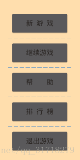
(这是系统默认的样式)
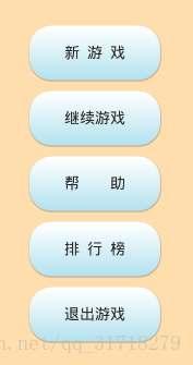
(这是修改后的样式)
1:在drawable中新建buttonstyle.xml
附加说明:
< item>表示一个动作或一个状态下的效果:
1、Android:state_pressed boolean。
“true”表示按下状态使用(例如按钮按下);“false”表示非按下状态使用。
2、android:state_focused boolean。
“true”表示聚焦状态使用(例如使用滚动球/d-pad聚焦button);“fal
4000
se”表示非聚焦状态使用。
3、android:state_selected boolean。
“true”表示选中状态使用(例如tab打开);“false”表示非选中状态使用。
4、android:state_checkable boolean。
“true”表示可勾选状态时使用;“false”表示非可勾选状态使用。(只对能切换可勾选—非可勾选的构件有用。)
5、android:state_checked boolean。
“true”表示勾选状态使用;“false”表示非勾选状态使用。
6、android:state_enabled boolean。
“true”表示可用状态使用(能接收触摸/点击事件);“false”表示不可用状态使用。
7、android:window_focused boolean。
“true”表示应用程序窗口有焦点时使用(应用程序在前台);“false”表示无焦点时使用(例如notification栏拉下或对话框显示)。
shape的属性:
1、solid:
实心,就是填充的意思 android:color指定填充的颜色
2、gradient:
渐变 android:startColor和android:endColor分别为起始和结束颜色,android:angle是渐变角度,必须为45的整数倍。当angle=0时,渐变色是从左向 右。 然后逆时针方向转,当angle=90时为从下往上。另外渐变默认的模式为android:type=”linear”,即线性渐变,可以指定渐变为径向渐变, android:type=”radial”,径向渐变需要指定半径android:gradientRadius=”50”,也可一指定二者的综合,扫描渐变 android: type=”sweep”
3、stroke:
描边 android:width=”2dp” 描边的宽度,android:color 描边的颜色。 我们还可以把描边弄成虚线的形式,设置方式为: android:dashWidth=”5dp” android:dashGap=”3dp” 其中android:dashWidth表示’-‘这样一个横线的宽度,android:dashGap表示之间隔开的距离。
4、corners:
圆角 android:radius为角的弧度,值越大角越圆。 我们还可以把四个角设定成不同的角度,方法为: android:topRightRadius=”20dp” 右上角android:bottomLeftRadius=”20dp” 右下角android:topLeftRadius=”1dp” 左上角android:bottomRightRadius=”0dp” 左下角 这里有个地方需要注意,bottomLeftRadius是右下角,而不是左下角
5、panding:内边矩
2.在style中应用
没办法在代码段中加粗,在style中应用Button的样式的代码是:
< item name=”android:background”>@drawable/buttonstyle< / item>
3.在布局中使用
还有一点:比如说在样式中我们已经设置了Button的宽度是50dp,
如果我们此时在布局文件中使用这个style的时候又给button设置了新的宽度,那么这时候button是使用哪里设置的宽度呢?经过实验证明,此时会使用在布局中重新设置的宽度。
(这是系统默认的样式)
(这是修改后的样式)
1:在drawable中新建buttonstyle.xml
<?xml version="1.0" encoding="utf-8"?>
<selector xmlns:android="http://schemas.android.com/apk/res/android">
<item android:state_pressed="true">
<shape>
<gradient
android:startColor="#FFFFFF"
android:endColor="#B0E0Ed"
android:angle="270"></gradient>
<stroke
android:width="0dp"></stroke>
<corners
android:radius="20dp"></corners>
<padding
android:bottom="10dip"
android:left="10dip"
android:right="10dip"
android:top="10dip"></padding>
</shape>
</item>
<item android:state_focused="true">
<shape>
<gradient
android:startColor="#FFFFFF"
android:endColor="#B0E0Ed"
android:angle="270"></gradient>
<stroke
android:width="0dp"></stroke>
<corners
android:radius="25dp"></corners>
<padding
android:bottom="10dip"
android:left="10dip"
android:right="10dip"
android:top="10dip"></padding>
</shape>
</item>
<item>
<shape>
<gradient
android:startColor="#FFFFFF"
android:endColor="#B0E0Ed"
android:angle="270"></gradient>
<stroke
android:width="0dp"></stroke>
<corners
android:radius="20dp"></corners>
<padding
android:bottom="10dip"
android:left="10dip"
android:right="10dip"
android:top="10dip"></padding>
</shape>
</item>
</selector>
附加说明:
< item>表示一个动作或一个状态下的效果:
1、Android:state_pressed boolean。
“true”表示按下状态使用(例如按钮按下);“false”表示非按下状态使用。
2、android:state_focused boolean。
“true”表示聚焦状态使用(例如使用滚动球/d-pad聚焦button);“fal
4000
se”表示非聚焦状态使用。
3、android:state_selected boolean。
“true”表示选中状态使用(例如tab打开);“false”表示非选中状态使用。
4、android:state_checkable boolean。
“true”表示可勾选状态时使用;“false”表示非可勾选状态使用。(只对能切换可勾选—非可勾选的构件有用。)
5、android:state_checked boolean。
“true”表示勾选状态使用;“false”表示非勾选状态使用。
6、android:state_enabled boolean。
“true”表示可用状态使用(能接收触摸/点击事件);“false”表示不可用状态使用。
7、android:window_focused boolean。
“true”表示应用程序窗口有焦点时使用(应用程序在前台);“false”表示无焦点时使用(例如notification栏拉下或对话框显示)。
shape的属性:
1、solid:
实心,就是填充的意思 android:color指定填充的颜色
2、gradient:
渐变 android:startColor和android:endColor分别为起始和结束颜色,android:angle是渐变角度,必须为45的整数倍。当angle=0时,渐变色是从左向 右。 然后逆时针方向转,当angle=90时为从下往上。另外渐变默认的模式为android:type=”linear”,即线性渐变,可以指定渐变为径向渐变, android:type=”radial”,径向渐变需要指定半径android:gradientRadius=”50”,也可一指定二者的综合,扫描渐变 android: type=”sweep”
3、stroke:
描边 android:width=”2dp” 描边的宽度,android:color 描边的颜色。 我们还可以把描边弄成虚线的形式,设置方式为: android:dashWidth=”5dp” android:dashGap=”3dp” 其中android:dashWidth表示’-‘这样一个横线的宽度,android:dashGap表示之间隔开的距离。
4、corners:
圆角 android:radius为角的弧度,值越大角越圆。 我们还可以把四个角设定成不同的角度,方法为: android:topRightRadius=”20dp” 右上角android:bottomLeftRadius=”20dp” 右下角android:topLeftRadius=”1dp” 左上角android:bottomRightRadius=”0dp” 左下角 这里有个地方需要注意,bottomLeftRadius是右下角,而不是左下角
5、panding:内边矩
2.在style中应用
<resources>
<style name="ButtonStyle">
<item name="android:layout_width">120dp</item>
<item name="android:layout_height">50dp</item>
<item name="android:gravity">center_horizontal|center_vertical</item>
<item name="android:background">@drawable/buttonstyle</item>
<item name="android:layout_margin">5dp</item>
<item name="android:textColor">@color/optionText</item>
</style>

</resources>
没办法在代码段中加粗,在style中应用Button的样式的代码是:
< item name=”android:background”>@drawable/buttonstyle< / item>
3.在布局中使用
<?xml version="1.0" encoding="utf-8"?>
<LinearLayout xmlns:android="http://schemas.android.com/apk/res/android"
xmlns:http="http://schemas.android.com/apk/res-auto"
android:id="@+id/activity_option"
android:layout_width="match_parent"
android:layout_height="match_parent"
android:orientation="vertical"
android:gravity="center_horizontal|center_vertical"
android:background="#FFDEAD">

<LinearLayout
android:layout_width="wrap_content"
android:layout_height="wrap_content"
android:orientation="vertical"
android:layout_gravity="center_vertical|center_horizontal">

<Button
android:id="@+id/bt_newGame"
android:text="@string/newGame"
style="@style/ButtonStyle"/>

<Button
android:id="@+id/bt_continueGame"
android:text="@string/continueGame"
style="@style/ButtonStyle"/>
<Button
android:id="@+id/bt_help"
android:text="@string/help"
style="@style/ButtonStyle"/>
<Button
android:id="@+id/bt_rank"
android:text="@string/rank"
style="@style/ButtonStyle"/>
<Button
android:id="@+id/bt_overGame"
android:text="@string/overGame"
style="@style/ButtonStyle"/>
</LinearLayout>

</LinearLayout>
还有一点:比如说在样式中我们已经设置了Button的宽度是50dp,
如果我们此时在布局文件中使用这个style的时候又给button设置了新的宽度,那么这时候button是使用哪里设置的宽度呢?经过实验证明,此时会使用在布局中重新设置的宽度。

相关文章推荐
- 如何在android中设置一个返回button,点击后返回上一个activity?
- Android ImageButton 如何实现一个点击效果
- Android之自定义背景Button按钮、自定义形状Button的全攻略、设置字体颜色
- 如何替换触屏去点击Android的一个App应用上的一个button
- AlertDialog中使用自定义View,view中的Button如何设置点击事件监听
- android中给Dialog设置的动画如何自定义修改参数
- 如何在Android中写和使用一个自定义的java库
- android如何写一个自定义的dialog可以在Title的位置弹出来
- android中给Dialog设置的动画如何自定义修改参数
- 【Android】如何在自定义View中设置自定义的属性
- android中给Dialog设置的动画如何自定义修改参数
- Android开发:如何安全的中止一个自定义线程Thread
- Android自定义Button [附一个例子吧]
- 如何为Android Spinner设置一个初始值(How to make an Android Spinner with initial text “Select One”)?
- 如何替换触屏去点击Android的一个App应用上的一个button
- Android 如何自定义一个简单的组件和自定义的点击事件(中级)
- Android开发笔记之:如何安全中止一个自定义线程Thread的方法
- android 一个控件设置了事件响应(比如Button添加了OnClick回调响应),却在触发控件事件时,不执行事件处理函数
- Android 如何将一个button放在屏幕中间
- 来自MSDN的一个Sample:如何自定义 Windows 窗体 DataGridView 控件中的数据格式设置