UI组件:TextView及其子类
2017-02-25 12:44
369 查看
TextView的功能与用法
TextView直接继承了View,它还是EditView,Button两个UI组件的父类。TextView与EditView有很多相似之处,他们之间的最大区别是EditView允许用户编辑编辑文本内容,而TextView不允许。
TextView提供了大量的XML属性,这些属性不仅适用于TextView,TextView的子类也同时适用。
TextView的XML属性
下面列举了TextView一些常用的XML属性及相关方法的说明:| XML属性 | 相关方法 | 说明 |
|---|---|---|
| android:autoLink | setAutoLinkMask(int) | 是否将符合指定格式的文本转化成可点击的链接的形式。 该属性支持如下属性值: none :没有匹配模式(默认值) web : 匹配URL网址 email : 匹配邮箱地址 phone : 匹配电话号码 map : 匹配映射地址 all : 匹配所有的模式 |
| android:drawableTop | setCompoundDrawablesWithIntrinsicBounds (Drawable,Drawable,Drawable,Drawable) | 在文本框内文本的顶端绘制指定图像 |
| android:drawableEnd | setCompoundDrawablesRelativeWithIntrinsicBounds (Drawable,Drawable,Drawable,Drawable) | 在文本框内文本的结尾绘制指定图像 |
| android:drawableLeft | setCompoundDrawablesWithIntrinsicBounds (Drawable,Drawable,Drawable,Drawable) | 在文本框内文本的左边绘制指定图像 |
| android:drawableRight | setCompoundDrawablesWithIntrinsicBounds (Drawable,Drawable,Drawable,Drawable) | 在文本框内文本的右边绘制指定图像 |
| android:drawablePadding | setCompoundDrawablePadding(int) | 设置文本框内文本与图像之间的间距 |
| android:ellipsize | setEllipsize(TextUtils.TruncateAt) | 设置当显示的文本超过TextView的长度时如何处理文本内容。 该属性支持如下属性值: none :不做任何处理 start : 在文本开始时截断,并显示省略号 middle : 在文本中间截断,并显示省略号 end : 在文本结束时截断,并显示省略号 marquee : 使用marquee滚动动画显示文本 |
| android:fontFamily | setTypeface(Typeface) | 设置文本框内文本的字体 |
| android:gravity | setGravity(int) | 设置文本框内文本的对齐方式 |
| android:hint | setHint(int) | 设置当文本框为空时,把文本框默认显示的文本内容 |
| android:lines | setLines(int) | 设置该文本框默认占几行 |
| android:shadowColor | setShadowLayer(float,float,float,int) | 设置文本框阴影的颜色 |
| android:shadowDx | setShadowLayer(float,float,float,int) | 设置文本框阴影在水平方向的偏移 |
| android:shadowDy | setShadowLayer(float,float,float,int) | 设置文本框阴影在垂直方向 4000 的偏移 |
| android:shadowRadius | setShadowLayer(float,float,float,int) | 设置文本框阴影的模糊程度。该值越大,阴影越模糊。 |
| android:text | setText(CharSequence) | 设置文本框的文本内容 |
| android:textColor | setTextColor(ColorStateList) | 设置文本框文本的颜色 |
| android:inputType | setRawInputType(int) | 指定该文本框的类型。该属性有点像HTML中的input元素type属性。 |
CheckedTextView的功能与用法
TextView派生出了一个CheckedTextView,CheckTextView增加了一个checked状态。通过setChecked(boolean)和isChecked()方法来改变、访问该组件的checked状态。
通过setCheckMarkDrawable()方法来设置它的勾选图标。
TextView和 CheckedTextView的基本实例
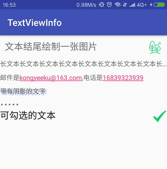
<?xml version="1.0" encoding="utf-8"?>
<LinearLayout xmlns:android="http://schemas.android.com/apk/res/android"
xmlns:tools="http://schemas.android.com/tools"
android:id="@+id/activity_main"
android:layout_width="match_parent"
android:layout_height="match_parent"
android:orientation="vertical"
tools:context="com.example.textviewinfo.MainActivity">

<!--设置字体大小为20sp,文本框右边绘制图片,文本内间距为10dp-->
<TextView
android:id="@+id/text"
android:layout_width="match_parent"
android:layout_height="wrap_content"
android:padding="10dp"
android:textSize="20sp"
android:drawableRight="@drawable/picture"
android:text="文本结尾绘制一张图片"/>
<!--设置文本行数为1,文本结尾省略显示-->
<TextView
android:layout_width="match_parent"
android:layout_height="wrap_content"
android:lines="1"
android:ellipsize="end"
android:text="长文本长文本长文本长文本长文本长文本长文本长文本长文本长文本长文本长文本"/>
<!--对邮件、电话添加链接-->
<TextView
android:layout_width="match_parent"
android:layout_height="wrap_content"
android:layout_marginTop="10dp"
android:autoLink="email|phone"
android:text="邮件是kongyeeku@163.com,电话是16839323939"/>
<!--设置文本颜色,大小,上边距为10dp,并使用阴影-->
<TextView
android:layout_width="match_parent"
android:layout_height="wrap_content"
android:layout_marginTop="10dp"
android:shadowColor="#3F51B5"
android:shadowDx="10.0"
android:shadowDy="8.0"
android:shadowRadius="3.0"
android:text="带有阴影的文字"/>
<!--测试密码框-->
<TextView
android:layout_width="match_parent"
android:layout_height="wrap_content"
android:layout_marginTop="10dp"
android:inputType="textPassword"
android:text="hello"/>
<CheckedTextView
android:layout_width="match_parent"
android:layout_height="wrap_content"
android:textSize="20sp"
android:checkMark="@drawable/ok"
android:text="可勾选的文本"/>
</LinearLayout>
1
2
3
4
5
6
7
8
9
10
11
12
13
14
15
16
17
18
19
20
21
22
23
24
25
26
27
28
29
30
31
32
33
34
35
36
37
38
39
40
41
42
43
44
45
46
47
48
49
50
51
52
53
54
55
56
57
1
2
3
4
5
6
7
8
9
10
11
12
13
14
15
16
17
18
19
20
21
22
23
24
25
26
27
28
29
30
31
32
33
34
35
36
37
38
39
40
41
42
43
44
45
46
47
48
49
50
51
52
53
54
55
56
57
效果图如下所示:
EditText的功能与用法
EditView继承自TextView,可以使用TextView的相关XML属性。 EditText组件最重要的属性是inputType,用来为EditText指定类型的输入组件。
EditText的实例
<?xml version="1.0" encoding="utf-8"?>
<LinearLayout xmlns:android="http://schemas.android.com/apk/res/android"
android:orientation="vertical" android:layout_width="match_parent"
android:layout_height="match_parent">

<!--当文本可选择时,聚焦时所有的文本被选择-->
<EditText
android:layout_width="match_parent"
android:layout_height="wrap_content"
android:hint="聚焦时所有的文本被选择"
android:selectAllOnFocus="true"/>
<EditText
android:layout_width="match_parent"
android:layout_height="wrap_content"
android:inputType="number"
android:hint="数字输入框"/>
<!--只能输入数字的密码框-->
<EditText
android:layout_width="match_parent"
android:layout_height="wrap_content"
android:hint="数字密码输入框"
android:inputType="numberPassword"/>
<EditText
android:layout_width="match_parent"
android:layout_height="wrap_content"
android:hint="密码输入框"
android:inputType="textPassword"/>
<!--能输入年月日-->
<EditText
android:layout_width="match_parent"
android:layout_height="wrap_content"
android:hint="日期输入框"
android:inputType="date"/>
<!--能输入年月日和小时分秒-->
<EditText
android:layout_width="match_parent"
android:layout_height="wrap_content"
android:hint="时间日期输入框"
android:inputType="datetime"/>
<EditText
android:layout_width="match_parent"
android:layout_height="wrap_content"
android:hint="电话号码输入框"
android:inputType="phone"/>
</LinearLayout>
1
2
3
4
5
6
7
8
9
10
11
12
13
14
15
16
17
18
19
20
21
22
23
24
25
26
27
28
29
30
31
32
33
34
35
36
37
38
39
40
41
42
43
44
45
1
2
3
4
5
6
7
8
9
10
11
12
13
14
15
16
17
18
19
20
21
22
23
24
25
26
27
28
29
30
31
32
33
34
35
36
37
38
39
40
41
42
43
44
45
Android:hint 指定文本的提示信息。
当焦点定位到相应的输入框,系统切换到相应的输入法。如点击数字密码输入框,系统会切换到数字输入法。
Button的功能与用法
Button继承自TextView,它主要是在UI界面上生成一个按钮,可添加点击事件。可为Button添加android:background属性为按钮添加背景颜色或图片。
可使用自定义的Drawable对象,可以使按钮背景颜色或者图片随用户动作动态改变。
Button的实例
下面设置了普通按钮和使用了Drawable对象的按钮。<?xml version="1.0" encoding="utf-8"?> <LinearLayout xmlns:android="http://schemas.android.com/apk/res/android" android:orientation="vertical" android:layout_width="match_parent" android:layout_height="match_parent"> <!--普通文字按钮--> <Button android:layout_width="match_parent" android:layout_height="wrap_content" android:background="@color/colorGreen" android:textColor="#FFF0F5F5" android:text="普通文字按钮"/> <!--使用Drawable对象的按钮--> <Button android:layout_width="match_parent" android:layout_height="wrap_content" android:layout_marginTop="5dp" android:textColor="#FFF0F5F5" android:background="@drawable/button_selector" android:text="使用Drawable对象的按钮"/> </LinearLayout>1
2
3
4
5
6
7
8
9
10
11
12
13
14
15
16
17
18
19
20
1
2
3
4
5
6
7
8
9
10
11
12
13
14
15
16
17
18
19
20
第二个按钮指定android:background属性为@drawable/button_selector,该属性值应用了一个Drawable资源,该资源对应的XML文件如下:
<?xml version="1.0" encoding="utf-8"?>
<selector xmlns:android="http://schemas.android.com/apk/res/android">
<!--指定按钮按下的颜色-->
<item android:state_pressed="true"
android:drawable="@color/colorRed"/>
<!--指定按钮松开的颜色-->
<item android:state_pressed="false"
android:drawable="@color/colorGreen"/>
</selector>
1
2
3
4
5
6
7
8
9
1
2
3
4
5
6
7
8
9
第一个按钮是固定的。第二个按钮点击前,按钮为绿色,按下时按钮为红色,松开后按钮又变绿色。
上面的资源文件使用selecto元素定义了一个StateListDrawable对象。
单选按钮(RadioButton)和复选按钮(CheckBox)的功能与用法
单选按钮(RadioButton)和复选按钮(CheckBox)、状态开关按钮(ToggleButton)和开关(Switch)都继承自Button。单选按钮(RadioButton)和复选按钮(CheckBox)与普通按钮的区别在于它们多了一个可供选择的功能。
RadioButton和CheckBox的区别在于前者为单选按钮,后者为多选按钮。
RadioButton通常要与RadioGroup一起使用,用于定义一组单选按钮。
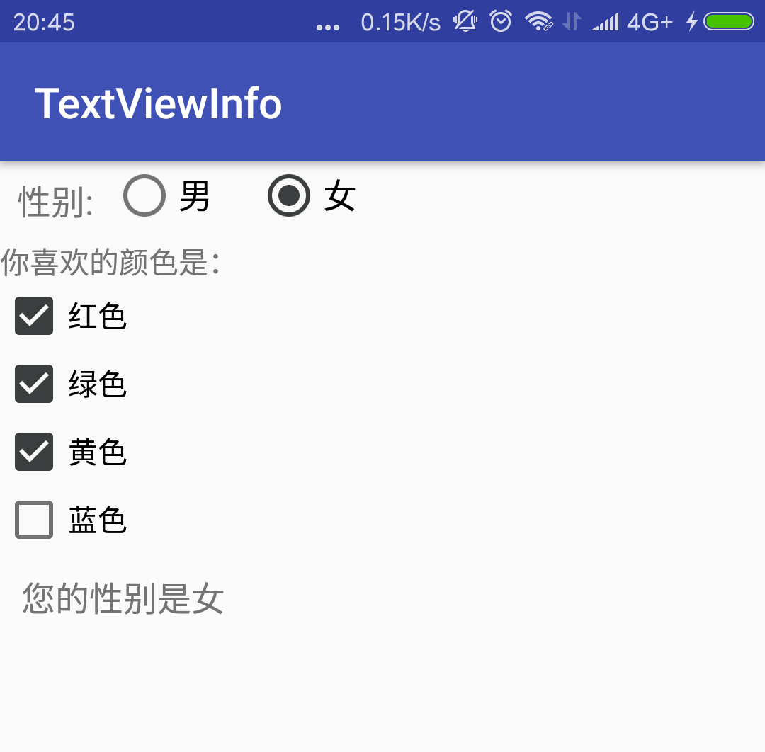
利用单选按钮、复选框获取用户信息的实例
布局文件如下所示:<?xml version="1.0" encoding="utf-8"?> <LinearLayout xmlns:android="http://schemas.android.com/apk/res/android" android:layout_width="match_parent" android:layout_height="match_parent" android:orientation="vertical"> <LinearLayout android:layout_width="match_parent" android:layout_height="wrap_content" android:orientation="horizontal"> <TextView android:layout_height="wrap_content" android:layout_width="wrap_content" android:textSize="16sp" android:padding="8dp" android:text="性别:"/> <!--定义一组单选按钮--> <RadioGroup android:id="@+id/sex" android:layout_width="wrap_content" android:layout_height="wrap_content" android:orientation="horizontal" android:layout_gravity="center_horizontal"> <RadioButton android:id="@+id/male" android:layout_width="wrap_content" android:layout_height="wrap_content" android:textSize="16sp" android:checked="true" android:text="男"/> <RadioButton android:id="@+id/female" android:layout_width="wrap_content" android:layout_height="wrap_content" android:textSize="16sp" android:layout_marginLeft="20dp" android:text="女"/> </RadioGroup> </LinearLayout> <TextView android:layout_width="match_parent" android:layout_height="wrap_content" android:text="你喜欢的颜色是:"/> <LinearLayout android:layout_width="match_parent" android:layout_height="wrap_content" android:orientation="vertical"> <CheckBox android:id="@+id/red" android:layout_width="match_parent" android:layout_height="wrap_content" android:checked="true" android:text="红色"/> <CheckBox android:id="@+id/green" android:layout_width="match_parent" android:layout_height="wrap_content" android:text="绿色"/> <CheckBox android:id="@+id/yellow" android:layout_width="match_parent" android:layout_height="wrap_content" android:text="黄色"/> <CheckBox android:id="@+id/blue" android:layout_width="match_parent" android:layout_height="wrap_content" android:text="蓝色"/> </LinearLayout> <TextView android:id="@+id/show" android:layout_width="wrap_content" android:layout_height="wrap_content" android:textSize="16sp" android:padding="10dp"/> </LinearLayout>1
2
3
4
5
6
7
8
9
10
11
12
13
14
15
16
17
18
19
20
21
22
23
24
25
26
27
28
29
30
31
32
33
34
35
36
37
38
39
40
41
42
43
44
45
46
47
48
49
50
51
52
53
54
55
56
57
58
59
60
61
62
63
64
65
66
67
68
69
70
71
72
73
74
75
1
2
3
4
5
6
7
8
9
10
11
12
13
14
15
16
17
18
19
20
21
22
23
24
25
26
27
28
29
30
31
32
33
34
35
36
37
38
39
40
41
42
43
44
45
46
47
48
49
50
51
52
53
54
55
56
57
58
59
60
61
62
63
64
65
66
67
68
69
70
71
72
73
74
75
上面的界面定义了一组单选按钮,并默认勾选了第一个单选按钮,可供用户选择性别。接下来定义了四个复选框,默认勾选了第一个复选框。
接着在Activity中为单选按钮添加事件监听。
package com.example.textviewinfo;

import android.os.Bundle;
import android.support.v7.app.AppCompatActivity;
import android.widget.RadioGroup;
import android.widget.TextView;

public class MainActivity extends AppCompatActivity {

private RadioGroup sex;
private TextView show;

@Override
protected void onCreate(Bundle savedInstanceState) {
super.onCreate(savedInstanceState);
setContentView(R.layout.radio_checkbox);

sex = (RadioGroup) findViewById(R.id.sex);
show = (TextView) findViewById(R.id.show);
//为RadioGroup组件绑定OnCheck事件绑定事件监听
sex.setOnCheckedChangeListener(new RadioGroup.OnCheckedChangeListener() {
@Override
public void onCheckedChanged(RadioGroup group, int checkedId) {
//根据用户勾选的单选按钮来改变sexStr的值
String sexStr = checkedId == R.id.male ? "您的性别是男":"您的性别是女";
//修改show组件中的文本
show.setText(sexStr);
}
});
}
}12
3
4
5
6
7
8
9
10
11
12
13
14
15
16
17
18
19
20
21
22
23
24
25
26
27
28
29
30
31
32
1
2
3
4
5
6
7
8
9
10
11
12
13
14
15
16
17
18
19
20
21
22
23
24
25
26
27
28
29
30
31
32
选择相应用户信息后,界面如下所示:
上面代码添加事件监听器的方式采用了“委托式”事件处理机制,委托式事件处理机制的原理是:当事件源上发生事件时,该事件将会激发该事件源上的监听事件器的特定方法。
状态开关按钮(ToggleButton)和开关(Switch)的功能与用法
ToggleButton,Switch和CheckBox非常相似,只是ToggleButton和Switch通常用于切换程序当中的某种状态。 ToggleButton支持的XML属性及相关得方法如下表所示:
| XML属性 | 相关方法 | 说明 |
|---|---|---|
| android:Checked | setChecked(boolean) | 设置该按钮是否被选中 |
| android:textOn | 设置该按钮状态打开时显示的文本 | |
| android:textOff | 设置该按钮状态关闭时显示的文本 |
| XML属性 | 相关方法 | 说明 |
|---|---|---|
| android:Checked | setChecked(boolean) | 设置该按钮是否被选中 |
| android:textOn | setTextOn(CharSequence) | 设置该按钮状态打开时显示的文本 |
| android:textOff | setTextOff(CharSequence) | 设置该按钮状态关闭时显示的文本 |
| android:swithMinWidth | setSwitchMinWidth(int) | 设置开关的最小宽度 |
| android:switchPadding | setSwitchPadding(int) | 设置开关与标题文本之间的空白 |
| android:switchTextAppearance | setSwitchTextAppearance(Context,int) | 设置该开关图标上的文本样式 |
| android:textStyle | setSwitchTypeface(Typeface) | 设置该开关的文本风格 |
| android:thumb | setThumbResource(int) | 指定使用自定义的Drawable绘制该开关的开关按钮 |
| android:track | setTrackResource(int) | 指定使用自定义的Drawable绘制该开关的开关轨道 |
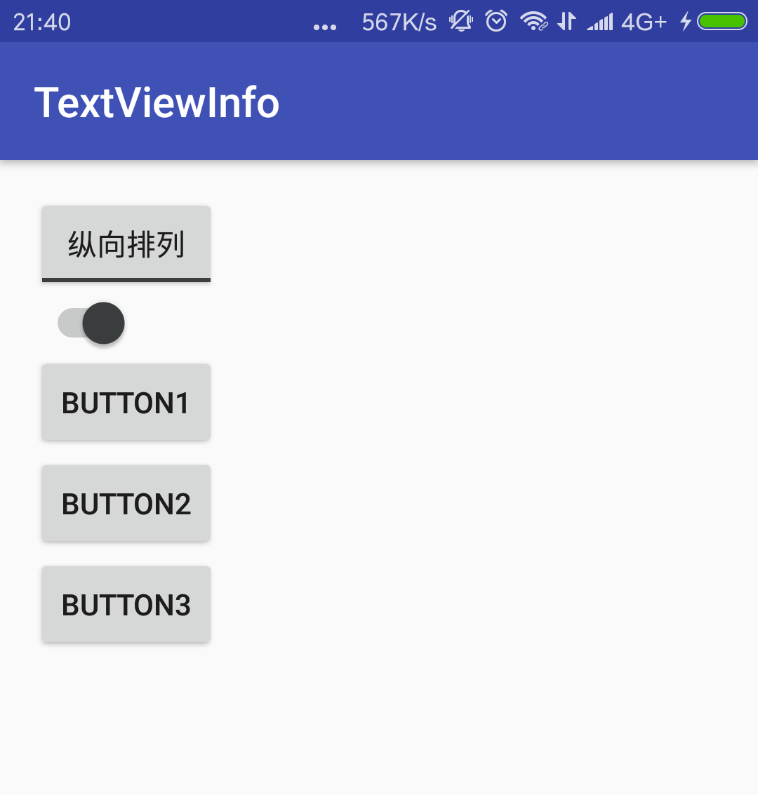
动态控制布局的实例
界面布局文件代码如下所示:<?xml version="1.0" encoding="utf-8"?> <LinearLayout xmlns:android="http://schemas.android.com/apk/res/android" xmlns:tools="http://schemas.android.com/tools" android:layout_width="match_parent" android:layout_height="match_parent" android:paddingBottom="@dimen/activity_vertical_margin" android:paddingLeft="@dimen/activity_horizontal_margin" android:paddingRight="@dimen/activity_horizontal_margin" android:paddingTop="@dimen/activity_vertical_margin" android:orientation="vertical" tools:context="com.example.textviewinfo.StateButtonActivity"> <ToggleButton android:id="@+id/toggle" android:layout_width="wrap_content" android:layout_height="wrap_content" android:textOff="横向排列" android:textOn="纵向排列" android:checked="true"/> <Switch android:id="@+id/switcher" android:layout_width="wrap_content" android:layout_height="wrap_content" android:textOff="横向排列" android:textOn="纵向排列" android:checked="true" /> <LinearLayout android:id="@+id/test" android:orientation="vertical" android:layout_width="wrap_content" android:layout_height="wrap_content"> <Button android:layout_width="wrap_content" android:layout_height="wrap_content" android:text="Button1"/> <Button android:layout_width="wrap_content" android:layout_height="wrap_content" android:text="Button2"/> <Button android:layout_width="wrap_content" android:layout_height="wrap_content" android:text="Button3"/> </LinearLayout> </LinearLayout>1
2
3
4
5
6
7
8
9
10
11
12
13
14
15
16
17
18
19
20
21
22
23
24
25
26
27
28
29
30
31
32
33
34
35
36
37
38
39
40
41
42
43
44
45
46
1
2
3
4
5
6
7
8
9
10
11
12
13
14
15
16
17
18
19
20
21
22
23
24
25
26
27
28
29
30
31
32
33
34
35
36
37
38
39
40
41
42
43
44
45
46
用ToggleButton和Switch按钮控制三个Button按钮的排列方式。
接下来为ToggleButton和Switch按钮添加绑定事件,代码如下所示:
package com.example.textviewinfo;

import android.support.v7.app.AppCompatActivity;
import android.os.Bundle;
import android.widget.CompoundButton;
import android.widget.LinearLayout;
import android.widget.Switch;
import android.widget.ToggleButton;

public class StateButtonActivity extends AppCompatActivity {

private ToggleButton toggleButton;
private Switch switcher;

@Override
protected void onCreate(Bundle savedInstanceState) {
super.onCreate(savedInstanceState);
setContentView(R.layout.activity_state_button);
toggleButton = (ToggleButton) findViewById(R.id.toggle);
switcher = (Switch) findViewById(R.id.switcher);
final LinearLayout linearLayout = (LinearLayout) findViewById(R.id.test);
CompoundButton.OnCheckedChangeListener listener = new CompoundButton.OnCheckedChangeListener() {
@Override
public void onCheckedChanged(CompoundButton buttonView, boolean isChecked) {
if (isChecked){
//设置 LinearLayout垂直布局
linearLayout.setOrientation(LinearLayout.VERTICAL);
}else {
//设置 LinearLayout纵向布局
linearLayout.setOrientation(LinearLayout.HORIZONTAL);
}
}
};
toggleButton.setOnCheckedChangeListener(listener);
switcher.setOnCheckedChangeListener(listener);
}
}12
3
4
5
6
7
8
9
10
11
12
13
14
15
16
17
18
19
20
21
22
23
24
25
26
27
28
29
30
31
32
33
34
35
36
37
38
1
2
3
4
5
6
7
8
9
10
11
12
13
14
15
16
17
18
19
20
21
22
23
24
25
26
27
28
29
30
31
32
33
34
35
36
37
38
随着用户改变ToggleButton和Switch按钮的状态,三个按钮的排列方式发生改变,界面效果如下所示:
时钟(AnalogClock和DigitalClock)的功能与用法
DigitalClock继承自TextView,它里面显示的内容总是当前时间,设置android:text是对其没有作用。AnalogClock则继承了View组件,它重写View的Ondraw方法,会在View上绘制模拟时钟。
AnalogClock和DigitalClock目前都已经过时了。
AnalogClock支持的XML属性及相关得方法如下表所示:
| XML属性 | 相关方法 | 说明 |
|---|---|---|
| android:dial | 设置该模拟时钟表盘所使用的图片 | |
| android:hand_hour | 设置该模拟时钟时针所使用的图片 | |
| android:hand_minute | 设置该模拟时钟分针所使用的图片 |
计时器(Chronometer)的功能与用法
Chronometer继承自TextView,它的功能是从某个起始时间开始计时。 它只提供了一个android:format属性,用于指定计时器的计时格式。
Chronometer还支持如下常用方法:
setBase(long base) : 设置定时器的起始时间。
setFormat(String format) : 设置显示时间的格式。
start() : 开始计时。
stop() : 停止计时。
setOnChronomenterTickListener(Chronometer.OnChronomenterTickListener listener) : 为计时器绑定事件监听器,当计时器改变时触发该监听器。
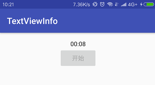
下面程序示范了Chronometer的用法。在布局文件中定义一个Chronometer组件和一个Button组件。当用户单机按钮定时器开始计时,当计时超过20s时停止计时。程序代码如下所示:
package com.example.textviewinfo;

import android.os.Bundle;
import android.os.SystemClock;
import android.support.v7.app.AppCompatActivity;
import android.view.View;
import android.widget.Button;
import android.widget.Chronometer;

public class ChronometerActivity extends AppCompatActivity {

private Button start;
private Chronometer chronometer;
@Override
protected void onCreate(Bundle savedInstanceState) {
super.onCreate(savedInstanceState);
setContentView(R.layout.activity_chronometer);
start = (Button) findViewById(R.id.start);
chronometer = (Chronometer) findViewById(R.id.chronometer_test);
start.setOnClickListener(new View.OnClickListener() {
@Override
public void onClick(View v) {
//设置开始计时时间,SystemClock.elapsedRealtime()是获取自启动起来的毫秒数,包括睡眠时间。
chronometer.setBase(SystemClock.elapsedRealtime());
//启动计时器
chronometer.start();
//将按钮设置成不可用
start.setEnabled(false);
}
});
//为Chronometer绑定事件监听器
chronometer.setOnChronometerTickListener(new Chronometer.OnChronometerTickListener() {
@Override
public void onChronometerTick(Chronometer chronometer) {
if (SystemClock.elapsedRealtime()-chronometer.getBase()>20*1000){
chronometer.stop();
start.setEnabled(true);
}
}
});
}
}12
3
4
5
6
7
8
9
10
11
12
13
14
15
16
17
18
19
20
21
22
23
24
25
26
27
28
29
30
31
32
33
34
35
36
37
38
39
40
41
42
43
1
2
3
4
5
6
7
8
9
10
11
12
13
14
15
16
17
18
19
20
21
22
23
24
25
26
27
28
29
30
31
32
33
34
35
36
37
38
39
40
41
42
43
单击按钮后,界面如下图所示:

相关文章推荐
- UI组件之TextView及其子类(一)TextView和EditText
- android-UI组件(二):TextView及其子类
- UI组件之TextView及其子类(三)ToggleButton和Switch
- Android用户界面 UI组件--TextView及其子类(二) Button,selector选择器,sharp属性
- Android界面编程之三 第二组UI组件:TextView及其子类
- Android用户界面 UI组件--TextView及其子类(二) Button,selector选择器,sharp属性
- UI组件(2):TextView及其子类
- Android用户界面 UI组件--TextView及其子类(三) EditView以及各种Span文字样式讲解
- Android用户界面 UI组件--TextView及其子类(三) EditView以及各种Span文字样式讲解
- UI组件之TextView及其子类(四)AnalogClock,DigitalClock
- Android用户界面 UI组件--TextView及其子类(四) Chronometer计时器
- Android用户界面 UI组件--TextView及其子类(四) Chronometer计时器
- Android用户界面 UI组件--TextView及其子类(五) DigitalClock,AnalogClock,RadioButton,CheckBox,ToggleButton汇总
- UI组件之TextView及其子类(一)
- UI组件之TextView及其子类(三)ToggleButton和Switch
- Android用户界面 UI组件--TextView及其子类(五) DigitalClock,AnalogClock,RadioButton,CheckBox,ToggleButton汇总
- 第2组UI组件:TextView及其子类
- UI组件之TextView及其子类
- Android用户界面 UI组件--TextView及其子类(一) TextView
- Android用户界面 UI组件--TextView及其子类(一) TextView