Android之可折叠Toolbar的实现
2017-01-30 10:32
423 查看
先介绍Android 5.X之后出现的Design meterial的新控件使用design包下的控件必须先导包
注:在gradle的dependencies中添加: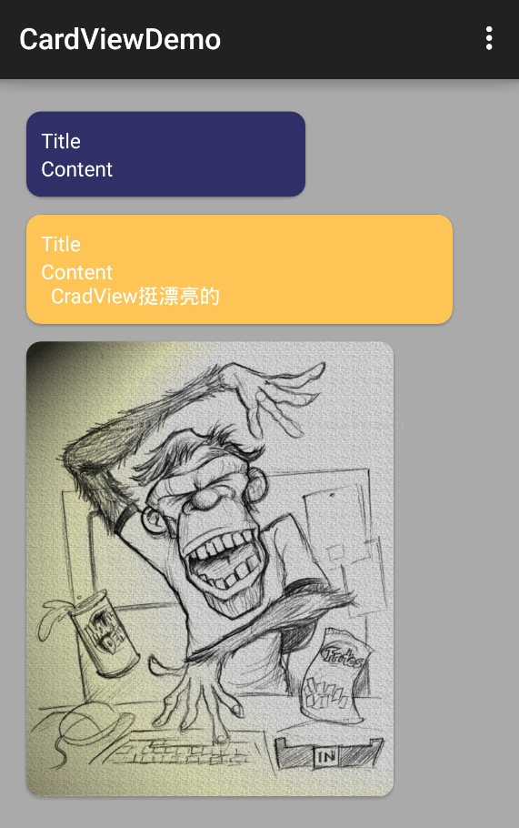 TextInputLayout只能包含一一个EditText因此比较麻烦 因此出现了InputTextEditText
compile 'com.android.support:design:24.0.0'CoordinatorLayout作为“super-poweredFrameLayout”本质是个帧布局FrameLayout基本实现两个功能: 1、作为顶层布局; 其子控件可以通过layout_gravity控制自身位置2、调度协调子布局.
CoordinatorLayout使用新的思路通过协调调度子布局的形式实现触摸影响布局
的形式产生动画效果。CoordinatorLayout通过设置子View的Behaviors来调
度子View。在CoordinatorLayout的子view中有需要滑动的view时候可以必须设置
app:layout_behavior="@string/appbar_scrolling_view_behavior"来实现滑动效果,这个behavior是系统内置的类,如果
还需要实现自定义的效果可以自定义behavior类AppBarLayout就是一个垂直的线性布局,该布局具有很多材料设计的特性,尤其是滚动特性.如果子视图想要实现滚动行为,可以通过setScrollFlags(int)方法或者在xml中设置
app:layout_scrollFlags.属性.AppBarLayout应该被作为CoordinatorLayout的一个子视图来使用,如果在别的ViewGroup中来使用的话,可能AppBarLayout的很多特性都无效了.在AppBarLayout里面的View,通过app:layout_scrollFlags属性来控制,滚动时候的表现.其中有4种Flag的类型.1⃣️.scroll: 表示向上滚动时,这个View会被滚出屏幕范围直到隐藏.没有设置这个flag的view将被固定在屏幕顶部。例如,TabLayout 没有设置这个值,将会停留在屏幕顶部。2⃣️.enterAlways: 表示向下滚动时,这个View会随着滚动手势出现,直到恢复原来的位置,启用快速“返回模式”。3⃣️.enterAlwaysCollapsed: 当你的视图已经设置minHeight属性又使用此标志时,你的视图只能已最小高度进入,只有当滚动视图到达顶部时才扩大到完整高度。4⃣️.exitUntilCollapsed: 滚动退出屏幕,最后折叠在顶端。
CollapseToolbarLayout 作用是提供了一个可以折叠的Toolbar,它继承自FrameLayout,给它设置常用属性及方法:CollapsingToolbarLayout可实现Toolbar的折叠效果。CollapsingToolbarLayout的子视图类似于LinearLayout的垂直方向排放。CollapsingToolbarLayout 提供以下属性和方法: 1⃣️.Collapsing title:ToolBar的标题,当CollapsingToolbarLayout没有全屏折叠时,title显示的是大字体,在折叠的过程中,title不断变小直到一定大小的效果。以调用setTitle(CharSequence)方法设置title。 2⃣️. Content scrim:ToolBar被折叠到顶部固定时候的背景,可以调用setContentScrim(Drawable)方法改变背景或者 在属性中使用 app:contentScrim=”?attr/colorPrimary”来改变背景。 3⃣️. Status bar scrim:状态栏的背景,调用方法setStatusBarScrim(Drawable)。不过这个只能在Android5.0以上系统有效果。 4⃣️. Parallax scrolling children:CollapsingToolbarLayout滑动时,子视图的视觉差,可以通过属性app:layout_collapseParallaxMultiplier="0.6"改变。值的范围[0.0,1.0],值越大视差越大。 5⃣️. CollapseMode:子视图的折叠模式,在子视图设置,有两种“pin”:固定模式,在折叠的时候最后固定在顶端;“parallax”:视差模式,在折叠的时候会有个视差折叠的效果。我们可以在布局中使用属性app:layout_collapseMode=”parallax”来改变,实现视差滚动效果,通常和layout_collapseParallaxMultiplier(设置视差因子)搭配使用。6⃣️.layout_collapseParallaxMultiplier(视差因子) - 设置视差滚动因子,值为:0~1。 7⃣️.CoordinatorLayout 还提供了一个 layout_anchor 的属性,连同 layout_anchorGravity 一起,可以用来放置与其他视图关联在一起的悬浮视图(如 FloatingActionButton)。本例中使用FloatingActionButton。8⃣️.contentScrim - 设置当CollapsingToolbarLayout完全折叠(收缩)后的背景颜色。9⃣️.expandedTitleMarginStart - 设置扩张时候(还没收缩时)title向左填充的距离。
下面是个实现可折叠Toolbar的案例 案例中有许多要注意的点
<?xml version="1.0" encoding="utf-8"?>
<!--CoordinatorLayout本质是个FrameLayout-->
<android.support.design.widget.CoordinatorLayout
xmlns:android="http://schemas.android.com/apk/res/android"
xmlns:tools="http://schemas.android.com/tools"
xmlns:app="http://schemas.android.com/apk/res-auto"
android:id="@+id/activity_main"
android:layout_width="match_parent"
android:layout_height="match_parent"
android:fitsSystemWindows="true"

tools:context="xixirupan.tmgp.com.newdesign.MainActivity">
<!--  android:fitsSystemWindows="true"必须加上否则toolbar名称设置不上
AppBarLayout本质是一个LinearLayout vertical
-->
<android.support.design.widget.AppBarLayout
android:layout_width="match_parent"
android:layout_height="wrap_content"
android:fitsSystemWindows="true"
>
<!-- layout_scrollFlags是AppBar需要滚动的子元素设置的属性
有四个值exitUntilCollapse,enterAlaways,enterAlwaysUtilCollapse scroll
要想实现滚动scroll必加 其他三个可以根据需要的效果选择
CollapsingToolbarLayout通常只包裹TooLbar
有时候也包裹一张图片作为Toolbar的背景图片 造成一定的视觉效果
CollapsingToolbarLayout本质也是一个FrameLayout
-->
<android.support.design.widget.CollapsingToolbarLayout
android:layout_width="match_parent"
android:layout_height="200dp"
android:background="#66ff0000"
app:contentScrim="#6600ff00"
app:layout_scrollFlags="scroll|exitUntilCollapsed"

>
<ImageView
android:layout_width="match_parent"
android:layout_height="match_parent"
android:background="@drawable/agin7"
/>
<!--Toolbar的高必须设置明确的值否则就不会收缩在上面
原因我想很简单就是toolbar没有明确高不知道该收缩多少这样的话系统将什么也不做
-->
<android.support.v7.widget.Toolbar
android:id="@+id/toolbar"
app:title=" "
android:layout_width="match_parent"
android:layout_height="?attr/actionBarSize"
app:layout_collapseMode="pin"

>

</android.support.v7.widget.Toolbar>
</android.support.design.widget.CollapsingToolbarLayout>
<android.support.design.widget.TabLayout
android:id="@+id/tabLayout"
android:layout_width="match_parent"
android:layout_height="wrap_content">

</android.support.design.widget.TabLayout>
</android.support.design.widget.AppBarLayout>
<!--app:layout_behavior="@string/appbar_scrolling_view_behavior"
该属性是CoordinatorLayout中的需要滚动的子元素设置的属性
-->
<android.support.v4.widget.NestedScrollView
app:layout_behavior="@string/appbar_scrolling_view_behavior"
android:layout_width="match_parent"
android:layout_height="wrap_content">
<xixirupan.tmgp.com.newdesign.view.NoListView
android:id="@+id/noListView"
android:layout_width="match_parent"
android:layout_height="match_parent"
android:entries="@array/items"
>
</xixirupan.tmgp.com.newdesign.view.NoListView>
</android.support.v4.widget.NestedScrollView>
</android.support.design.widget.CoordinatorLayout>
上面的NoListView是自定义的ListView来解决滑动冲突的这个解决方法如下
public class NoListView extends ListView {
public NoListView(Context context) {
super(context);
}

public NoListView(Context context, AttributeSet attrs) {
super(context, attrs);
}

public NoListView(Context context, AttributeSet attrs, int defStyleAttr) {
super(context, attrs, defStyleAttr);
}

@Override
public void onMeasure(int widthMeasureSpec, int heightMeasureSpec) {
int expandSpec = MeasureSpec.makeMeasureSpec(Integer.MAX_VALUE >> 2, MeasureSpec.AT_MOST);
super.onMeasure(widthMeasureSpec, expandSpec);
}
}其他的design包下的控件简介:一.简介:CardView则是Google提供的一个卡片式视图组件,继承自FrameLayout类,可以在一个卡片布局中一致性地显示内容,卡片可以包含圆角和阴影。CardView被包装为一种布局,可以布局其他View,并且经常在ListView和RecyclerView的Item布局中,作为一种容器使用。CardView应该被使用在显示层次性的内容时;在显示列表或网格时更应该被选择,因为这些边缘可以使得用户更容易去区分这些内容。所以当我们要进行特殊的UI显示时,比如:1.边框圆角;2.有阴影Shadow.等用来突出个性,比如展览,相册等时,都可以考虑使用CardView.二.常用属性:app:cardElevation阴影的大小
app:cardMaxElevation阴影最大高度
app:cardBackgroundColor卡片的背景色
app:cardCornerRadius卡片的圆角大小
app:contentPadding卡片内容于边距的间隔app:contentPaddingBottomapp:contentPaddingTopapp:contentPaddingLeftapp:contentPaddingRightapp:contentPaddingStartapp:contentPaddingEnd
app:cardUseCompatPadding设置内边距,V21+的版本和之前的版本仍旧具有一样的计算方式.
app:cardPreventConrerOverlap在V20和之前的版本中添加内边距,这个属性为了防止内容和边角的重叠.
| 12345678910 | <android.support.v7.widget.CardViewxmlns:card_view="http://schemas.android.com/apk/res-auto"android:layout_width="200dp"android:layout_height="wrap_content"card_view:cardBackgroundColor="#303069"card_view:cardCornerRadius="10dp"card_view:cardPreventCornerOverlap="true"card_view:cardUseCompatPadding="true"card_view:contentPadding="10dp"> ...</android.support.v7.widget.CardView> |
compile 'com.android.support:cardview-v7:24.0.0'CardView提供了一个默认的elevation(意为CardView的Z轴阴影)和圆角角度,所以每一个卡片都能够在不同的设备上保持相同的外观。然而,你也可以根据自己的需求去定制这些值。注意:cardElevation属性被用来决定阴影的大小以及柔和度,以至于可以逼真的模拟出对于深度效果的描述。
添加波纹点击效果:
默认情况,CardView是不可点击的,并且没有任何的触摸反馈效果。触摸反馈动画在用户点击CardView时可以给用户以视觉上的反馈。为了实现这种行为,你必须提供一下属性:<android.support.v7.widget.CardView ... android:clickable="true" android:foreground="?android:attr/selectableItemBackground"> ... </android.support.v7.widget.CardView>使用android:foreground=”?android:attr/selectableItemBackground”可以使CardView点击产生波纹的效果,有触摸点向外扩散。
对更早的版本的支持:
在AndroidL之前的设备上,CardView为了支持圆角的效果加上了padding,圆角剪裁操作可以算是很昂贵的操作。相似的,对阴影效果来说,在AndroidL之前,也会提供padding去绘制阴影面积,这些内容的padding是和elevation属性相关的,按照文档:padding值为: 左右两边的值为:maxCardElevation + (1 - cos45) * cornerRadius 上下两边的值为:maxCardElevation * 1.5 + (1 - cos45) * cornerRadius因此,如果你需要给自己的内容加上padding的话,需要使用新的属性:card_view:contentPadding 相似的,如果改变CardView的背景,也需要使用新的属性:card_view:cardBackgroundColor示例效果:TextInputLayout只能包含一一个EditText因此比较麻烦 因此出现了InputTextEditTextTextInputLayout是一个用来包裹EditText的布局,本质上就是一个LinearLayout.它可以在EditText的hint提示信息消失后,用来给用户展示一个浮动的label标签.并且该控件支持展示错误提示信息.
该控件是用于包裹EditView输入框的,主要解决之前EditView在获得焦点编辑时hint属性提示语消失,这一点在一个页面有多个EditView输入框的时候不是很好,因为很多可能用户在输入多个EditView之后,不知道当前EditView需要输入什么内容。为了解决这一问题,TextInputLayout就此诞生了。TextInputLayout是继承自LinearLayout容器布局,因此我们需要将EditView包含在TextInputLayout之内才可以使用,言外之意:TextInputLayout不能单独使用。.TextInputEditText: 和TextInputLayout类似,Design包还有一个组件TextInputEditText,继承AppCompatEditText,可以在右侧显示出错误信息的小弹窗.用法和TextInputLayout类似,可以直接使用TextInputEditText控件.而且不用设置错误信息消除,重新在TextInputEditText输出会自动取消,什么是 FAB?
FAB 全称:Floating Action Button,是浮动操作按钮,一般作为进阶操作的开关,在用户界面中通常是一个漂浮的小圆圈,它有自身独特的动态效果,比如变形、弹出、位移等等,代表着在当前页面上用户的特定的操作。 App的标准导航菜单实现方式.导航菜单的内容由菜单menu资源文件来填充.NavigationView通常被放置于一个DrawerLayout内部.在Material Design中,Navigation drawer导航抽屉,被设计用于应用导航,提供了一种通用的导航方式,体现了设计的一致性。而NavigationView的典型用途就是配合之前v4包的DrawerLayout,作为其中的Drawer部分,即导航菜单的本体部分。NavigationView是一个导航菜单框架,使用menu资源填充数据,使我们可以更简单高效的实现导航菜单。它提供了不错的默认样式、选中项高亮、分组单选、分组子标题、以及可选的Header。
 <android.support.v4.widget.DrawerLayoutxmlns:android="http://schemas.android.com/apk/res/android"
     xmlns:app="http://schemas.android.com/apk/res-auto"
     android:id="@+id/drawer_layout"
     android:layout_width="match_parent"
     android:layout_height="match_parent"
     android:fitsSystemWindows="true">

     <!-- Your contents -->

     <android.support.design.widget.NavigationView
         android:id="@+id/navigation"
         android:layout_width="wrap_content"
         android:layout_height="match_parent"
         android:layout_gravity="start"
         app:menu="@menu/my_navigation_items"/>
</android.support.v4.widget.DrawerLayout>典型的布局文件如下,外层是DrawerLayout,它的第一个child将作为content,第二个child作为Drawer.注意其中NavigationView的两个自定义属性:
1⃣️.app:headerLayout接收一个layout,作为导航菜单顶部的Header,可选项。
2⃣️.app:menu接收一个menu,作为导航菜单的菜单项,几乎是必选项,不然这个控件就失去意义了。但也可以在运行时动态改变menu属性。我们可以用
setNavigationItemSelectedListener方法来设置当导航项被点击时的回调。
OnNavigationItemSelectedListener会提供给我们被选中的
MenuItem,这与Activity的
onOptionsItemSelected非常类似。通过这个回调方法,我们可以处理点击事件,改变item的选中状态,更新页面内容,关闭导航菜单,以及任何我们需要的操作。示例代码如下:
mNavigationView.setNavigationItemSelectedListener(new
NavigationView.OnNavigationItemSelectedListener() {@OverridepublicbooleanonNavigationItemSelected(MenuItem menuItem){if (sNavigationMap.containsKey(menuItem.getItemId())) {[/code]
menuItem.setChecked(true);// 改变item选中状态
setTitle(menuItem.getTitle()); // 改变页面标题,标明导航状态[/code]
currentNavigationId = menuItem.getItemId();
mDrawerLayout.closeDrawers(); // 关闭导航菜单
returntrue;
} else {returnfalse; } } });[/code]关于NavigationView中item的字体颜色和icon选中状态颜色是去当前主题theme中的
<--正常状态下字体颜色和icon颜色--><item name="android:textColorPrimary">@android:color/darker_gray</item><--选中状态icon的颜色和字体颜色--><item name="colorPrimary">@color/accent_material_light</item>当然你可以通过如下方法或者属性来改变这一状态: 1⃣️.setItemBackgroundResource(int):给menu设置背景资源,对应的属性
app:itemBackground.
2⃣️.setItemIconTintList(ColorStateList):给menu的icon设置颜色,对应的属
性app:itemIconTint.
3⃣️.setItemTextColor(ColorStateList):给menu的item设置字体颜色,对应的属性
app:itemTextColor.

相关文章推荐
- 使用C++实现JNI接口需要注意的事项
- Android IPC进程间通讯机制
- Android Manifest 用法
- [转载]Activity中ConfigChanges属性的用法
- Android之获取手机上的图片和视频缩略图thumbnails
- Android之使用Http协议实现文件上传功能
- Android学习笔记(二九):嵌入浏览器
- android string.xml文件中的整型和string型代替
- i-jetty环境搭配与编译
- android之定时器AlarmManager
- android wifi 无线调试
- Android Native 绘图方法
- Android java 与 javascript互访(相互调用)的方法例子
- android 代码实现控件之间的间距
- android FragmentPagerAdapter的“标准”配置
- Android"解决"onTouch和onClick的冲突问题
- android:installLocation简析
- android searchView的关闭事件