android 实现类似个人中心的界面设计
2017-01-05 18:47
585 查看
From:android 实现类似个人中心的界面设计
上效果图: 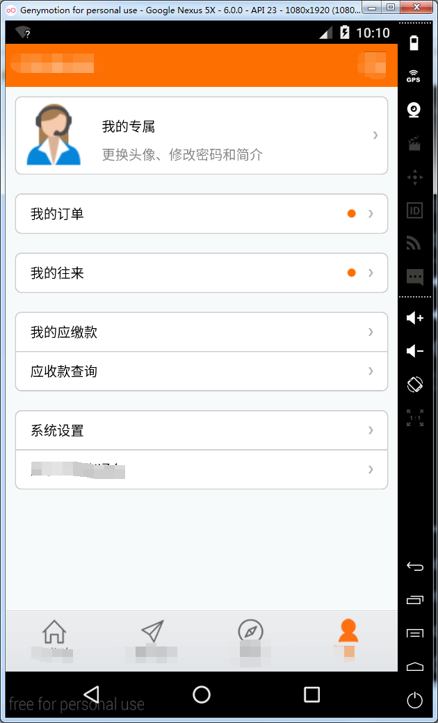
先理清设计思路:
1、外层用linearlayout包裹,linearlayout采用shape,搭上描边、圆角和填充背景色。
2、里层采用relativelayout填充进textview、imageview。
思路搞清后,很简单就两步。
先上布局代码:
<LinearLayout style="@style/PersonalMainLayoutStyle" >

<RelativeLayout style="@style/FindBottomStyle" >

<TextView
style="@style/PersonalTextStyle"
android:text="我的订单" />

<ImageView
android:id="@+id/iv_drop_down"
style="@style/PersonalRightIconStyle"
android:src="@drawable/android_list_idex" />
</RelativeLayout>
</LinearLayout>
1
2
3
4
5
6
7
8
9
10
11
12
13
14
1
2
3
4
5
6
7
8
9
10
11
12
13
14
linearlayout布局属性代码:
<style name="PersonalMainLayoutStyle">
<item name="android:layout_width">match_parent</item>
<item name="android:layout_height">wrap_content</item>
<item name="android:layout_margin">10dp</item>
<item name="android:background">@drawable/background_corners</item>
<item name="android:orientation">vertical</item>
<item name="android:padding">1dp</item>
</style>
1
2
3
4
5
6
7
8
1
2
3
4
5
6
7
8
relativelayout布局属性代码:
<style name="FindBottomStyle">
<item name="android:layout_width">match_parent</item>
<item name="android:layout_height">30dp</item>
<item name="android:layout_margin">5dp</item>
<item name="android:background">@drawable/more_activity_item_selector_bottom_corners</item>
</style>
1
2
3
4
5
6
1
2
3
4
5
6
textview和imageview的属性代码可以自己设计了。
下面是drawable的设计代码.
看到上边relativelayout的item中引用了drawable-more_activity_item_selector_bottom_corners,个人感觉好像没什么卵用,主要是linearlayout的drawable,但是我没试,还是贴出来吧
relativelayout-drawable:
<?xml version="1.0" encoding="utf-8"?>
<selector
xmlns:android="http://schemas.android.com/apk/res/android">
<item android:state_pressed="true">
<shape>
<solid android:color="#ffffe381" />
<stroke android:width="0.0dip" android:color="#ffcccccc" />
<corners android:bottomLeftRadius="6.0dip" android:bottomRightRadius="6.0dip" />
</shape>
</item>
<item>
<shape>
<solid android:color="#ffffffff" />
<stroke android:width="0.0dip" android:color="#ffcccccc" />
<corners android:bottomLeftRadius="6.0dip" android:bottomRightRadius="6.0dip" />
</shape>
</item>
</selector>
1
2
3
4
5
6
7
8
9
10
11
12
13
14
15
16
17
18
1
2
3
4
5
6
7
8
9
10
11
12
13
14
15
16
17
18
linearlayout-drawable:
<?xml version="1.0" encoding="utf-8"?>
<selector xmlns:android="http://schemas.android.com/apk/res/android">

<item><shape>
<solid android:color="#ffffffff" />

<stroke android:width="1.0dip" android:color="#ffcccccc" />

<corners android:radius="6.0dip" />
</shape></item>

</selector>
1
2
3
4
5
6
7
8
9
10
11
12
1
2
3
4
5
6
7
8
9
10
11
12

相关文章推荐
- android 实现类似个人中心的界面设计
- 下拉实现头部图片放大效果,实现类似QQ,新浪个人中心界面
- Android实现个人中心设置界面
- Android界面设计之——类似百度手机助手的两层导航实现
- android -------个人中心界面UI的实现。
- 下拉实现头部图片放大效果,实现类似QQ,新浪个人中心界面
- android expandablelistview--实现类似qq界面的效果
- Android实现通用的ActivityGroup(效果类似Android微博客户端主界面),强烈建议不要再使用TabActivity
- Android实现通用的ActivityGroup(效果类似Android微博客户端主界面),强烈建议不要再使用TabActivity
- android 的导航界面的设计与实现
- Android 实例-个人理财工具 之一 启动界面实现
- Android UI设计之<二>自定义SwitchButton开关,实现类似IOS中UISwitch的动画效果
- android中选择控件与选择界面自然过度效果的实现--一种新的交互设计
- Android实现通用的ActivityGroup(效果类似Android微博客户端主界面),强烈建议不要再使用TabActivity
- Android个人理财工具实例之一:项目概述与启动界面的实现
- Android典型界面设计——FragmentTabHost+Fragment实现底部tab切换
- Android 实例-个人理财工具 之一 启动界面实现
- Android入门实例一 登录界面的设计与实现
- Android实现通用的ActivityGroup(效果类似Android微博客户端主界面),强烈建议不要再使用TabActivity