Android自定义带进度的刻度条
2016-11-30 00:24
148 查看
如何自定义控件?
1.自定义属性的声明和获取;
2.测量onMeasure;
3.布局onLayout(ViewGroup);
4.绘制onDraw;
5.onTouchEvent;
6.onInterceptTouchEvent(ViewGroup);
7.状态的恢复与保存(与Activity生命周期有关);
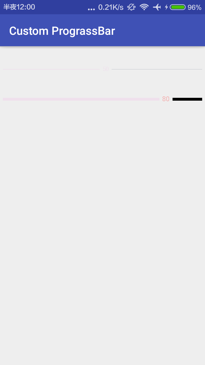
自定义绘制的PrograssBar的水平进度条如下 有刻度 刻度在中间显示
下面由代码实现:在values文件夹下建立attr.xml 放入要绘制进度条所需要的。分别是进度条字体①颜色和②大小,Prograss走过的条的③颜色和④高度,Prograss没有走过的条的⑤颜色和⑥高度,还有显示数值和进度条之间有间隔的空间⑦宽度。一共七个参数。
新建包View,并新建类class horizonalPrograssBarWithPrograss,如下:
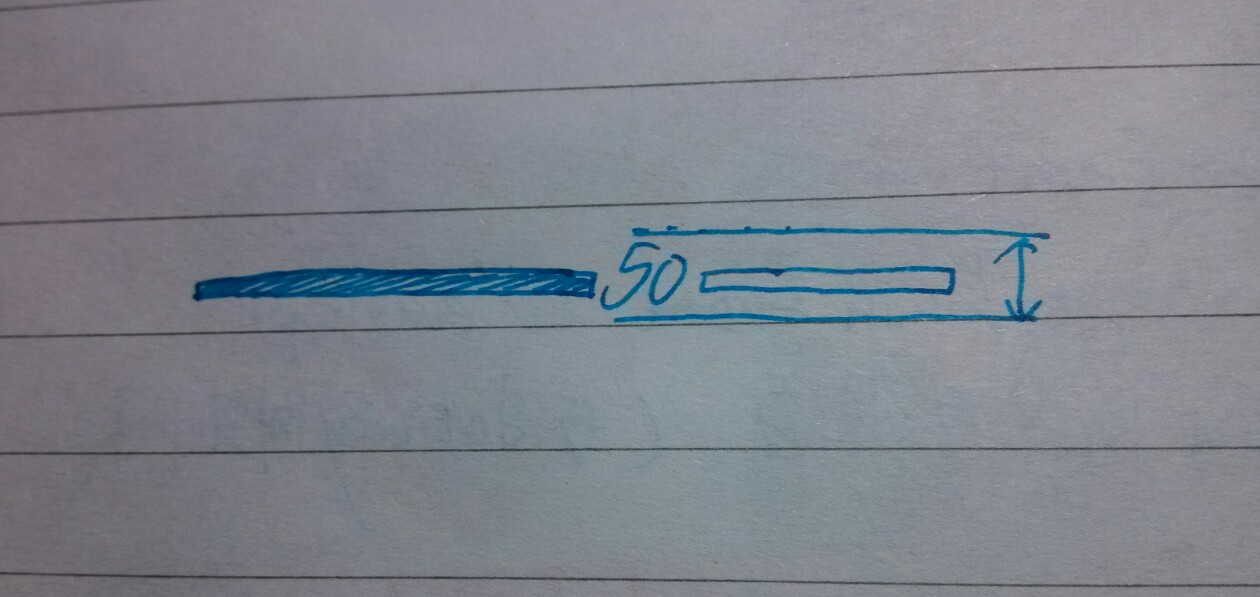
这是进度条的绘制完成了,上面进度条高度的测量,实际比较关键的是测量文字的高度,如图:
然后现在可以在activity_main.xml中定义并测试:
就如上面的,我们可以自定义进度条的属性,只需要添加这行:(这是在AS中)
Eclipse中应该要这么写(跟上ManiFeast中显示的包名):
如前面所示,第二个PrograssBar进行进度变化测试,在MainActivity中:用handler进行测试:
下面的代码自定义了圆形的进度条,样式与上面的相似,只不过是圆形的。
首先在attr.xml中继续添加:添加圆形需要的半径
在View包下新建class RoundPrograssBarWithPrograss,继承上面的水平进度条。
然后再activity_main.xml中可以使用了:
1.自定义属性的声明和获取;
2.测量onMeasure;
3.布局onLayout(ViewGroup);
4.绘制onDraw;
5.onTouchEvent;
6.onInterceptTouchEvent(ViewGroup);
7.状态的恢复与保存(与Activity生命周期有关);
自定义绘制的PrograssBar的水平进度条如下 有刻度 刻度在中间显示
下面由代码实现:在values文件夹下建立attr.xml 放入要绘制进度条所需要的。分别是进度条字体①颜色和②大小,Prograss走过的条的③颜色和④高度,Prograss没有走过的条的⑤颜色和⑥高度,还有显示数值和进度条之间有间隔的空间⑦宽度。一共七个参数。
<?xml version="1.0" encoding="utf-8"?>
<resources>

<!-- 声明-->
<attr name="prograss_unreach_color" format="color"></attr>
<attr name="prograss_unreach_height" format="dimension"></attr>
<attr name="prograss_reach_color" format="color"></attr>
<attr name="prograss_reach_height" format="dimension"></attr>
<attr name="text_color" format="color"></attr>
<attr name="text_size" format="dimension"></attr>
<attr name="prograss_text_offset" format="dimension"></attr>

<!-- 使用-->
<declare-styleable name="horizonalPrograssBarWithPrograss">
<attr name="prograss_unreach_color" ></attr>
<attr name="prograss_unreach_height" ></attr>
<attr name="prograss_reach_color" ></attr>
<attr name="prograss_reach_height" ></attr>
<attr name="text_color"></attr>
<attr name="text_size"></attr>
<attr name="prograss_text_offset" ></attr>

</declare-styleable>
</resources>
新建包View,并新建类class horizonalPrograssBarWithPrograss,如下:
package com.chase.view;

import android.content.Context;
import android.content.res.TypedArray;
import android.graphics.Canvas;
import android.graphics.Paint;
import android.util.AttributeSet;
import android.util.TypedValue;
import android.widget.ProgressBar;

import com.chase.cn.customprograssbar.R;

/**
* Created by Chase on 2016/11/29.
*/

public class horizonalPrograssBarWithPrograss extends ProgressBar {

//这里声明默认值
private static final int DEFAULT_TEXT_SIZE = 10;//sp
private static final int DEFAULT_TEXT_COLOR = 0xFFC00D1;
private static final int DEFAULT_COLOR_UNREACH = 0XFFD3D6DA;
private static final int DEFAULT_HEIGHT_UNREACH = 2;//dp
private static final int DEFAULT_COLOR_REACH = 0xFFC00D1;
private static final int DEFAULT_HRIGHT_REACH = 2;//dp
private static final int DEFAULT_TEXT_OFFSET = 10;//dp

//编写我们的值
protected int mTextSize = dp2px(DEFAULT_TEXT_SIZE);
protected int mTextColor = DEFAULT_TEXT_COLOR;
protected int mUnReachColor = DEFAULT_COLOR_UNREACH;
protected int mUnReachHeight = DEFAULT_HEIGHT_UNREACH;
protected int mReachColor = DEFAULT_COLOR_REACH;
protected int mReachHeight = DEFAULT_HRIGHT_REACH;
protected int mTextOffset = dp2px(DEFAULT_TEXT_OFFSET);

protected Paint mPaint = new Paint();
protected int mRealWidth; //进度条实际宽度

//2个参数法
public horizonalPrograssBarWithPrograss(Context context, AttributeSet attrs) {
this(context, attrs, 0);//2个参数继承3个参数的方法
}

public horizonalPrograssBarWithPrograss(Context context, AttributeSet attrs, int defStyleAttr) {
super(context, attrs, defStyleAttr);
obtainStyledAttrs(attrs);

}

//获取自定义属性
private void obtainStyledAttrs(AttributeSet attrs) {
TypedArray ta = getContext().obtainStyledAttributes(attrs, R.styleable.horizonalPrograssBarWithPrograss);

mTextSize = (int) ta.getDimension(R.styleable.horizonalPrograssBarWithPrograss_text_size, mTextSize);
mTextColor = ta.getColor(R.styleable.horizonalPrograssBarWithPrograss_text_color, mTextColor);
mTextOffset = (int) ta.getDimension(R.styleable.horizonalPrograssBarWithPrograss_prograss_text_offset, mTextOffset);
mUnReachColor = ta.getColor(R.styleable.horizonalPrograssBarWithPrograss_prograss_unreach_color, mUnReachColor);
mUnReachHeight = (int) ta.getDimension(R.styleable.horizonalPrograssBarWithPrograss_prograss_unreach_height, mUnReachHeight);
mReachColor = ta.getColor(R.styleable.horizonalPrograssBarWithPrograss_prograss_reach_color, mReachColor);
mReachHeight = (int) ta.getDimension(R.styleable.horizonalPrograssBarWithPrograss_prograss_reach_height, mReachHeight);

mPaint.setTextSize(mTextSize);
ta.recycle();
}

@Override
protected synchronized void onMeasure(int widthMeasureSpec, int heightMeasureSpec) {
//        int widthMode = MeasureSpec.getMode(widthMeasureSpec);//因为是水平进度条 默认宽度为用户的输入 所以不需要判断
int widthVal = MeasureSpec.getSize(widthMeasureSpec);

int height = measureHeight(heightMeasureSpec);

setMeasuredDimension(widthVal, height);//完成测量
//实际绘制区域的宽度
mRealWidth = getMeasuredWidth() - getPaddingLeft() - getPaddingRight();
}

//高度测量的方法
private int measureHeight(int heightMeasureSpec) {
int result = 0;
int mode = MeasureSpec.getMode(heightMeasureSpec);
int size = MeasureSpec.getSize(heightMeasureSpec);

if (mode == MeasureSpec.EXACTLY) {//精确值,用户给的精确值 如200dp marchparent
result = size;
} else {//否则宽度 是由文字的距离确定的
int textHeight = (int) (mPaint.descent() - mPaint.ascent());
result = getPaddingTop() //上边距
+ getPaddingBottom() //下边距
+ Math.max(Math.max(mReachHeight, mUnReachHeight), Math.abs(textHeight));//三者最大值
if (mode == MeasureSpec.AT_MOST) {
result = Math.min(result, size);
}
}

return result;
}

//1个参法
public horizonalPrograssBarWithPrograss(Context context) {
this(context, null);//继承两个参数的构造方法,当用户在使用时new的时候用,但是使用时一般是用两个参数的构造方法的
}

/**
*
下面是绘制进度条的方法
* @param canvas
*/
@Override
protected synchronized void onDraw(Canvas canvas) {
//        super.onDraw(canvas);
canvas.save();
canvas.translate(getPaddingLeft(), getHeight() / 2);//移动画布到 最左边 正中间

//判断是否需要绘制unReachBar
boolean noNeedUnReach = false;
//DrawReachBar如下:

//拿到文本宽度
String text = getProgress() + "";
int textWidth = (int) mPaint.measureText(text);

float ratio = getProgress() * 1.0f / getMax();
float prograssX = ratio * mRealWidth;
if (prograssX + textWidth > mRealWidth) {
prograssX = mRealWidth - textWidth;//防止进度条到100文本出去
noNeedUnReach = true;
}

float endX = prograssX - mTextOffset / 2;
if (endX > 0) {
mPaint.setColor(mReachColor);
mPaint.setStrokeWidth(mReachHeight);
canvas.drawLine(0, 0, endX, 0, mPaint);
}

//Draw Text
mPaint.setColor(mTextColor);
int y = (int) (-(mPaint.descent()+mPaint.ascent())/2);
canvas.drawText(text,prograssX,y,mPaint);

//Draw UnReachBar
if (!noNeedUnReach){
float start = prograssX + mTextOffset/2 +textWidth;
mPaint.setColor(mUnReachColor);
mPaint.setStrokeWidth(mReachHeight);
canvas.drawLine(start,0,mRealWidth,0,mPaint);
}

canvas.restore();
}

//转换方法dp 2 px
protected int dp2px(int dpVal) {
return (int) TypedValue.applyDimension(TypedValue.COMPLEX_UNIT_DIP,
dpVal, getResources().getDisplayMetrics());
}

protected int sp2px(int spVal) {
return (int) TypedValue.applyDimension(TypedValue.COMPLEX_UNIT_SP,
spVal, getResources().getDisplayMetrics());
}

}
这是进度条的绘制完成了,上面进度条高度的测量,实际比较关键的是测量文字的高度,如图:
然后现在可以在activity_main.xml中定义并测试:
<?xml version="1.0" encoding="utf-8"?>
<ScrollView xmlns:android="http://schemas.android.com/apk/res/android"
xmlns:chase="http://schemas.android.com/apk/res-auto"
android:id="@+id/activity_main"
android:layout_width="match_parent"
android:layout_height="match_parent">

<LinearLayout
android:layout_width="match_parent"
android:layout_height="wrap_content"
android:orientation="vertical">

<com.chase.view.horizonalPrograssBarWithPrograss
android:layout_width="match_parent"
android:layout_height="wrap_content"
android:layout_marginTop="30dp"
android:padding="5dp"
android:progress="50" />

<com.chase.view.horizonalPrograssBarWithPrograss
android:id="@+id/prograss2"
chase:text_color="#44ff0000"
chase:prograss_unreach_color="#000"
chase:prograss_reach_height="5dp"
chase:prograss_unreach_height="5dp"
chase:text_size="10sp"
android:layout_width="match_parent"
android:layout_height="wrap_content"
android:layout_marginTop="30dp"
android:padding="5dp"
android:progress="0" />

</LinearLayout>
</ScrollView>
就如上面的,我们可以自定义进度条的属性,只需要添加这行:(这是在AS中)
xmlns:chase="http://schemas.android.com/apk/res-auto"
Eclipse中应该要这么写(跟上ManiFeast中显示的包名):
xmlns:chase="http://schemas.android.com/apk/com.chase.cn.customprograssbar"
如前面所示,第二个PrograssBar进行进度变化测试,在MainActivity中:用handler进行测试:
package com.chase.cn.customprograssbar;

import android.os.Bundle;
import android.os.Handler;
import android.os.Message;
import android.support.v7.app.AppCompatActivity;

import com.chase.view.horizonalPrograssBarWithPrograss;

public class MainActivity extends AppCompatActivity {

private horizonalPrograssBarWithPrograss mPrograss;

private static final int MSG_UPDATE = 0x111;
private Handler handler = new Handler(){
@Override
public void handleMessage(Message msg) {
int prograss = mPrograss.getProgress();
mPrograss.setProgress(++prograss);
if (prograss>=100){
handler.removeMessages(MSG_UPDATE);
}else {
handler.sendEmptyMessageDelayed(MSG_UPDATE,100);
}
}
};

@Override
protected void onCreate(Bundle savedInstanceState) {
super.onCreate(savedInstanceState);
setContentView(R.layout.activity_main);
mPrograss = (horizonalPrograssBarWithPrograss) findViewById(R.id.prograss2);
handler.sendEmptyMessage(MSG_UPDATE);
}
}
下面的代码自定义了圆形的进度条,样式与上面的相似,只不过是圆形的。
首先在attr.xml中继续添加:添加圆形需要的半径
<declare-styleable name="RoundPrograssBarWithPrograss">
<attr name="radius" format="dimension" ></attr>
</declare-styleable>
在View包下新建class RoundPrograssBarWithPrograss,继承上面的水平进度条。
package com.chase.view;

import android.content.Context;
import android.content.res.TypedArray;
import android.graphics.Canvas;
import android.graphics.Paint;
import android.graphics.RectF;
import android.util.AttributeSet;

import com.chase.cn.customprograssbar.R;

/**
* Created by Chase on 2016/11/30.
*/

public class RoundPrograssBarWithPrograss extends horizonalPrograssBarWithPrograss {

private int mRadius = dp2px(30);

private int mMaxPaintWidth;

public RoundPrograssBarWithPrograss(Context context, AttributeSet attrs, int defStyleAttr) {
super(context, attrs, defStyleAttr);

mReachHeight = (int) (mUnReachHeight * 2.5f);

TypedArray ta = getContext().obtainStyledAttributes(attrs, R.styleable.RoundPrograssBarWithPrograss);
mRadius = (int) ta.getDimension(R.styleable.RoundPrograssBarWithPrograss_radius, mRadius);
ta.recycle();

//设置画笔属性
mPaint.setStyle(Paint.Style.STROKE);
mPaint.setAntiAlias(true);//抗锯齿
mPaint.setDither(true);//防抖动
mPaint.setStrokeCap(Paint.Cap.ROUND);//设置连接处为弧形
}

public RoundPrograssBarWithPrograss(Context context, AttributeSet attrs) {
this(context, attrs, 0);
}

public RoundPrograssBarWithPrograss(Context context) {
this(context, null);
}

@Override
protected synchronized void onMeasure(int widthMeasureSpec, int heightMeasureSpec) {
super.onMeasure(widthMeasureSpec, heightMeasureSpec);

mMaxPaintWidth = Math.max(mReachHeight, mUnReachHeight);//最大画笔宽度 取进度条 unreach和reach的最大
//设置期望值,默认四个Paddding一致
int expect = mRadius * 2 + mMaxPaintWidth + getPaddingLeft() + getPaddingRight();

//用系统提供的方法来测量用户给出的数据
int width = resolveSize(expect, widthMeasureSpec);
int height = resolveSize(expect, heightMeasureSpec);

int realWidth = Math.min(width, height);//取二者最小值,防止宽高取得不一致、

mRadius = (realWidth - getPaddingLeft() - getPaddingRight() - mMaxPaintWidth) / 2;

setMeasuredDimension(realWidth, realWidth);
}

@Override
protected synchronized void onDraw(Canvas canvas) {
String text = getProgress() + "%";
float textWidth = mPaint.measureText(text);
float textHeight = (mPaint.descent() + mPaint.ascent()) / 2;

canvas.save();
canvas.translate(getPaddingLeft() + mMaxPaintWidth / 2, getPaddingTop() + mMaxPaintWidth / 2);
mPaint.setStyle(Paint.Style.STROKE);
//Draw unReachBar
mPaint.setColor(mUnReachColor);
mPaint.setStrokeWidth(mUnReachHeight);
canvas.drawCircle(mRadius,mRadius,mRadius,mPaint);
//Draw ReachBar
mPaint.setColor(mReachColor);
mPaint.setStrokeWidth(mReachHeight);
float sweepAngle = getProgress()*1.0f/getMax()*360; //算出弧度
canvas.drawArc(new RectF(0,0,mRadius*2,mRadius*2),0,sweepAngle,false,mPaint);
//Draw Text
mPaint.setColor(mTextColor);
mPaint.setStyle(Paint.Style.FILL);
canvas.drawText(text,mRadius-textWidth/2,mRadius-textHeight,mPaint);
canvas.restore();
}
}
然后再activity_main.xml中可以使用了:
<?xml version="1.0" encoding="utf-8"?>
<ScrollView xmlns:android="http://schemas.android.com/apk/res/android"
xmlns:chase="http://schemas.android.com/apk/res-auto"
android:id="@+id/activity_main"
android:layout_width="match_parent"
android:layout_height="match_parent">

<LinearLayout
android:layout_width="match_parent"
android:layout_height="wrap_content"
android:orientation="vertical">

<com.chase.view.horizonalPrograssBarWithPrograss
android:layout_width="match_parent"
android:layout_height="wrap_content"
android:layout_marginTop="30dp"
android:padding="5dp"
android:progress="50" />

<com.chase.view.horizonalPrograssBarWithPrograss
android:id="@+id/prograss2"
chase:text_color="#44ff0000"
chase:prograss_unreach_color="#000"
chase:prograss_reach_height="5dp"
chase:prograss_unreach_height="5dp"
chase:text_size="10sp"
android:layout_width="match_parent"
android:layout_height="wrap_content"
android:layout_marginTop="30dp"
android:padding="5dp"
android:progress="0" />

<com.chase.view.RoundPrograssBarWithPrograss
android:id="@+id/prograss3"
chase:text_color="#44ff0000"
chase:radius="25dp"
chase:prograss_reach_height="5dp"
chase:prograss_unreach_height="5dp"
chase:text_size="10sp"
android:layout_width="match_parent"
android:layout_height="wrap_content"
android:layout_marginTop="30dp"
android:padding="5dp"
android:progress="30" />

<com.chase.view.RoundPrograssBarWithPrograss
android:id="@+id/prograss4"
chase:text_color="#44ff0000"
chase:radius="80dp"
chase:prograss_reach_height="5dp"
chase:prograss_unreach_height="5dp"
chase:text_size="10sp"
android:layout_width="match_parent"
android:layout_height="wrap_content"
android:layout_marginTop="30dp"
android:padding="5dp"
android:progress="20" />

</LinearLayout>
</ScrollView>

相关文章推荐
- Android-自定义水波纹刻度进度条
- Android中自定义Adapter实现ListView动态刷新进度条
- Android自定义标题栏:显示网页加载进度
- Android ProgressBar自定义图片进度,自定义渐变色进度条
- android 进度条seekbar样式自定义
- Android自定义进度条颜色
- Android中自定义SeekBar的背景颜色,进度条颜色,以及滑块的图片
- Android中自定义SeekBar的背景颜色,进度条颜色,以及滑块的图片
- 自定义实现圆形播放进度条(android,飞一般的感觉)
- Android--自定义标题栏之显示网页加载进度
- Android 自定义进度条
- Android中自定义Adapter实现ListView动态刷新进度条
- Android系列学习讲座之三--App自动更新之自定义进度视图和内部存储
- Android中自定义SeekBar的背景颜色,进度条颜色,以及滑块的图片
- 自定义实现圆形播放进度条(android,飞一般的感觉)
- Android组件之自定义下载进度条
- Android学习系列(3)--App自动更新之自定义进度视图和内部存储
- android自定义Dialog实现文件下载和下载进度
- Android自定义进度条
- Android那些事儿之自定义进度条