学习android必经之路自定义View
2016-11-22 10:52
211 查看
ps: 文章较长适合电脑阅读
首先感谢
maimingliang的开源项目,让我学到了很多。源码作者的github
学习Android一定会遇到产品上需要通过自定义View才能实现的控件,或者说为了提高编码效率通过自定View写一个公用的控件方便以后使用。自定义View也是学习Android必须要掌握的知识点之一。本篇文章将分析我在github上看到的一个开源的控件旨在总结一下自己学习自定义View的收获以及通过讲解让自己更加深刻的理解整个实现的过程。
这里是
BaseItemLayout项目的github地址
这里顺便推荐一款chrome的插件方便在线浏览github叫
Octotree在chrome应用商店里面可以搜索到
使用该插件你就能够通过树形文件结构快速的跳转到你想查看的文件了。
简单的介绍一下
BaseItemLayout项目,就是自定义项目中常用到的列表布局,大家自行脑补微信
我的页面的列表项。通过自定义该布局方便以后快速的添加此布局提高开发效率。
下面我们就来分析如何实现这个自定义View
先看一下整体的结构:
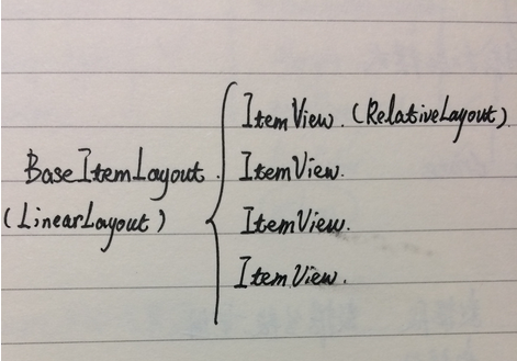
在
BaseItemLayout中管理着许多
ItemView,所以这里我们其实是需要自定义两个View。一个是
BaseItemLayout另外一个就是列表项
ItemView。
自定义 ItemView

如上图,
ItemView中有三个控件–行图标、行标题、箭头。
Step 1 创建ItemView
这里我们创建自定义View将继承RelativeLayout。
总体结构就是两大部分:
1. 初始化
ItemView的三个控件。
2. 为这些控件添加一些控制样式的方法如:位置、大小、文本颜色……
代码如下:
public class ItemView extends RelativeLayout {

private Context context;

private ImageView icon;
private TextView title;
private ImageView arrow;

private LayoutParams iconLp;
private LayoutParams titleLp;
private LayoutParams arrowLp;

public ItemView(Context context) {
this(context, null);
}

public ItemView(Context context, AttributeSet attrs) {
this(context, attrs, 0);
}

public ItemView(Context context, AttributeSet attrs, int defStyleAttr) {
super(context, attrs, defStyleAttr);
initView(context);
}

public void initView(Context context) {

this.context = context;

icon = new ImageView(context);
title = new TextView(context);
arrow = new ImageView(context);

iconLp = new LayoutParams(ViewGroup.LayoutParams.WRAP_CONTENT,
ViewGroup.LayoutParams.WRAP_CONTENT);
iconLp.addRule(RelativeLayout.CENTER_VERTICAL, RelativeLayout.TRUE);
addView(icon, iconLp);

titleLp = new LayoutParams(ViewGroup.LayoutParams.WRAP_CONTENT,
ViewGroup.LayoutParams.WRAP_CONTENT);
titleLp.addRule(RelativeLayout.CENTER_VERTICAL, RelativeLayout.TRUE);
titleLp.addRule(RelativeLayout.RIGHT_OF, R.id.iv_icon);
addView(title, titleLp);

arrowLp = new LayoutParams(ViewGroup.LayoutParams.WRAP_CONTENT,
ViewGroup.LayoutParams.WRAP_CONTENT);
arrowLp.addRule(RelativeLayout.CENTER_VERTICAL, RelativeLayout.TRUE);
arrowLp.addRule(RelativeLayout.ALIGN_PARENT_RIGHT, RelativeLayout.TRUE);
addView(arrow, arrowLp);
}

//---------为控件添加一些控制其属性的方法----------

//设置控件的相关属性(icon title arrow)
//setIconStyle() setTitleStyle() setArrowStyle()
//setLayoutParams() 设置ItemView列表项的高度
}
上面代码中分别定义好了
icon
title
arrow这三个控件在
ItemView中的位置。
在代码的最后添加了一些控制这三个控件的一些方法(此处省略具体代码)。到目前为止,我们就在
ItemView上面画出来了这三个控件以及规定好了他们大致的位置。
在自定义View中,需要重写
ItemView的构造方法,注意这三个构造方法中的前两个。第一个构造方法是调用的第二个构造方法,第二个则是调用的第三个构造方法。
Step 2 为ItemView新增控制样式的方法
写好了ItemView的控件,我们再来添加一些控制其控件样式的方法。
/**
* 设置图标样式
*
* @param iconMarginLeft 图标距离itemView左边的距离
* @param resId          图标资源
* @param height         图标的高度
* @param width          图标的宽度
*/
public void setIconStyle(int iconMarginLeft, int resId, int height, int width) {

// set icon margin left itemLayout
iconLp.leftMargin = DensityUtil.dip2px(context, iconMarginLeft);
// set pic for icon
icon.setImageResource(resId);
// set icon dimen
ViewGroup.LayoutParams layoutParams = icon.getLayoutParams();
layoutParams.height = height;
layoutParams.width = width;

icon.setLayoutParams(layoutParams);
}

/**
* 设置标题样式
*
* @param titleMarginLeft 标题距离图标左边的距离
* @param text            标题的内容
* @param textColor       标题的颜色
* @param textSize        标题文字的大小
*/
public void setTitleStyle(int titleMarginLeft, String text, int textColor, int textSize) {

// set title margin left
titleLp.leftMargin = DensityUtil.dip2px(context, titleMarginLeft);
// set title size and content
title.setText(text);
title.setTextColor(textColor);
title.setTextSize(DensityUtil.dip2px(context, textSize));
}

/**
* 设置箭头的样式
*
* @param isShow           是否显示箭头
* @param arrowMarginRight 箭头距离ItemView右边的距离
* @param resId            箭头图片资源
* @param height           箭头的高度
* @param width            箭头的宽度
*/
public void setArrowStyle(boolean isShow, int arrowMarginRight, int resId, int height, int width) {

// if show arrow
if (isShow) {
arrow.setVisibility(VISIBLE);
} else {
arrow.setVisibility(GONE);
}

arrowLp.rightMargin = DensityUtil.dip2px(context, arrowMarginRight);

// set image resource and dimen
arrow.setImageResource(resId);
ViewGroup.LayoutParams layoutParams = arrow.getLayoutParams();
layoutParams.height = height;
layoutParams.width = width;

arrow.setLayoutParams(layoutParams);
}

/**
* set ItemView height
* @param itemHeight
*/
public void setItemLayoutParams(int itemHeight) {
ViewGroup.LayoutParams layoutParams = new ViewGroup.LayoutParams(
ViewGroup.LayoutParams.MATCH_PARENT,
ViewGroup.LayoutParams.MATCH_PARENT);
layoutParams.height = DensityUtil.dip2px(context, itemHeight);
setLayoutParams(layoutParams);
}
至此,我们已经创建好的了
ItemView这个自定义控件。
Step 3 为ItemView添加自定义属性
为了能够在XML中通过属性来设置
ItemView控件的相关属性,就像我们平常用系统中的属性如
android:layout_width="match_parent"一样我们需要创建一个
attrs文件来定义需要设置的属性。
创建
attrs属性文件

<resources>
<declare-styleable name="ItemAttrs">

<attr name="item_height_jngoogle" format="integer"/>
<attr name="text_size_jngoogle" format="integer"/>
<attr name="text_color_jngoogle" format="color"/>
<attr name="icon_marginLeft_jngoogle" format="integer"/>
<attr name="title_marginLeft_jngoogle" format="integer"/>
<attr name="arrow_marginRight_jngoogle" format="integer"/>
<attr name="lineColor_jngoogle" format="color"/>
<attr name="isShow_jngoogle" format="boolean"/>

</declare-styleable>
这里设置了:
1.
ItemView的行高
2. 标题字体的大小以及颜色
3. 图标、标题、箭头的位置
4.
ItemView之间分割线的颜色
5. 是否显示箭头
OK,到这里我们已经把
ItemView全部创建好了,现在就可以在你想使用的布局中使用我们自定义的View。
但是在实际的开发使用中,我们一般用到这种列表项的布局不会是只画一个,一般来说是多个所以为了更加方便的管理和更加快速的添加。我们又创建一个自定义View
BaseItemLayout来管理多个
ItemView。
自定义BaseItemLayout
首先我们整理一下思路,我们要在BaseItemLayout中做什么事情。
1. 提供设置
ItemView样式参数的set方法。
2. 绘制并把
ItemView添加到
BaseItemLayout中。
Step 1 初始化BaseItemLayout
同样的步骤我们首先要对BaseItemLayout初始化
public class BaseItemLayout extends LinearLayout {

private Context context;

private List<Integer> iconList = new ArrayList<>();
private List<String> titleList = new ArrayList<>();

//init icon title arrow attribute
private int iconHeight = 24;
private int iconWidth = 24;
private int iconMarginLeft = 10;

private int textSize = 14; // 14dp
private int textColor = 0xFF666666;
private int titleMarginLeft = 10; // 10dp

private int arrowResId = 0;
private int arrowHeight = 24;
private int arrowWidth = 16;
private int arrowMarginRight = 10;
private boolean isShow = false; // set arrow is show

// divide line color
private int lineColor = 0xff303F9F;

// item height
private int itemHeight = 40;

// distance between items
private SparseArray<Integer> itemsMarginArray = new SparseArray<>();
private static int DEFAOUT_ITEMS_MARGIN = 10;
private static int ZERO_ITEMS_MARGIN = 0;

public BaseItemLayout(Context context) {
this(context, null);
}

public BaseItemLayout(Context context, AttributeSet attrs) {
this(context, attrs, 0);
}

public BaseItemLayout(Context context, AttributeSet attrs, int defStyleAttr) {
super(context, attrs, defStyleAttr);

TypedArray a = context.obtainStyledAttributes(attrs, R.styleable.ItemAttrs);

iconMarginLeft = a.getInteger(R.styleable.ItemAttrs_icon_marginLeft_jngoogle, iconMarginLeft);
textSize = a.getInteger(R.styleable.ItemAttrs_text_size_jngoogle, textSize);
textColor = a.getInteger(R.styleable.ItemAttrs_text_color_jngoogle, textColor);
titleMarginLeft = a.getInteger(R.styleable.ItemAttrs_title_marginLeft_jngoogle, titleMarginLeft);
arrowMarginRight = a.getInteger(R.styleable.ItemAttrs_arrow_marginRight_jngoogle, arrowMarginRight);
lineColor = a.getInteger(R.styleable.ItemAttrs_lineColor_jngoogle, lineColor);
itemHeight = a.getInteger(R.styleable.ItemAttrs_item_height_jngoogle, itemHeight);
isShow = a.getBoolean(R.styleable.ItemAttrs_isShow_jngoogle, isShow);

a.recycle();
init(context);
}

// create()方法 -- 绘制BaseItemLayout
// addItem()方法 -- 添加 itemView 到 BaseItemLayout 中
//一些参数值得set方法
//ex:setIconWidth() 设置图标的宽度
}
注意
TypedArray a = context.obtainStyledAttributes(attrs, R.styleable.ItemAttrs);
得到当前
BaseItemLayout的属性数组,之后我们在
XML中设置的值就可以作为参数在方法中使用。
特别提醒别忘记
a.recycle();
Step 2 绘制BaseItemLayout,把ItemView添加到BaseItemLayout中
步骤:1. 设置好
ItemView的控件样式。
2. 依次把
ItemView添加到
BaseItemLayout中。
/**
* create baseItemLayout
*/
public void create() {

if (iconList.isEmpty()) {
throw new RuntimeException("iconList is null");
}

if (titleList.isEmpty()) {
throw new RuntimeException("titleList is null");
}

if (iconList.size() != titleList.size()) {
throw new RuntimeException("params not match, icon's sum should be equal title's sum");
}

for (int i = 0; i < iconList.size(); i++) {

ItemView itemView = new ItemView(context);
itemView.setIconStyle(iconMarginLeft, iconList.get(i), iconHeight, iconWidth);
itemView.setTitleStyle(titleMarginLeft, titleList.get(i), textColor, textSize);
itemView.setArrowStyle(isShow, arrowMarginRight, arrowResId, arrowHeight, arrowWidth);
itemView.setItemLayoutParams(itemHeight);// set item height
addItem(itemView, i);
}
}
这里通过
setIconStyle()
setTitleStyle()
setArrowStyle()
setItemLayoutParams()
这四个方法设置好
ItemView中控件的样式。
然后通过
addItem()方法将
ItemView添加到
BaseItemLayout
addItem()方法:
/**
* 添加ItemView布局到baseItemLayout
*
* @param itemView
* @param pos      the position of current itemView
*/
private void addItem(ItemView itemView, int pos) {

if (itemsMarginArray.get(pos) != null) {

if (itemsMarginArray.get(pos) > 0) {
addView(createLineView(itemsMarginArray.get(pos)));
}

} else {
addView(createLineView(DEFAOUT_ITEMS_MARGIN));
}

addView(itemView);
addView(createLineView(ZERO_ITEMS_MARGIN));// item的下面的分割线
}
这里按照 上分割线 -> itemView -> 下分割线 的顺序绘制。这样就把
ItemView绘制到
BaseItemLayout中。
剩下的就是提供图片、文字、箭头的方法,设置样式的方法,此处省略。
设置样式的方法
至此,已经完成了
BaseItemLayout的自定义。最后我们来看一下如何使用自定义的View
使用方法
public class MainActivity extends AppCompatActivity {

private BaseItemLayout baseItemLayout;

@Override
protected void onCreate(Bundle savedInstanceState) {
super.onCreate(savedInstanceState);
setContentView(R.layout.activity_main);

baseItemLayout = (BaseItemLayout) findViewById(R.id.base_item_layout);
initData();
}

private void initData() {
List<Integer> iconList = new ArrayList<>();
List<String> titleList = new ArrayList<>();

titleList.add("photo");
titleList.add("favorite");
titleList.add("wallet");
titleList.add("cardCase");
titleList.add("settings");

iconList.add(R.mipmap.xc);
iconList.add(R.mipmap.sc);
iconList.add(R.mipmap.qb);
iconList.add(R.mipmap.kb);
iconList.add(R.mipmap.sz);

baseItemLayout.setTitleList(titleList)
.setIconList(iconList)
.setArrowIsShow(true)
.setArrowResId(R.mipmap.img_find_arrow)
.setItemsMargin(0,0)
.create();
}
}
整个自定义View的流程就是这么多了,其中一些具体的方法需要读者自行去阅读。总体来说自定义View的步骤:
1. 写好自定义View的布局(也可以省略,在java中绘制出来)。
2. 创建自定义View, 设置好相对应的方法。

相关文章推荐
- Android学习小结(三)——自定义圆角ImageView控件
- android 学习笔记(1) ExpandableListActivity 自定义view
- Android TextView标点符号换行问题(顺便学习Android自定义View)
- Android总结笔记01:自定义View学习(一)
- Android学习:自定义ViewGroup方法总结
- Android学习备忘020——android自定义ImageView实现缩放,回弹效果
- Apidemo学习 android 自定义View
- Android 学习之--自定义ViewGroup
- 【Android开发学习】自定义View
- android学习_自定义View
- Android文档学习08_自定义view
- Android学习开发 之 自定义view
- Android学习札记47:TextView显示Html类解析的网页和图片及自定义标签
- Android学习小demo(1)自定义View
- Android学习小demo(2)自定义ViewGroup
- Android学习小demo(3)自定义ViewGroup 利用 scroller 实行屏幕滚动
- Android学习自定义View(五)——自定义ViewGroup及其onMeasure()的理解
- Android学习自定义View(五)——自定义ViewGroup及其onMeasure()的理解
- Android学习自定义View(四)——继承控件(滑动时ListView的Item出现删除按钮)
- Android学习自定义View(四)——继承控件(滑动时ListView的Item出现删除按钮)