【移动端】使用REM进行的响应式布局
2016-11-16 08:23
267 查看
工具ViewtoREM:PX转换到REM(自动预处理)
REM的定义:
REM与EM、PX的区别:
REM支持的浏览器:
支持的浏览器还是蛮多的,比如:Mozilla Firefox 3.6+、Apple Safari 5+、Google Chrome、IE9+和Opera11+。只是可怜的IE6-8无法支持。
REM使用方法示例:
1.html中默认的
2.以设计宽度为750px为例,那么定义
3.定义页面中的尺寸,就是: 宽度/50 rem(比例为15)。例如:设计稿中dom(20px)的尺寸为:20px/50=0.4rem
4.针对不同屏幕尺寸,按同比例设置
5.例如:
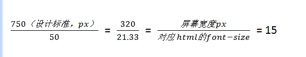
屏幕宽度为750px,则html设置的font-size为:750/15 = 50,设计稿中dom(20px)的尺寸为:20px/50=0.4rem,1rem = 50px
屏幕宽度为320px,则html设置的font-size为:320/15 = 21.33….,设计稿中dom(20px)的尺寸依然为:20px/50=0.4rem,1rem = 320/750*50px
如下比例关系:
JS动态设置width:
CSS固定样式:以下场景包含了移动端设备绝大多数屏幕尺寸。
详细:字体rem的使用:
http://www.w3cplus.com/css3/define-font-size-with-css3-rem
http://ued.taobao.org/blog/2013/05/rem-font-size/
详细:结合Media Query和REM实现响应式布局:
http://isux.tencent.com/web-app-rem.html
范例:
http://m.dx.com/
REM的定义:
rem是相对于根元素
<html>来设置字体大小的,这样就意味着,我们只需要在根元素确定一个参考值,在根元素中设置多大的字体,这完全可以根据您自己的需求。
REM与EM、PX的区别:
PX:像素,比较精确的单位,但不好做响应式布局
EM:以父节点font-size大小为参考点,标准不统一,容易造成混乱
REM支持的浏览器:
支持的浏览器还是蛮多的,比如:Mozilla Firefox 3.6+、Apple Safari 5+、Google Chrome、IE9+和Opera11+。只是可怜的IE6-8无法支持。
REM使用方法示例:
1.html中默认的
font-size:16px; 也就是 1rem = 16px
2.以设计宽度为750px为例,那么定义
font-size:50px; 那么 1rem = 50px,比例为:750/50=15
3.定义页面中的尺寸,就是: 宽度/50 rem(比例为15)。例如:设计稿中dom(20px)的尺寸为:20px/50=0.4rem
4.针对不同屏幕尺寸,按同比例设置
font-size(比例仍为15)。相当于1rem 变成对应大小(
font-size变小多少,
1rem就同比例变小多少)。
5.例如:
屏幕宽度为750px,则html设置的font-size为:750/15 = 50,设计稿中dom(20px)的尺寸为:20px/50=0.4rem,1rem = 50px
屏幕宽度为320px,则html设置的font-size为:320/15 = 21.33….,设计稿中dom(20px)的尺寸依然为:20px/50=0.4rem,1rem = 320/750*50px
如下比例关系:
JS动态设置width:
<script>
(function (doc, win) {
var docEl = doc.documentElement,
resizeEvt = 'orientationchange' in window ? 'orientationchange' : 'resize',
recalc = function () {
var clientWidth = docEl.clientWidth;
if (!clientWidth) return;
docEl.style.fontSize = 20 * (clientWidth / 320) + 'px';
};

if (!doc.addEventListener) return;
win.addEventListener(resizeEvt, recalc, false);
doc.addEventListener('DOMContentLoaded', recalc, false);
})(document, window);
</script>
CSS固定样式:以下场景包含了移动端设备绝大多数屏幕尺寸。
html{font-size:50px;}
body{font-size:24px;}
@media screen and (min-width:320px){
html{font-size:21.333333333333332px;}
body{font-size:12px;}
}
@media screen and (min-width:360px){
html{font-size:24px;}
body{font-size:12px;}
}
@media screen and (min-width:375px){
html{font-size:25px;}
body{font-size:12px;}
}
@media screen and (min-width:384px){
html{font-size:25.6px;}
body{font-size:14px;}
}
@media screen and (min-width:400px){
html{font-size:26.666666666666668px;}
body{font-size:14px;}
}
@media screen and (min-width:414px){
html{font-size:27.6px;}
body{font-size:14px;}
}
@media screen and (min-width:424px){
html{font-size:28.266666666666667px;}
body{font-size:14px;}
}
@media screen and (min-width:480px){
html{font-size:32px;}
body{font-size:15.36px;}
}
@media screen and (min-width:540px){
html{font-size:36px;}
body{font-size:17.28px;}
}
@media screen and (min-width:720px){
html{font-size:48px;}
body{font-size:23.04px;}
}
@media screen and (min-width:750px){
html{font-size:50px;}
body{font-size:24px;}
}
详细:字体rem的使用:
http://www.w3cplus.com/css3/define-font-size-with-css3-rem
http://ued.taobao.org/blog/2013/05/rem-font-size/
详细:结合Media Query和REM实现响应式布局:
http://isux.tencent.com/web-app-rem.html
范例:
http://m.dx.com/

相关文章推荐
- web移动端CSS使用rem单位设置font-size自适应
- 关于使用rem单位,calc()进行自适应布局
- 使用rem来开发你的移动端网站
- 使用rem实现移动端适配的简单方法
- 使用rem来开发你的移动端网站
- 移动端 rem字体的使用demo
- 3分钟读懂移动端rem使用方法
- 使用Egret开发的HTML5项目,使用本地电脑作为服务器进行移动端调试流程
- 移动端使用rem适配及相关问题
- 使用Ionic进行移动端APP开发
- 使用MQTT在移动端进行消息推送
- 如何使用 UC浏览器开发者版 进行移动端调试
- 使用rem设计移动端自适应页面二(转载)
- 使用BootStrap进行响应式布局案例
- 移动端web开发filter:blur()样式进行模糊处理使用心得
- 使用Firefox user agent进行移动端网页测试
- 使用Firefox user agent进行移动端网页测试
- 响应式布局之尺寸单位rem使用
- 移动端rem布局背景图片使用以及sprite雪碧图
- 移动端布局之REM,以及实际使用总结