Web开发(初级)- 常用css总结,方便查询
2016-11-11 22:15
471 查看
一些常用css总结,方便查询
1. 颜色属性: color HEX(十六进制色:color: #FFFF00 --> 缩写:#FF0)RGB(红绿蓝,使用方式:color:rgb(255,255,0)或者color:rgb(100%,100%,0%))
RGBA(红绿蓝透明度,A是透明度在0~1之间取值。使用方式:color:rgba(255,255,0,0.5))
HSL(CSS3有效,H表示色调,S表示饱和度,L表示亮度,使用方式:color:hsl(360,100%,50%))
HSLA(和HSL相似,A表示Alpha透明度,取值0~1之间。)
transparent全透明,使用方式:color: transparent;
opacity元素的透明度,语法:opacity: 0.5;
属性值在0.0到1.0范围内,0表示透明,1表示不透明。
filter滤镜属性(只适用于早期的IE浏览器,语法:filter:alpha(opacity:20);)。
2. 字体属性: font-style: 用于规定斜体文本normal 文本正常显示
italic 文本斜体显示
oblique 文本倾斜显示
font-weight: 设置文本的粗细normal(默认)
bold(加粗)
bolder(相当于<strong>和<b>标签)
lighter (常规)
100 ~ 900 整百(400=normal,700=bold)
font-size: 设置字体的大小默认值:medium
<absolute-size>可选参数值:xx-small、 x-small、 small、 medium、 large、 x-large、 xx-large
<relative-size>相对于父标签中字体的尺寸进行调节。可选参数值:smaller、 larger
<percentage>百分比指定文字大小。
<length>用长度值指定文字大小,不允许负值。
font-family:字体名称使用逗号隔开多种字体(优先级从前向后,如果系统中没有找到当前字体,则往后面寻找)
font[b]:简写属性[/b]语法:font:字体大小/行高 字体;(字体要在最后)
3. 文本属性: white-space: 设置元素中空白的处理方式normal:默认处理方式。
pre:保留空格,当文字超出边界时不换行
nowrap:不保留空格,强制在同一行内显示所有文本,直到文本结束或者碰到br标签
pre-wrap:保留空格,当文字碰到边界时换行
pre-line:不保留空格,保留文字的换行,当文字碰到边界时换行
direction: 规定文本的方向 ltr 默认,文本方向从左到右。
rtl 文本方向从右到左。
text-align: 文本的水平对齐方式 left
center
right
line-height: 文本行高normal 默认
vertical-align: [b]文本所在行高的垂直对齐方式[/b]baseline 默认
sub 垂直对齐文本的下标,和<sub>标签一样的效果
super 垂直对齐文本的上标,和<sup>标签一样的效果
top 对象的顶端与所在容器的顶端对齐
text-top 对象的顶端与所在行文字顶端对齐
middle 元素对象基于基线垂直对齐
bottom 对象的底端与所在行的文字底部对齐
text-bottom 对象的底端与所在行文字的底端对齐
text-indent: 文本缩进 letter-spacing: 添加字母之间的空白 word-spacing: 添加每个单词之间的空白 text-transform: 属性控制文本的大小写capitalize 文本中的每个单词以大写字母开头。
uppercase 定义仅有大写字母。
lowercase 定义仅有小写字母。
text-overflow: 文本溢出样式clip 修剪文本。
ellipsis 显示省略符号...来代表被修剪的文本。
string 使用给定的字符串来代表被修剪的文本。
text-decoration: 文本的装饰none 默认。
underline 下划线。
overline 上划线。
line-through 中线。
text-shadow:文本阴影第一个参数是左右位置
第二个参数是上下位置
第三个参数是虚化效果
第四个参数是颜色
text-shadow: 5px 5px 5px #888;
word-wrap:自动换行word-wrap: break-word;
4. 背景属性 [b]背景颜色[/b] background-image 设置图像为背景url("http://images.cnblogs.com/cnblogs_com/suoning/845162/o_ns.png"); 图片地址
background-image:linear-gradient(green,blue,yellow,red,black); 颜色渐变效果
background-position 设置背景图像的位置坐标background-position: center center; 图片置中,x轴center,y轴center
1px -195px 截取图片某部分,分别代表坐标x,y轴
background-repeat 设置背景图像不重复平铺
no-repeat 设置图像不重复,常用
round 自动缩放直到适应并填充满整个容器
space 以相同的间距平铺且填充满整个容器
background-attachment 背景图像是否固定或者随着页面的其余部分滚动 background 简写background: url("o_ns.png") no-repeat 0 -196px;
background: url("o_ns.png") no-repeat center bottom 15px;
background: url("o_ns.png") no-repeat left 30px bottom 15px;
5. 列表属性 list-style-type: 列表项标志的类型none 去除标志
decimal-leading-zero; 02.
square; 方框
circle; 空心圆
upper-alph; & disc; 实心圆
list-style-image:将图象设置为列表项标志 list-style-position:列表项标志的位置inside
outside
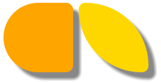
list-style:缩写1. 边框 border-style:边框样式solid 默认,实线
double 双线
dotted 点状线条
dashed 虚线
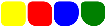
border-color:边框颜色 border-width:边框宽度 border-radius:圆角1个参数:四个角都应用
2个参数:第一个参数应用于 左上、右下;第二个参数应用于 左下、右上
3个参数:第一个参数应用于 左上;第二个参数应用于 左下、右上;第三个参数应用于右下
4个参数:左上、右上、右下、左下(顺时针)
border: 简写border: 2px yellow solid;
box-shadow:边框阴影第一个参数是左右位置
第二个参数是上下位置
第三个参数是虚化效果
第四个参数是颜色
box-shadow: 10px 10px 5px #888;
一些边框的实现案例:
<!DOCTYPE html>
<html lang="en">
<head>
<meta charset="UTF-8">
<title>Title</title>
<style>
.radius1 {
display: inline-block;
width: 100px;
height: 100px;
background-color: yellow;
border-radius: 20px;
}
.radius2 {
display: inline-block;
width: 100px;
height: 100px;
background-color: red;
border-radius: 20px 35px;
}
.radius3 {
display: inline-block;
width: 100px;
height: 100px;
background-color: blue;
border-radius: 20px 35px 50px;
}
.radius4 {
display: inline-block;
width: 100px;
height: 100px;
background-color: green;
border-radius: 20px 35px 50px 60px;
}
</style>
</head>
<body>
<div>
<span class="radius1"></span>
<span class="radius2"></span>
<span class="radius3"></span>
<span class="radius4"></span>
</div>
</body>
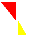
</html>边框实现各种三角符号:

<!DOCTYPE html>
<html lang="en">
<head>
<meta charset="UTF-8">
<title>Title</title>
<style>
.triangle-one {
display: inline-block;
border-top: 50px red solid;
border-right: 50px green solid;
border-bottom: 50px yellow solid;
border-left: 50px blue solid;
}
.triangle-two {
display: inline-block;
border-top: 0 red solid;
border-right: 50px green solid;
border-bottom: 50px yellow solid;
border-left: 50px blue solid;
}
.triangle-stree {
display: inline-block;
border-top: 50px red solid;
border-right: 0 green solid;
border-bottom: 50px yellow solid;
border-left: 50px blue solid;
}
.triangle-four {
display: inline-block;
border-top: 50px red solid;
border-right: 0 green solid;
border-bottom: 0 yellow solid;
border-left: 50px blue solid;
}

.triangle-five {
display: inline-block;
border: 50px transparent solid;
border-top: 50px red solid;
}
.triangle-six {
display: inline-block;
border: 50px transparent solid;
border-bottom: 50px yellow solid;
}
.triangle-seven {
display: inline-block;
border: 50px transparent solid;
border-top: 60px red solid;
border-right: 0;
}
.triangle-eight {
display: inline-block;
border: 50px transparent solid;
border-left: 30px yellow solid;
border-bottom: 0;
}
</style>
</head>
<body>
<div class="triangle-one"></div>
<div class="triangle-two"></div>
<div class="triangle-stree"></div>
<div class="triangle-four"></div>
<div class="triangle-five"></div>
<div class="triangle-six"></div>
<div class="triangle-seven"></div>
<div class="triangle-eight"></div>
</body>
</html>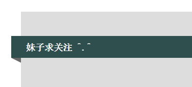
<!DOCTYPE html>
<html lang="en">
<head>
<meta charset="UTF-8">
<title>Title</title>
<style>
.back {
width: 1000px;
height: 1000px;
margin: 0 auto;
background-color: #ddd;
position: relative;
}
.back-in {
position: absolute;
width: 1020px;
height: 45px;
left: -20px;
top: 50px;
background-color: #2F4F4F;
}
.back-img {
border: 20px solid transparent;
border-top: 10px solid dimgrey;
border-right: 0;
display: inline-block;
position: absolute;
top: 95px;
left: -20px;
}
.back-font {
line-height: 9px;
margin-left: 30px;
color: white;
}
</style>
</head>
<body>
<div class="back">
<div class="back-in"><h3 class="back-font">妹子求关注 ^.^</h3></div>
<div class="back-img"></div>
</div>
</body>
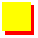
</html>z-index 元素层叠顺序z-index 仅在定位元素上有效(例:position:absolute;)可以指定负数属性值(例:-1;)

代码:
<!DOCTYPE html>
<html lang="en">
<head>
<meta charset="UTF-8">
<title>Title</title>
<style>
.z-index1 {
width: 100px;
height: 100px;
background-color: yellow;
position: absolute;
z-index: -1;
}
.z-index2 {
width: 100px;
height: 100px;
background-color: red;
position: absolute;
top: 20px;
left: 20px;
z-index: 5;
}
</style>
</head>
<body>
<div class="z-index1"></div>
<div class="z-index2"></div>
</body>
</html>
outline 边框轮廓outline-width 轮廓宽度outline-color 轮廓颜色
outline-style 轮廓样式

zoom 缩放比例
<!DOCTYPE html>
<html lang="en">
<head>
<meta charset="UTF-8">
<title>Title</title>
<style>
.zoom1 {
zoom: 100%;
}
.zoom2 {
zoom: 150%;
}
.zoom3 {
zoom: 200%;
}
</style>
</head>
<body>
<div class="zoom1">Nick 100%</div>
<div class="zoom2">Nick 200%</div>
<div class="zoom3">Nick 300%</div>
</body>
</html>
cursor 鼠标的类型形状鼠标放在以下单词上,There will be a miracle: url: 自定义光标 Auto: 默认Default: 默认
e-resize
ne-resize
nw-resize
n-resize
se-resize
sw-resize
s-resize
w-resize
Crosshair
Pointer
Move
text
wait
help
自定义光标实例

<!DOCTYPE html>
<html lang="en">
<head>
<meta charset="UTF-8">
<title>Title</title>
<!--<link href="cc2.css" rel="stylesheet" type="text/css">-->
<style>
body {
cursor: url("mouse.png"), auto;
/*图片地址:http://images.cnblogs.com/cnblogs_com/suoning/845162/o_mouse.png*/
}
</style>
</head>
<body>
<div><img src="http://images.cnblogs.com/cnblogs_com/suoning/845162/o_ns.png" height="100%" width="100%"></div>
</body>
</html>
transform、transition 动画效果transform 转换,变形origin 定义旋转基点(left top center right bottom 坐标值) transform-origin: 50px 50px; transform-origin: left;。rotate 旋转 transform:rotate(50deg) 旋转角度可以为负数,需要先定义origin。
skew 扭曲 transform:skew(50deg,50deg) 分别为相对x轴倾斜,相对y轴倾斜。
scale 缩放 transform:scale(2,3) 横向放大2倍,纵向放大3倍;transform:scale(2) 横竖都放大2倍。
translate 移动 transform:translate(50px, 50px) 分别为相对x轴移动,相对y轴移动。
<!DOCTYPE html>
<html>
<head>
<meta http-equiv="Content-Type" content="text/html; charset=utf-8" />
<title>nick</title>
<meta charset="utf-8" />
<style type="text/css">
div {
border: 1px solid black;
height: 30px;
width: 30px;
background-color: yellow;

/*transform-origin: 50px 50px;*/
transform-origin: left;
transform: rotate(50deg);
/*transform: skew(50deg,50deg);*/
/*transform: translate(50px,50px);*/
/*transform: scale(2);*/
}
</style>
</head>
<body>
<div></div>
</body>
</html>
Transition 平滑过渡transition-property: 变换的属性(none(没有属性改变)、all(所有属性改变)、具体属性)transition-duration: 变换持续时间
transition-timing-function: 变换的速率(ease:(逐渐变慢)、linear:(匀速)、ease-in:(加速)、ease-out:(减速)、ease-in-out:(加速然后减速)、cubic-bezier:(自定义时间曲线))
transition-delay: 变换延迟时间
transition: 缩写
图标
一般实现制作图标有三种方式:图片(自定义)CSS实现
fontawsome
本例引用第三方,fontawsome,网址:http://fontawesome.io/icons/首先下载解压,引用,使用方法,例:
<!DOCTYPE html>
<html lang="en">
<!--图标-->
<head>
<meta charset="UTF-8">
<title>Title</title>
<link rel="stylesheet" href="font-awesome/css/font-awesome.css">
</head>
<body>
<span class="icon-dollar"></span>
</body>
</html>
important
CSS写在不同的地方有不同的优先级, .css文件中的定义 < 元素style中的属性,但是如果使用!important,事情就会变得不一样css定义中的用!important限定的定义却是优先级最高的格式:Tag:css !importantimportant应用
<!DOCTYPE html>
<html lang="en">
<!--important-->
<head>
<meta charset="UTF-8">
<title>Title</title>
<style>
div{
font-size: 16px;
color: red;
font-weight: bold;
}
.limit{
color: orchid !important;
}
</style>
</head>
<body>
<div>
<p>没应用样式</p>
</div>
<div >
<a class="limit">应用了</a>
<p>hello</p>
</div>
</body>
</html>overflow
规定溢出元素的首选滚动方法<!DOCTYPE html>
<html lang="en">
<!--页面布局-->
<head>
<meta charset="UTF-8">
<title>Title</title>
<style>
body{margin: 0px}
.top{
background-color: #666666;
height: 30px;
}
.center .center_left{
position: absolute;
background-color: antiquewhite;
width: 110px;
left: 0;
}
.center .content{
position: absolute;
background-color: #2459a2;
top: 30px;
left: 112px;
right: 0;
bottom: 0;
overflow: auto;
}
</style>
</head>
<body>
<div class="top"></div>
<div class="center">
<div class="center_left">
<ul>
<li>menu</li>
<li>menu</li>
<li>menu</li>
<li>menu</li>
<li>menu</li>
</ul>
</div>
<div class="content">
<h1>标题</h1><h1>标题</h1><h1>标题</h1><h1>标题</h1><h1>标题</h1><h1>标题</h1><h1>标题</h1><h1>标题</h1><h1>标题</h1>
<h1>标题</h1><h1>标题</h1><h1>标题</h1><h1>标题</h1><h1>标题</h1><h1>标题</h1><h1>标题</h1><h1>标题</h1><h1>标题</h1>
<h1>标题</h1><h1>标题</h1><h1>标题</h1><h1>标题</h1><h1>标题</h1><h1>标题</h1><h1>标题</h1><h1>标题</h1><h1>标题</h1>
<h1>标题</h1><h1>标题</h1><h1>标题</h1><h1>标题</h1><h1>标题</h1><h1>标题</h1><h1>标题</h1><h1>标题</h1><h1>标题</h1>
</div>
</div>
</body>
</html>

相关文章推荐
- SQL SERVER 中常用函数的总结,方便开发的时候查询
- Css常用效果总结 — 快速查询笔记
- Gentle.Net学习笔记二:常用查询数据的方法总结
- 常用CSS缩写语法总结
- CSS优化2-(常用CSS缩写语法总结)
- 常用CSS缩写语法总结
- 常用CSS缩写语法总结及缩写的原因
- 常用CSS缩写语法总结
- 常用CSS缩写语法总结
- 常用CSS缩写语法总结
- 常用CSS缩写语法总结
- CSS中的常用技巧大总结
- 常用CSS缩写语法总结
- 常用CSS缩写语法总结
- 常用CSS缩写语法总结
- CSS优化2-(常用CSS缩写语法总结)
- 常用CSS缩写语法总结
- 常用CSS缩写语法总结
- 常用CSS缩写语法总结
- 项目中常用到的一些CSS总结