CoordinatorLayout+AppBarLayout+CollapsingToolbarLayout全解析
2016-10-31 22:59
525 查看
1.概述
CoordinatorLayout是Material风格的重要组件, 协调(Coordinate)其他组件, 实现联动。官方解释:
CoordinatorLayout is intended for two primary use cases:
1.As a top-level application decor or chrome layout
2.As a container for a specific interaction with one or more child views
CoordinatorLayout两个主要使用的例子是:
1.作为顶层布局;
2.调度协调一个或多个子布局
在我们实际使用过程中,CoordinatorLayout使用是通过协调调度子布局的形式实现触摸影响布局的形式产生动画效果,特别是扩展或者缩小Toolbar或者头部,让主内容区域有更多的空间。
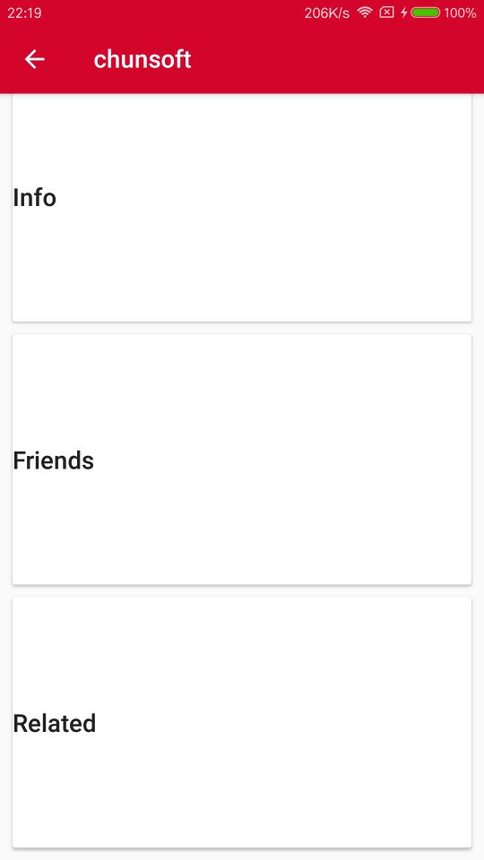
效果图:
1.完成形式

2.上滑形式
2.应用
(1)在项目的build.gradle文件中,根据个人sdk版本导入:compile 'com.android.support:design:24.2.1'
(2)在布局文件中:
<?xml version="1.0" encoding="utf-8"?>

<android.support.design.widget.CoordinatorLayout
xmlns:android="http://schemas.android.com/apk/res/android"
xmlns:app="http://schemas.android.com/apk/res-auto"
android:id="@+id/main_content"
android:layout_width="match_parent"
android:layout_height="match_parent"
android:fitsSystemWindows="true">

<!--第一部分:伸缩工具栏-->
<android.support.design.widget.AppBarLayout
android:id="@+id/appbar"
android:layout_width="match_parent"
android:layout_height="300dp"
android:fitsSystemWindows="true"
android:theme="@style/ThemeOverlay.AppCompat.Dark.ActionBar">

<android.support.design.widget.CollapsingToolbarLayout
android:id="@+id/collapsing_toolbar"
android:layout_width="match_parent"
android:layout_height="match_parent"
android:fitsSystemWindows="true"
app:contentScrim="?attr/colorPrimary"
app:expandedTitleMarginEnd="64dp"
app:expandedTitleMarginStart="48dp"
app:layout_scrollFlags="scroll|exitUntilCollapsed">

<ImageView
android:id="@+id/backdrop"
android:layout_width="match_parent"
android:layout_height="match_parent"
android:fitsSystemWindows="true"
android:scaleType="centerCrop"
android:src="@drawable/collbg"
app:layout_collapseMode="parallax" />

<android.support.v7.widget.Toolbar
android:id="@+id/toolbar"
android:layout_width="match_parent"
android:layout_height="?attr/actionBarSize"
app:layout_collapseMode="pin"

app:popupTheme="@style/ThemeOverlay.AppCompat.Light" />

</android.support.design.widget.CollapsingToolbarLayout>

</android.support.design.widget.AppBarLayout>
<!--第二部分:主要内容,NestedScrollView和ScrollView基本功能一致,只不过NestedScrollView可以兼容新的控件-->
<android.support.v4.widget.NestedScrollView
android:layout_width="match_parent"
android:layout_height="match_parent"
app:layout_behavior="@string/appbar_scrolling_view_behavior">

<LinearLayout
android:layout_width="match_parent"
android:layout_height="match_parent"
android:orientation="vertical"
android:paddingTop="24dp">

<!--卡片布局-->
<android.support.v7.widget.CardView
android:layout_width="match_parent"
android:layout_height="wrap_content"
android:layout_margin="10dp">

<LinearLayout
style="@style/Widget.AppCompat.ActionBar"
android:layout_width="match_parent"
android:layout_height="wrap_content">

<TextView
android:layout_width="match_parent"
android:layout_height="wrap_content"
android:text="Info"
android:textAppearance="@style/TextAppearance.AppCompat.Title" />

<TextView
android:layout_width="match_parent"
android:layout_height="wrap_content"
android:text="cheese_ipsum" />

</LinearLayout>

</android.support.v7.widget.CardView>

<android.support.v7.widget.CardView
android:layout_width="match_parent"
android:layout_height="wrap_content"
android:layout_marginBottom="10dp"
android:layout_marginLeft="10dp"
android:layout_marginRight="10dp">

<LinearLayout
style="@style/Widget.AppCompat.ActionBar"
android:layout_width="match_parent"
android:layout_height="wrap_content">

<TextView
android:layout_width="match_parent"
android:layout_height="wrap_content"
android:text="Friends"
android:textAppearance="@style/TextAppearance.AppCompat.Title" />

<TextView
android:layout_width="match_parent"
android:layout_height="wrap_content"
android:text="cheese_ipsum" />

</LinearLayout>

</android.support.v7.widget.CardView>

<android.support.v7.widget.CardView
android:layout_width="match_parent"
android:layout_height="wrap_content"
android:layout_marginBottom="10dp"
android:layout_marginLeft="10dp"
android:layout_marginRight="10dp">

<LinearLayout
style="@style/Widget.AppCompat.ActionBar"
android:layout_width="match_parent"
android:layout_height="wrap_content">

<TextView
android:layout_width="match_parent"
android:layout_height="wrap_content"
android:text="Related"
android:textAppearance="@style/TextAppearance.AppCompat.Title" />

<TextView
android:layout_width="match_parent"
android:layout_height="wrap_content"
android:text="cheese_ipsum" />

</LinearLayout>

</android.support.v7.widget.CardView>

</LinearLayout>

</android.support.v4.widget.NestedScrollView>

<!--第三部分:漂浮按钮-->
<android.support.design.widget.FloatingActionButton
android:layout_width="wrap_content"
android:layout_height="wrap_content"
android:layout_margin="10dp"
android:clickable="true"
android:src="@drawable/ic_category_0"
app:layout_anchor="@id/appbar"
app:layout_anchorGravity="bottom|right|end" />
</android.support.design.widget.CoordinatorLayout>
(3)主页面代码
public class DetailActivity extends AppCompatActivity {

@Override
protected void onCreate(Bundle savedInstanceState) {
super.onCreate(savedInstanceState);
setContentView(R.layout.activity_detail);
//给页面设置工具栏
final Toolbar toolbar = (Toolbar) findViewById(R.id.toolbar);
setSupportActionBar(toolbar);
getSupportActionBar().setDisplayHomeAsUpEnabled(true);

//设置工具栏标题
CollapsingToolbarLayout collapsingToolbar = (CollapsingToolbarLayout) findViewById(R.id.collapsing_toolbar);
collapsingToolbar.setTitle("chunsoft");
}
3.注意事项
(1)layout_scrollFlagsandroid.support.design.widget.CollapsingToolbarLayout中的标签 app:layout_scrollFlags="scroll|exitUntilCollapsed"中的各个属性含义: 1.scroll: 所有想滚动出屏幕的view都需要设置这个flag, 例如,TabLayout 没有设置这个值,将会停留在屏幕顶部。 2.enterAlways: 设置这个flag时,向下的滚动都会导致该view变为可见,启用快速“返回模式”。 3.exitUntilCollapsed:如果AppBarLayout的直接子控件设置该属 性,该子控件可以滚动,向上滚动NestedScrollView出父布局(一般为 CoordinatorLayout)时,会折叠到顶端,向下滚动时 NestedScrollView必须滚动到最上面的时候才能拉出该布局 。 4.enterAlwaysCollapsed:向下滚动NestedScrollView到最底端时该布局才会显示出来
(2)Behavior
CoordinatorLayout自己并不控制View,所有的控制权都在Behavior。前面写到了FloatingActionButton.Behavior,
用户可以自定义Behavior实现更多效果。
(3)CollapsingToolbarLayout
直译是折叠的toolbar,确实是起到折叠作用的,可以把布局折叠,
控制显示的位置,它的直接子布局可以使用的属性:
app:layout_collapseMode(折叠模式):可取的值如下:
1.pin:在滑动过程中,此自布局会固定在它所在的位置不动,直到
CollapsingToolbarLayout全部折叠或者全部展开

2.parallax:视察效果,在滑动过程中,不管上滑还是下滑都会有视察
取值,当设置了parallax时可以配合这个属性使用,调节自己想要的视差效果)

3.不设置:跟随NestedScrollView的滑动一起滑动,NestedScrollView滑动多少距离他就会跟着走多少距离
张兴业有篇博客对CoordinatorLayout的其他应用作了介绍,
链接:http://blog.csdn.net/xyz_lmn/article/details/48055919
我将retrofit+rxjava+rxandroid+okHttp+mvp设计模式结合,和一些流行开源库写了一个简单的android基础开发框架,会不断加入新的内容:
GitHub地址:https://github.com/chunonesoft/BaseFramework

相关文章推荐
- Android M新控件之AppBarLayout,NavigationView,CoordinatorLayout,CollapsingToolbarLayout的使用
- Android M新控件之AppBarLayout,NavigationView,CoordinatorLayout,CollapsingToolbarLayout的使用
- CoordinatorLayout AppbarLayout CollapsingToolbarLayout 实现顶部栏
- 自学“CoordinatorLayout+AppBarLayout+CollapsingToolbarLayout”心得体会,及详细介绍
- JuheNews系列之二 · ToolBar+AppBarLayout+CoordinatorLayout+CollapsingToolbarLayout
- Android M新控件之AppBarLayout,NavigationView,CoordinatorLayout,CollapsingToolbarLayout的使用
- CoordinatorLayout+AppBarLayout+CollapsingToolbarLayout+ViewPager滑动效果,以及代码处理是否推动效果
- Android M新控件之AppBarLayout,NavigationView,CoordinatorLayout,CollapsingToolbarLayout的使用
- CoordinatorLayout+AppBarLayout+CollapsingToolbarLayout+Toolbar用法小结
- CoordinatorLayout的AppBarLayout和CollapsingToolbarLayout
- Android M 控件:AppBarLayout,CoordinatorLayout,CollapsingToolbarLayout
- Android M新控件之AppBarLayout,NavigationView,CoordinatorLayout,CollapsingToolbarLayout的使用 标签: supportan
- CoordinatorLayout+AppBarLayout+CollapsingToolbarLayout+Toolbar
- CoordinatorLayout+AppBarLayout+CollapsingToolbarLayout+Toolbar实现渐变透明的状态栏
- Android M新控件之AppBarLayout,NavigationView,CoordinatorLayout,CollapsingToolbarLayout的使用
- Material Design学习:CoordinatorLayout+AppBarLayout+CollapsingToolbarLayout
- Android M新控件之AppBarLayout,NavigationView,CoordinatorLayout,CollapsingToolbarLayout的使用
- Android Design风格实现可折叠页面CoordinatorLayout+AppBarLayout+CollapsingToolbarLayout
- CoordinatorLayout+AppBarLayout+CollapsingToolbarLayout+Toolbar实现app的折叠效果
- Android M新控件之AppBarLayout,NavigationView,CoordinatorLayout,CollapsingToolbarLayout的使用