用CSS绘制最常见的形状和图形
2016-10-21 09:59
549 查看

#rectangle {
width: 200px;
height: 100px;
background: red;
}
#circle {
width: 100px;
height: 100px;
background: red;
-moz-border-radius: 50px;
-webkit-border-radius: 50px;
border-radius: 50px;
}

/* 可以使用百分比值(大于50%),但是低版本的Android不支持 */
#oval {
width: 200px;
height: 100px;
background: red;
-moz-border-radius: 100px / 50px;
-webkit-border-radius: 100px / 50px;
border-radius: 100px / 50px;
}

/* 可以使用百分比值(大于50%),但是低版本的Android不支持 */
#triangle-up {
width: 0;
height: 0;
border-left: 50px solid transparent;
border-right: 50px solid transparent;
border-bottom: 100px solid red;
}
#triangle-down {
width: 0;
height: 0;
border-left: 50px solid transparent;
border-right: 50px solid transparent;
border-top: 100px solid red;
}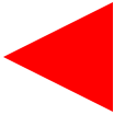
#triangle-left {
width: 0;
height: 0;
border-top: 50px solid transparent;
border-right: 100px solid red;
border-bottom: 50px solid transparent;
}
#triangle-right {
width: 0;
height: 0;
border-top: 50px solid transparent;
border-left: 100px solid red;
border-bottom: 50px solid transparent;
}

相关文章推荐
- CSS绘制常见形状的图形
- 用CSS绘制最常见的40种形状和图形
- 用css绘制常见图形
- CSS 魔法系列:纯 CSS 绘制图形(各种形状的钻石)
- 在SurfaceView/自定义View中利用手势绘制不同颜色不同形状的图形并且保存为Bitmap位图
- 用css绘制各种形状(放松一下)
- opencv 绘制常见图形
- 美轮美奂-随机绘制不同形状、色彩、大小、位置的图形
- Python绘制常见图形
- 如何用 CSS 绘制各种形状
- 用css绘制基本图形
- CSS图形形状大全
- 【Cocoa(mac) Application 开发系列之三】自定义NSView并绘制一些常见的图形及字符串;
- css 绘制各种图形
- CSS 魔法系列:纯 CSS 绘制各种图形《系列五》
- 纯 CSS 创建各种不同的图形形状
- 纯CSS绘制的图形
- CSS 魔法系列:纯 CSS 绘制图形(心形、六边形等)
- HTML5之SVG 2D入门2—图形绘制(基本形状)介绍及使用
- HTML5之SVG 2D入门2―图形绘制(基本形状)介绍及使用