Android控件之TextView及其子类
2016-09-25 19:02
691 查看
TextView直接继承于View,同时还是Button和EditText这两个基本控件的父类,以下将会介绍分别介绍这三种类型的控件的一些常用属性。因为Button和EditText都是直接继承于TextView,故而TextView的大部分xml属性也适用于Button和EditText。
首先先介绍下几乎所有的控件都具有的属性:layout_width、layout_height.这两种属性分别指定了组件的高度和宽度,这个大家经常会看到match_parent、fill_parent、wrap_content这三种字样。那么这三种字样代表的意思有是什么呢?
wrap_content :指的是当前控件的大小刚好满足其包含的内容。例如TextView的显示的字,字越长,TextView的长度也就越长。
match_parent:指的是当前的组件大小充满整个父类容器。
fill_parent:他的意思与match_parent的意思并没有多大的区别,然而Android推荐使用的match_parent,fill_parent几乎很少使用。
下面介绍TextView的一些属性:
drawable属性:可以在文本框上下左右绘制.png的图片
效果图:
TextAllCaps属性:布尔值,true代表全部大写
ellipsize:为省略标志,可以设置省略中间的字符,结尾的字符
效果图:

autolink: 增加链接:phone 电话号码,email 电子邮件,可用或’|’字符兼并;即为这两个增加超链接
效果图:

- CheckMark:可勾选的图标
效果图:
- password:表示输入的字符将会用黑点代替;(布尔值为“true”)
效果图:

另外、还可以通过其background属性设置文本框样式,其可由xml文件定义,将该文件放入drawable文件夹下,然后由@drawable/图片名字引用至background中。由此可以看出,有些xml文件是可以当做drawable的资源来使用 eg:
(1)定义新文本框文件
(2)直接在布局的xml文件中引用
效果图:
EditText组件的属性除上之外常用的还有:
- hint:表示为文本输入框显示提示性语句,即只要输入字符这个语句就会消失,它的值为提示性语句的字符串。
效果图:
inputType:顾名思义,设置输入的类型,numberPassword,代表输入的为数字密码,且输入的字符会用黑点代替,number 代表输入的是数字 date 代表输入的是日期 phone 代表输入的是电话号码。
Button :
效果图:
- Button也可通过上述的xml文件定义其按钮样式,还可以设置其按钮被点击时按钮的样式改变的提示性功能
drawable中的xml文件:
布局文件xml:
点击之前:
点击之后:
希望大家有所收获!
本次的Demo下载链接Demo
首先先介绍下几乎所有的控件都具有的属性:layout_width、layout_height.这两种属性分别指定了组件的高度和宽度,这个大家经常会看到match_parent、fill_parent、wrap_content这三种字样。那么这三种字样代表的意思有是什么呢?
wrap_content :指的是当前控件的大小刚好满足其包含的内容。例如TextView的显示的字,字越长,TextView的长度也就越长。
match_parent:指的是当前的组件大小充满整个父类容器。
fill_parent:他的意思与match_parent的意思并没有多大的区别,然而Android推荐使用的match_parent,fill_parent几乎很少使用。
下面介绍TextView的一些属性:
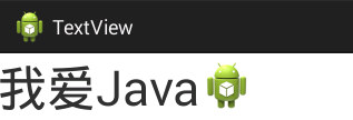
drawable属性:可以在文本框上下左右绘制.png的图片
android:drawableEnd="@drawable/ic_launcher"`
效果图:
TextAllCaps属性:布尔值,true代表全部大写
ellipsize:为省略标志,可以设置省略中间的字符,结尾的字符
android:ellipsize="middle"
android:textAllCaps="true"
效果图:
autolink: 增加链接:phone 电话号码,email 电子邮件,可用或’|’字符兼并;即为这两个增加超链接
android:autoLink="phone|email"
android:text="email:1925130654@qq.com;tel:18482065251"
效果图:
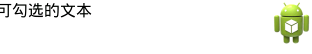
- CheckMark:可勾选的图标
android:text="可勾选的文本"
android:checkMark="@drawable/ic_launcher"
效果图:
- password:表示输入的字符将会用黑点代替;(布尔值为“true”)
android:password="true"
android:text="TextView”
效果图:
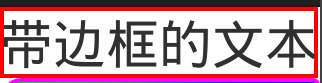
另外、还可以通过其background属性设置文本框样式,其可由xml文件定义,将该文件放入drawable文件夹下,然后由@drawable/图片名字引用至background中。由此可以看出,有些xml文件是可以当做drawable的资源来使用 eg:
(1)定义新文本框文件
<?xml version="1.0" encoding="utf-8"?>
<shape xmlns:android="http://schemas.android.com/apk/res/android" >
<solid
android:color="#0000"/>//文本框内部的颜色
<stroke
android:width="4px"//边框的宽度
android:color="#f00"/>//边框的颜色
</shape>
(2)直接在布局的xml文件中引用
<TextView
android:id="@+id/textView1"
android:layout_width="wrap_content"
android:layout_height="wrap_content"
android:text="带边框的文本"
android:textSize="24pt"
android:background="@drawable/bg_border" />
效果图:
EditText组件的属性除上之外常用的还有:
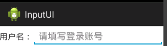
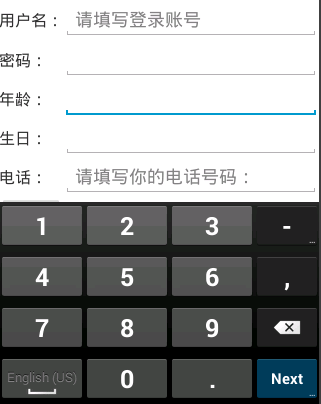
- hint:表示为文本输入框显示提示性语句,即只要输入字符这个语句就会消失,它的值为提示性语句的字符串。
效果图:
```
<EditText
android:id="@+id/editText1"
android:layout_width="wrap_content"
android:layout_height="wrap_content"
android:hint="请填写登录账号"
android:selectAllOnFocus="true">
inputType:顾名思义,设置输入的类型,numberPassword,代表输入的为数字密码,且输入的字符会用黑点代替,number 代表输入的是数字 date 代表输入的是日期 phone 代表输入的是电话号码。
Button :
<EditText
android:layout_width="wrap_content"
android:layout_height="wrap_content"
android:inputType="numberPassword"/>
<EditText
android:layout_width="wrap_content"
android:layout_height="wrap_content"
android:inputType="number"/>
效果图:
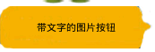
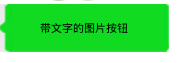
- Button也可通过上述的xml文件定义其按钮样式,还可以设置其按钮被点击时按钮的样式改变的提示性功能
drawable中的xml文件:
<?xml version="1.0" encoding="utf-8"?>
<selector xmlns:android="http://schemas.android.com/apk/res/android" >
<item
android:state_pressed="true"
android:drawable="@drawable/wechatl"></item>
<item
android:state_pressed="false"
android:drawable="@drawable/wechat2"
></item>
</selector>
布局文件xml:
<Button
android:id="@+id/button3"
android:layout_width="wrap_content"
android:layout_height="wrap_content"
android:text="带文字的图片按钮"
android:background="@drawable/selectetor"
android:textSize="11px"
/>
点击之前:
点击之后:
希望大家有所收获!
本次的Demo下载链接Demo

相关文章推荐
- AndroidUI控件之TextView及其子类
- Android用户界面 UI组件--TextView及其子类(四) Chronometer计时器
- Android: TextView 及其子类通过代码和 XML 设置字体大小的存在差异的分析
- AndroidUI控件之imageview及其子类
- Android用户界面 UI组件--TextView及其子类(五) DigitalClock,AnalogClock,RadioButton,CheckBox,ToggleButton汇总
- Android textview及其子类
- Android用户界面 UI组件--TextView及其子类(二) Button,selector选择器,sharp属性
- Android用户界面 UI组件--TextView及其子类(一) TextView
- 【android_温故知新】第 2 组 UI 组件:TextView及其子类
- Android用户界面 UI组件--TextView及其子类(三) EditView以及各种Span文字样式讲解
- android-UI组件(二):TextView及其子类
- Android用户界面 UI组件--TextView及其子类(五) DigitalClock,AnalogClock,RadioButton,CheckBox,ToggleButton汇总
- Android应用的界面编程(三)--TextView及其子类
- android基础-TextView及其子类、ImageView及其子类
- Android界面编程之三 第二组UI组件:TextView及其子类
- Android用户界面 UI组件--TextView及其子类(二) Button,selector选择器,sharp属性
- 二、Android应用的界面编程(七)ViewAnimator及其子类[ ViewSwitcher、ImageSwitcher、TextSwitcher、ViewFlipper ]
- Android用户界面 UI组件--TextView及其子类(四) Chronometer计时器
- Android用户界面 UI组件--TextView及其子类(三) EditView以及各种Span文字样式讲解
- Android用户界面 UI组件--TextView及其子类(一) TextView