画饼图和折线图和柱状图的实现
2016-09-20 13:03
281 查看
每一个数据首先是列表,然后进行赋值:

# -*- coding: utf-8 -*-
import numpy as np
import matplotlib.pyplot as plt
import matplotlib as mpl
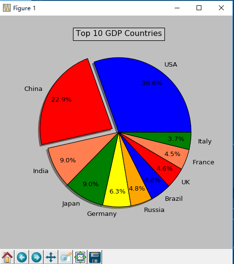
def draw_pie(labels, quants):
# make a square figure
plt.figure( figsize=(6, 6))#表示绘画一个图,图的大小是6*6
#
# For China, make the piece explode a bit
expl = [0, 0.1, 0, 0, 0, 0, 0, 0, 0, 0]
# Colors used. Recycle if not enough.
colors = ["blue", "red", "coral", "green", "yellow", "orange"]
# Pie Plot
# autopct: format of "percent" string;
plt.pie(quants, explode=expl, colors=colors, labels=labels, autopct='%1.1f%%', pctdistance=0.8, shadow=True)
plt.title('Top 10 GDP Countries', bbox={'facecolor': '0.8', 'pad': 5})
plt.show()
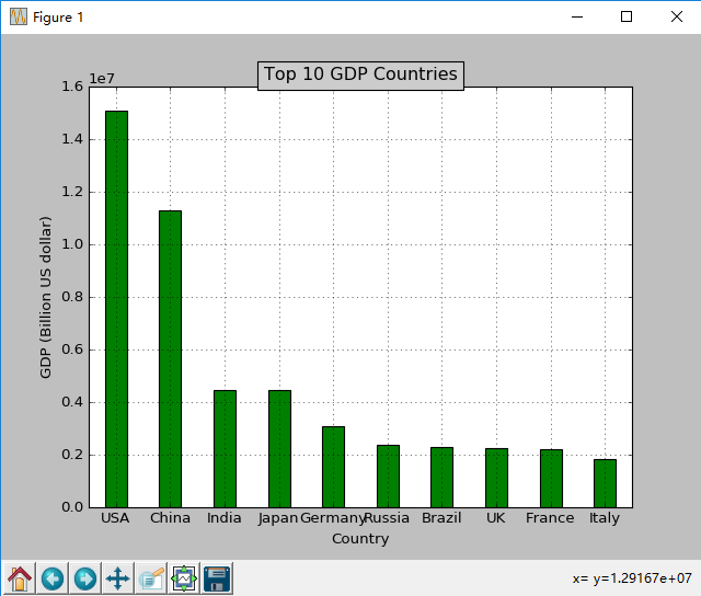
def draw_bar(labels, quants):
width = 0.4
ind = np.linspace(0.5, 9.5, 10)#0.5到9.5之间,划为10个数
# make a square figure
fig = plt.figure(1)
ax = fig.add_subplot(111)#表示画图,画的图分为几行几列,第几块
#2,绘制多个子图使用subplot(a,b,c)命令,里面有三个参数,分别代表每一行,每一列的子图的个数和当前子图的编号。 当这三个参数都小于10的时候可以省略其中的','。我们还是从一
# Bar Plot
ax.bar(ind - width / 2, quants, width, color='green')
# Set the ticks on x-axis
ax.set_xticks(ind)
ax.set_xticklabels(labels)#设置标签
# labels
ax.set_xlabel('Country')
ax.set_ylabel('GDP (Billion US dollar)')
# title
ax.set_title('Top 10 GDP Countries', bbox={'facecolor': '0.8', 'pad': 5})
plt.grid(True)
plt.show()
def draw_line(labels, quants):
ind = np.linspace(0, 9, 10)
fig = plt.figure(1)
ax = fig.add_subplot(111)
ax.plot(ind, quants)
ax.set_title('Top 10 GDP Countries', bbox={'facecolor': '0.8', 'pad': 5})
ax.set_xticklabels(labels)
plt.grid(True)
plt.show()
# quants: GDP
# labels: country name
labels = ['USA', 'China', 'India', 'Japan', 'Germany', 'Russia', 'Brazil', 'UK', 'France', 'Italy']
quants = [15094025.0, 11299967.0, 4457784.0, 4440376.0, 3099080.0, 2383402.0, 2293954.0, 2260803.0, 2217900.0,
1846950.0]
draw_pie(labels, quants)
draw_bar(labels,quants)
draw_line(labels,quants)

相关文章推荐
- 插件jfreechart+shh实现树状图 柱状图 折线图
- Android 借助aChartEngine实现饼图,折线图,柱状图
- echarts多条折线图和柱状图实现
- jsp+vml 实现柱状图、饼图、折线图
- Amcharts插件实现柱状图+折线图+多个主题
- Android图表超简单实现柱状图、折线图、饼状图(基于MpAndroidChart)
- JFreeChart实现饼状图、柱状图和折线图以及各类报表
- 基于SpringMVC框架使用ECharts3.0实现折线图,柱状图,饼状图,的绘制(上篇)
- 前端实现饼图、堆叠柱状图、折线图
- Amcharts插件实现柱状图+折线图+单个主题
- Echarts3.0+JavaWeb+Mysql实现饼图,折线图,柱状图
- PHP实现动态生成饼状图、柱状图和折线图(转)
- jsp页面显示扇形图、柱状图,折线图等功能的实现
- 基于SpringMVC框架使用ECharts3.0实现折线图,柱状图,饼状图,的绘制(上篇)
- JfreeChart画饼图,折线图,柱状图
- android实现折线图和柱状图
- 基于SpringMVC框架使用ECharts3.0实现折线图,柱状图,饼状图,的绘制(上篇)
- 分组折线图、柱状图实现(多条折线图、柱状图同时显示)实现方式
- [置顶] 【python可视化】python 画饼图,柱状图,折线图,条形图
- ZedGraph控件 画饼图 折线图 柱状图 函数