React Native控件只TextInput
2016-09-17 19:06
246 查看
TextInput是一个允许用户在应用中通过键盘输入文本的基本组件。本组件的属性提供了多种特性的配置,譬如自动完成、自动大小写、占位文字,以及多种不同的键盘类型(如纯数字键盘)等等。
比如官网最简单的写法:
import React, { Component } from 'react';
import { AppRegistry, TextInput } from 'react-native';
class UselessTextInput extends Component {
constructor(props) {
super(props);
this.state = { text: 'Useless Placeholder' };
}
render() {
return (
<TextInput
style={{height: 40, borderColor: 'gray', borderWidth: 1}}
onChangeText={(text) => this.setState({text})}
value={this.state.text}
/>
);
}
}
// App registration and rendering
AppRegistry.registerComponent('AwesomeProject', () => UselessTextInput);
对于TextInput我们重点需要了解控件的属性,以方便我们实行不同的效果。
characters: 所有的字符。
words: 每个单词的第一个字符。
sentences: 每句话的第一个字符(默认)。
none: 不自动切换任何字符为大写。
这些值在所有平台都可用
default
numeric
email-address
onBlur function
当文本框失去焦点的时候调用此回调函数。
placeholderTextColor string
secureTextEntry bool
secureTextEntry bool
如果为true,文本框会遮住之前输入的文字,这样类似密码之类的敏感文字可以更加安全。默认值为false。
TextInput是一个受约束的(Controlled)的组件,意味着如果提供了value属性,原生值会被强制与value属性保持一致。在大部分情况下这都工作的很好,不过有些情况下会导致一些闪烁现象——一个常见的原因就是通过不改变value来阻止用户进行编辑。如果你希望阻止用户输入,可以考虑设置editable={false};如果你是希望限制输入的长度,可以考虑设置maxLength属性,这两个属性都不会导致闪烁。
关于TextInput的属性就讲这么多,下面写一个登录的例子来加强我们对控件的认识。
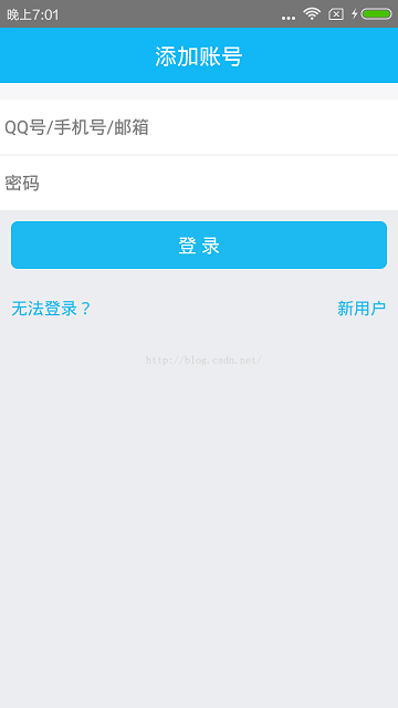
这里需要说明几点:1、<TextInput>组件在React Native中,默认是带一条横线的,如果想去掉输入框下面的横线,需要给<TextInput>指定一个underlineColorAndroid='transparent',这样就可以去掉输入框下面的横线了;2、密码输入框需要指定属性:secureTextEntry={true}3、要显示图片,必须为<Image>标签指定宽度和高度,和Android中不同的是,<Image>没法自动调整图片的大小,没有类似Android中的wrap_content。代码如下:/**
* Sample React Native App
* https://github.com/facebook/react-native * @flow
*/
import React, {Component} from 'react';
import {
AppRegistry,
StyleSheet,
Text,
Image,
View,
TextInput
} from 'react-native';
class ReactDemo extends Component {
render() {
return (
<View style={styles.container}>
<View style={styles.header}>
<Text style={styles.headtitle}>添加账号</Text>
</View>
<View style={styles.marginTopview}/>
<View style={styles.inputview}>
<TextInput underlineColorAndroid='transparent' style={styles.textinput} placeholder='QQ号/手机号/邮箱'/>
<View style={styles.dividerview}>
<Text style={styles.divider}></Text>
</View>
<TextInput underlineColorAndroid='transparent' style={styles.textinput} placeholder='密码'
secureTextEntry={true}/>
</View>
<View style={styles.bottomview}>
<View style={styles.buttonview}>
<Text style={styles.logintext}>登 录</Text>
</View>
<View style={styles.bottombtnsview}>
<View style={styles.bottomleftbtnview}>
<Text style={styles.bottombtn}>无法登录?</Text>
</View>
<View style={styles.bottomrightbtnview}>
<Text style={styles.bottombtn}>新用户</Text>
</View>
</View>
</View>
</View>
);
}
}
const styles = StyleSheet.create({
container: {
flex: 1,
backgroundColor: '#FFFFFF'
},
header: {
height: 50,
backgroundColor: '#12B7F5',
justifyContent: 'center',
},
headtitle: {
alignSelf: 'center',
fontSize: 20,
color: '#ffffff',
},
avatarview: {
height: 150,
backgroundColor: '#ECEDF1',
justifyContent: 'center',
},
avatarimage: {
width: 100,
height: 100,
alignSelf: 'center'
},
marginTopview: {
height: 15,
backgroundColor: '#F7F7F9'
},
inputview: {
height: 100,
},
textinput: {
flex: 1,
fontSize: 16,
},
dividerview: {
flexDirection: 'row',
},
divider: {
flex: 1,
height: 1,
backgroundColor: '#ECEDF1'
},
bottomview: {
backgroundColor: '#ECEDF1',
flex: 1,
},
buttonview: {
backgroundColor: '#1DBAF1',
margin: 10,
borderRadius: 6,
justifyContent: 'center',
alignItems: 'center',
},
logintext: {
fontSize: 17,
color: '#FFFFFF',
marginTop: 10,
marginBottom: 10,
},
emptyview: {
flex: 1,
},
bottombtnsview: {
flexDirection: 'row',
},
bottomleftbtnview: {
flex: 1,
height: 50,
paddingLeft: 10,
alignItems: 'flex-start',
justifyContent: 'center',
},
bottomrightbtnview: {
flex: 1,
height: 50,
paddingRight: 10,
alignItems: 'flex-end',
justifyContent: 'center',
},
bottombtn: {
fontSize: 15,
color: '#1DBAF1',
}
});
AppRegistry.registerComponent('ReactDemo', () => ReactDemo);
这里如果需要调试的话请移步:http://blog.csdn.net/xiangzhihong8/article/details/52564391
比如官网最简单的写法:
import React, { Component } from 'react';
import { AppRegistry, TextInput } from 'react-native';
class UselessTextInput extends Component {
constructor(props) {
super(props);
this.state = { text: 'Useless Placeholder' };
}
render() {
return (
<TextInput
style={{height: 40, borderColor: 'gray', borderWidth: 1}}
onChangeText={(text) => this.setState({text})}
value={this.state.text}
/>
);
}
}
// App registration and rendering
AppRegistry.registerComponent('AwesomeProject', () => UselessTextInput);
对于TextInput我们重点需要了解控件的属性,以方便我们实行不同的效果。
TextInput属性
autoCapitalize enum('none', 'sentences', 'words', 'characters')
控制TextInput是否要自动将特定字符切换为大写:characters: 所有的字符。
words: 每个单词的第一个字符。
sentences: 每句话的第一个字符(默认)。
none: 不自动切换任何字符为大写。
autoCorrect bool
如果为false,会关闭拼写自动修正。默认值是true。autoFocus bool
如果为true,在componentDidMount后会获得焦点。默认值为false。blurOnSubmit bool
如果为true,文本框会在提交的时候失焦。对于单行输入框默认值为true,多行则为false。注意:对于多行输入框来说,如果将blurOnSubmit设为true,则在按下回车键时就会失去焦点同时触发onSubmitEditing事件,而不会换行。defaultValue string
提供一个文本框中的初始值。当用户开始输入的时候,值就可以改变。在一些简单的使用情形下,如果你不想用监听消息然后更新value属性的方法来保持属性和状态同步的时候,就可以用defaultValue来代替。editable bool
如果为false,文本框是不可编辑的。默认值为true。keyboardType
决定弹出的何种软键盘的,譬如numeric(纯数字键盘)。这些值在所有平台都可用
default
numeric
email-address
multiline bool
如果为true,文本框中可以输入多行文字。默认值为false。onBlur function
当文本框失去焦点的时候调用此回调函数。onChange function
当文本框内容变化时调用此回调函数。onChangeText function
当文本框内容变化时调用此回调函数。改变后的文字内容会作为参数传递。onEndEditing function
当文本输入结束后调用此回调函数。onFocus function
当文本框获得焦点的时候调用此回调函数。onLayout function
当组件挂载或者布局变化的时候调用,参数为{x, y, width, height}。onSubmitEditing function
此回调函数当软键盘的确定/提交按钮被按下的时候调用此函数。如果multiline={true},此属性不可用。placeholder string
如果没有任何文字输入,会显示此字符串。placeholderTextColor string
占位字符串显示的文字颜色。
secureTextEntry bool
如果为true,文本框会遮住之前输入的文字,这样类似密码之类的敏感文字可以更加安全。默认值为false。
selectTextOnFocus bool
如果为true,当获得焦点的时候,所有的文字都会被选中。selectionColor string
设置输入框高亮时的颜色(在iOS上还包括光标)占位字符串显示的文字颜色。secureTextEntry bool
如果为true,文本框会遮住之前输入的文字,这样类似密码之类的敏感文字可以更加安全。默认值为false。
selectTextOnFocus bool
如果为true,当获得焦点的时候,所有的文字都会被选中。selectionColor string
设置输入框高亮时的颜色(在iOS上还包括光标)style Text#style
译注:这意味着本组件继承了所有Text的样式。value string
文本框中的文字内容。TextInput是一个受约束的(Controlled)的组件,意味着如果提供了value属性,原生值会被强制与value属性保持一致。在大部分情况下这都工作的很好,不过有些情况下会导致一些闪烁现象——一个常见的原因就是通过不改变value来阻止用户进行编辑。如果你希望阻止用户输入,可以考虑设置editable={false};如果你是希望限制输入的长度,可以考虑设置maxLength属性,这两个属性都不会导致闪烁。
关于TextInput的属性就讲这么多,下面写一个登录的例子来加强我们对控件的认识。
这里需要说明几点:1、<TextInput>组件在React Native中,默认是带一条横线的,如果想去掉输入框下面的横线,需要给<TextInput>指定一个underlineColorAndroid='transparent',这样就可以去掉输入框下面的横线了;2、密码输入框需要指定属性:secureTextEntry={true}3、要显示图片,必须为<Image>标签指定宽度和高度,和Android中不同的是,<Image>没法自动调整图片的大小,没有类似Android中的wrap_content。代码如下:/**
* Sample React Native App
* https://github.com/facebook/react-native * @flow
*/
import React, {Component} from 'react';
import {
AppRegistry,
StyleSheet,
Text,
Image,
View,
TextInput
} from 'react-native';
class ReactDemo extends Component {
render() {
return (
<View style={styles.container}>
<View style={styles.header}>
<Text style={styles.headtitle}>添加账号</Text>
</View>
<View style={styles.marginTopview}/>
<View style={styles.inputview}>
<TextInput underlineColorAndroid='transparent' style={styles.textinput} placeholder='QQ号/手机号/邮箱'/>
<View style={styles.dividerview}>
<Text style={styles.divider}></Text>
</View>
<TextInput underlineColorAndroid='transparent' style={styles.textinput} placeholder='密码'
secureTextEntry={true}/>
</View>
<View style={styles.bottomview}>
<View style={styles.buttonview}>
<Text style={styles.logintext}>登 录</Text>
</View>
<View style={styles.bottombtnsview}>
<View style={styles.bottomleftbtnview}>
<Text style={styles.bottombtn}>无法登录?</Text>
</View>
<View style={styles.bottomrightbtnview}>
<Text style={styles.bottombtn}>新用户</Text>
</View>
</View>
</View>
</View>
);
}
}
const styles = StyleSheet.create({
container: {
flex: 1,
backgroundColor: '#FFFFFF'
},
header: {
height: 50,
backgroundColor: '#12B7F5',
justifyContent: 'center',
},
headtitle: {
alignSelf: 'center',
fontSize: 20,
color: '#ffffff',
},
avatarview: {
height: 150,
backgroundColor: '#ECEDF1',
justifyContent: 'center',
},
avatarimage: {
width: 100,
height: 100,
alignSelf: 'center'
},
marginTopview: {
height: 15,
backgroundColor: '#F7F7F9'
},
inputview: {
height: 100,
},
textinput: {
flex: 1,
fontSize: 16,
},
dividerview: {
flexDirection: 'row',
},
divider: {
flex: 1,
height: 1,
backgroundColor: '#ECEDF1'
},
bottomview: {
backgroundColor: '#ECEDF1',
flex: 1,
},
buttonview: {
backgroundColor: '#1DBAF1',
margin: 10,
borderRadius: 6,
justifyContent: 'center',
alignItems: 'center',
},
logintext: {
fontSize: 17,
color: '#FFFFFF',
marginTop: 10,
marginBottom: 10,
},
emptyview: {
flex: 1,
},
bottombtnsview: {
flexDirection: 'row',
},
bottomleftbtnview: {
flex: 1,
height: 50,
paddingLeft: 10,
alignItems: 'flex-start',
justifyContent: 'center',
},
bottomrightbtnview: {
flex: 1,
height: 50,
paddingRight: 10,
alignItems: 'flex-end',
justifyContent: 'center',
},
bottombtn: {
fontSize: 15,
color: '#1DBAF1',
}
});
AppRegistry.registerComponent('ReactDemo', () => ReactDemo);
这里如果需要调试的话请移步:http://blog.csdn.net/xiangzhihong8/article/details/52564391

相关文章推荐
- React Native控件只TextInput
- React Native控件只TextInput
- React Native控件之TextInput组件介绍以及实际登录界面实现
- React Native控件只TextInput
- JS获取页面input控件中所有text控件并追加样式属性
- React Native之TextInput组件解析示例
- React Native控件之Text组件介绍
- android的main.xml文件中编写控件EditText时This text field does not specify an inputType or a hint
- android之TextInputLayout控件介绍和使用
- JS获取页面input控件中所有text控件并追加样式属性
- RN控件之TextInput
- Flex中如何给DataGrid控件的项目添加一个可编辑TextArea/TextInput,单击控件内的项目时,自动进入编辑状态
- Android M新控件之FloatingActionButton,TextInputLayout,Snackbar,TabLayout的使用
- 6.0新控件:TextInputLayout_TextInputEditText的使用
- FloatingActionButton,TextInputLayout,Snackbar,TabLayout 四种控件
- 一天一个控件——TextInputLayout
- 强大的提示控件TextInputLayout使用以及源码分析
- 编辑控件的警告提示是:This text field does not specify an inputType or a hint
- Flex中如何在displayAsPassword为true控件TextInput密码显示时,鼠标移上去时显示内容
- Android M新控件之FloatingActionButton,TextInputLayout,Snackbar,TabLayout的使用