CSS基础之几种常见的页面布局
2016-08-06 18:44
537 查看
CSS基础之几种常见的页面布局 本人前端菜鸟一枚,在学习 CSS 过程中发现网上流传的教程参差不齐,要么内容不够详细,要么方法就是错的,按照它给出的方法不能实现我想要的目的。于是自己决定写一篇经验。如有错误的地方,希望各位大神能够指出。话不多说,以下开始正文。
第一部分 两列式页面布局
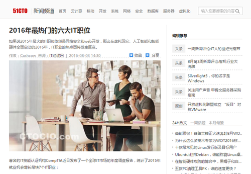
两列式的页面布局结构是页面中最常用的也是最简单的结构,尤其是在产品展示及新闻内容页面最为常见。如下图所示,51cto的新闻内的页面就是一个典型的两列式布局。
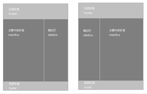
该布局方式在内容上分为主要内容区域和侧边栏。一般情况下该布局的两列宽度具有一定的固定值,不同的是主要内容区域及侧边栏的位置。为更好的理解两列的页面布局结构,将其简化为下图(上图中的尾部区域没有截图)。
由上面的示意图可知,一个页面主要分为上、中、下三个部分。根据示意图可以将页面结构以如下形式编写代码:
一、两列定宽布局
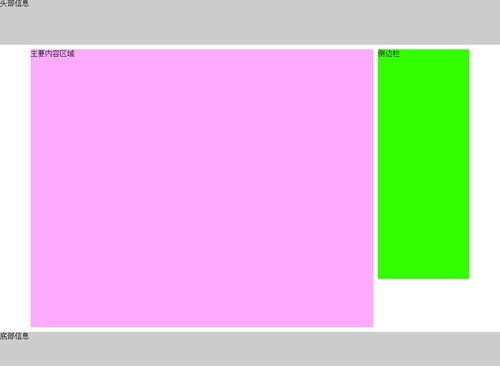
两列定宽布局主要是指将mainBox及sideBox这两个div标签的宽度值固定,再将其控制在页面内容区域中的左右两侧。
例如,将mainBox的宽度设为750px,高度设为900px;sideBox的宽度设为200px,高度设为600px;将其父元素id名为container的容器样式设为高度900px,宽度960px,上下外边距为10px。
注意事项:
1、关于清除浮动的方法,请看这里。
2、为了能够实现自适应高度的效果,需将样式中内容区域的高度删除,这样随意在HTML代码的mainBox容器中或者sideBox容器中添加内容,都不会有文字溢出容器的现象。
3、两列定宽的布局方式要求两列的盒模型宽度相加不能大于父级元素的宽度,否则将会导致页面内的错位现象。例如:如果上边代码中.mainBox 和 .sideBox 的宽度之和大于 #container 的宽度,.mainBox 和 .sideBox 将不会并列显示。
二、两列自适应布局
两列自适应布局方式其实就是将宽度属性以百分比的形式计算,但该宽度并不是盒模型的总宽度,而是盒模型的内容区域的宽度。
三、单列定宽单列自适应布局
根据上面的内容,无论是两列定宽的布局还是两列自适应的布局,两列的盒模型总宽度相加不能大于父级元素的宽度或者大于100%,否则就会出现错位的现象。那么试想一下,定宽的布局采用px为单位,而自适应布局采用的是百分比或者默认的auto,如何将这两种不同的单位结合在一起,最终实现我们想要的单列定宽单列自适应布局呢?
我们将自适应布局中的CSS样式稍微修改一下,保持mainBox的宽度属性值为70%,修改sideBox的宽度属性值为450px。
我们可以发现 sideBox 掉了下来,不再与 mainBox 并列显示了。原因是 container 宽度的30%小于450px(我的屏幕分辨率为1366*768),所以导致sideBox 被挤下来了。
解决这个问题比较好用的方法是利用“负边距”来处理。对 mainBox 添加“负边距” margin-right: 450px;,对 sideBox 添加“负边距”margin-left: -450px;。
更改之后,我们发现上面出现的问题好像完美的解决了(此处就不再截图了,有兴趣的同学可以自己操作一下),但美中不足的是,当视口的宽度小于 sideBox 的宽度时,即此处小于450px时,sideBox 同样会掉下来,更小时sideBox 的前面部分还会被遮挡。这个问题在实际操作中根据情况来操作,例如设置页面大小不小于 sideBox 的宽度, 或者使用媒体查询的方式,实时地更改 sideBox 的宽度等等。
四、两列等高布局
两列等高布局的方法有很多种,每一种都有自己的优点和缺点,不论哪一种方法,最终实现的效果都是相同的。
① 利用负边距实现
在原来HTML结构的基础上,改变CSS样式。代码如下所示:
②使用display:table-cell;
大家都知道在table中同一行列表中的元素高度都相同,因此我们可以借助display:table-cell;来实现等高布局。
③通过javascript
CSS代码如下:
使用该方法有一个不足是当浏览器窗口发生变化时,高度不能立即发生变化,这可以通过js来解决。
除此之外,还有其他一些方法,不过我觉得它们使用起来太过麻烦或者弊端太多,因此我就不再写出来了。
第二部分 三列或多列布局
多列的情况一般比较少见,其中常见的也就三列比较多,门户类型的网站中使用比较多。如腾讯网页面就是一个典型的三列式布局。(尾部未截图)

换个思维来看,我们会发现三列式布局可以看成是两个两列式布局组合而成的。因此我们只需以两列式布局结构的方式来对待三列式布局。
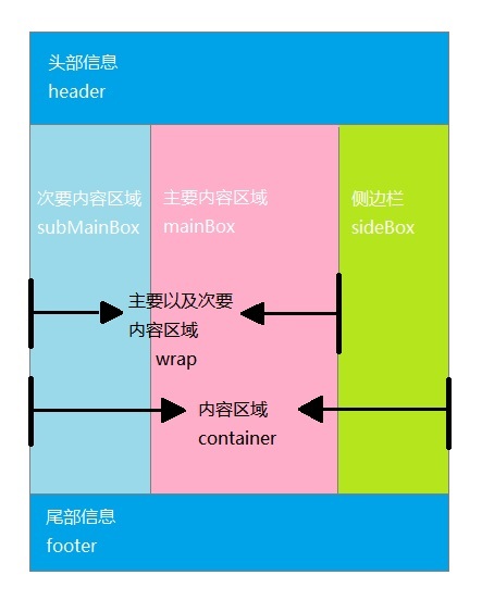
我们可以针对上图所示的结构以HTML代码表示为:
一、两列定宽中间自适应布局
①按照第一部分单列定宽单列自适应的方式
有一个小问题是在chrome和IE下,当窗口宽度过小时,会发生错位的现象,因此我们需要设置页面的最小距离。
②我认为是比较简单的方法
HTML结构跟上面的不一样,完整代码如下:
二、三列自适应布局和[b]三列等高布局[/b]
实现方法跟两列自适应布局及一样,这里就不写出代码了。
总结
至此,常见的几种页面布局已经介绍完毕,工作中想要实现的其他布局基本都可以以此为基础实现。俗话说:条条大路通罗马。实现你想要效果的方法有很多,关键是要找到适合自己的方法,才能在工作中更加游刃有余。
第一部分 两列式页面布局
两列式的页面布局结构是页面中最常用的也是最简单的结构,尤其是在产品展示及新闻内容页面最为常见。如下图所示,51cto的新闻内的页面就是一个典型的两列式布局。
该布局方式在内容上分为主要内容区域和侧边栏。一般情况下该布局的两列宽度具有一定的固定值,不同的是主要内容区域及侧边栏的位置。为更好的理解两列的页面布局结构,将其简化为下图(上图中的尾部区域没有截图)。
由上面的示意图可知,一个页面主要分为上、中、下三个部分。根据示意图可以将页面结构以如下形式编写代码:
<!DOCTYPE html>
<html lang="en">
<head>
<meta charset="UTF-8">
<title>两列式页面布局</title>
</head>
<body>
<div id="header">头部信息</div>
<div id="container">
<div class="mainBox">主要内容区域</div>
<div class="sideBox">侧边栏</div>
</div>
<div id="footer">底部信息</div>
</body>
</html>
有了以上HTML骨架,接下来就用CSS来实现我们想要的样式。
一、两列定宽布局
两列定宽布局主要是指将mainBox及sideBox这两个div标签的宽度值固定,再将其控制在页面内容区域中的左右两侧。
例如,将mainBox的宽度设为750px,高度设为900px;sideBox的宽度设为200px,高度设为600px;将其父元素id名为container的容器样式设为高度900px,宽度960px,上下外边距为10px。
<style type="text/css">
*{
margin: 0;
padding: 0;
}
#header,#footer{
width: 100%;
height: 100px;
background: #ccc;
}
#container{
width: 960px;
height: 900px;
margin: 10px auto;/**左右设为auto,是为了让container在页面内居中**/
}
.mainBox{
float: left;
width: 750px;
height: 900px;
color: #000;
background: #faf;
}
.sideBox{
float: right;
width: 200px;
height: 600px;
color: #000;
background: #3f0;
}
#container:after{        /**清除浮动**/
display: block;
visibility: hidden;
content: "";
clear: both;
}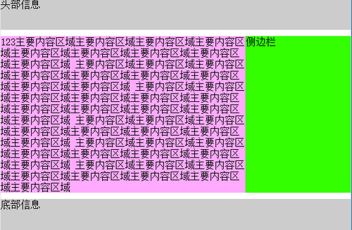
</style>效果图如下注意事项:
1、关于清除浮动的方法,请看这里。
2、为了能够实现自适应高度的效果,需将样式中内容区域的高度删除,这样随意在HTML代码的mainBox容器中或者sideBox容器中添加内容,都不会有文字溢出容器的现象。
3、两列定宽的布局方式要求两列的盒模型宽度相加不能大于父级元素的宽度,否则将会导致页面内的错位现象。例如:如果上边代码中.mainBox 和 .sideBox 的宽度之和大于 #container 的宽度,.mainBox 和 .sideBox 将不会并列显示。
二、两列自适应布局
两列自适应布局方式其实就是将宽度属性以百分比的形式计算,但该宽度并不是盒模型的总宽度,而是盒模型的内容区域的宽度。
<style type="text/css">
*{
margin: 0;
padding: 0;
}
#header,#footer{
width: 100%;
height: 100px;
background: #ccc;
}
#container{
margin: 10px auto;/**左右设为auto,是为了让container在页面内居中**/
}
.mainBox{
float: left;
width: 70%;
height: 900px;
color: #000;
background: #faf;
}
.sideBox{
float: right;
width: 29%;
height: 600px;
color: #000;
background: #3f0;
}
#container:after{        /**清除浮动**/
display: block;
visibility: hidden;
content: "";
clear: both;
}
</style>这样mainBox和sideBox容器的高度就会随着里面内容的多少而改变。效果图就不贴出来了,有兴趣的同学可以自行拷贝代码运行一下。三、单列定宽单列自适应布局
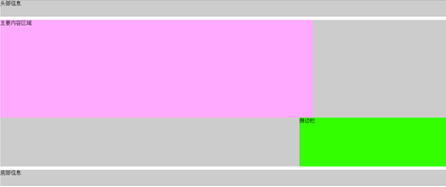
根据上面的内容,无论是两列定宽的布局还是两列自适应的布局,两列的盒模型总宽度相加不能大于父级元素的宽度或者大于100%,否则就会出现错位的现象。那么试想一下,定宽的布局采用px为单位,而自适应布局采用的是百分比或者默认的auto,如何将这两种不同的单位结合在一起,最终实现我们想要的单列定宽单列自适应布局呢?
我们将自适应布局中的CSS样式稍微修改一下,保持mainBox的宽度属性值为70%,修改sideBox的宽度属性值为450px。
<style type="text/css">
*{
margin: 0;
padding: 0;
}
#header,#footer{
width: 100%;
height: 50px;
background: #ccc;
}
#container{
background: #ccc;
margin: 10px auto;/**左右设为auto,是为了让container在页面内居中**/
}
.mainBox{
float: left;
width: 70%;
color: #000;
background: #faf;
}
.sideBox{
float: right;
width: 450px;
color: #000;
background: #3f0;
}
#container:after{        /**清除浮动**/
display: block;
visibility: hidden;
content: "";
clear: both;
}
</style>修改后的效果如下(为方便截图我将各个div的高度都设置了一定的高度)我们可以发现 sideBox 掉了下来,不再与 mainBox 并列显示了。原因是 container 宽度的30%小于450px(我的屏幕分辨率为1366*768),所以导致sideBox 被挤下来了。
解决这个问题比较好用的方法是利用“负边距”来处理。对 mainBox 添加“负边距” margin-right: 450px;,对 sideBox 添加“负边距”margin-left: -450px;。
更改之后,我们发现上面出现的问题好像完美的解决了(此处就不再截图了,有兴趣的同学可以自己操作一下),但美中不足的是,当视口的宽度小于 sideBox 的宽度时,即此处小于450px时,sideBox 同样会掉下来,更小时sideBox 的前面部分还会被遮挡。这个问题在实际操作中根据情况来操作,例如设置页面大小不小于 sideBox 的宽度, 或者使用媒体查询的方式,实时地更改 sideBox 的宽度等等。
四、两列等高布局
两列等高布局的方法有很多种,每一种都有自己的优点和缺点,不论哪一种方法,最终实现的效果都是相同的。
① 利用负边距实现
在原来HTML结构的基础上,改变CSS样式。代码如下所示:
<style type="text/css">
*{
margin: 0;
padding: 0;
}
#header,#footer{
width: 100%;
height: 50px;
background: #ccc;
}
#container{
overflow: hidden;
background: #ccc;
margin: 10px auto;/**左右设为auto,是为了让container在页面内居中**/
}
.mainBox{
float: left;
margin-right: 450px;
width: auto;
background: #faf;
}
.sideBox{
float: right;
width: 450px;
background: #3f0;
margin-left: -450px;
}
.mainBox,.sideBox{
color: #000;
margin-bottom: -9999px;
padding-bottom: 9999px;
}
#container:after{        /**清除浮动**/
display: block;
visibility: hidden;
content: "";
clear: both;
}
</style>
该方法的重点是设置了 mainBox 和 sideBox 的margin-bottom 和 padding-bottom 属性, 以及父元素container 使用了overflow属性。使用该方法有一个很大的弊端是如果mainBox 或者 sideBox 设置背景图片的background-position 的值为bottom时,那么背景图片很有可能会“消失”。除此之外还有很多其他的不足,因此不建议使用该方法。②使用display:table-cell;
大家都知道在table中同一行列表中的元素高度都相同,因此我们可以借助display:table-cell;来实现等高布局。
<style type="text/css">
*{
margin: 0;
padding: 0;
}
#header,#footer{
width: 100%;
height: 50px;
background: #ccc;
}
#container{
display: table-row;
background: #ccc;
margin: 10px auto;
}
.mainBox{
display: table-cell;
width: 70%;
background: #faf;
color: #000;
}
.sideBox{
display: table-cell;
width: 30%;
background: #3f0;
color: #000;
}

</style> 这种方法我认为是最简单也是最有效的。③通过javascript
CSS代码如下:
<style type="text/css">
*{
margin: 0;
padding: 0;
}
#header,#footer{
width: 100%;
height: 50px;
background: #ccc;
}
#container{
background: #ccc;
margin: 10px auto;/**左右设为auto,是为了让container在页面内居中**/
}
.mainBox{
float: left;
width: 70%;
color: #000;
background: #faf;
}
.sideBox{
float: right;
width: 30%;
color: #000;
background: #3f0;
}
#container:after{        /**清除浮动**/
display: block;
visibility: hidden;
content: "";
clear: both;
}
</style>以下才是控制两列等高的关键所在,<script type="text/javascript">
var mainBox = document.getElementsByClassName("mainBox")[0];
var sideBox = document.getElementsByClassName("sideBox")[0];
if(mainBox.clientHeight < sideBox.clientHeight){
alert(mainBox.clientHeight);
mainBox.style.height = sideBox.clientHeight + "px";
}else {
sideBox.style.height = mainBox.clientHeight + "px";
}
</script> 在HTML中嵌入以上代码,即可实现我们想要的等高效果。运行结果如下:使用该方法有一个不足是当浏览器窗口发生变化时,高度不能立即发生变化,这可以通过js来解决。
除此之外,还有其他一些方法,不过我觉得它们使用起来太过麻烦或者弊端太多,因此我就不再写出来了。
第二部分 三列或多列布局
多列的情况一般比较少见,其中常见的也就三列比较多,门户类型的网站中使用比较多。如腾讯网页面就是一个典型的三列式布局。(尾部未截图)
换个思维来看,我们会发现三列式布局可以看成是两个两列式布局组合而成的。因此我们只需以两列式布局结构的方式来对待三列式布局。
我们可以针对上图所示的结构以HTML代码表示为:
<!DOCTYPE html>
<html lang="en">
<head>
<meta charset="UTF-8">
<title>三列式布局</title>
</head>
<body>
<div id="header">头部信息</div>
<div id="container">
<div class="wrap">
<div class="mainBox">主要内容区域</div>
<div class="subMainBox">次要内容区域</div>
</div>
<div class="sideBox">侧边栏</div>
</div>
<div class="footer">底部信息</div>
</body>
</html>
一、两列定宽中间自适应布局
①按照第一部分单列定宽单列自适应的方式
<style>
*{
margin: 0;
padding: 0;
}
#header,#footer{
width: 100%;
height: 100px;
background: #ccc;
}
.wrap{
float: left;
width: auto;
margin-right: 200px;/**margin-right 的值要等于 sideBox 的宽度**/
}
.sideBox{
float: right;
width: 200px;
background: #3af;
margin-left: -200px;/**margin-left 的值要等于 sideBox 的宽度的负值**/
}
.subMainBox{
float: left;
width: 200px;
background: #33ff00;
margin-right: -200px;/**margin-right 的值要等于 subMainBox的宽度的负值**/
}
.mainBox{
float: right;
width: auto;
margin-left: 200px;/**margin-right 的值要等于 subMainBox 的宽度**/
background: #faf;
}
.wrap:after,#container:after{
display: block;
visibility: hidden;
content: "";
clear: both;
}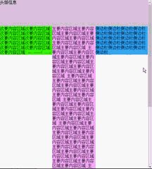
</style>运行效果如下有一个小问题是在chrome和IE下,当窗口宽度过小时,会发生错位的现象,因此我们需要设置页面的最小距离。
②我认为是比较简单的方法
HTML结构跟上面的不一样,完整代码如下:
<!DOCTYPE html>
<html lang="en">
<head>
<meta charset="UTF-8">
<title>三列式布局</title>
<style>
*{
margin: 0;
padding: 0;
}
#container{
margin: 5px 0;
}
#header,#footer{
width: 100%;
height: 100px;
background: #ccc;
}
.subMainBox{
float: left;
width: 200px;
background: #af3;
margin-right: -200px;
}
.mainBox{
float: left;
background: #3af;
width: auto;
margin-left: 200px;
margin-right: 200px;
}
.sideBox{
float: right;
width: 200px;
background: #ff3;
margin-left: -200px;
}
#container:after{
display: block;
visibility: hidden;
content: "";
clear: both;
}
</style>
</head>
<body>
<div id="header">头部信息</div>
<div id="container">
<div class="subMainBox">次要内容区域次要内容区域次要内容区域次要内容区域次要内容区
域次要内容区域次要内容区域次要内容区域次要内容区域次要内容区域次要内容区域
</div>
<div class="mainBox">主要内容区域主要内容区域主要内容区域主要内容区域主要内容区域
主要内容区域主要内容区域主要内容区域主要内容区域主要内容区域主要内容区域主
要内容区域<br>
主要内容区域主要内容区域主要内容区域<br>
主要内容区域主要内容区域主要内容区域<br>
主要内容区域主要内容区域主要内容区域<br>
主要内容区域主要内容区域主要内容区域<br>
主要内容区域主要内容区域主要内容区域<br>
主要内容区域主要内容区域主要内容区域<br>
主要内容区域主要内容区域主要内容区域<br>
主要内容区域主要内容区域主要内容区域<br>
</div>

<div class="sideBox">侧边栏侧边栏侧边栏侧边栏侧边栏侧边栏侧边栏侧边栏侧边栏侧边栏侧边栏侧边栏
侧边栏侧边栏侧边栏侧边栏侧边栏侧边栏侧边栏侧边栏侧边栏</div>
</div>
<div id="footer">底部信息</div>
</body>
</html> 这种方法出现的问题跟上面的一样,解决方法也同上。二、三列自适应布局和[b]三列等高布局[/b]
实现方法跟两列自适应布局及一样,这里就不写出代码了。
总结
至此,常见的几种页面布局已经介绍完毕,工作中想要实现的其他布局基本都可以以此为基础实现。俗话说:条条大路通罗马。实现你想要效果的方法有很多,关键是要找到适合自己的方法,才能在工作中更加游刃有余。

相关文章推荐
- CSS页面布局基础1
- Java Web入门之css页面布局基础知识
- 【小细节】利用基础HTML和CSS实现企业最常见的布局
- 常见的几种页面内容布局方式
- CSS页面布局基础1——盒模型
- css页面布局基础
- 常见的几种页面布局方式
- 一些页面布局常见CSS问题
- CSS页面布局基础3——元素浮动
- css页面布局基础
- CSS基础 - 页面布局
- css中常见几种float方式以及倒计时(刷新页面不清)
- css页面中常见左中右分栏布局的两种实现方式
- CSS页面布局基础4——元素可见性、溢出和元素重叠问题
- css页面布局基础盒模型
- css页面布局基础
- css 常见页面布局之圣杯布局(margin负值法)
- [置顶] CSS中几种控制页面布局的定位机制(相对定位与绝对定位)
- CSS页面布局基础
- 前端基础学习-常见CSS网页布局