Android ConstraintLayout
2016-07-28 10:01
537 查看
说明
Google I/O 2016 上发布了 ConstraintLayout, 简直是要变革 Android 写界面方式. 于是第二天我立即找到相关文档尝试,这是官方提供的 Codelab 项目. 手把手教你探索 ConstraintLayout. 英文原文: https://codelabs.developers.google.com/codelabs/constraint-layout/index.html
本文涉及到一些词汇对照表:
EN CN
Constraint 约束
Constraint Handle 约束手柄
AutoConnect 自动连接
Inference 推理
UI Builder UI 生成器
| EN | CN |
|---|---|
| Constraint | 约束 |
| Constraint Handle | 约束手柄 |
| AutoConnect | 自动连接 |
| Inference | 推理 |
| UI BuilderUI | 生成器 |
概述
在此 codelab 中, 你将会学习 ConstrainLayout – 一个构建在灵活的约束系统上的新型 Layout, 由 Android Support 库提供. 在此 Codelab 的最后, 你将能够使用 Android Studio 中的布局编辑器建立一个相当复杂的布局(使用 ConstrainLayout).
constraint-layout 库和 UI 生成器当期处于 preview 状态.
将学到什么
新布局管理器使用的约束系统 创建约束以构建灵活且高效的布局
新布局编辑器中的各种特性
你所需的准备
Android Studio 2.2 preview 或者更新的版本 样例代码
获取样例代码
要下载样例代码, 你可以选择:下载 zip
或者用命令行克隆 Github 仓库
git clone https://github.com/googlecodelabs/constraint-layout.git
contraint-layout 仓库包括一个工程: * constraint-layout-start — 包含此 Codelab 中你将会构建的 layout 的工程.
运行样例代码
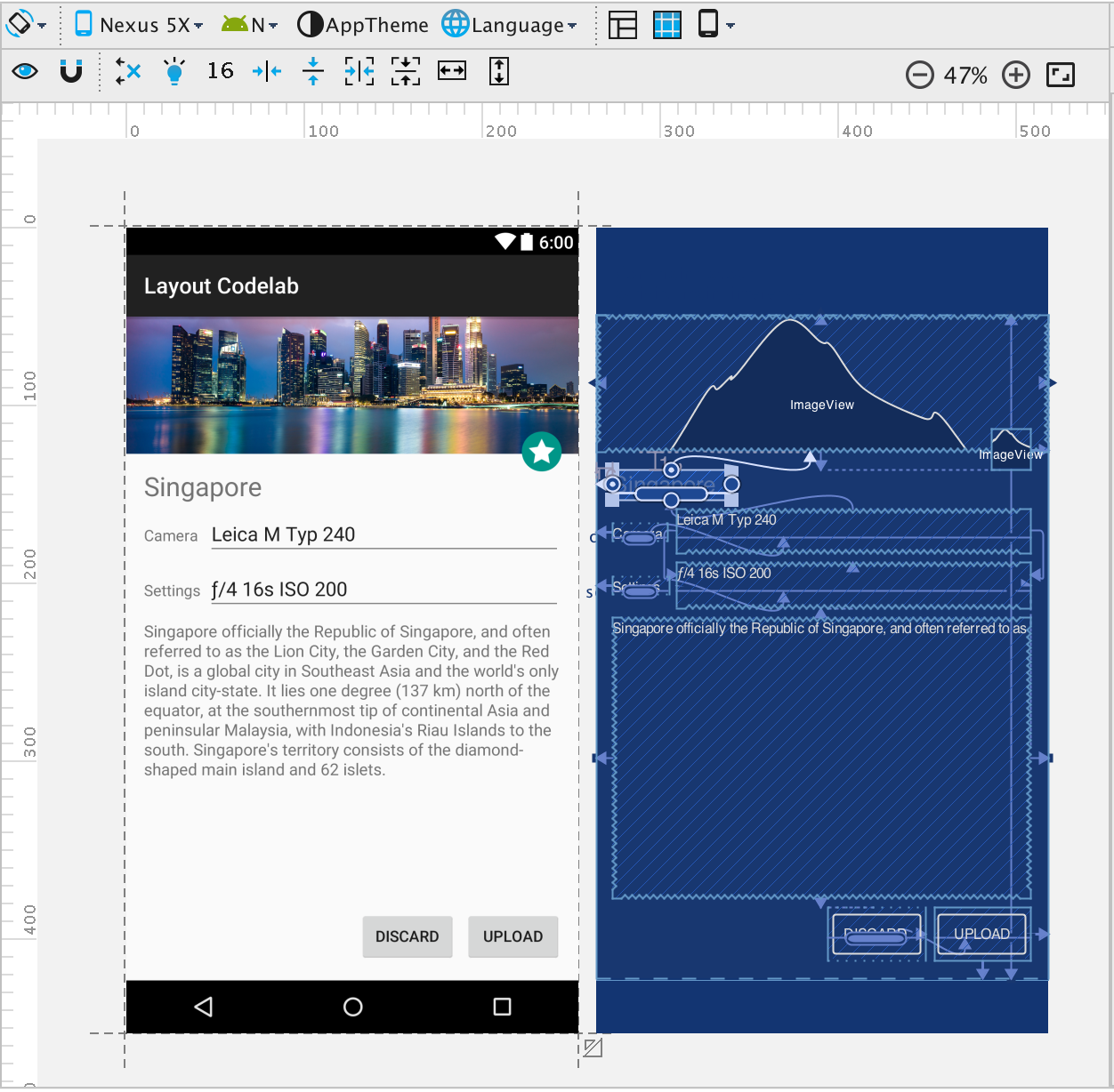
首先, 我们来看看这个已经完成的应用的样子. 下载代码后, 这个指导书讲解了如何用 Android Studio 打开完整的样例应用. 请注意此样例需要 Android Studio 2.2 preview.
打开 File > New > Import Project 并从之前下载样例代码目录选择constraint-layout-start 目录

点击Gradle sync 按钮.

从工程面板打开 res/layout/activity_main_done.xml.
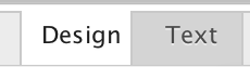
选择 Design 标签查看最终布局.
改变 UI 生成器做上的 “Virtual Device to render the layout with”(渲染所用的虚拟设备)查看在不同情况中的布局.
或者:
如果你打算在 Android 设备上运行此样例, 打开 MainActivity.java 并确保 setContentView 方法使用参数是 activity_main_done.xml.
<code class="hljs bash has-numbering" style="display: block; padding: 0px; color: inherit; box-sizing: border-box; font-family: "Source Code Pro", monospace;font-size:undefined; white-space: pre; border-radius: 0px; word-wrap: normal; background: transparent;"><span class="hljs-keyword" style="color: rgb(0, 0, 136); box-sizing: border-box;">set</span>ContentView(R.layout.activity_main_<span class="hljs-keyword" style="color: rgb(0, 0, 136); box-sizing: border-box;">done</span>);</code><ul class="pre-numbering" style="box-sizing: border-box; position: absolute; width: 50px; top: 0px; left: 0px; margin: 0px; padding: 6px 0px 40px; border-right-width: 1px; border-right-style: solid; border-right-color: rgb(221, 221, 221); list-style: none; text-align: right; background-color: rgb(238, 238, 238);"><li style="box-sizing: border-box; padding: 0px 5px;">1</li></ul><ul class="pre-numbering" style="box-sizing: border-box; position: absolute; width: 50px; top: 0px; left: 0px; margin: 0px; padding: 6px 0px 40px; border-right-width: 1px; border-right-style: solid; border-right-color: rgb(221, 221, 221); list-style: none; text-align: right; background-color: rgb(238, 238, 238);"><li style="box-sizing: border-box; padding: 0px 5px;">1</li></ul>
接入你的 Android 设备并点击运行

按钮. 你应当会看到 constraint-layout 屏幕出现在模拟器或者已连接的设备上.
常见问题
如何安装 Android Studio? 如何启用 USB 调试?
Gradle sync error: Ensure that you update the SDK Manager to use build tools version >= 23.0.2. The error message typically has a link that helps in downloading the build tools version.
约束系统概览
布局引擎使用每一个控件指定的约束确定他们在布局中的位置. 你可以手动指定约束, 也可以使用 Android Studio 布局编辑器推理自动指定. 为了更好的理解约束, 让我来看看选中空间上可用的基础手柄.
约束
约束帮助你保持控件对齐. 你可以使用锚点(比如下图展示的约束手柄)来确定各控件之间的对齐规则. 例如, 设置一个从 button 2 的左手柄到 button 1 的右手柄的约束(见下图A)意味着控件 button 2 将会位于 button 1 右边 56dp 处. 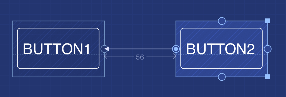
Figure A.
手柄的类型:
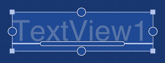
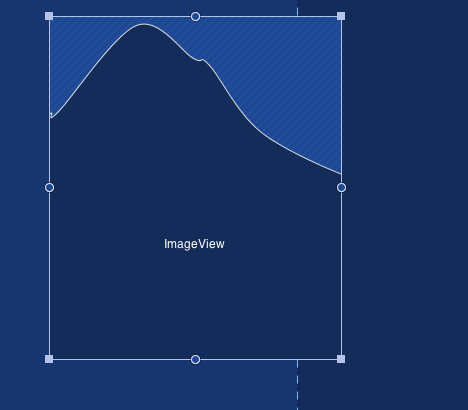
Figure B. 在这个控件中我们可以看到不同的手柄
改变尺寸的手柄: 类似于其它你可能已经用过的绘图设计程序, 调整尺寸的手柄允许你改变控件的尺寸.

侧边约束手柄: 侧边约束 handle 呈现为每一个控件侧边的圆圈, 可以让你指定控件的位置. 例如, 你可以使用某个控件的左侧边约束 handle 设置控件总是位于另一个控件右边 24dp 处. 这种手柄在此 codelab 中也被称作锚点.

基准线约束手柄:
基准线约束 handle 帮助你对齐两个控件的文本区域, 与控件尺寸无关. 在你想使用两个不同大小的控件同时又想保持其中文字对齐的时候很有帮助.

约束系统的规则
除了以下情况外, 布局中控件的锚点可以连接到其它控件的任意锚点. * 不同轴上的锚点, 例如左边和上边的锚点不能相连.
* 基线约束 handle 只能与其它极限建立约束
禁止会产生循环的锚点连接
构建入门项目
现在你已经准备好在入门项目上构建你的 constraint layout 了.从左导航栏打开 res/layout/activity_main_start.xml.
引入 constraint-layout 的依赖
constraint-layout 被构建为一个独立的 support 库, 支持所有 Android 2.3(Gingrebread) 以上的 Android 版本. 本入门项目已经在 app/build.gradle 中包含了它的依赖. 对于你打算用 ConstraintLayout 构建的应用, 加入如下编译依赖:<code class="hljs r has-numbering" style="display: block; padding: 0px; color: inherit; box-sizing: border-box; font-family: "Source Code Pro", monospace;font-size:undefined; white-space: pre; border-radius: 0px; word-wrap: normal; background: transparent;">dependencies {
<span class="hljs-keyword" style="color: rgb(0, 0, 136); box-sizing: border-box;">...</span>
compile <span class="hljs-string" style="color: rgb(0, 136, 0); box-sizing: border-box;">'com.android.support.constraint:constraint-layout:1.0.0-alpha'</span>
}</code><ul class="pre-numbering" style="box-sizing: border-box; position: absolute; width: 50px; top: 0px; left: 0px; margin: 0px; padding: 6px 0px 40px; border-right-width: 1px; border-right-style: solid; border-right-color: rgb(221, 221, 221); list-style: none; text-align: right; background-color: rgb(238, 238, 238);"><li style="box-sizing: border-box; padding: 0px 5px;">1</li><li style="box-sizing: border-box; padding: 0px 5px;">2</li><li style="box-sizing: border-box; padding: 0px 5px;">3</li><li style="box-sizing: border-box; padding: 0px 5px;">4</li></ul><ul class="pre-numbering" style="box-sizing: border-box; position: absolute; width: 50px; top: 0px; left: 0px; margin: 0px; padding: 6px 0px 40px; border-right-width: 1px; border-right-style: solid; border-right-color: rgb(221, 221, 221); list-style: none; text-align: right; background-color: rgb(238, 238, 238);"><li style="box-sizing: border-box; padding: 0px 5px;">1</li><li style="box-sizing: border-box; padding: 0px 5px;">2</li><li style="box-sizing: border-box; padding: 0px 5px;">3</li><li style="box-sizing: border-box; padding: 0px 5px;">4</li></ul>
定位到 res/layout/activity_main_start.xml
包含在此 codelab 项目中此 xml 布局已经有了一个空的 ConstraintLayout 元素. ConstraintLayout一开始就被构建为在 UI 生成器中单独使用.<code class="hljs xml has-numbering" style="display: block; padding: 0px; color: inherit; box-sizing: border-box; font-family: "Source Code Pro", monospace;font-size:undefined; white-space: pre; border-radius: 0px; word-wrap: normal; background: transparent;"><span class="hljs-pi" style="color: rgb(0, 102, 102); box-sizing: border-box;"><?xml version="1.0" encoding="utf-8"?></span> <span class="hljs-tag" style="color: rgb(0, 102, 102); box-sizing: border-box;"><<span class="hljs-title" style="box-sizing: border-box; color: rgb(0, 0, 136);">android.support.constraint.ConstraintLayout </span> <span class="hljs-attribute" style="box-sizing: border-box; color: rgb(102, 0, 102);">xmlns:android</span>=<span class="hljs-value" style="box-sizing: border-box; color: rgb(0, 136, 0);">"http://schemas.android.com/apk/res/android"</span> <span class="hljs-attribute" style="box-sizing: border-box; color: rgb(102, 0, 102);">xmlns:app</span>=<span class="hljs-value" style="box-sizing: border-box; color: rgb(0, 136, 0);">"http://schemas.android.com/apk/res-auto"</span> <span class="hljs-attribute" style="box-sizing: border-box; color: rgb(102, 0, 102);">android:layout_width</span>=<span class="hljs-value" style="box-sizing: border-box; color: rgb(0, 136, 0);">"match_parent"</span> <span class="hljs-attribute" style="box-sizing: border-box; color: rgb(102, 0, 102);">android:layout_height</span>=<span class="hljs-value" style="box-sizing: border-box; color: rgb(0, 136, 0);">"match_parent"</span>></span> <span class="hljs-tag" style="color: rgb(0, 102, 102); box-sizing: border-box;"></<span class="hljs-title" style="box-sizing: border-box; color: rgb(0, 0, 136);">android.support.constraint.ConstraintLayout</span>></span></code><ul class="pre-numbering" style="box-sizing: border-box; position: absolute; width: 50px; top: 0px; left: 0px; margin: 0px; padding: 6px 0px 40px; border-right-width: 1px; border-right-style: solid; border-right-color: rgb(221, 221, 221); list-style: none; text-align: right; background-color: rgb(238, 238, 238);"><li style="box-sizing: border-box; padding: 0px 5px;">1</li><li style="box-sizing: border-box; padding: 0px 5px;">2</li><li style="box-sizing: border-box; padding: 0px 5px;">3</li><li style="box-sizing: border-box; padding: 0px 5px;">4</li><li style="box-sizing: border-box; padding: 0px 5px;">5</li><li style="box-sizing: border-box; padding: 0px 5px;">6</li><li style="box-sizing: border-box; padding: 0px 5px;">7</li><li style="box-sizing: border-box; padding: 0px 5px;">8</li></ul><ul class="pre-numbering" style="box-sizing: border-box; position: absolute; width: 50px; top: 0px; left: 0px; margin: 0px; padding: 6px 0px 40px; border-right-width: 1px; border-right-style: solid; border-right-color: rgb(221, 221, 221); list-style: none; text-align: right; background-color: rgb(238, 238, 238);"><li style="box-sizing: border-box; padding: 0px 5px;">1</li><li style="box-sizing: border-box; padding: 0px 5px;">2</li><li style="box-sizing: border-box; padding: 0px 5px;">3</li><li style="box-sizing: border-box; padding: 0px 5px;">4</li><li style="box-sizing: border-box; padding: 0px 5px;">5</li><li style="box-sizing: border-box; padding: 0px 5px;">6</li><li style="box-sizing: border-box; padding: 0px 5px;">7</li><li style="box-sizing: border-box; padding: 0px 5px;">8</li></ul>
切换到显示为编辑器窗口底部一个标签页的 Design 视图.
添加一个 ImageView 到布局中
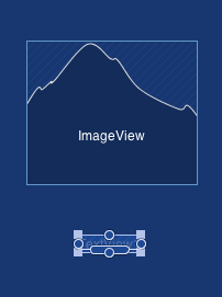
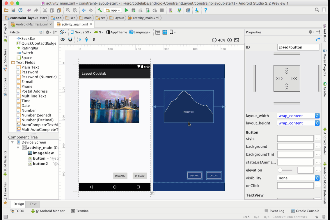
第一个任务是添加一个 ImageView 到布局中. 在设计窗口, 找到控件选择板上的 ImageView 拖入布局.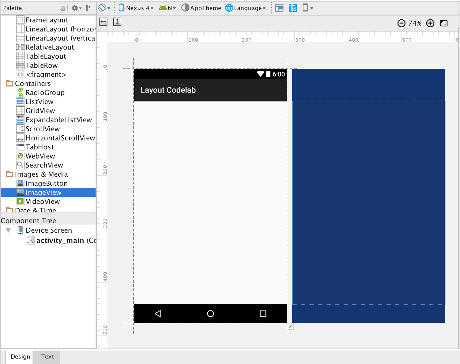
ImageView 被拖入布局后, UI 生成器就会立即询问其所使用的资源(显示在 ImageView 中的图). constraint-layout-start 项目已经包含了一些让让此 codelab 更加顺利的资源. 直接去选择 @drawable/singapore 资源就好.
选择好后, ImageViewe 出现在布局上, 你可以如”约束系统概述”中提到的一样点击拖动角以调整图片大小.
添加 TextView 到布局中
现在让我们从控件板上拖一个 TextView 到布局上. 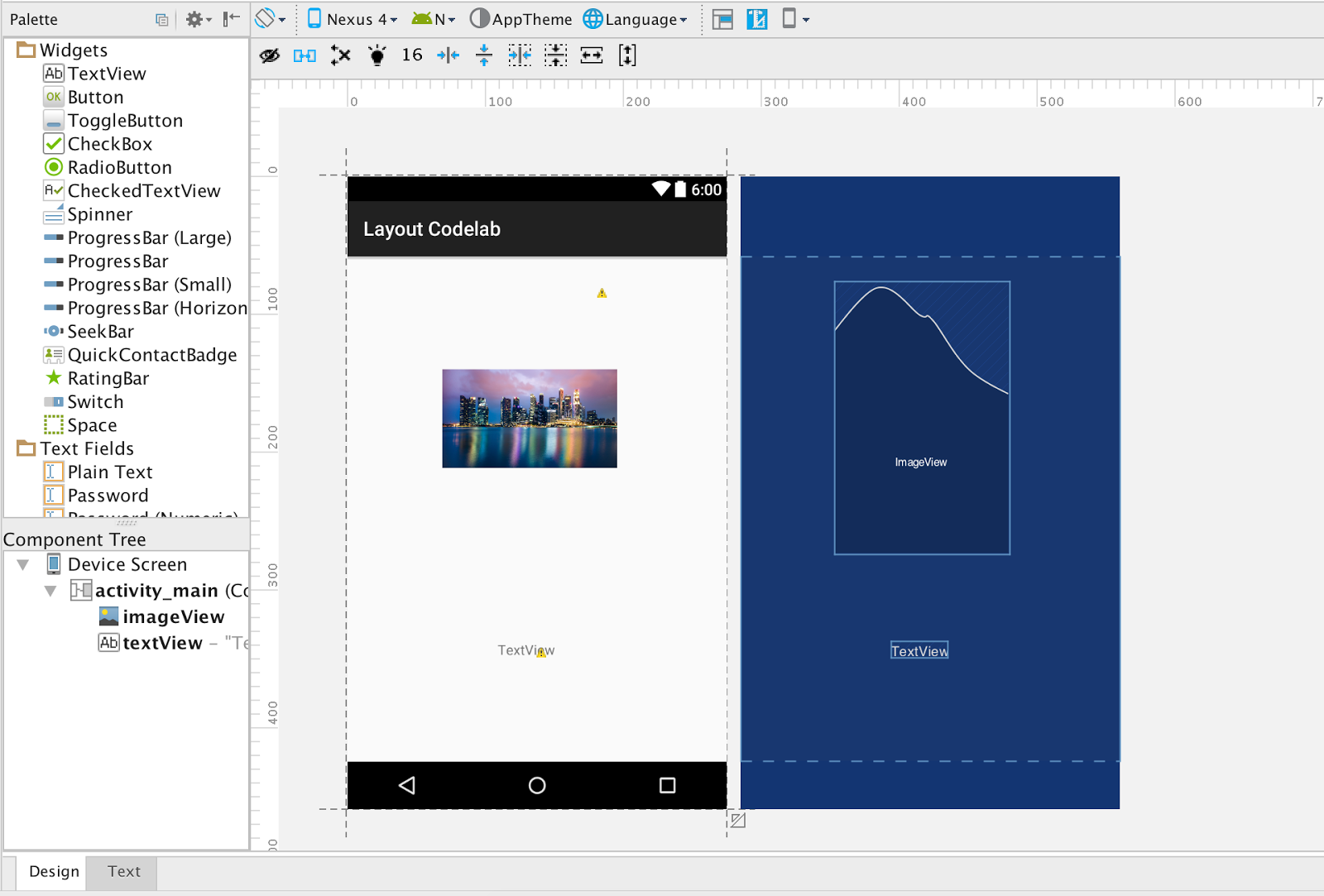
我们在 UI 生成器中看到一些警告, 这些是由 ImageView 缺失 contentDescription 参数和 TextView 中硬编码的文本导致的. 内容描述参数(contentDescription)对构建无障碍应用很关键. 在本 codelab 中, 我们使用一个预先可用的资源 @string/dummy 作为这些属性值.
在右边, 一个检查面板让你可以改变选中控件的各个参数.
选中 ImageView 然后添加 @string/dummy 到它的contentDescription 属性中.
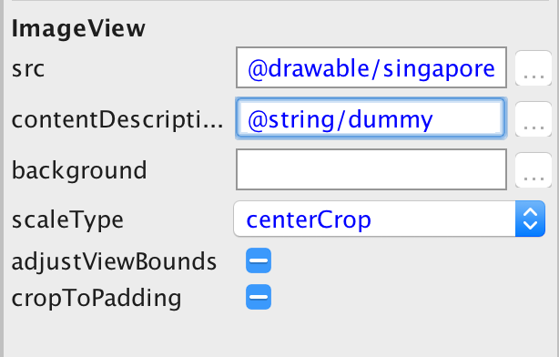
在Inspector 面板中, 还可以看见 ImageView 的其它属性. 把 scaleType 属性改为 centerCrop以符合此 codelab 的目标.
接下来, 我们选择 TextView 并使用 Inspector 面板修改 text 属性值为
@string/singapore.
此刻, 在布局中有两个 View. 在下一节, 我们会学习如何创建 View 之间的约束.
创建手工约束
要创建一个约束, 你需要在指定手柄上点击并按住鼠标, 然后拖到另一个控件的约束手柄. 一旦锚点变绿, 就可以松开鼠标完成约束创建.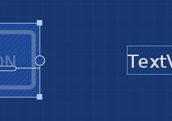
重要: UI 生成器默认自动连接(AutoConnect)模式开启. 因为本节我们在学习手动创建约束, 点击

以关闭自动连接, 或者确保它之前已经被关闭.
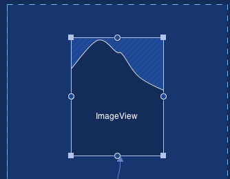
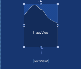
在我们开始之前, 确保布局中已经有一个 ImageView 和一个 TextView. 这里我们的目标是创建已经在布局上的 ImageView, 容器以及 TextView 之间的约束.
假定我们需要最终布局中 TextView 在 ImageView 下面. 为了实现, 我们可以如下所示创建一个 TextView 上锚点和 ImageView 底锚点之间的约束.
删除约束
使用这个

显示在布局中的删除约束按钮以删除选中控件上的 所有 约束.
要删除单个约束, 点击设定了该约束的锚点
如果你打算删除布局中的所有约束, 使用菜单图标.
下一步是创建 ImageView 顶锚点于 Layout 顶部的约束.
最终我们还可以使用左和右侧边约束锚定 ImageView 在布局中间.
本节演示了如何用拖拽连接线的方式创建控件间约束的基础. 此时你可以通过添加其他元素的方式探索一下各种 View 和 UI 生成器. 在下一节中我们将学习Inspector.
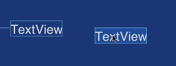
创建基线约束
要连接控件的基线, 鼠标悬浮在空间上, 等几秒钟, 基线约束出现然后就可以连接了.
熟悉 Inspector
本节我们看一下 View Inspector. Inspector 在 UI 生成器上的右边. 除了列出所选控件的属性, 它还展示了 View 是如何对齐的以及所有的约束.继续, 从布局中删除 TextView
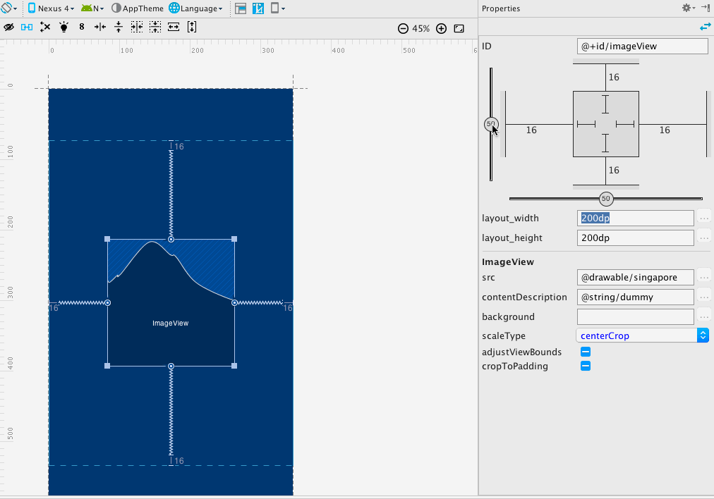
创建 ImageView 底锚点和容器底部的约束
UI 生成器应该看起来是这样
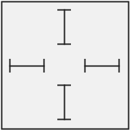
Inspector 显示出控件控件在一个方形区域的中间. 下面的小节说明了它各个元素已经他们的使用.
Margins: 控件外部的左右上下就是 margin. 你可以点击 margin 的值并设置成另一个值来改变它. 在上面的截图中, margins 的值被设为 16dp.
删除约束: 在 Inspector 中点击链接控件和容器的线同样可以删除约束. 注意, 删除约束删除约束还可以通过点击已有的约束手柄实现.
相对约束定位控件: 当一个控件上有至少两个对立的连接时, 比如上和下, 或者左和右, 你可以看到一个可以让你沿着对立连接的轴调整控件位置的滑块. 这也被称为横向或纵向偏量. 调整纵向和横向偏量然后改变方向, 可以看到偏量依然保留. 另外也可以通过移动控件到目标目标位置实现这一点.
继续, 改变垂直偏量至75%, 而横向偏量到75%. 下面的图可用作参考.
控制控件的内部尺寸: 控件内部的线允许你控制它的尺寸, 你可以点击特定的线看看它的具体运作方式.
这是 Inspector 中一个控件的放大视图. 点击 Inspector 面板控件内部的线, 会循环切换以下选项

Fixed: 此选项允许你指定控件的高和宽.

AnySize: 此选项让控件占用所有可用空间以适应约束. 换句话说, 这更像是匹配约束. 与 match_parent 不同, 后者占用父 View 的所有可用空间.

Wrap Content: 此选项仅扩展至所含元素(如 text 或者 drawable)填充满 widget.
AnySize 与容器无关. 如果 ImageView 约束于一个 Button, 设置为 AnySize 只会扩展它适应 button.
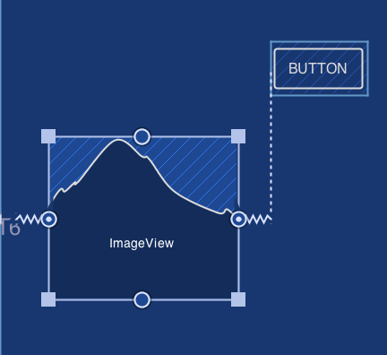
Figure A: 显示 ImageView 在设定 width 为 ‘AnySize’ 前
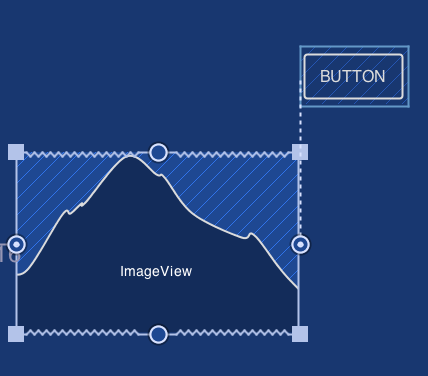
Figure B:显示 ImageView 在设定 width 为 ‘AnySize’ 后
要查看并编辑一个指定控件所有其他参数, 点击 Properties 面板右上的

在本节中, 我们探索了 Inspector. Inspector 的目的是让你在不离开 UI 生成器的情况下编辑所有参数和约束.
使用自动连接创建约束
Autoconnect, 顾名思义, 自动创建控件之间的连接. 理解 Autoconnect 尝试创建控件与邻近控件之间的连接的功能非常重要.在我们开始本节前, 请确保:
从 Project 面板打开res/layout/activity_main_autoconnect.xml. 选择 “Design” 标签
Autoconnect 已经启用

下面我们选择 ImageView 然后拖动它到布局中间直到提示线出现, 几秒钟内, 它就被居中了, Autoconnect 介入并创建了与容器上下左右的约束, 如下面的动画所示.
现在布局里只有单一个 ImageView, 我们来看一下 Autoconnect 是如何创建约束的
这里是本节下一部分的步骤, 作为指导, 上面的动画显示下方使用的步骤:
把 ImageView 对齐到顶部并使用 Inspector(AnySize) 确保它扩展填充父 View 的宽度.
在布局右下角放置两个按钮. 使用 Inspector 面板把最右边按钮 text 属性改成@string/upload, 左边的改成 @string/discard.
从控件板上拖一个 TextView 和一个 Plain Text 到布局上.
调整 TextView 和 Plain Text 相距 48dp. 几秒内, Autoconnect 就会创建两个控件的约束.
同样选择上传按钮并放置它接近右 margin 然后让 Autoconnect 完成剩余的事情
最后把舍弃按钮放置在距离上传按钮 32dp 的地方.
作为一个练习, 移动 TextView 到 ImageView 下方 48dp 的位置. 要做到这个, 选择 TextView 并移动它直到它位于 ImageView 下方 48dp 处.
明白 Autoconnect 仅为当前正在移动的控件创建约束是很重要.
Autoconnect 通过自动连接相近的控件协助你, 这在很多情况下非常有用. 有些情况 Autoconnect 不能完成预期行为, 此时开发者应当使用人工约束或者推理来构建 ConstraintLayout. 推理将在此 codelab 的下一节讨论.
使用推理创建约束
推理引擎辅助开发者在布局添加的元素之间创建约束. 由推理创建的约束依赖于添加到布局的元素的类型和他们的尺寸.推理(Inference)和自动连接(Autoconnect)有什么区别
推理引擎创建布局上的所有元素之间的约束, 而自动连接创建邻居元素之间的约束
自动连接的目标是创建用来布局正在被操纵的控件的约束. 其它空间不会约束于你正在移动的控件, 但是你正在移动的控件会约束与其它控件. 这是一个重要的区别, 因为它意味着自动连接不会修改你当前的约束.
Setup
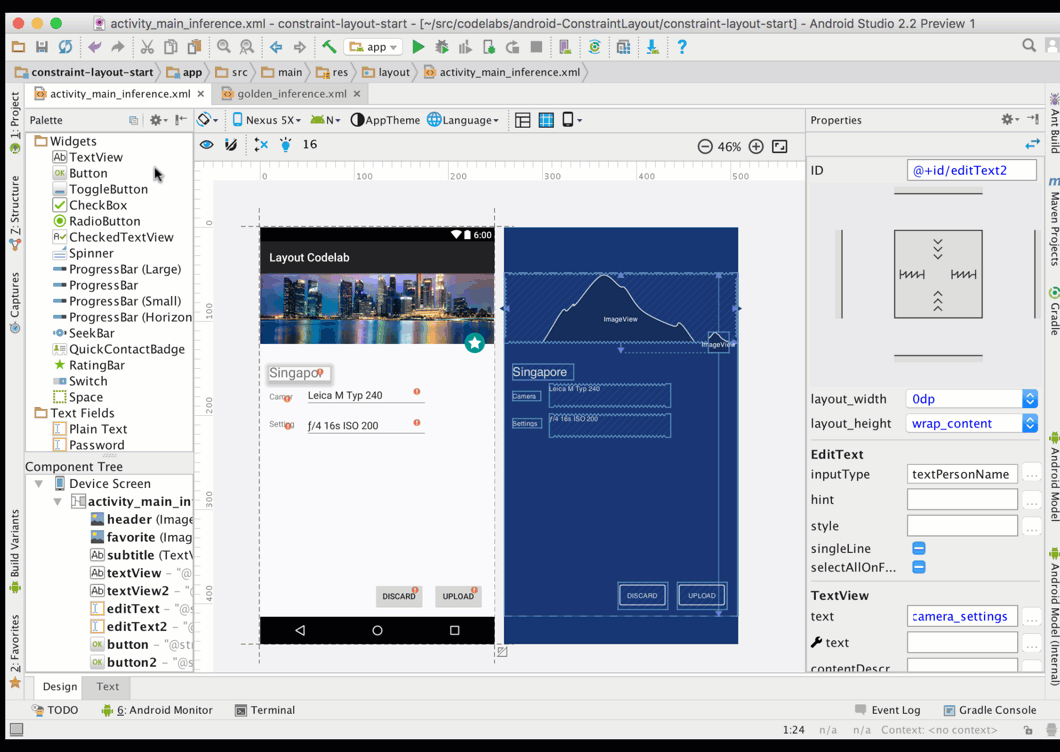
对于这一步, 我们从 layout/activity_main_inference.xml 布局开始. 在 Design 视图中打开布局文件. 默认情况下, 此文件中的布局定义如下:
显示 @drawable/singapore 和 @drawable/ic_star 的 ImageViews. ic_star
图片已经被约束垂直偏量 81%. 你可以通过选中控件查看 Inspector 面板的方式查看包含ic_star 的 ImageView 的垂直偏量, 如之前讨论的一样.
大 ImageView (@drawable/singapore) 的底部锚点约束于 ic_star
ImageView 的底部. ImageView 之外还有为ImageView 显示相机, 设置和字幕的TextViews.
你将要学些什么
使用菜单的操作横向和纵向展开 view.使用推理按钮通过推理协助创建约束.
理解 UI 生成器图标操作
由于我们将使用其中一些选项,这是一个好时机看看在UI生成器可用的操作。 
删除所有约束, 当年想以另一种方式撤销布局中所有约束时会很有用.

使用推理创建约束. 推理引擎会基于诸如空间位置和大小之类的各种因素尝试查找并创建最佳连接.

横向扩展空间以适应约束

纵向扩展空间以适应约束
重要: UI 生成启动默认启用”自动连接”. 由于本节我们打算用推理创建约束, 点击
关闭自动连接.
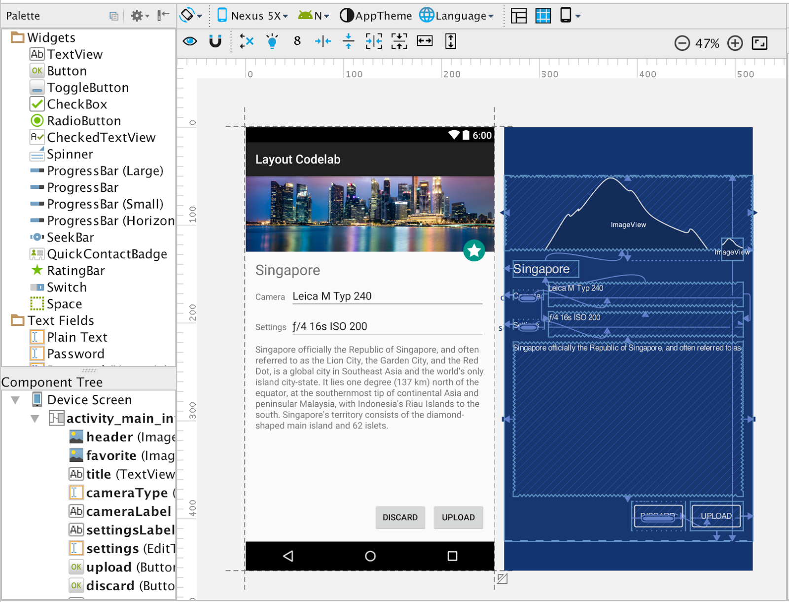
添加一个占用可用空间的 TextView
我们的目标是是为图片的描述添加一个 TextView. 我们已经有一个多行的字符串资源 @string/singapore_description.首先, 从控件选择板拖拽一个 TextView 并放置在设置文本下面.
使用
操作水平扩展 View 以适应引导线.
使用
操作纵向扩展以填充纵向可用空间.
使用推理操作
现在TextView 在布局中了, 你已经准备好看推理的实际运作了.
点击 infer constraints
用推理创建约束.
约束引擎在布局上所有 View 之中创建约束. 最终的布局应该看来是这样.
一旦约束被创建, 你可以修改点击 UI 生成器左上的
按钮修改 “virtual device to render with”. 选择一个不同的设备, 如 Nexus 6P 或者 Nexus 9 以检查布局渲染正确.
你现在已经看到使用约束系统的整个系列: 创建手工约束, 使用自动连接约束, 还有使用推理引擎约束.
自动连接和推理通过布局引擎断定如何为布局中各个元素创建约束协助你. 然后你可以进一步按照你认为合适的方式自由地修改这些约束, 无论它们是由自动连接还是推理引擎生成的.
另外提供两个参考文章 http://blog.csdn.net/qiujuer/article/details/51462471
http://www.jianshu.com/p/a8b49ff64cd3

相关文章推荐
- 路由器技术的变革
- winform异型不规则界面设计的实现方法
- 在ASP.NET 2.0中操作数据之二十:定制数据修改界面
- Android中设置只有程序第一次运行才显示的界面实现思路
- hta 实现的五子棋界面
- android开发之欢迎界面的小例子
- C#中载入界面的常用方法
- Android绘制炫酷引导界面
- android编程实现局部界面动态切换的方法
- Android判断现在所处界面是否为home主桌面的方法
- Android用户注册界面
- Android编程实现泡泡聊天界面实例详解(附源码)
- android 引导界面的实现方法
- ViewPager 与 Fragment相结合实现微信界面实例代码
- VC 界面库皮肤库相关信息珍藏
- 在ASP.NET 2.0中操作数据之二十:定制数据修改界面
- 大数据如何推动金融业的商业变革?
- Android中界面实现全屏显示的两种方式
- 简单做出不丑设计