CSS实现三角形
2016-06-28 22:43
393 查看
CSS三角形绘制方法,学会了这个,其它的也就简单。
我们的网页因为 CSS 而呈现千变万化的风格。这一看似简单的样式语言在使用中非常灵活,只要你发挥创意就能实现很多比人想象不到的效果。特别是随着 CSS3 的广泛使用,更多新奇的 CSS 作品涌现出来。
今天给大家带来 CSS 三角形绘制方法
复制代码代码如下:
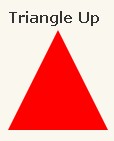
#triangle-up {
width: 0;
height: 0;
border-left: 50px solid transparent;
border-right: 50px solid transparent;
border-bottom: 100px solid red;
}
复制代码代码如下:
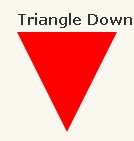
#triangle-down {
width: 0;
height: 0;
border-left: 50px solid transparent;
border-right: 50px solid transparent;
border-top: 100px solid red;
}
复制代码代码如下:
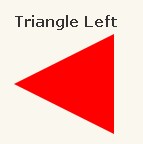
#triangle-left {
width: 0;
height: 0;
border-top: 50px solid transparent;
border-right: 100px solid red;
border-bottom: 50px solid transparent;
}
复制代码代码如下:
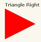
#triangle-right {
width: 0;
height: 0;
border-top: 50px solid transparent;
border-left: 100px solid red;
border-bottom: 50px solid transparent;
}

复制代码代码如下:
#triangle-topleft {
width: 0;
height: 0;
border-top: 100px solid red;
border-right: 100px solid transparent;
}
复制代码代码如下:
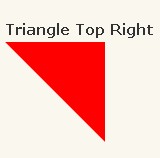
#triangle-topright {
width: 0;
height: 0;
border-top: 100px solid red;
border-left: 100px solid transparent;
}
复制代码代码如下:
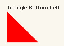
#triangle-bottomleft {
width: 0;
height: 0;
border-bottom: 100px solid red;
border-right: 100px solid transparent;
}
复制代码代码如下:
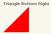
#triangle-bottomright {
width: 0;
height: 0;
border-bottom: 100px solid red;
border-left: 100px solid transparent;
}
我们的网页因为 CSS 而呈现千变万化的风格。这一看似简单的样式语言在使用中非常灵活,只要你发挥创意就能实现很多比人想象不到的效果。特别是随着 CSS3 的广泛使用,更多新奇的 CSS 作品涌现出来。
今天给大家带来 CSS 三角形绘制方法
复制代码代码如下:
#triangle-up {
width: 0;
height: 0;
border-left: 50px solid transparent;
border-right: 50px solid transparent;
border-bottom: 100px solid red;
}
复制代码代码如下:
#triangle-down {
width: 0;
height: 0;
border-left: 50px solid transparent;
border-right: 50px solid transparent;
border-top: 100px solid red;
}
复制代码代码如下:
#triangle-left {
width: 0;
height: 0;
border-top: 50px solid transparent;
border-right: 100px solid red;
border-bottom: 50px solid transparent;
}
复制代码代码如下:
#triangle-right {
width: 0;
height: 0;
border-top: 50px solid transparent;
border-left: 100px solid red;
border-bottom: 50px solid transparent;
}
复制代码代码如下:
#triangle-topleft {
width: 0;
height: 0;
border-top: 100px solid red;
border-right: 100px solid transparent;
}
复制代码代码如下:
#triangle-topright {
width: 0;
height: 0;
border-top: 100px solid red;
border-left: 100px solid transparent;
}
复制代码代码如下:
#triangle-bottomleft {
width: 0;
height: 0;
border-bottom: 100px solid red;
border-right: 100px solid transparent;
}
复制代码代码如下:
#triangle-bottomright {
width: 0;
height: 0;
border-bottom: 100px solid red;
border-left: 100px solid transparent;
}

相关文章推荐
- CSS3属性教程与案例分享
- CSS3属性教程与案例分享
- CSS3的calc()使用
- 使用CSS3的appearance属性改变元素的外观
- CSS3美化图片
- CSS3质感分析——表面线性渐变
- 分析选项卡底部内凹圆角制作
- 细说百度图片栏目——图片展示效果
- 8个实用的响应式设计框架
- 20+ Animation Scripts, Libraries and Plugins
- 新时代编辑神器:Atom
- 如何使用CSS3画出一个叮当猫
- 基于Jquery和CSS3制作数字时钟附源码下载(CSS3篇)
- jQuery CSS3相结合实现时钟插件
- CSS3实现动态翻牌效果 仿百度贴吧3D翻牌一次动画特效
- c#用for语句输出一个三角形的方法
- CSS3实例分享之多重背景的实现(Multiple backgrounds)
- 低版本IE正常运行HTML5+CSS3网站的3种解决方案
- js判断一点是否在一个三角形内
- CSS3中Transition属性详解以及示例分享