html+css——网页布局
2016-06-28 10:14
453 查看
1、一列布局
<meta charset="UTF-8">
<title>Title</title>
<style type="text/css">
body{
margin: 0;
padding: 0;
}
.top{
height: 100px;
background-color: aqua;
}
.main{
width: 800px;
height: 300px;
background-color: gainsboro;
margin:0 auto ;
}
.foot{
width: 800px;
height: 100px;
background-color: bisque;
margin: 0 auto;
}
</style>
</head>
<body>
<div class="top"></div>
<div class="main"></div>
<div class="foot"></div>
</body>
</html>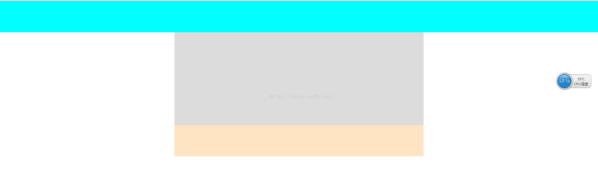
2、自适应宽度及固定宽度的二列布局
2.1自适应宽度
<!DOCTYPE html>
<html lang="en">
<head>
<meta charset="UTF-8">
<title>Title</title>
<style type="text/css">
body{
margin: 0;
padding: 0;
}
.left{
height: 500px;
width: 20%;
float: left;
background: #ccc;
}
.right{
width: 80%;
height: 500px;
background-color: gainsboro;
float: right;
}

</style>
</head>
<body>
<div class="left"></div>
<div class="right"></div>
</body>
</html>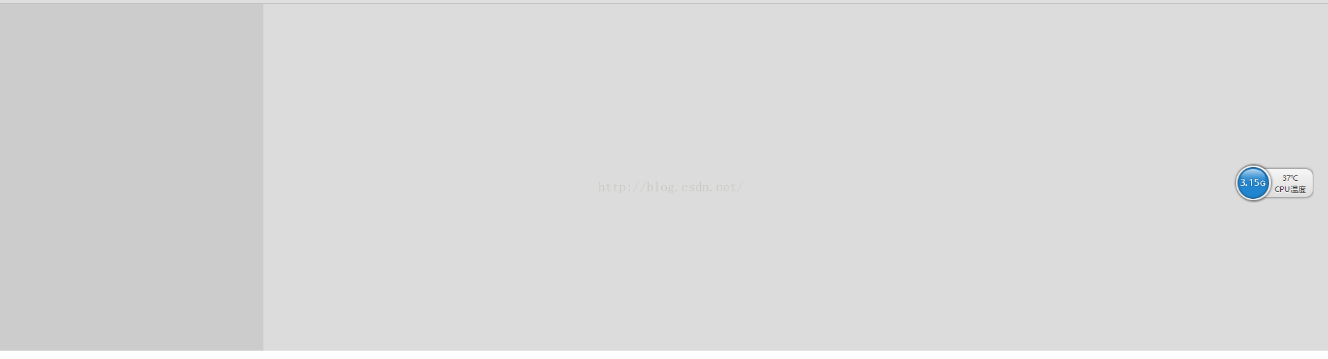
2.2固定宽度
<!DOCTYPE html>
<html lang="en">
<head>
<meta charset="UTF-8">
<title>Title</title>
<style type="text/css">
body{
margin: 0;
padding: 0;
}
.main{
width: 800px;
margin: 0 auto;
}
.left{
height: 500px;
width: 220px;
float: left;
background: #ccc;
}

.right{
width: 580px;
height: 500px;
background-color: gainsboro;
float: right;
}

</style>
</head>
<body>
<div class="main">
<div class="left"></div>
<div class="right"></div>
</div>
</body>
</html>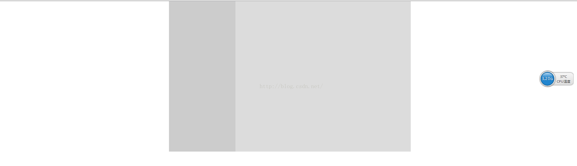
2.3 使用absolute实现横向两列布局(常用于一列用于固定宽度,另一列宽度自适应)
主要应用技能:relative——父元素相对定位
absolute——自适应宽度元素绝对定位
注意:固定宽度列的高度>自适应宽度的列
3、三列布局
3.1 全部自适应
<!DOCTYPE html>
<html lang="en">
<head>
<meta charset="UTF-8">
<title>Title</title>
<style type="text/css">
body{
margin: 0;
padding: 0;
}
.left{
height: 500px;
width: 33.33%;
float: left;
background: #ccc;
}
.middle{
height: 500px;
width: 33.33%;
float: left;
background: #999999;
}
.right{
width: 33.33%;
height: 500px;
background:#000000;
float: right;
}

</style>
</head>
<body>
<div class="left"></div>
<div class="middle"></div>
<div class="right"></div>
</body>
</html>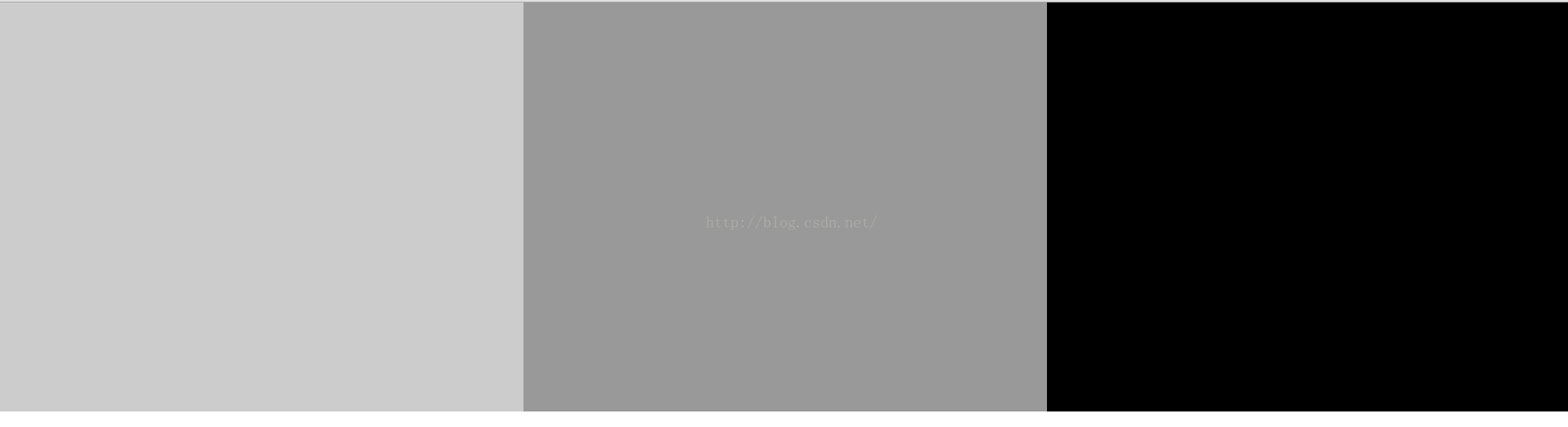
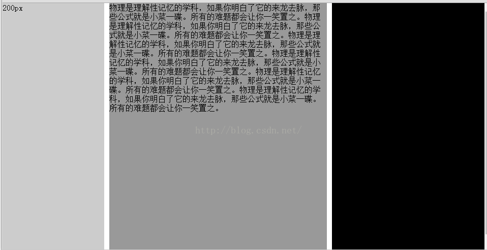
3.2 两边固定宽度,中间自适应(用到绝对定位)
<!DOCTYPE html>
<html lang="en">
<head>
<meta charset="UTF-8">
<title>Title</title>
<style type="text/css">
body{
margin: 0;
padding: 0;
}
.left{
height: 500px;
width: 200px;
position: absolute;
left: 0px;
top: 0px;
background: #ccc;
}
.middle{
height: 500px;
margin: 0 310px 0 210px;
background: #999999;
}
.right{
width: 300px;
height: 500px;
background:#000000;
position: absolute;
right: 0px;
top: 0px;
}

</style>
</head>
<body>
<div class="left">200px</div>
<div class="middle">物理是理解性记忆的学科,如果你明白了它的来龙去脉,那些公式就是小菜一碟。所有的难题都会让你一笑置之。物理是理解性记忆的学科,如果你明白了它的来龙去脉,那些公式就是小菜一碟。所有的难题都会让你一笑置之。物理是理解性记忆的学科,如果你明白了它的来龙去脉,那些公式就是小菜一碟。所有的难题都会让你一笑置之。物理是理解性记忆的学科,如果你明白了它的来龙去脉,那些公式就是小菜一碟。所有的难题都会让你一笑置之。物理是理解性记忆的学科,如果你明白了它的来龙去脉,那些公式就是小菜一碟。所有的难题都会让你一笑置之。物理是理解性记忆的学科,如果你明白了它的来龙去脉,那些公式就是小菜一碟。所有的难题都会让你一笑置之。</div>
<div class="right">300px</div>
</body>
</html>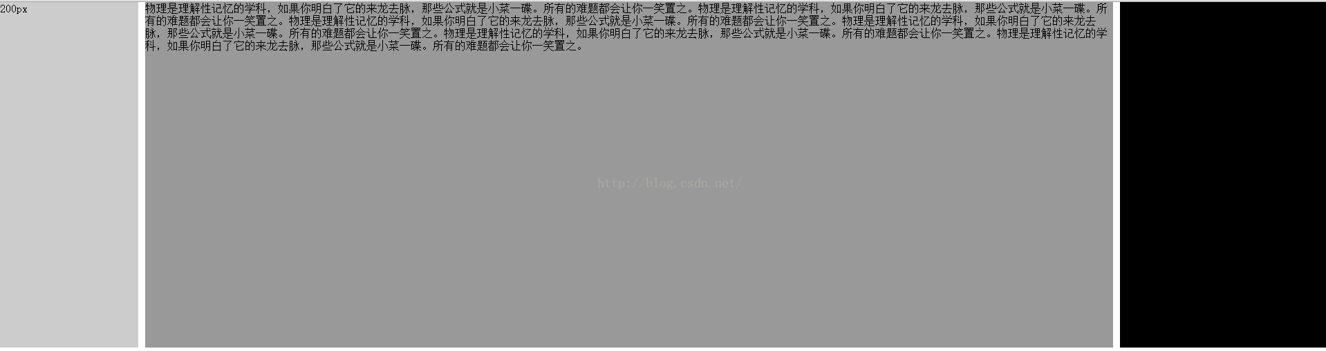
4、混合布局
4.1 混合布局1
<meta charset="UTF-8">
<title>Title</title>
<style type="text/css">
body{
margin: 0;
padding: 0;
}
.top{
height: 100px;
background-color: aqua;
}
.main{
width: 800px;
height: 600px;
background-color: gainsboro;
margin:0 auto ;
}
.left{
width: 200px;
height: 600px;
background: rebeccapurple;
float: left;
}
.right{
width: 600px;
height: 600px;
background: goldenrod;
float: left;
}
.foot{
width: 800px;
height: 100px;
background-color: bisque;
margin: 0 auto;
}
</style>
</head>
<body>
<div class="top"></div>
<div class="main">
<div class="left"></div>
<div class="right"></div>
</div>
<div class="foot"></div>
</body>
</html>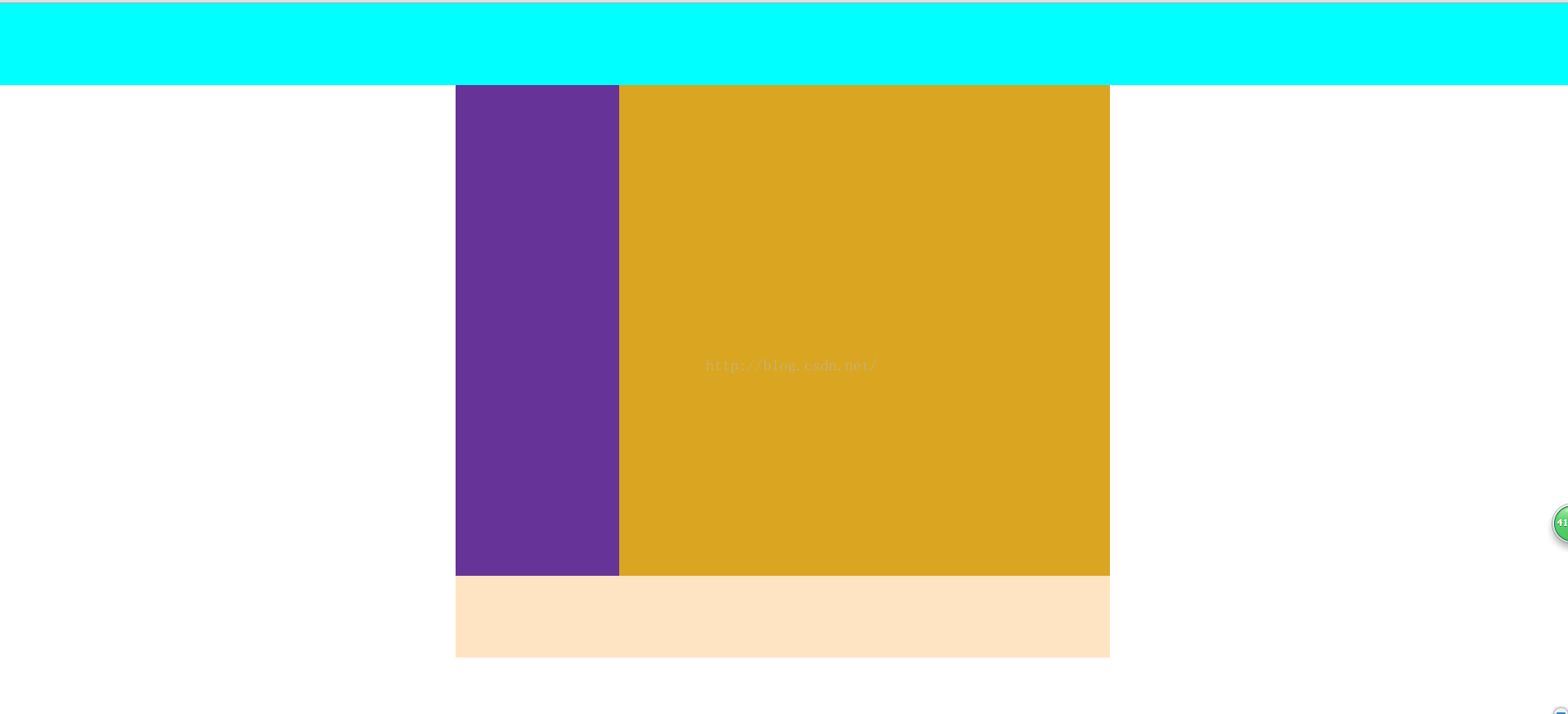
4.2 混合布局2
<meta charset="UTF-8">
<title>Title</title>
<style type="text/css">
body{
margin: 0;
padding: 0;
}
.top{
height: 100px;
background-color: aqua;
}
.main{
width: 800px;
height: 600px;
background-color: gainsboro;
margin:0 auto ;
}
.left{
width: 200px;
height: 600px;
background: rebeccapurple;
float: left;
}
.right{
width: 600px;
height: 600px;
background: goldenrod;
float: left;
}
.sub_l{
width: 400px;
height: 600px;
background: greenyellow;
float: left;
}
.sub_2{
width: 200px;
height: 600px;
background: wheat;
float: left;
}
.foot{
width: 800px;
height: 100px;
background-color: bisque;
margin: 0 auto;
}
</style>
</head>
<body>
<div class="top"></div>
<div class="main">
<div class="left"></div>
<div class="right">
<div class="sub_l"></div>
<div class="sub_2"></div>
</div>
</div>
<div class="foot"></div>
</body>
</html>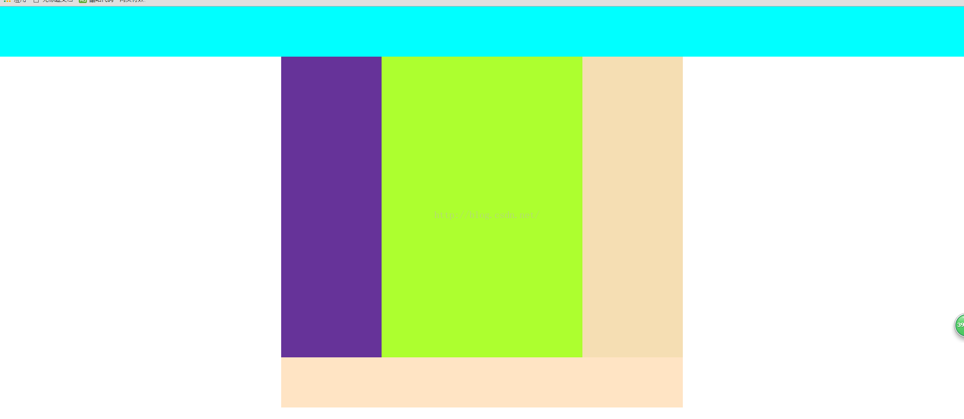
4.3 混合布局3
<meta charset="UTF-8">
<title>Title</title>
<style type="text/css">
body{
margin: 0;
padding: 0;
}
.top{
height: 100px;
background-color: aqua;
}
.head{
height: 100px;
width: 800px;
background: royalblue;
margin: 0 auto;
}
.main{
width: 800px;
height: 600px;
background-color: gainsboro;
margin:0 auto ;
}
.left{
width: 200px;
height: 600px;
background: rebeccapurple;
float: left;
}
.right{
width: 600px;
height: 600px;
background: goldenrod;
float: left;
}
.sub_l{
width: 400px;
height: 600px;
background: greenyellow;
float: left;
}
.sub_2{
width: 200px;
height: 600px;
background: wheat;
float: left;
}
.foot{
width: 800px;
height: 100px;
background-color: bisque;
margin: 0 auto;
}
</style>
</head>
<body>
<div class="top">
<div class="head"></div>
</div>
<div class="main">
<div class="left"></div>
<div class="right">
<div class="sub_l"></div>
<div class="sub_2"></div>
</div>
</div>
<div class="foot"></div>
</body>
</html>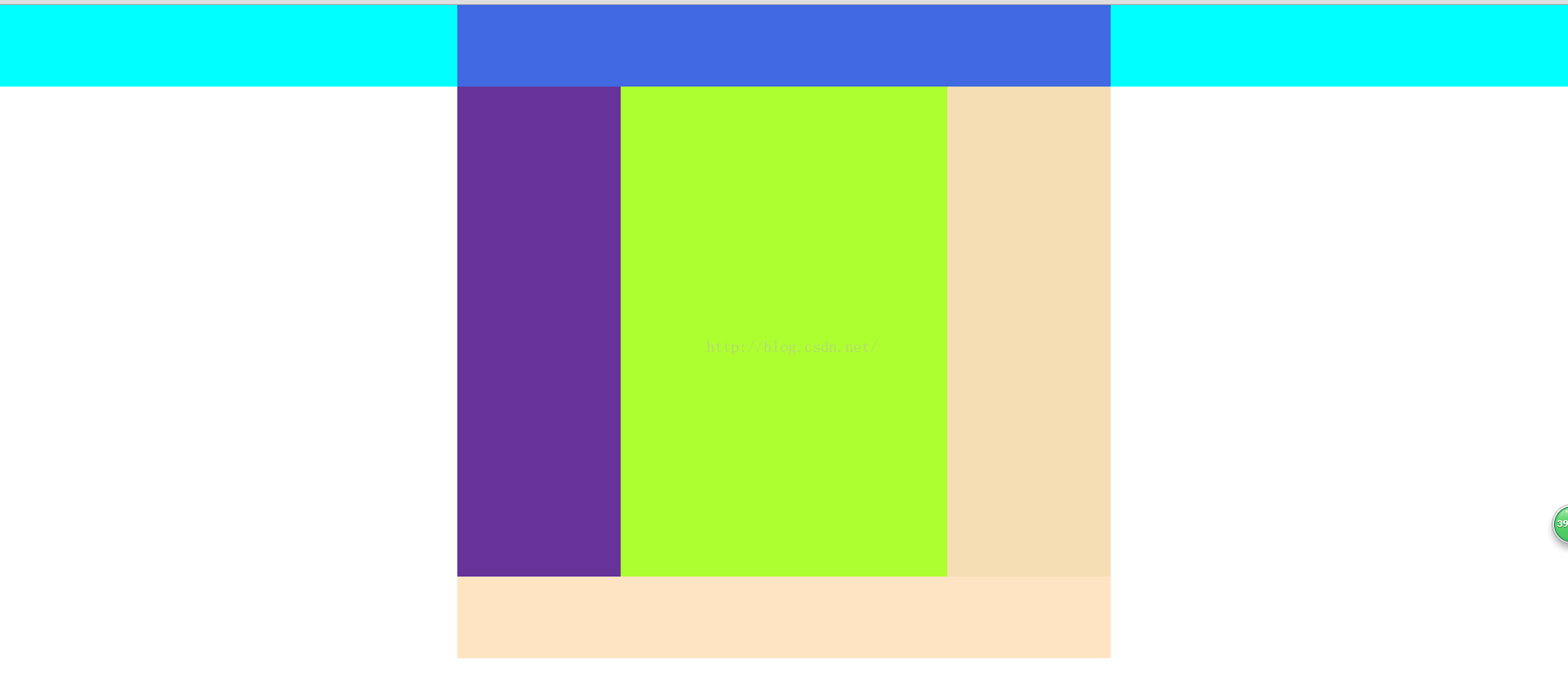
4.4 混合布局4
<!DOCTYPE html PUBLIC "-//W3C//DTD XHTML 1.0 Transitional//EN" "http://www.w3.org/TR/xhtml1/DTD/xhtml1-transitional.dtd">
<html xmlns="http://www.w3.org/1999/xhtml">
<head>
<meta http-equiv="Content-Type" content="text/html; charset=utf-8" />
<title>混合布局</title>
<style>
body{ margin:0; padding:0; font-size:30px; font-weight:bold}
div{ text-align:center; line-height:50px}
.top{ height:100px;background:#9CF}
.head,.main{ width:960px; margin:0 auto;}
.head{ height:100px; background:#F90}
.left{ width:220px; height:600px; background:#ccc; float:left;}
.right{ width:740px; height:600px;background:#FCC; float:right}
.r_sub_left{ width:540px; height:600px; background:#9C3; float:left}
.r_sub_right{ width:200px; height:600px; background:#9FC; float:left;}
.footer{ height:50px; background:#9F9;clear:both; }
</style>
</head>

<body>
<div class="top">
<div class="head">head</div>
</div>
<div class="main">
<div class="left">left</div>
<div class="right">
<div class="r_sub_left">sub_left
</div>
<div class=" r_sub_right">sub_right
</div>
</div>
</div>
<div class="footer">footer</div>
</body>
</html>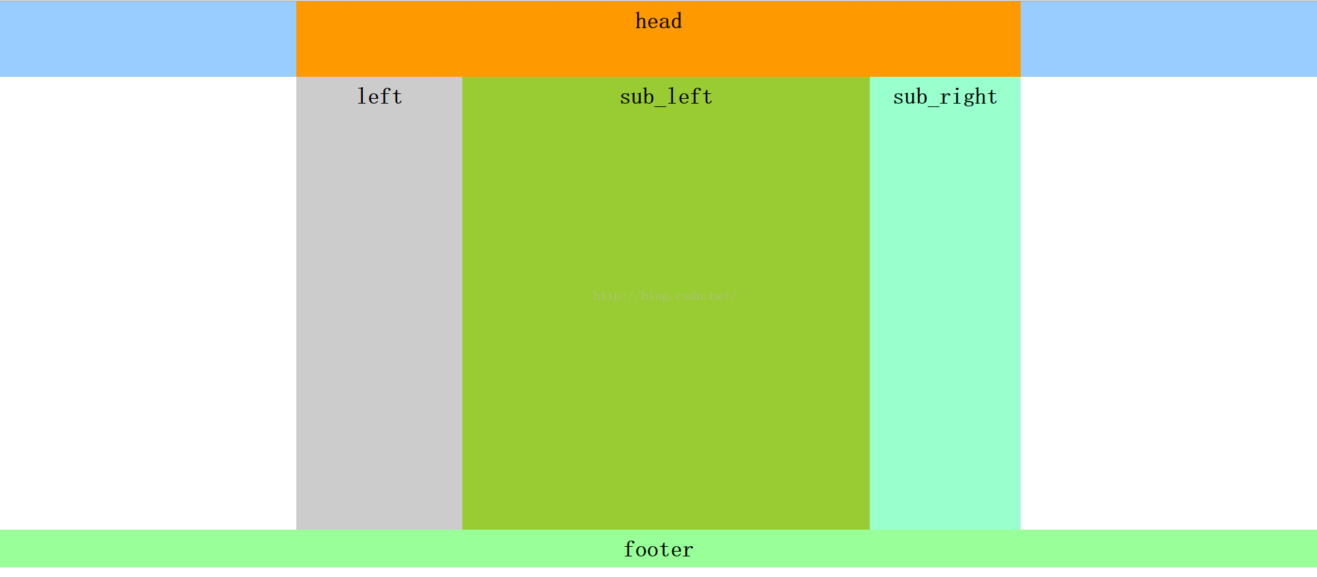

相关文章推荐
- js改变css样式的三种方法
- Emmet:HTML/CSS代码快速编写神器
- CSS技巧分享:如何用css制作横排二级下拉菜单
- CSS 继承性
- CSS层叠性
- CSS之background-position 用法详细介绍
- 怎么用MathType给公式加三角着重号
- Basics CSS
- 用html 和css 写了一个简单的空页面
- css之缩进
- css之重要性
- select下拉样式
- display:inline、block、inline-block的区别
- css中的clip属性rect(top,right,bottom,left);
- CSS改变png图片颜色
- webworker
- CSS常见效果代码总结
- CSS3边框 , 背景
- CSS旋转&翻转,兼容方案
- css布局与定位