安卓Gallery之自定义图片边框
2016-06-21 19:09
239 查看
作为一个初入门级别安卓菜鸟,我从CSDN上也学到了不少的东西,今天想着写篇文章作为自己的处女秀,力求一篇文章解决一个问题,如标题所说,希望老鸟勿喷。
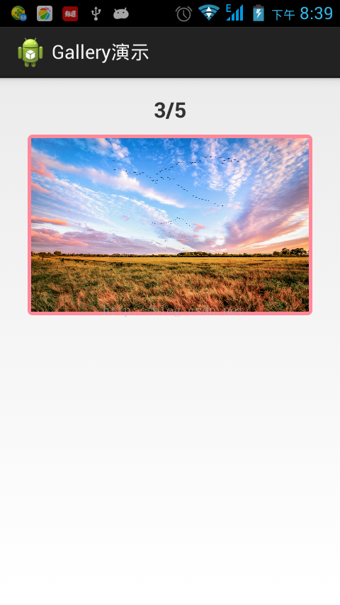
上面是一张效果图,由于还没细细研究gif动画得制作,大家就将就着看了,下面上代码,代码即文档,鄙人喜欢把代码注释的比较完善,所以就不多解释了。
首先是MainActivity,自己看代码,图片数组资源在drawable中引用。
public class MainActivity extends Activity implements OnItemSelectedListener{
/** 界面上指示当前照片的TextView控件 **/
private TextView tv_index;
/** 界面上的Galley控件 **/
private Gallery mGallery;
/**Gallery的适配器**/
private MyGalleryAdapter mAdapter ;
/** 测试用的图片数组。该数组就是图片资源的引用 **/
private Integer[] imgs = new Integer[] { R.drawable.pic01,
R.drawable.pic02, R.drawable.pic03, R.drawable.pic04,
R.drawable.pic05, };
@Override
protected void onCreate(Bundle savedInstanceState) {
super.onCreate(savedInstanceState);
// 加载界面布局文件
setContentView(R.layout.activity_main);
// 初始化界面控件
initView();
}
/** 初始化界面的控件 **/
private void initView() {
// 获取界面的控件
tv_index = (TextView) this.findViewById(R.id.txtIndex);
mGallery = (Gallery) this.findViewById(R.id.galleryShow);
// 为Gallery新建适配器,传入图片数组
mAdapter = new MyGalleryAdapter(this,imgs);
// 为Gallery配置适配器
mGallery.setAdapter(mAdapter);
// 为mGallery绑定选中监听器,否则指示器不工作
mGallery.setOnItemSelectedListener(this);
}
@Override
public void onItemSelected(AdapterView<?> parent, View view, int position,
long id) {
// TODO Auto-generated method stub
// 设置照片指示器,指示当前照片的张数和总数
tv_index.setText((position+1)+"/"+mAdapter.getCount());
}
@Override
public void onNothingSelected(AdapterView<?> parent) {
// TODO Auto-generated method stub
}
}
接着看Gallery的适配器MyGalleryAdapter
@SuppressWarnings("deprecation")
public class MyGalleryAdapter extends BaseAdapter {
/** 运行的上下文环境 **/
private Context context = null;
/** 要进行展示的相册的数组,从外部传入的参数 **/
private Integer[] imgs = null;
/** gallery中的ImageView控件 **/
private ImageView imgView = null;
/**边框的宽度**/
private static final int BOUND_WIDTH = 5 ;
public MyGalleryAdapter() {
super();
// TODO Auto-generated constructor stub
}
/**
* 自定义Gallery构造参数
*
* @param context
* 运行的上下文环境
* @param imgs
* 要展示的相片的数组
*/
public MyGalleryAdapter(Context context, Integer[] imgs) {
super();
this.context = context;
this.imgs = imgs;
}
/**
* 自定义Gallery构造参数
*
* @param context
* 运行的上下文环境
*/
public MyGalleryAdapter(Context context) {
super();
this.context = context;
}
@Override
public int getCount() {
// TODO Auto-generated method stub
return imgs.length;
}
@Override
public Object getItem(int position) {
// TODO Auto-generated method stub
return position;
}
@Override
public long getItemId(int id) {
// TODO Auto-generated method stub
return id;
}
// 这个方法很重要
@Override
public View getView(int position, View convertView, ViewGroup parent) {
// TODO Auto-generated method stub
// 首先这里的imgView是Gallery中将要显示的图片的容器,已经定义成全局变量
imgView = new ImageView(context);
// 设置图片的来源,外部传入的图片数组
imgView.setImageResource(imgs[position]);
// 设置图片自适应边界
imgView.setAdjustViewBounds(true);
// 由于相框的边框宽度设置为向内收缩的大小,上下左右四个方向向内收缩的大小
imgView.setPadding(BOUND_WIDTH, BOUND_WIDTH, BOUND_WIDTH, BOUND_WIDTH);
// 适应整个屏幕
imgView.setScaleType(ScaleType.FIT_XY);
// 设置LayoutParams参数
imgView.setLayoutParams(new Gallery.LayoutParams(
LayoutParams.MATCH_PARENT, LayoutParams.MATCH_PARENT));
// 在该ImageView的外面再包一层布局,这层布局用来作为边框
LinearLayout linearLay = new LinearLayout(context);
linearLay.setLayoutParams(new LayoutParams(LayoutParams.MATCH_PARENT,
LayoutParams.MATCH_PARENT));
// 设置边框的背景
linearLay.setBackgroundResource(R.drawable.main_photo_frame);
// 将ImageView添加到这个布局中去,然后返回该布局
linearLay.addView(imgView);
// 返回具有边框的布局
return linearLay;
}
}适配器中最重要的部分是重写的getView的方法,代码中我已经做了详细的注释,其余的部分大家可以自行研究。
然后是MainActivity中的布局文件,一个文本框,用来做相册的指示器,一个Gallery控件,测试的时候,越简单越能研究透彻一个控件。
<RelativeLayout xmlns:android="http://schemas.android.com/apk/res/android"
xmlns:tools="http://schemas.android.com/tools"
android:layout_width="match_parent"
android:layout_height="match_parent"
android:paddingBottom="@dimen/activity_vertical_margin"
android:paddingLeft="@dimen/activity_horizontal_margin"
android:paddingRight="@dimen/activity_horizontal_margin"
android:paddingTop="@dimen/activity_vertical_margin"
tools:context="com.cjt.gallerydemo.MainActivity" >
<!-- 指示当前的照片 -->
<TextView
android:id="@+id/txtIndex"
android:layout_width="match_parent"
android:layout_height="wrap_content"
android:gravity="center_horizontal"
android:textSize="20sp"
android:textStyle="bold" />
<!-- 展示照片的Gallery -->
<Gallery
android:id="@+id/galleryShow"
android:layout_width="match_parent"
android:layout_height="wrap_content"
android:layout_marginTop="10dp"
android:paddingLeft="10dp"
android:paddingRight="10dp"
android:spacing="10dp"
android:layout_alignLeft="@+id/txtIndex"
android:layout_below="@+id/txtIndex"/>
</RelativeLayout>
最后是getView中
<?xml version="1.0" encoding="utf-8"?>
<shape xmlns:android="http://schemas.android.com/apk/res/android"
android:shape="rectangle" >
<corners android:radius="2dp" />
<!-- 线条的颜色和宽度 -->
<!-- 这里边框的颜色属性和宽度可以自行设定,宽度设定的时候注意跟MyGalleryAdapter中的 private static final int BOUND_WIDTH = 5 保持一致 -->
<stroke
android:width="5dp"
android:color="#F89" />
<!-- 填充部分的颜色 -->
<solid android:color="#0fff" />
<!-- 收缩 -->
<padding
android:bottom="0dp"
android:left="0dp"
android:right="0dp"
android:top="0dp" />
</shape>
好了,到此就大功告成了,想要修改边框的宽度或者颜色什么的都可以在这个xml文件中修改,
源码下载
上面是一张效果图,由于还没细细研究gif动画得制作,大家就将就着看了,下面上代码,代码即文档,鄙人喜欢把代码注释的比较完善,所以就不多解释了。
首先是MainActivity,自己看代码,图片数组资源在drawable中引用。
public class MainActivity extends Activity implements OnItemSelectedListener{
/** 界面上指示当前照片的TextView控件 **/
private TextView tv_index;
/** 界面上的Galley控件 **/
private Gallery mGallery;
/**Gallery的适配器**/
private MyGalleryAdapter mAdapter ;
/** 测试用的图片数组。该数组就是图片资源的引用 **/
private Integer[] imgs = new Integer[] { R.drawable.pic01,
R.drawable.pic02, R.drawable.pic03, R.drawable.pic04,
R.drawable.pic05, };
@Override
protected void onCreate(Bundle savedInstanceState) {
super.onCreate(savedInstanceState);
// 加载界面布局文件
setContentView(R.layout.activity_main);
// 初始化界面控件
initView();
}
/** 初始化界面的控件 **/
private void initView() {
// 获取界面的控件
tv_index = (TextView) this.findViewById(R.id.txtIndex);
mGallery = (Gallery) this.findViewById(R.id.galleryShow);
// 为Gallery新建适配器,传入图片数组
mAdapter = new MyGalleryAdapter(this,imgs);
// 为Gallery配置适配器
mGallery.setAdapter(mAdapter);
// 为mGallery绑定选中监听器,否则指示器不工作
mGallery.setOnItemSelectedListener(this);
}
@Override
public void onItemSelected(AdapterView<?> parent, View view, int position,
long id) {
// TODO Auto-generated method stub
// 设置照片指示器,指示当前照片的张数和总数
tv_index.setText((position+1)+"/"+mAdapter.getCount());
}
@Override
public void onNothingSelected(AdapterView<?> parent) {
// TODO Auto-generated method stub
}
}
接着看Gallery的适配器MyGalleryAdapter
@SuppressWarnings("deprecation")
public class MyGalleryAdapter extends BaseAdapter {
/** 运行的上下文环境 **/
private Context context = null;
/** 要进行展示的相册的数组,从外部传入的参数 **/
private Integer[] imgs = null;
/** gallery中的ImageView控件 **/
private ImageView imgView = null;
/**边框的宽度**/
private static final int BOUND_WIDTH = 5 ;
public MyGalleryAdapter() {
super();
// TODO Auto-generated constructor stub
}
/**
* 自定义Gallery构造参数
*
* @param context
* 运行的上下文环境
* @param imgs
* 要展示的相片的数组
*/
public MyGalleryAdapter(Context context, Integer[] imgs) {
super();
this.context = context;
this.imgs = imgs;
}
/**
* 自定义Gallery构造参数
*
* @param context
* 运行的上下文环境
*/
public MyGalleryAdapter(Context context) {
super();
this.context = context;
}
@Override
public int getCount() {
// TODO Auto-generated method stub
return imgs.length;
}
@Override
public Object getItem(int position) {
// TODO Auto-generated method stub
return position;
}
@Override
public long getItemId(int id) {
// TODO Auto-generated method stub
return id;
}
// 这个方法很重要
@Override
public View getView(int position, View convertView, ViewGroup parent) {
// TODO Auto-generated method stub
// 首先这里的imgView是Gallery中将要显示的图片的容器,已经定义成全局变量
imgView = new ImageView(context);
// 设置图片的来源,外部传入的图片数组
imgView.setImageResource(imgs[position]);
// 设置图片自适应边界
imgView.setAdjustViewBounds(true);
// 由于相框的边框宽度设置为向内收缩的大小,上下左右四个方向向内收缩的大小
imgView.setPadding(BOUND_WIDTH, BOUND_WIDTH, BOUND_WIDTH, BOUND_WIDTH);
// 适应整个屏幕
imgView.setScaleType(ScaleType.FIT_XY);
// 设置LayoutParams参数
imgView.setLayoutParams(new Gallery.LayoutParams(
LayoutParams.MATCH_PARENT, LayoutParams.MATCH_PARENT));
// 在该ImageView的外面再包一层布局,这层布局用来作为边框
LinearLayout linearLay = new LinearLayout(context);
linearLay.setLayoutParams(new LayoutParams(LayoutParams.MATCH_PARENT,
LayoutParams.MATCH_PARENT));
// 设置边框的背景 linearLay.setBackgroundResource(R.drawable.main_photo_frame);
// 将ImageView添加到这个布局中去,然后返回该布局
linearLay.addView(imgView);
// 返回具有边框的布局
return linearLay;
}
}适配器中最重要的部分是重写的getView的方法,代码中我已经做了详细的注释,其余的部分大家可以自行研究。
然后是MainActivity中的布局文件,一个文本框,用来做相册的指示器,一个Gallery控件,测试的时候,越简单越能研究透彻一个控件。
<RelativeLayout xmlns:android="http://schemas.android.com/apk/res/android"
xmlns:tools="http://schemas.android.com/tools"
android:layout_width="match_parent"
android:layout_height="match_parent"
android:paddingBottom="@dimen/activity_vertical_margin"
android:paddingLeft="@dimen/activity_horizontal_margin"
android:paddingRight="@dimen/activity_horizontal_margin"
android:paddingTop="@dimen/activity_vertical_margin"
tools:context="com.cjt.gallerydemo.MainActivity" >
<!-- 指示当前的照片 -->
<TextView
android:id="@+id/txtIndex"
android:layout_width="match_parent"
android:layout_height="wrap_content"
android:gravity="center_horizontal"
android:textSize="20sp"
android:textStyle="bold" />
<!-- 展示照片的Gallery -->
<Gallery
android:id="@+id/galleryShow"
android:layout_width="match_parent"
android:layout_height="wrap_content"
android:layout_marginTop="10dp"
android:paddingLeft="10dp"
android:paddingRight="10dp"
android:spacing="10dp"
android:layout_alignLeft="@+id/txtIndex"
android:layout_below="@+id/txtIndex"/>
</RelativeLayout>
最后是getView中
// 设置边框的背景 linearLay.setBackgroundResource(R.drawable.main_photo_frame);这一句中引用xml文件
<?xml version="1.0" encoding="utf-8"?>
<shape xmlns:android="http://schemas.android.com/apk/res/android"
android:shape="rectangle" >
<corners android:radius="2dp" />
<!-- 线条的颜色和宽度 -->
<!-- 这里边框的颜色属性和宽度可以自行设定,宽度设定的时候注意跟MyGalleryAdapter中的 private static final int BOUND_WIDTH = 5 保持一致 -->
<stroke
android:width="5dp"
android:color="#F89" />
<!-- 填充部分的颜色 -->
<solid android:color="#0fff" />
<!-- 收缩 -->
<padding
android:bottom="0dp"
android:left="0dp"
android:right="0dp"
android:top="0dp" />
</shape>
好了,到此就大功告成了,想要修改边框的宽度或者颜色什么的都可以在这个xml文件中修改,
源码下载

相关文章推荐
- jquery 为动态加载的元素添加事件
- 数据结构——栈和队列
- socket粘包,socket缓冲区设
- Java学习——Thread中run()和start()的区别
- 服务端入门《一》(配置SrcureCRT 与 sshd_config )
- Python的修饰器@
- [bzoj4383][POI2015]Pustynia
- Statement 接口简介
- php图像处理
- 兼容ie7到ie11,edge,chrome,firefox的ajax发送接收post数据代码
- oracle 合并字段
- [转载]SOAPUI压力测试的参数配置
- filezilla server 0.9.57 配置方法
- 一些技术网站
- [转]OpenStack Neutron运行机制解析概要
- 1.5.3 在SQL数据库中存储数据
- Java中九大内置对象
- java通过JDBC操作mysql数据库
- Web界面中功能模块测试用例(模板)
- gulp详细教程---学习总结