Libgdx之Button TextButton ImageButton ImageTextButton 按钮使用
2016-06-07 21:23
453 查看
Button 即按钮,在游戏界面中最常用的元素之一。Button具有3中状态: pressed, unpressed, checked。点击Button按钮时, checked状态触发。 同样Button也是一个Table,可以当做承装其它Actor的容器。
Button的preferred size由背景图片和里面的装载的演员决定的。点击Button时ChangeEvent事件被触发,按钮也会保存checked 状态。通过Button的初始化化函数
public Button (Drawable up) {
this(new ButtonStyle(up, null, null));
}
我们知道,在初始化化Button的时候可以不定义ButtonStyle或者Skin,为想要练习的我们能省下不少时间。但是为了游戏的更美观,建议使用uiskin.json,省去我们定义ButtonStyle的时间。
TextButton extends Button。在Button里面加了一个Label用来显示文字。
ImageButton extends Button。 在Button里面增加了一个Image来显示图片。
ImageTextButton extends Button。 在Button里面增加了一个Label和Image来显示文字和图片。
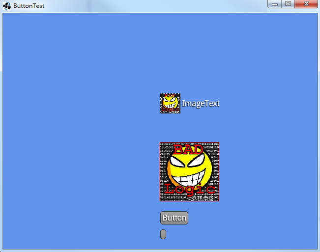
下面直接展示代码和图片来的更直观一些
Button的preferred size由背景图片和里面的装载的演员决定的。点击Button时ChangeEvent事件被触发,按钮也会保存checked 状态。通过Button的初始化化函数
public Button (Drawable up) {
this(new ButtonStyle(up, null, null));
}
我们知道,在初始化化Button的时候可以不定义ButtonStyle或者Skin,为想要练习的我们能省下不少时间。但是为了游戏的更美观,建议使用uiskin.json,省去我们定义ButtonStyle的时间。
TextButton extends Button。在Button里面加了一个Label用来显示文字。
ImageButton extends Button。 在Button里面增加了一个Image来显示图片。
ImageTextButton extends Button。 在Button里面增加了一个Label和Image来显示文字和图片。
下面直接展示代码和图片来的更直观一些
Stage stage;
Skin skin;

Button bt;
TextButton tb;
ImageButton ib;
ImageTextButton itb;

Texture imgUp, imgChecked;

@Override
public void create() {
stage = new Stage();
Gdx.input.setInputProcessor(stage);

skin = new Skin(Gdx.files.internal("uiskin.json"));

// 单纯的一个按钮
bt = new Button(skin);
// isChecked默认是false的
bt.setPosition(Gdx.graphics.getWidth() / 2, 20);
Gdx.app.log("Button", "width=" + bt.getWidth() + "preWidth=" + bt.getPrefWidth());
Gdx.app.log("Button", "isChecked=" + bt.isChecked());
bt.addListener(new ClickListener() {

@Override
public void clicked(InputEvent event, float x, float y) {
// 通过log可以看出点击Button后,checked状态在切换
Gdx.app.log("Button", "isChecked=" + bt.isChecked());
}

});
stage.addActor(bt);

// 在按钮上显示文字
tb = new TextButton("Button", skin);
tb.setPosition(bt.getX(), bt.getY() + bt.getPrefHeight() + 10);
tb.addListener(new ClickListener() {

@Override
public void clicked(InputEvent event, float x, float y) {
if (tb.isChecked()) {
tb.setText("Clicked me");
// 不重新设置大小,文字将会出现在Button边框之外
tb.setSize(tb.getLabel().getPrefWidth(), tb.getLabel().getPrefHeight());
} else {
tb.setText("Button");
}
}

});
stage.addActor(tb);

imgChecked = new Texture(Gdx.files.internal("badlogic.jpg"));
imgUp = new Texture(Gdx.files.internal("badlogic.jpg"));

TextureRegion region = new TextureRegion(imgChecked);
region.flip(true, true);
TextureRegion regionDown = new TextureRegion(imgUp);
regionDown.flip(true, false);
// 设置了imageUp imageDown imageChecked的图片之后点击就会看见图片随之发生变化
ib = new ImageButton(new TextureRegionDrawable(new TextureRegion(imgUp)),
new TextureRegionDrawable(regionDown), new TextureRegionDrawable(region));
ib.setSize(120, 120);
ib.setPosition(tb.getX(), tb.getY() + tb.getHeight() + 20);
ib.debug();
stage.addActor(ib);

ImageTextButton.ImageTextButtonStyle itbs = new ImageTextButton.ImageTextButtonStyle();
// 从skin中获取字体
itbs.font = skin.get("default-font", BitmapFont.class);
itbs.imageUp = new TextureRegionDrawable(new TextureRegion(imgUp));
itbs.imageDown = new TextureRegionDrawable(regionDown);
itbs.imageChecked = new TextureRegionDrawable(region);
itb = new ImageTextButton("ImageText", itbs);
// 文字和图片的长度一共是120,默认是左边图片右边文字,可以自己重新写Image
itb.setSize(120, 120);
itb.setPosition(ib.getX(), ib.getY() + ib.getHeight() + 20);
//      默认是Fit,可以切换到这个模式看看图片的变化
//      itb.getImage().setScaling(Scaling.stretch);
itb.addListener(new ClickListener() {

@Override
public void clicked(InputEvent event, float x, float y) {
if (itb.isChecked()) {
itb.setText("Click me");
} else {
itb.setText("ImageText");
}
}

});
stage.addActor(itb);

//      itb = new ImageTextButton("ImageTest", style)
}

@Override
public void render() {
Gdx.gl.glClearColor(0.39f, 0.58f, 0.92f, 1.0f);
Gdx.gl.glClear(GL20.GL_COLOR_BUFFER_BIT);

stage.act();
stage.draw();

// 当Button按下时触发此事件
if (bt.isPressed()) {
Gdx.app.log("Button", "isPressed");
}
// 当鼠标滑过此按钮时触发此事件
if (bt.isOver()) {
Gdx.app.log("Button", "isOver");
}
}

@Override
public void dispose() {
stage.dispose();
skin.dispose();
imgUp.dispose();
imgChecked.dispose();
}

相关文章推荐
- Android使用libgdx实现模拟方向键控制角色移动的方法
- Libgdx之封装简单的脚本机制
- Libgdx学习笔记:UI之技能冷却按钮
- Android中AlertDialog的使用小结
- libgdx html 跨平台的坑
- gwt中 java与js 的相互调用
- libGDX引擎之存入数据到keychain(IOS)
- 二,游戏的game loop搭建
- 三,资源初始化操作和主菜单界面的创建
- 四,主要菜单界面的创建
- 五,一个可以左右滑动的关卡选择界面
- 六,游戏主界面
- 七,游戏世界
- 八,游戏世界的渲染
- 九,碰到的问题
- 学习Libgdx游戏开发(二)
- 学习Libgdx游戏开发(一)
- libgdx 自动适应分辨率的方法
- libgdx学习笔记02