Android shape使用详解
2016-05-26 00:18
615 查看
一、在res/drawable文件夹下创建一个名为gradient_box的xml文件:
二、在窗口布局文件中将步骤一中创建的文件作为TextView的背景:
3
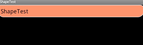
三、运行效果展示:
Android中shape的使用
<?xml version="1.0" encoding="utf-8"?>
<!--
shape drawable xml文件中定义的一个几何图形,定义在res/drawable/目录下,文件名filename称为访问的资源ID
在代码中通过R.drawable.filename进行访问,在xml文件中通过@[package:]drawable/filename进行访问。
-->
<!--
android:shape=["rectangle" | "oval" | "line" | "ring"]
shape的形状,默认为矩形,可以设置为矩形(rectangle)、椭圆形(oval)、线性形状(line)、环形(ring)
下面的属性只有在android:shape="ring时可用:
android:innerRadius 尺寸,内环的半径。
android:innerRadiusRatio  浮点型,以环的宽度比率来表示内环的半径,
例如,如果android:innerRadiusRatio,表示内环半径等于环的宽度除以5,这个值是可以被覆盖的,默认为9.
android:thickness 尺寸,环的厚度
android:thicknessRatio    浮点型,以环的宽度比率来表示环的厚度,例如,如果android:thicknessRatio="2",
那么环的厚度就等于环的宽度除以2。这个值是可以被android:thickness覆盖的,默认值是3.
android:useLevel  boolean值,如果当做是LevelListDrawable使用时值为true,否则为false.
-->
<shape
xmlns:android="http://schemas.android.com/apk/res/android"
android:shape="rectangle">

<!--
圆角
android:radius      整型 半径
android:topLeftRadius     整型 左上角半径
android:topRightRadius    整型 右上角半径
android:bottomLeftRadius 整型 左下角半径
android:bottomRightRadius 整型 右下角半径
-->
<corners
android:radius="8dp"
android:topLeftRadius="5dp"
android:topRightRadius="15dp"
android:bottomLeftRadius="20dp"
android:bottomRightRadius="25dp"
/>

<!--
渐变色
android:startColor  颜色值 起始颜色
android:endColor    颜色值 结束颜色
android:centerColor 整型   渐变中间颜色,即开始颜色与结束颜色之间的颜色
android:angle       整型   渐变角度(PS:当angle=0时,渐变色是从左向右。 然后逆时针方向转,当angle=90时为从下往上。angle必须为45的整数倍)
android:type        ["linear" | "radial" | "sweep"] 渐变类型(取值:linear、radial、sweep)
linear 线性渐变,这是默认设置
radial 放射性渐变,以开始色为中心。
sweep 扫描线式的渐变。
android:useLevel   ["true" | "false"] 如果要使用LevelListDrawable对象,就要设置为true。设置为true无渐变。false有渐变色
android:gradientRadius 整型 渐变色半径.当 android:type="radial" 时才使用。单独使用 android:type="radial"会报错。
android:centerX      整型   渐变中心X点坐标的相对位置
android:centerY   整型   渐变中心Y点坐标的相对位置
-->
<gradient
android:startColor="#FFFF0000"
android:endColor="#80FF00FF"
android:angle="45"
/>

<!--
内边距,即内容与边的距离
android:left      整型 左内边距
android:top   整型 上内边距
android:right     整型 右内边距
android:bottom 整型 下内边距
-->
<padding
android:left="10dp"
android:top="10dp"
android:right="10dp"
android:bottom="10dp"
/>

<!--
size 大小
android:width 整型 宽度
android:height 整型 高度
-->
<size
android:width="600dp"
/>

<!--
内部填充
android:color 颜色值 填充颜色
-->
<solid
android:color="#ffff9d77"
/>

<!--
描边
android:width 整型 描边的宽度
android:color 颜色值 描边的颜色
android:dashWidth 整型 表示描边的样式是虚线的宽度, 值为0时,表示为实线。值大于0则为虚线。
android:dashGap    整型 表示描边为虚线时,虚线之间的间隔 即“ - - - - ”
-->
<stroke
android:width="2dp"
android:color="#dcdcdc"
/>
</shape>
二、在窗口布局文件中将步骤一中创建的文件作为TextView的背景:
<?xml version="1.0" encoding="utf-8"?>
<LinearLayout
xmlns:android="http://schemas.android.com/apk/res/android"
android:layout_width="fill_parent"
android:layout_height="fill_parent">
<TextView
android:layout_width="wrap_content"
android:layout_height="wrap_content"
android:text="ShapeTest"
android:background="@drawable/gradient_box"
android:textSize="24.0dp"
android:textColor="@android:color/black"
/>
</LinearLayout>
3
三、运行效果展示:
Android中shape的使用

相关文章推荐
- photoshop去除渐变色上的文字的简单方法
- JavaScript 渐变效果页面图片控制第1/2页
- jquery实现模拟百分比进度条渐变效果代码
- JavaScript淡入淡出渐变简单实例
- JS+CSS实现的漂亮渐变背景特效代码(6个渐变效果)
- JS+CSS实现自适应选项卡宽度的圆角滑动门效果
- js实现按钮颜色渐变动画效果
- jquery实现两个图片渐变切换效果的方法
- jquery实现带渐变淡入淡出并向右依次展开的多级菜单效果实例
- jQuery渐变发光导航菜单的实例代码
- jQuery+html5+css3实现圆角无刷新表单带输入验证功能代码
- jquery实现鼠标经过显示下划线的渐变下拉菜单效果代码
- JS+CSS实现的经典圆角下拉菜单效果代码
- JS实现的颜色实时渐变效果完整实例
- JS实现带圆弧背景渐变效果的导航菜单代码
- php使用GD实现颜色渐变实例
- jQuery实现渐变下拉菜单的简单方法
- js实现带圆角的多级下拉菜单效果
- C#圆角窗体简单实现方法
- WinForm绘制圆角的方法