[Echarts]用Echarts绘制饼状图
2016-05-11 00:27
453 查看
在项目网站的网页中,有这样一幅图:

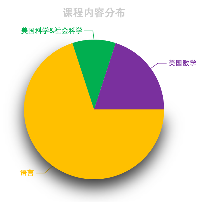
心血来潮,想使用百度Echarts来绘制一下,可是没能绘制得完全一样,Echarts饼状图的label不能在图形下面放成一行,最后的效果是这样子的:
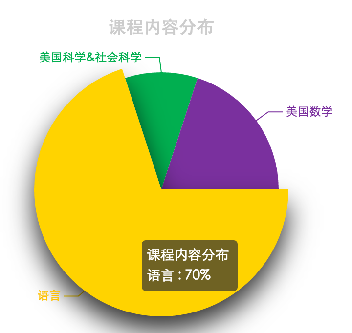
鼠标移动到items上,可动态显示百分比:
另外,还了解到了一种特殊的饼状图:南丁格尔图,就是用扇形半径的大小来表示百分比,对于相差比较大的items,看起来会有些不平衡;
最后,上代码:
心血来潮,想使用百度Echarts来绘制一下,可是没能绘制得完全一样,Echarts饼状图的label不能在图形下面放成一行,最后的效果是这样子的:
鼠标移动到items上,可动态显示百分比:
另外,还了解到了一种特殊的饼状图:南丁格尔图,就是用扇形半径的大小来表示百分比,对于相差比较大的items,看起来会有些不平衡;
最后,上代码:
<!DOCTYPE html>
<html>
<head>
<meta charset="UTF-8">
<title>饼状图练习</title>
<style>
#pic1{
width:400px;
height:400px;
margin: 20px auto;
}
</style>
<script src="js/echarts.common.min.js"></script>
</head>
<body>
<div id="pic1"></div>
<script>
var myCharts1 = echarts.init(document.getElementById('pic1'));
var option1 = {
backgroundColor: 'white',

title: {
text: '课程内容分布',
left: 'center',
top: 20,
textStyle: {
color: '#ccc'
}
},
tooltip : {
trigger: 'item',
formatter: "{a} <br/>{b} : {d}%"
},

visualMap: {
show: false,
min: 500,
max: 600,
inRange: {
colorLightness: [0, 1]
}
},
series : [
{
name:'课程内容分布',
type:'pie',
clockwise:'true',
startAngle:'0',
radius : '60%',
center: ['50%', '50%'],
data:[
{
value:70,
name:'语言',
itemStyle:{
normal:{
color:'rgb(255,192,0)',
shadowBlur:'90',
shadowColor:'rgba(0,0,0,0.8)',
shadowOffsetY:'30'
}
}
},
{
value:10,
name:'美国科学&社会科学',
itemStyle:{
normal:{
color:'rgb(1,175,80)'
}
}
},
{
value:20,
name:'美国数学',
itemStyle:{
normal:{
color:'rgb(122,48,158)'
}
}
}

],
}
]
};
myCharts1.setOption(option1);
</script>
</body>
</html>

相关文章推荐
- 欢迎使用CSDN-markdown编辑器
- bzoj3917【Baltic2014】sequence
- [Android]百度地图之地图标注
- c++作业5
- tamcat学习2之使用Maven新建webapp,并从HelloServlet中读取变量值
- 数据库设计简要规范
- Play framework 2.5.x JAVA版本 教程一 IntelliJ 调试
- hihocoder -#1043 : 完全背包
- [LeetCode] 347. Top K Frequent Elements 解题思路 - Java
- 5.sqlMapConfig配置
- git的学习(各个版本之间的转换)
- ui-router
- python socket理论知识
- PHP基础语法
- AVL
- Redis Cluster集群的搭建与实践
- 线程同步的几种方法
- C++第5次作业
- springMVC之国际化
- sqlserver 纵横