盒子模型的百分比是根据什么来的
2016-04-14 23:42
274 查看
之前一直很模糊,他们的水平和垂直方向上的百分比是根据什么来的?
是根据宽度还是高度呢?
来揭秘一下把。
首先是

可以看出margin-top和margin-bottom都是根据父容器的宽度来决定的。
比如我这里的margin:10%
父容器的width:800px;height:600px;
结论:margin百分比也是根据父容器的宽度来决定的。不管margin-top还是margin-bottom。

这里的padding设置的是10%;可以看到padding-top和padding-bottom都是80px;
结论:padding百分比也是根据父容器的宽度来决定的。不管padding-top还是padding-bottom。
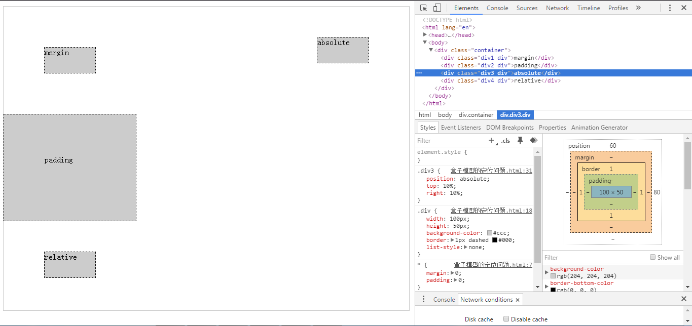
这里的div3设置的属性是position:absolute;top:10%;right:10%;
可以看出解析出来之后top:60px;right:80px;
结论:当position:absolute时,top的百分比是根据父容器高度来计算的,left的百分比是根据父容器的宽度来计算的。
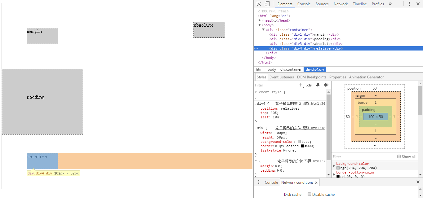
这里的div4设置的属性是position:relative;top:10%;left:10%;
可以看出解析出来之后top:60px;left:80px;
结论:当position:relative时,top的百分比是根据父容器高度来计算的,left的百分比是根据父容器的宽度来计算的。
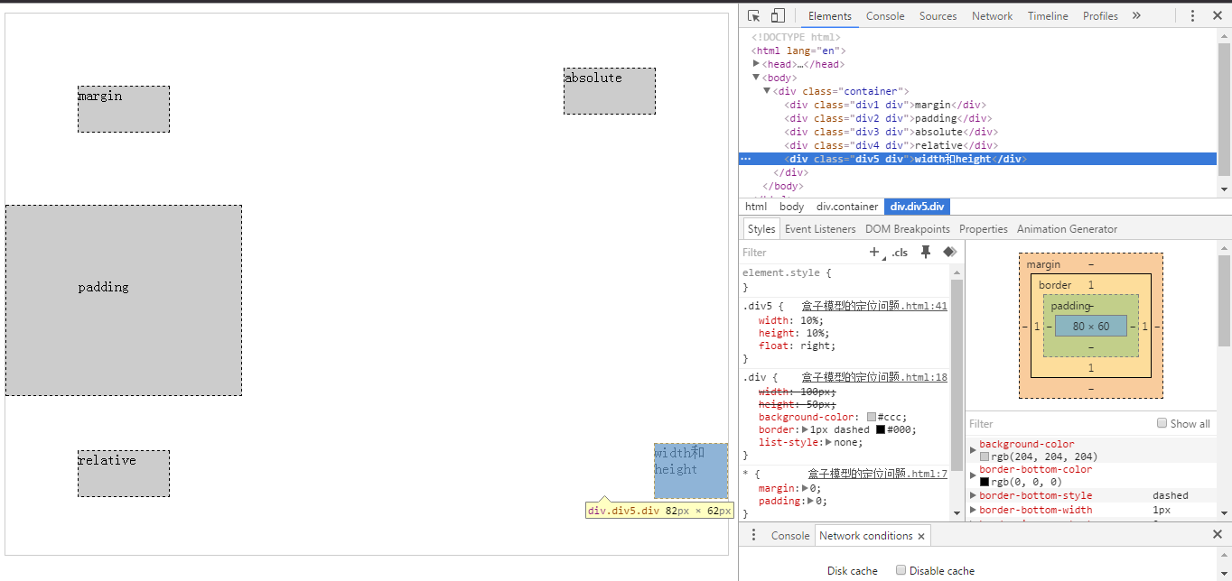
可以看出,设置宽度百分比和高度百分比是根据父容器的宽度和高度来设置的。
总结:height、top两个值都是根据父容器的高度来设置的。
padding-top/padding-bottom/padding-left/padding-right、margin-top/margin-bottom/margin-left/margin-right、width、left是根据父容器的宽度来设置的。
路径:http://sandbox.runjs.cn/show/cckc8yek
是根据宽度还是高度呢?
来揭秘一下把。
首先是
margin:
可以看出margin-top和margin-bottom都是根据父容器的宽度来决定的。
比如我这里的margin:10%
父容器的width:800px;height:600px;
结论:margin百分比也是根据父容器的宽度来决定的。不管margin-top还是margin-bottom。
<!DOCTYPE html>
<html lang="en">
<head>
<meta charset="UTF-8">
<title>盒子模型的定位问题</title>
<style type="text/css">
*{
margin: 0;
padding: 0;
}
.container{
width:800px;
height:600px;
margin:10px auto 0;
border:1px solid #ccc;
position: relative;
}
.div{
width:100px;
height:50px;
background-color:#ccc;
border:1px dashed #000;
list-style:none;
}
.div1{
margin:10%;
}
</style>
</head>
<body>
<div class="container">
<div class="div1 div">margin</div>
</div>
</body>
</html>
padding:
这里的padding设置的是10%;可以看到padding-top和padding-bottom都是80px;
结论:padding百分比也是根据父容器的宽度来决定的。不管padding-top还是padding-bottom。
<!DOCTYPE html>
<html lang="en">
<head>
<meta charset="UTF-8">
<title>盒子模型的定位问题</title>
<style type="text/css">
*{
margin: 0;
padding: 0;
}
.container{
width:800px;
height:600px;
margin:10px auto 0;
border:1px solid #ccc;
position: relative;
}
.div{
width:100px;
height:50px;
background-color:#ccc;
border:1px dashed #000;
list-style:none;
}
.div2{
padding:10%;
}
</style>
</head>
<body>
<div class="container">
<div class="div2 div">padding</div>
</div>
</body>
</html>
position:absolute;
这里的div3设置的属性是position:absolute;top:10%;right:10%;
可以看出解析出来之后top:60px;right:80px;
结论:当position:absolute时,top的百分比是根据父容器高度来计算的,left的百分比是根据父容器的宽度来计算的。
<!DOCTYPE html>
<html lang="en">
<head>
<meta charset="UTF-8">
<title>盒子模型的定位问题</title>
<style type="text/css">
*{
margin: 0;
padding: 0;
}
.container{
width:800px;
height:600px;
margin:10px auto 0;
border:1px solid #ccc;
position: relative;
}
.div{
width:100px;
height:50px;
background-color:#ccc;
border:1px dashed #000;
list-style:none;
}
.div3{
position: absolute;
top:10%;
right:10%;
}
</style>
</head>
<body>
<div class="container">
<div class="div3 div">absolute</div>
</div>
</body>
</html>
position:relative;
这里的div4设置的属性是position:relative;top:10%;left:10%;
可以看出解析出来之后top:60px;left:80px;
结论:当position:relative时,top的百分比是根据父容器高度来计算的,left的百分比是根据父容器的宽度来计算的。
<!DOCTYPE html>
<html lang="en">
<head>
<meta charset="UTF-8">
<title>盒子模型的定位问题</title>
<style type="text/css">
*{
margin: 0;
padding: 0;
}
.container{
width:800px;
height:600px;
margin:10px auto 0;
border:1px solid #ccc;
position: relative;
}
.div{
width:100px;
height:50px;
background-color:#ccc;
border:1px dashed #000;
list-style:none;
}
.div4{
position: relative;
top:10%;
left:10%;
}
</style>
</head>
<body>
<div class="container">
<div class="div4 div">relative</div>
</div>
</body>
</html>
width和height:
可以看出,设置宽度百分比和高度百分比是根据父容器的宽度和高度来设置的。
<!DOCTYPE html>
<html lang="en">
<head>
<meta charset="UTF-8">
<title>盒子模型的定位问题</title>
<style type="text/css">
*{
margin: 0;
padding: 0;
}
.container{
width:800px;
height:600px;
margin:10px auto 0;
border:1px solid #ccc;
position: relative;
}
.div{
width:100px;
height:50px;
background-color:#ccc;
border:1px dashed #000;
list-style:none;
}
.div5{
width:10%;
height:10%;
float:right;
}
</style>
</head>
<body>
<div class="container">
<div class="div5 div">width和height</div>
</div>
</body>
</html>
总结:height、top两个值都是根据父容器的高度来设置的。
padding-top/padding-bottom/padding-left/padding-right、margin-top/margin-bottom/margin-left/margin-right、width、left是根据父容器的宽度来设置的。
路径:http://sandbox.runjs.cn/show/cckc8yek

相关文章推荐
- 用RBG颜色设置自定义颜色
- Docker的镜像和容器的区别
- SSM:spring+springmvc+mybatis框架中的XML配置文件功能详细解释
- X86汇编基础
- 栈的操作
- 为什么不应该买小房换大房?
- 基于Sublime Text搭建Python IDE
- 回文词(UVa401)
- 2.2.3 X Window的学习
- C++中负数的位操作
- 电脑常识和电脑常见故障
- java面向对象三大特征之多态
- C++中负数的位操作
- WebApplicationInitializer (spring 3.x.x以上版本)
- 享元模式
- 浅析Java中的访问权限控制
- spring+springmvc+mybatis详细运转流程
- 2.2.2 学习心态的分别
- Java异常处理的一些常见问题
- java中Long和long的区别(转)