html之大白
2016-03-25 20:43
344 查看
<!doctype html>
<html>

<head>
<meta charset="utf-8">
<title>Baymax</title>

<style>
body {
background: #595959;
}

#baymax {

/*设置为 居中*/
margin: 0 auto;

/*高度*/
height: 600px;

/*隐藏溢出*/
overflow: hidden;
}

#head {
height: 64px;
width: 100px;

/*以百分比定义圆角的形状*/
border-radius: 50%;

/*背景*/
background: #fff;
margin: 0 auto;
margin-bottom: -20px;

/*设置下边框的样式*/
border-bottom: 5px solid #e0e0e0;

/*属性设置元素的堆叠顺序;
拥有更高堆叠顺序的元素总是会处于堆叠顺序较低的元素的前面*/
z-index: 100;

/*生成相对定位的元素*/
position: relative;
}

#eye,
#eye2 {
width: 11px;
height: 13px;
background: #282828;
border-radius: 50%;
position: relative;
top: 30px;
left: 27px;

/*旋转该元素*/
transform: rotate(8deg);
}

#eye2 {

/*使其旋转对称*/
transform: rotate(-8deg);
left: 69px;
top: 17px;

}

#mouth {
width: 38px;
height: 1.5px;
background: #282828;
position: relative;
left: 34px;
top: 10px;
}

#torso,
#belly {
margin: 0 auto;
height: 200px;
width: 180px;
background: #fff;
border-radius: 47%;

/*设置边框*/
border: 5px solid #e0e0e0;
border-top: none;
z-index: 1;
}

#belly {
height: 300px;
width: 245px;
margin-top: -140px;
z-index: 5;
}

#cover {
width: 190px;
background: #fff;
height: 150px;
margin: 0 auto;
position: relative;
top: -20px;
border-radius: 50%;
}

#heart{
width:25px;
height:25px;
border-radius:50%;
position:relative;

/*向边框四周添加阴影效果*/
box-shadow:2px 5px 2px #ccc inset;

right:-115px;
top:40px;
z-index:111;
border:1px solid #ccc;
}

#left-arm,
#right-arm {
height: 270px;
width: 120px;
border-radius: 50%;
background: #fff;
margin: 0 auto;
position: relative;
top: -350px;
left: -100px;
transform: rotate(20deg);
z-index: -1;
}

#right-arm {
transform: rotate(-20deg);
left: 100px;
top: -620px;
}

#l-bigfinger,
#r-bigfinger {
height: 50px;
width: 20px;
border-radius: 50%;
background: #fff;
position: relative;
top: 250px;
left: 50px;
transform: rotate(-50deg);
}

#r-bigfinger {
left: 50px;
transform: rotate(50deg);
}

#l-smallfinger,
#r-smallfinger {
height: 35px;
width: 15px;
border-radius: 50%;
background: #fff;
position: relative;
top: 195px;
left: 66px;
transform: rotate(-40deg);
}

#r-smallfinger {
background: #fff;
transform: rotate(40deg);
top: 195px;
left: 37px;
}

#left-leg,
#right-leg {
height: 170px;
width: 90px;
border-radius: 40% 30% 10px 45%;
background: #fff;
position: relative;
top: -640px;
left: -45px;
transform: rotate(-1deg);
z-index: -2;
margin: 0 auto;
}

#right-leg {
background: #fff;
border-radius:30% 40% 45% 10px;
margin: 0 auto;
top: -810px;
left: 50px;
transform: rotate(1deg);
}

</style>

</head>

<body>
<div id="baymax">

<!-- 定义头部,包括两个眼睛、嘴 -->
<div id="head">
<div id="eye"></div>
<div id="eye2"></div>
<div id="mouth"></div>
</div>

<!-- 定义躯干,包括心脏 -->
<div id="torso">
<div id="heart"></div>
</div>

<!-- 定义肚子腹部,包括 cover(和躯干的连接处) -->
<div id="belly">
<div id="cover"></div>
</div>

<!-- 定义左臂,包括一大一小两个手指 -->
<div id="left-arm">
<div id="l-bigfinger"></div>
<div id="l-smallfinger"></div>
</div>

<!-- 定义右臂,同样包括一大一小两个手指 -->
<div id="right-arm">
<div id="r-bigfinger"></div>
<div id="r-smallfinger"></div>
</div>

<!-- 定义左腿 -->
<div id="left-leg"></div>

<!-- 定义右腿 -->
<div id="right-leg"></div>

</div>
</body>

</html>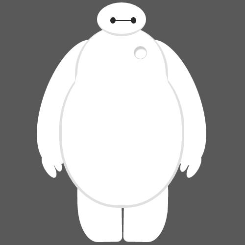

相关文章推荐
- HTML空格占位符
- HTML标签-图像
- 理解Html DOM、Ext Element及Component
- 课堂所讲整理:HTML--6运算符、类型转换
- 两个input之间有空隙,处理方法
- HTML中的超链接
- 议:如何将树形菜单形式的数据转化成HTML的二维表(相同内容需合并单元格)
- HTML标签-列表
- HTML标签-文本
- html a标签打开邮件
- HTML学习笔记2
- HTML标签表格
- html中的块元素(Block)和内联元素(Inline)(转)
- 符合搜索引擎SEO规则的HTML代码
- HTML—格式布局
- HTML 5 Web 存储
- html第六节课
- HTML文件基本标签body
- 简单的网页处理工具-HtmlParser
- Html如何设置横向导航结构