CSS之切出横幅
2016-03-16 19:32
561 查看
简述
上节分享了clip-path来实现一个剪切横幅,本节通过另外一种方式来实现一个更经典的横幅。简述
最终效果
小三角
效果
源码
阴影分割
效果
源码
合并
最终效果
我们先看一下最终要实现的效果。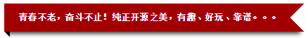
我们要实现这样一个效果,首先需要将其进行上下分割,上面为一个红色背景右边有剪切三角且下边带阴影效果的样式,下面是一个黑色小三角。
为了实现这个效果,我们一步步分析,先从小三角入手。
小三角
为了更容易理解过程,将其拆分为以下几步。效果

源码
下面我们实现一个<div>,其宽度为50px,边框为20px,这里为了凸显效果,左、上、右、下边框的颜色分别设置为红、绿、蓝、橙。
<!DOCTYPE html>
<html>
<head>
<style type='text/css'>

.bord {
width: 50px;
border: 20px solid #fff;
border-left-color: red;
border-top-color: green;
border-right-color: blue;
border-bottom-color: orange;
}

</style>
</head>
<body>
<div class="bord">

</div>
</body>
</html>
这个显然不满足我们三角的需求,好的我们再分析,小三角为上边框和右边框组合而成,但是由于宽度过大会造成不能均分,这时我们再进行一下设置。
看效果:

注意:这里只改动了这一处代码
.bord {
width: 0px;
...
}
如果我们将左边框、下边框设置为透明,上边框、右边框设置会黑色不正好是我们想要的效果么。有点意思,我们不妨试试。

.bord {
width: 0px;
border: 20px solid #000;
border-left-color: transparent;
border-bottom-color: transparent;
}
是不是很喜人呢O(∩_∩)O~。
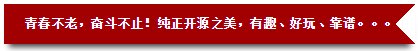
阴影分割
三角实现了,那么阴影分割可以参考上一节的实现。效果
源码
<!DOCTYPE html>
<html>
<head>
<meta charset="utf-8">
<style type='text/css'>
.bord {
position: relative;
margin: 50px;
}

.bord:before {
content: "青春不老,奋斗不止!纯正开源之美,有趣、好玩、靠谱。。。";
position: absolute;
color: #fff;
font-weight: bold;
height: 0px;
border: 20px solid #a20000;
/* 设置右边框透明 */
border-right-color: transparent;
line-height: 0px;
box-shadow: 0 8px 8px -5px rgba(0, 0, 0, 0.75);
z-index: 1;
}

body {
font-size: 13px;
}
</style>
</head>
<body>
<div class="bord">

</div>
</body>
</html>
这里主要说一下border-right-color: transparent。由于高度为0,边框为20px,所以这行样式和上面看到的一样将出现一个锯齿三角。
合并
将上面分别实现的两部分合并即可。<!DOCTYPE html>
<html>
<head>
<meta charset="utf-8">
<style type='text/css'>
.bord {
position: relative;
margin: 50px
}
.bord:before {
content: "青春不老,奋斗不止!纯正开源之美,有趣、好玩、靠谱。。。";
position: absolute;
/* 设置右内边距,防止文本显示不全 */
padding-right: 15px;
color: #fff;
font-weight: bold;
height: 0px;
border: 20px solid #a20000;
/* 设置右边框透明,实现剪切的三角 */
border-right-color: transparent;
line-height: 0px;
box-shadow: 0 8px 8px -5px rgba(0, 0, 0, 0.75);
z-index: 1;
}
.bord:after {
content: "";
/* 设置距离上边缘的距离 */
top: 40px;
position: absolute;
border: 4px solid #000;
border-left-color: transparent;
border-bottom-color: transparent;
}
body {
font-size: 13px;
}
</style>
</head>
<body>
<div class="bord">
</div>
</body>
</html>注意:
由于上部分的边框为20px,所以也就是说,高度为上下边框之和,即:40px,所以下面的小三角必须设置距离上边缘的距离top: 40px。否则,显示的位置就会出现错乱。

相关文章推荐
- CSS3属性教程与案例分享
- CSS3属性教程与案例分享
- CSS3的calc()使用
- 使用CSS3的appearance属性改变元素的外观
- Web布局连载——两栏固定布局(五)
- CSS3美化图片
- CSS3质感分析——表面线性渐变
- 分析选项卡底部内凹圆角制作
- 细说百度图片栏目——图片展示效果
- 8个实用的响应式设计框架
- 20+ Animation Scripts, Libraries and Plugins
- [div+css]晒晒最新制作专题推广页模板
- 盒子模型
- CSS选择器
- CSS样式优先权
- [css] line-height 百分比单位和数值单位的区别
- Apple官网研究之使用Justify布局导航
- 设计更快的网页(三):字体和 CSS 调整
- 纯CSS制作的新闻网站中的文章列表
- 10条影响CSS渲染速度的写法与使用建议第1/3页