Android卡片式布局的简单实现方法
2016-02-24 20:04
931 查看
之前在网上看到一个开源项目cardslib感觉做的很漂亮,个人也喜欢这种布局。但是作者使用Androidstudio写的,试了几次没办法导入Eclipse,AndroidStudio没试过(因为没安装),于是就想自己做一个,这里用的工具是Eclipse。
1、布局设计
首先添加一个列表的项目,这里包括一个textview和六个button,button分为两组分别添加到两个里nearlayout中。
<?xml version="1.0" encoding="utf-8"?>
<LinearLayout xmlns:android="http://schemas.android.com/apk/res/android"
android:layout_width="match_parent"
android:layout_height="match_parent"
android:background="@drawable/border"
android:orientation="vertical" >

<TextView
android:id="@+id/list_item_card_text"
style="@style/ListItemText"
android:layout_width="match_parent"
android:layout_height="wrap_content"
android:text="卡片布局测试"
/>

<View
android:id="@+id/list_item_seperator"
android:layout_width="match_parent"
android:layout_height="1dip"
android:layout_marginLeft="5dip"
android:layout_marginRight="5dip"
/>

<LinearLayout
style="?android:attr/buttonBarStyle"
android:layout_width="match_parent"
android:layout_height="wrap_content"
android:orientation="horizontal"

>

<Button
android:id="@+id/list_item_card_button_1"
style="?android:attr/buttonBarButtonStyle"
android:layout_width="match_parent"
android:layout_height="120dp"
android:layout_margin="0dip"
android:layout_weight="1"
android:focusable="false"
android:focusableInTouchMode="false"
android:paddingLeft="5dp"
android:paddingTop="40dp"
android:paddingRight="10dp"
android:paddingBottom="20dp"
android:drawableTop="@drawable/speech_balloon"
android:text="卡片1"
android:textSize="12sp"

android:textStyle="normal"  />

<Button
android:id="@+id/list_item_card_button_2"
style="?android:attr/buttonBarButtonStyle"
android:layout_width="match_parent"
android:layout_height="120dp"
android:layout_margin="0dip"
android:layout_weight="1"
android:focusable="false"
android:focusableInTouchMode="false"
android:paddingLeft="5dp"
android:paddingTop="40dp"
android:paddingRight="5dp"
android:paddingBottom="20dp"
android:drawableTop="@drawable/speech_balloon"
android:text="卡片2"
android:textSize="12sp"
android:textStyle="normal"  />

<Button
android:id="@+id/list_item_card_button_3"
style="?android:attr/buttonBarButtonStyle"
android:layout_width="match_parent"
android:layout_height="120dp"
android:layout_margin="0dip"
android:layout_weight="1"
android:focusable="false"
android:focusableInTouchMode="false"
android:paddingLeft="5dp"
android:paddingTop="40dp"
android:paddingRight="5dp"
android:paddingBottom="20dp"
android:drawableTop="@drawable/speech_balloon"
android:text="卡片3"
android:textSize="12sp"

android:textStyle="normal"  />
</LinearLayout>

<LinearLayout
style="?android:attr/buttonBarStyle"
android:layout_width="match_parent"
android:layout_height="wrap_content"

>
<Button
android:id="@+id/list_item_card_button_4"
style="?android:attr/buttonBarButtonStyle"
android:layout_width="match_parent"
android:layout_height="120dp"
android:layout_margin="0dip"
android:layout_weight="1"
android:focusable="false"
android:focusableInTouchMode="false"
android:paddingLeft="5dp"
android:paddingTop="40dp"
android:paddingRight="5dp"
android:paddingBottom="20dp"
android:drawableTop="@drawable/speech_balloon"
android:text="卡片4"
android:textSize="12sp"

android:textStyle="normal" />

<Button
android:id="@+id/list_item_card_button_5"
style="?android:attr/buttonBarButtonStyle"
android:layout_width="match_parent"
android:layout_height="120dp"
android:layout_margin="0dip"
android:layout_weight="1"
android:focusable="false"
android:focusableInTouchMode="false"
android:paddingLeft="5dp"
android:paddingTop="40dp"
android:paddingRight="5dp"
android:paddingBottom="20dp"
android:drawableTop="@drawable/speech_balloon"
android:text="卡片5"

android:textSize="12sp"
android:textStyle="normal" />

<Button
android:id="@+id/list_item_card_button_6"
style="?android:attr/buttonBarButtonStyle"
android:layout_width="match_parent"
android:layout_height="120dp"
android:layout_margin="0dip"
android:layout_weight="1"
android:focusable="false"
android:focusableInTouchMode="false"
android:paddingLeft="5dp"
android:paddingTop="40dp"
android:paddingRight="5dp"
android:paddingBottom="20dp"
android:drawableTop="@drawable/speech_balloon"
android:text="卡片6"
android:textSize="12sp"

android:textStyle="normal" />
</LinearLayout>

</LinearLayout>
效果图入下:
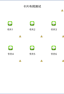
这里调整图片位置语句为:
android:paddingLeft="5dp"
android:paddingTop="40dp"
android:paddingRight="5dp"
android:paddingBottom="20dp"
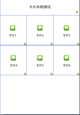
可以看出没有边框,这里为每个卡片添加一个边框。在文件夹drawable_hdpi下添加xml文件border:
<?xml version="1.0" encoding="UTF-8"?>
<shape
xmlns:android="http://schemas.android.com/apk/res/android"
>
<solid android:color="#ffffff" />
<stroke
android:width="0.01dp"
android:color="#003399"
/>
<padding
android:bottom="0dp"
android:top="0dp"
android:left="0dp"
android:right="0dp"
/>
</shape>
效果图如下:
最后添加主activity的代码编辑如下:
 2、代码编写 ------ 这里代码编写比较简单。 首先构造适配器,这里继承了BaseAdapter,在getView方法里填充列表项目的图层,然后在getView方法里为各个卡片添加触发器。
public class CardsAdapter extends BaseAdapter
{
private List<String> items;
private final OnClickListener itemButtonClickListener;
private final Context context;

public CardsAdapter(Context context, List<String> items,OnClickListener itemButtonClickListener)
{
this.context = context;
this.items = items;
this.itemButtonClickListener = itemButtonClickListener;
}

@Override
public int getCount()
{
return items.size();
}

@Override
public String getItem(int position)
{
return items.get(position);
}

@Override
public long getItemId(int position)
{
return position;
}

@Override
public View getView(final int position, View convertView, ViewGroup parent)
{

ViewHolder holder;

if (convertView == null)
{
convertView = LayoutInflater.from(context).inflate( R.layout.list_item_card, null);

holder = new ViewHolder();
holder.itemText = (TextView) convertView.findViewById(R.id.list_item_card_text);
holder.itemButton1 = (Button) convertView.findViewById(R.id.list_item_card_button_1);
holder.itemButton2 = (Button) convertView.findViewById(R.id.list_item_card_button_2);
convertView.setTag(holder);

}
else
{
holder = (ViewHolder) convertView.getTag();
}

holder.itemText.setText(items.get(position));

holder.itemButton1.setOnClickListener(new OnClickListener()
{

@Override
public void onClick(View v)
{
new AlertDialog.Builder(context)
.setTitle("当前点击为:"+position).setMessage("是否提交?")
.setPositiveButton("是", null).setNegativeButton("否", null).show();
}
});
holder.itemButton2.setOnClickListener(new OnClickListener()
{

@Override
public void onClick(View v)
{
new AlertDialog.Builder(context)
.setTitle("当前点击为:"+position).setMessage("是否提交?")
.setPositiveButton("是", null).setNegativeButton("否", null).show();
}
});

return convertView;
}

private static class ViewHolder
{
private TextView itemText;
private Button itemButton1;
private Button itemButton2;
}
}
然后在图层里填充listview
public class CardLayoutFragment extends Fragment
{
private ListView cardsList;
public CardLayoutFragment()
{
}
@Override
public View onCreateView(LayoutInflater inflater, ViewGroup container,Bundle savedInstanceState)
{
View rootView = inflater.inflate(R.layout.fragment_card_layout,container, false);
cardsList = (ListView) rootView.findViewById(R.id.cards_list);
setupList();
return rootView;
}
private void setupList()
{
cardsList.setAdapter(createAdapter());
cardsList.setOnItemClickListener(new ListItemClickListener());
}
private CardsAdapter createAdapter()
{
ArrayList<String> items = new ArrayList<String>();
for (int i = 0; i < 2; i++)
{
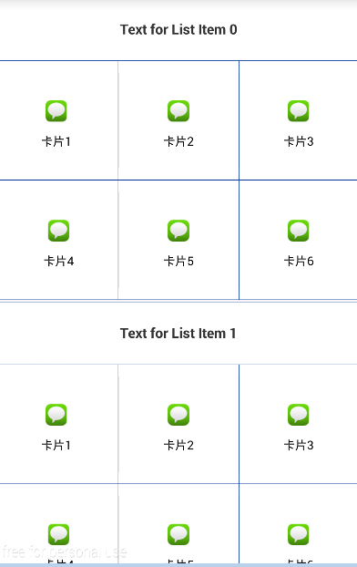
items.add(i, "Text for List Item " + i);
}
return new CardsAdapter(getActivity(), items,new ListItemButtonClickListener());
}
private final class ListItemButtonClickListener implements OnClickListener
{
@Override
public void onClick(View v)
{
}
}
private final class ListItemClickListener implements OnItemClickListener
{
@Override
public void onItemClick(AdapterView<?> parent, View view, int position,long id)
{
Toast.makeText(getActivity(), "Clicked on List Item " + position,Toast.LENGTH_SHORT).show();
}
}}
“`
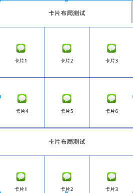
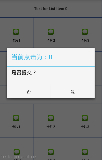
最后也行效果如下:
附上demo
http://download.csdn.net/detail/czcl123/9442391

相关文章推荐
- 使用C++实现JNI接口需要注意的事项
- Android IPC进程间通讯机制
- Android Manifest 用法
- [转载]Activity中ConfigChanges属性的用法
- Android之获取手机上的图片和视频缩略图thumbnails
- Android之使用Http协议实现文件上传功能
- Android学习笔记(二九):嵌入浏览器
- android string.xml文件中的整型和string型代替
- i-jetty环境搭配与编译
- android之定时器AlarmManager
- android wifi 无线调试
- Android Native 绘图方法
- Android java 与 javascript互访(相互调用)的方法例子
- android 代码实现控件之间的间距
- android FragmentPagerAdapter的“标准”配置
- Android"解决"onTouch和onClick的冲突问题
- android:installLocation简析
- android searchView的关闭事件
- SourceProvider.getJniDirectories