RemoteControl应用介绍
2016-02-23 14:21
323 查看
本文介绍了RemoteControl应用,该应用来自《Android权威编程指南》一书。
通过本应用可以学到的知识点:
自定义style样式、继承父类的style样式,并将样式加入到XML代码中;
自定义include标签以消除重复代码;
学习各种类型的drawable(state list drawable、shape drawable、layer list drawable、inset drawable、nine patch drawable),通过这些drawable给应用赋予一种全新的独特视觉体验。
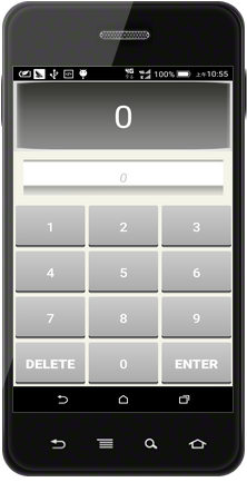
本应用的效果图如下所示:
样式可用于适配各种UI控件,避免重复性编写具有相似控件属性的代码。样式定义在res/values/styles.xml文件中,该文件以resources标签为根标签,每一种样式均以style标签作为元素节点,节点内包含一个或多个item子节点,每个样式item都是以XML属性进行命名的,元素内的文字即为属性值。下面为每个button定义了一组统一的样式:
在上面的XML代码中,style标签的属性name=”RemoteButton”就是该样式的名字,当需要在其他XML代码中引用该样式,可使用下面的方式:
在子标签item中定义了button的共同属性,其中name为该item的属性名,而元素内为属性值。
为了突出Delete按钮和Enter按钮,将这两个按钮的文字加粗,但其余属性不变,可以设置一个新的style样式”RemoteButtonBold”,该样式的parent属性指定为”RemoteButton”,表示样式”RemoteButtonBold”继承了”RemoteButton”样式的所有属性,同时还可以添加子样式特有的文字加粗属性:
注意到在上个小节中定义的style中,有两个特殊的item:
以上代码通过引用drawable的方式(@drawable/)将名为”button_text_color”的XML文件引用进来,该文件就是定义在res/drawable目录下的XML drawable,由于该XML drawable负责指定处于点击与非点击状态下button的drawable,所以这个自定义的XML drawable属于state list drawable,”button_text_color”文件的内容如下:
state list drawable必须有一个selector作为根标签,每一个子标签item表示各个状态下button的表现形式。
第二个引用的drawable文件名为”button_shape_shadowed”,同样定义在res/drawable目录中,代码如下所示:
上面XML代码的根标签是layer-list,表示这是一个layer list drawable,该drawable主要用于使UI控件在不同状态切换时产生层次效果,使控件具有立体感,提高用户的交互体验。
每个子标签item中,都包含了一个drawable,并以从后至前的顺序进行排序,第二个drawable是一个inset drawable,其任务就是在已创建的drawable底部做5dp单位的位移,并刚好落在位移形成的阴影上,同时又引入了一个名为”button_shape”的drawable,该drawable是一个state list drawable,具体代码见本段文字的下面;第一个drawable是一个shape drawable,通过shape标签定义控件的形状,若不指定,系统将默认指定为rectangle,shape内的子标签corners和gradients分别定义了控件的四角圆滑半径和渐变色。
button_shape.xml中的引用drawable:”button_shape_normal”和”button_shape_pressed”是两个shape drawable,定义如下:
以下是主布局XML:
以上XML有如下几点说明:
属性android:stretchColumns= “*” 表示TableRow中的每一个控件大小均分;
最上面的两个TextView分别使用了nine-patch图片作为背景,有关nine-patch图片也属于drawable的一种(nine patch drawable),有关nine-patch图片的定义及制作,请参见我的博文《Nine-Patch格式图片浅析》。
两个TextView分别设置了android:layout_weight属性,比例为2:1,表示在竖直方向上,两个TextView按照2:1的高度分配空间。注意:由于button属性中定义了android:layout _height=”0dp”,同时未指定android:layout _weight,所以在高度的分配上,应先为TableRow所需空间占用竖直方向的高度,剩余的高度空间再按2:1 的比例分配给两个TextView。
注:逻辑代码添加在了Fragment的onCreateView方法中,这与将代码逻辑写在Activity的onCreate方法中是一样的。
最后,为了强制activity竖屏显示,应在AndroidManifest中为activity指定如下属性:
RemoteControl简介
RemoteControl应用只有一个activity。应用界面的最顶端区域可以显示当前频道。下面紧接着的区域显示用户正在输入的新频道。点击Delete按钮可以清除输入区域的频道;点击Enter按钮可变换频道,即更新当前频道并清除输入区域的频道。通过本应用可以学到的知识点:
自定义style样式、继承父类的style样式,并将样式加入到XML代码中;
自定义include标签以消除重复代码;
学习各种类型的drawable(state list drawable、shape drawable、layer list drawable、inset drawable、nine patch drawable),通过这些drawable给应用赋予一种全新的独特视觉体验。
本应用的效果图如下所示:
为相同的view定义style
由上图可以看出,屏幕的下面是button区域,用于输入不同的频道号,这些button都具有相同或相似的外观,不妨为button设置一个统一的样式,这样一来消除了重复的代码、是代码看起来更加简洁,二来方便后期维护。下面将结合代码对style样式做一介绍。样式可用于适配各种UI控件,避免重复性编写具有相似控件属性的代码。样式定义在res/values/styles.xml文件中,该文件以resources标签为根标签,每一种样式均以style标签作为元素节点,节点内包含一个或多个item子节点,每个样式item都是以XML属性进行命名的,元素内的文字即为属性值。下面为每个button定义了一组统一的样式:
<!-- res/styles.xml -->
<!-- 用于定义样式及主题 -->

<style name="RemoteButton">
<item name="android:layout_width">0dp</item>
<item name="android:layout_height">match_parent</item>
<item name="android:textColor">@drawable/button_text_color</item>
<item name="android:textSize">20sp</item>
<item name="android:layout_margin">3dp</item>
<item name="android:paddingTop">24dp</item>
<item name="android:paddingBottom">24dp</item>
<item name="android:background">@drawable/button_shape_shadowed</item>
</style>
在上面的XML代码中,style标签的属性name=”RemoteButton”就是该样式的名字,当需要在其他XML代码中引用该样式,可使用下面的方式:
style="@style/RemoteButton"
在子标签item中定义了button的共同属性,其中name为该item的属性名,而元素内为属性值。
为了突出Delete按钮和Enter按钮,将这两个按钮的文字加粗,但其余属性不变,可以设置一个新的style样式”RemoteButtonBold”,该样式的parent属性指定为”RemoteButton”,表示样式”RemoteButtonBold”继承了”RemoteButton”样式的所有属性,同时还可以添加子样式特有的文字加粗属性:
<!-- 样式"RemoteButtonBold"继承了父样式"RemoteButton"的全部属性,并添加自己的特有属性android:textStyle -->

<style name="RemoteButtonBold" parent="RemoteButton">
<item name="android:textStyle">bold</item>
</style>
XML drawable
Android把任何可绘制在屏幕上的图形称为 drawable。drawable是一种抽象的图形、一个继承drawable类的子类,或是一张位图图像。常见的drawable有state list drawable、shape drawable、layer list drawable、nine patch drawable。由于前三者通常定义在XML文件中,故统一将他们称为XML drawable类别。XML drawable有与像素密度无关的优良特性,故可以将他们定义在默认的res/drawable目录下。下面将结合代码说明这几种XML drawable。注意到在上个小节中定义的style中,有两个特殊的item:
<!-- 自定义state list drawable;不同状态下View的状态不同 -->
<item name="android:textColor">@drawable/button_text_color</item>

<!-- 自定义layer list drawable;使View产生阴影效果 -->
<item name="android:background">@drawable/button_shape_shadowed</item>
以上代码通过引用drawable的方式(@drawable/)将名为”button_text_color”的XML文件引用进来,该文件就是定义在res/drawable目录下的XML drawable,由于该XML drawable负责指定处于点击与非点击状态下button的drawable,所以这个自定义的XML drawable属于state list drawable,”button_text_color”文件的内容如下:
<!-- button_text_color.xml -->
<!-- state list drawable -->

<selector xmlns:android="http://schemas.android.com/apk/res/android">

<item android:state_pressed="false" android:color="#ffffff"></item>
<item android:state_pressed="true" android:color="#556699"></item>

</selector>
state list drawable必须有一个selector作为根标签,每一个子标签item表示各个状态下button的表现形式。
第二个引用的drawable文件名为”button_shape_shadowed”,同样定义在res/drawable目录中,代码如下所示:
<!-- button_shape_shadowed.xml -->
<!-- layer list drawable -->

<layer-list xmlns:android="http://schemas.android.com/apk/res/android" >

<item>
<shape android:shape="rectangle" >
<corners android:radius="5dp" />

<gradient
android:angle="90"
android:centerColor="#303339"
android:centerY="0.05"
android:endColor="#000000"
android:startColor="#00000000" />
</shape>
</item>
<item>
<inset
android:drawable="@drawable/button_shape"
android:insetBottom="5dp" />
</item>

</layer-list>
上面XML代码的根标签是layer-list,表示这是一个layer list drawable,该drawable主要用于使UI控件在不同状态切换时产生层次效果,使控件具有立体感,提高用户的交互体验。
每个子标签item中,都包含了一个drawable,并以从后至前的顺序进行排序,第二个drawable是一个inset drawable,其任务就是在已创建的drawable底部做5dp单位的位移,并刚好落在位移形成的阴影上,同时又引入了一个名为”button_shape”的drawable,该drawable是一个state list drawable,具体代码见本段文字的下面;第一个drawable是一个shape drawable,通过shape标签定义控件的形状,若不指定,系统将默认指定为rectangle,shape内的子标签corners和gradients分别定义了控件的四角圆滑半径和渐变色。
<!-- button_shape.xml -->
<!-- state list drawable -->

<selector xmlns:android="http://schemas.android.com/apk/res/android">

<item android:drawable="@drawable/button_shape_normal" android:state_pressed="false"></item>
<item android:drawable="@drawable/button_shape_pressed" android:state_pressed="true"></item>

</selector>
button_shape.xml中的引用drawable:”button_shape_normal”和”button_shape_pressed”是两个shape drawable,定义如下:
<!-- button_shape_normal.xml -->
<!-- shape drawable -->

<shape xmlns:android="http://schemas.android.com/apk/res/android"
android:shape="rectangle" >

<corners android:radius="3dp" />

<gradient
android:angle="90"
android:endColor="#cccccc"
android:startColor="#acacac" />

</shape>
<!-- button_shape_pressed.xml -->
<!-- shape drawable -->

<shape xmlns:android="http://schemas.android.com/apk/res/android"
android:shape="rectangle" >

<corners android:radius="3dp" />

<gradient
android:angle="270"
android:endColor="#cccccc"
android:startColor="#acacac" />

</shape>
引用style样式、引用include标签
将主activity(fragment)的布局以TableLayout为根标签,则每一行button可以由一个TableRow包含,即每个TableRow包含三个button,由于每一行的TableRow的布局都一样,故可以单独定义一个layout资源,最后通过include标签引入至主布局:<!-- button_row.xml --> <!--使用 @style/ 的方式为控件添加样式--> <TableRow xmlns:android="http://schemas.android.com/apk/res/android" > <Button style="@style/RemoteButton" /> <Button style="@style/RemoteButton" /> <Button style="@style/RemoteButton" /> </TableRow>
<!-- button_row_bottom.xml -->
<!-- 最后一行按钮需特殊定制 -->

<TableRow xmlns:android="http://schemas.android.com/apk/res/android" >

<Button style="@style/RemoteButtonBold" />

<Button style="@style/RemoteButton" />

<Button style="@style/RemoteButtonBold" />

</TableRow>
以下是主布局XML:
<!-- fragment_remote_control.xml -->

<TableLayout xmlns:android="http://schemas.android.com/apk/res/android"
android:id="@+id/fragment_remote_control_tableLayout"
android:layout_width="match_parent"
android:layout_height="match_parent"
android:background="@drawable/remote_background"
android:stretchColumns="*" >

<TextView
android:id="@+id/fragment_remote_control_selectedTextView"
android:layout_width="match_parent"
android:layout_height="0dp"
android:layout_weight="2"
android:background="@drawable/window_patch"
android:gravity="center"
android:text="0"
android:textColor="#ffffff"
android:textSize="50sp" />

<TextView
android:id="@+id/fragment_remote_control_workingTextView"
android:layout_width="match_parent"
android:layout_height="0dp"
android:layout_margin="16dp"
android:layout_weight="1"
android:background="@drawable/bar_patch"
android:gravity="center"
android:text="0"
android:textColor="#cccccc"
android:textSize="20sp"
android:textStyle="italic" />

<include layout="@layout/button_row" />

<include layout="@layout/button_row" />

<include layout="@layout/button_row" />

<include layout="@layout/button_row_bottom" />

</TableLayout>
以上XML有如下几点说明:
属性android:stretchColumns= “*” 表示TableRow中的每一个控件大小均分;
最上面的两个TextView分别使用了nine-patch图片作为背景,有关nine-patch图片也属于drawable的一种(nine patch drawable),有关nine-patch图片的定义及制作,请参见我的博文《Nine-Patch格式图片浅析》。
两个TextView分别设置了android:layout_weight属性,比例为2:1,表示在竖直方向上,两个TextView按照2:1的高度分配空间。注意:由于button属性中定义了android:layout _height=”0dp”,同时未指定android:layout _weight,所以在高度的分配上,应先为TableRow所需空间占用竖直方向的高度,剩余的高度空间再按2:1 的比例分配给两个TextView。
实现逻辑功能
代码如下:public class ReomoteControlFragment extends android.support.v4.app.Fragment {
private TextView mSelectedTextView;
private TextView mWorkingTextView;
@Override
@Nullable
public View onCreateView(LayoutInflater inflater,
@Nullable ViewGroup container, @Nullable Bundle savedInstanceState) {
// TODO Auto-generated method stub
final View view = inflater.inflate(R.layout.fragment_remote_control,
container, false);
mSelectedTextView = (TextView) view
.findViewById(R.id.fragment_remote_control_selectedTextView);
mWorkingTextView = (TextView) view
.findViewById(R.id.fragment_remote_control_workingTextView);
View.OnClickListener numberButtonListener = new View.OnClickListener() {
@Override
public void onClick(View v) {
// TODO Auto-generated method stub
TextView textView = (TextView) v;
String working = mWorkingTextView.getText().toString();
String text = textView.getText().toString();
if (working.equals("0")) {
mWorkingTextView.setText(text);
} else {
mWorkingTextView.setText(working + text);
}
}
};
// 为每个按钮动态设置内容、批量绑定监听器
TableLayout tableLayout = (TableLayout) view
.findViewById(R.id.fragment_remote_control_tableLayout);
int number = 1;
// getChildCount返回tableLayout中直接子控件的个数
for (int _i = 2; _i < tableLayout.getChildCount() - 1; ++_i) {
TableRow row = (TableRow) tableLayout.getChildAt(_i);
for (int _j = 0; _j < row.getChildCount(); _j++) {
Button button = (Button) row.getChildAt(_j);
button.setText("" + number);
button.setOnClickListener(numberButtonListener);
++number;
}
}
// 最后一排按钮的内容及监听器特殊处理
TableRow bottomRow = (TableRow) tableLayout.getChildAt(tableLayout
.getChildCount() - 1);
// 最后一排第一个按钮为"delete"
Button deleteButton = (Button) bottomRow.getChildAt(0);
deleteButton.setText("Delete");
deleteButton.setOnClickListener(new OnClickListener() {
@Override
public void onClick(View v) {
// TODO Auto-generated method stub
mWorkingTextView.setText("0");
}
});
// 最后一排第二个按钮为"0"
Button zeroButton = (Button) bottomRow.getChildAt(1);
zeroButton.setText("0");
zeroButton.setOnClickListener(numberButtonListener);
// 最后一排第三个按钮为"Enter"
Button enterButton = (Button) bottomRow.getChildAt(2);
enterButton.setText("Enter");
enterButton.setOnClickListener(new OnClickListener() {
@Override
public void onClick(View v) {
// TODO Auto-generated method stub
CharSequence working = mWorkingTextView.getText();
if (working.length() > 0) {
mSelectedTextView.setText(working);
}
mWorkingTextView.setText("0");
}
});
return view;
}
}注:逻辑代码添加在了Fragment的onCreateView方法中,这与将代码逻辑写在Activity的onCreate方法中是一样的。
最后,为了强制activity竖屏显示,应在AndroidManifest中为activity指定如下属性:
android:screenOrientation="portrait"

相关文章推荐
- XML 与 JSON 优劣对比
- As3.0 xml + Loader应用代码
- 网马生成器 MS Internet Explorer XML Parsing Buffer Overflow Exploit (vista) 0day
- ext读取两种结构的xml的代码
- Ruby中require、load、include、extend的区别介绍
- C#针对xml基本操作及保存配置文件应用实例
- Ruby程序中创建和解析XML文件的方法
- JQuery插件Style定制化方法的分析与比较
- asp下查询xml的实现代码
- sqlserver FOR XML PATH 语句的应用
- 使用sp_xml_preparedocument处理XML文档的方法
- EBS xml publisher中文乱码问题及解决办法
- C#中的Linq to Xml详解
- C#操作XML文件实例汇总
- vbscript include的办法实现代码第1/2页
- SQL Server中的XML数据进行insert、update、delete
- C#实现将文件转换为XML的方法
- SQL Server中的XML数据进行insert、update、delete操作实现代码
- 关于SQLServer2005的学习笔记 XML的处理