欢迎使用CSDN-markdown编辑器
2016-02-22 10:01
211 查看
background-attachment
当页面内容超过显示区域时,使用 local 使背景图片同页面内容一同滚动。
background-attachment: [, ]*
= scroll | fixed | local
background-position
background-position: [, ]*
= [left|center|right|top|bottom||]|[left|center|right|top|bottom||] [left|center|right|top|bottom||] | [center |[left|right][|]?]&&[center |[left|right][|]?]
/* 默认位置为 */
background-position: 0 0;
/* percentage 是容器与图片的百分比重合之处*/
background-position: 20% 50%;
/* 等同效果 */
background-position: 50% 50%;
background-position: center center;
background-position: 0 0;
background-position: left top;
background-position: 100% 100%;
background-position: right bottom;
/* 四个值时方向只为参照物 */
background-position: right 10px top 20px;
Sprite 的使用
background-image: url(sprite.png)
background-repeat: no-repeat;
background-positon: 0 -100px
使用位置为负值将图片偏移使需要的图片位置上移并显示正确的图案。
radial-gradient
repeat-*-gradient

决定背景 (0,0) 坐标与 100% 坐标的区域。默认值为 padding-box。

当页面内容超过显示区域时,使用 local 使背景图片同页面内容一同滚动。
background-attachment: [, ]*
= scroll | fixed | local
background-position
background-position: [, ]*
= [left|center|right|top|bottom||]|[left|center|right|top|bottom||] [left|center|right|top|bottom||] | [center |[left|right][|]?]&&[center |[left|right][|]?]
/* 默认位置为 */
background-position: 0 0;
/* percentage 是容器与图片的百分比重合之处*/
background-position: 20% 50%;
/* 等同效果 */
background-position: 50% 50%;
background-position: center center;
background-position: 0 0;
background-position: left top;
background-position: 100% 100%;
background-position: right bottom;
/* 四个值时方向只为参照物 */
background-position: right 10px top 20px;
Sprite 的使用
background-image: url(sprite.png)
background-repeat: no-repeat;
background-positon: 0 -100px
使用位置为负值将图片偏移使需要的图片位置上移并显示正确的图案。
linear-gradient()
[[<angle> | to <side-or-corner],]? <color-step>[, <color-stop>]+
<side-or-corner> = [left | right] || [top | bottom]
<color-stop> = <color> [<percentage> | <length>]?

background-image: linear-gradient(red, blue);
background-image: linear-gradient(to top, red, blue);
background-image: linear-gradient(to right bottom, red, blue);
background-image: linear-gradient(0deg, red, blue);
background-image: linear-gradient(45deg, red, blue);
background-image: linear-gradient(red, green, blue);
background-image: linear-gradient(red, green 20%, blue);
radial-gradient
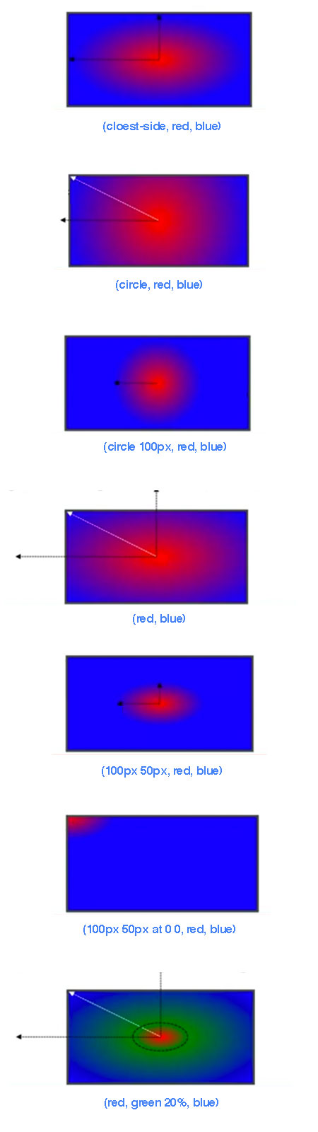
radial-gradient(   [ circle || <length> ] [ at <position> ]? , | [ ellipse || [<length> | <percentage> ]{2}] [ at <position> ]? , | [ [ circle | ellipse ] || <extent-keyword> ] [ at <position> ]? , | at <position> , <color-stop> [ , <color-stop> ]+ )

<extent-keyword> = closest-corner | closest-side | farthest-corner | farthest-side
<color-stop> = <color> [ <percentage> | <length> ]?

background-image: radial-gradient(cloest-side, red, blue);
background-image: radial-gradient(circle, red, blue);
background-image: radial-gradient(circle 100px, red, blue);
background-image: radial-gradient(red, blue);
background-image: radial-gradient(100px 50px, red, blue);
background-image: radial-gradient(100px 50px at 0 0, red, blue);
background-image: radial-gradient(red, green 20%, blue);
repeat-*-gradient
background-image: repeating-linear-gradient(red, blue 20px, red 40px);
background-image: repeating-radial-gradient(red, blue 20px, red 40px);
决定背景 (0,0) 坐标与 100% 坐标的区域。默认值为 padding-box。
<box>[, <box>]*
<box> = border-box | padding-box | content-box

background-image: url(red.png);
background-repeat: no-repeat;

background-origin: padding-box;
background-origin: border-box;
background-origin: content-box;

相关文章推荐
- log4j的配置全过程
- ural1297Palindrome【后缀数组+RMQ最长回文子串】
- 百度前端笔试题
- 摆脱久坐的危害
- POJ 2240 - Arbitrage
- Android文件读写总结
- 文章链接
- ifconfig 命令
- Dataguard后台进程解析
- 学习OpenCV 函数方法结构总结
- 看程序写结果
- 借助工具解决内存问题
- Qt:在TreeModel+QTreeView中使用复选框(checkbox)
- 软件文档
- jquery使用说明
- expect远程登录
- 计算机科学精彩帖子收集--JAVA和分布式专栏
- CentOS6.6普通用户使用sudo命令借用root用户权限
- WinCE 下 RAS 拨号连接的建立和拨号过程
- KVM详细安装