Using the Material Theme
2016-02-17 16:27
435 查看
Using the Material Theme
The new material theme provides:System widgets that let you set their color palette
Touch feedback animations for the system widgets
Activity transition animations
You can customize the look of the material theme according to your brand identity with a color palette you control. You can tint the action bar and the status bar using theme attributes, as shown in Figure
3.
The system widgets have a new design and touch feedback animations. You can customize the color palette, the touch feedback animations, and the activity transitions for your app.
The material theme is defined as:
@android:style/Theme.Material(dark version)
@android:style/Theme.Material.Light(light version)
@android:style/Theme.Material.Light.DarkActionBar
For a list of material styles that you can use, see the API reference for
R.style.
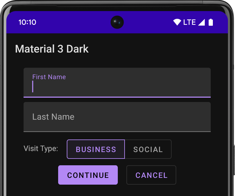
Figure 1. Dark material theme
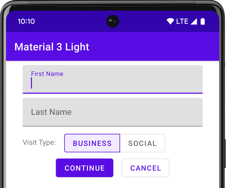
Figure 2. Light material theme
Note: The material theme is only available in Android 5.0 (API level 21) and above. The v7 Support
Librariesprovide themes with material design styles for some widgets and support for customizing the color palette. For more information, see Maintaining
Compatibility.
Customize the Color Palette
To customize the theme's base colors to fit your brand, define your custom colors using theme attributes when you inherit from the material theme:<resources>
<!-- inherit from the material theme -->
<style name="AppTheme" parent="android:Theme.Material">
<!-- Main theme colors -->
<!-- your app branding color for the app bar -->
<item name="android:colorPrimary">@color/primary</item>
<!-- darker variant for the status bar and contextual app bars -->
<item name="android:colorPrimaryDark">@color/primary_dark</item>
<!-- theme UI controls like checkboxes and text fields -->
<item name="android:colorAccent">@color/accent</item>
</style>
</resources>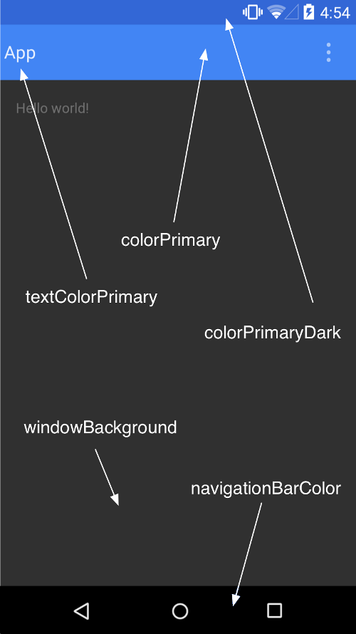
Figure 3. Customizing the material theme.
Customize the Status Bar
The material theme lets you easily customize the status bar, so you can specify a color that fits your brand and provides enough contrast to show the white status icons. To set a custom color for the status bar,use the
android:statusBarColorattribute when you extend the material theme. By default,
android:statusBarColorinherits the value of
android:colorPrimaryDark.
You can also draw behind the status bar yourself. For example, if you want to show the status bar transparently over a photo, with a subtle dark gradient to ensure the white status icons are visible. To do so, set
the
android:statusBarColorattribute to
@android:color/transparentand adjust the window flags as required. You can also use the
Window.setStatusBarColor()method
for animations or fading.
Note: The status bar should almost always have a clear delineation from the primary toolbar, except for cases where you show edge-to-edge rich imagery or media content behind these bars and when you use a gradient to ensure that the icons are
still visible.
When you customize the navigation and status bars, either make them both transparent or modify only the status bar. The navigation bar should remain black in all other cases.
Theme Individual Views
Elements in XML layout definitions can specify the android:themeattribute, which references a theme resource. This attribute modifies the theme for the element and any child elements, which
is useful for altering theme color palettes in a specific portion of an interface.

相关文章推荐
- Ubuntu 14.04LTS修改显示分辨率
- MAC中设置android adb环境变量和用wifi真机调试
- Android 使用android-support-multidex解决Dex超出方法数的限制问题,让你的应用不再爆棚
- 互联网英文简写
- struts2 使用dmi
- 控制反转与依赖注入
- Android Context完全解析,你所不知道的Context的各种细节
- iOS:Crash文件解析
- Struct2_定义拦截器并使用注解方式作用在Action的方法中
- onenote发送至博客实践
- ABAP 内表的行列转换-发货通知单-SLIS
- Android源码分析一:语言切换机制
- JavaScipt中栈的实现方法
- InfoQ - 促进软件开发领域知识与创新的传播 搜索关键词 登录 En |中文 |日本 |Fr |Br 966,690 一月 独立访问用户 语言 & 开发 Java Clojure Scala
- iOS 7系列译文:忘记NSURLConnection,拥抱NSURLSession吧!
- fedora20/21 中文输入法 记录
- MySQL在服务器异常断电后,无法重启解决办法
- 多线程时的单例
- uCOS-II中的任务切换-图解多种任务调度时机与问题
- 10个最佳最新的网页设计工具