CSS float 属性
2016-01-24 22:45
615 查看
实例
把图像向右浮动:img{
float:right;
}浏览器支持
所有主流浏览器都支持 float 属性。注释:任何的版本的 Internet Explorer (包括 IE8)都不支持属性值 “
inherit“。
定义和用法
float 属性定义元素在哪个方向浮动。以往这个属性总应用于图像,使文本围绕在图像周围,不过在 CSS 中,任何元素都可以浮动。浮动元素会生成一个块级框,而不论它本身是何种元素。如果浮动非替换元素,则要指定一个明确的宽度;否则,它们会尽可能地窄。
注释:假如在一行之上只有极少的空间可供浮动元素,那么这个元素会跳至下一行,这个过程会持续到某一行拥有足够的空间为止。
| 默认值: |
| 继承性: |
| 版本: |
| JavaScript 语法: |
可能的值
| 值 | 描述 |
|---|---|
| left | 元素向左浮动。 |
| right | 元素向右浮动。 |
| none | 默认值。元素不浮动,并会显示在其在文本中出现的位置。 |
| inherit | 规定应该从父元素继承 float 属性的值。 |
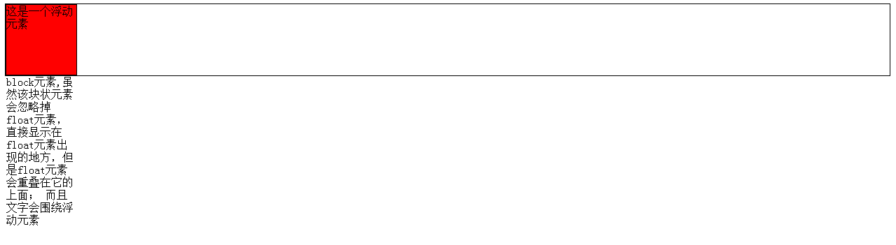
float元素后面跟着block元素
<!DOCTYPE html>
<html>
<head>
<meta http-equiv="Content-Type" content="text/html; charset=utf-8">
<title></title>
</head>
<body>
<div style="border:1px solid;">
<div style="border:1px solid;width:100px;height:100px;float:left;background-color:red;">
这是一个浮动元素
</div>
<div style="border:1px solid;width:100px;height:100px;background-color:green;">
block元素,虽然该块状元素会忽略掉float元素,直接显示在float元素出现的地方,但是float元素会重叠在它的上面;
而且文字会围绕浮动元素
</div>
</div>
</body>
</html>
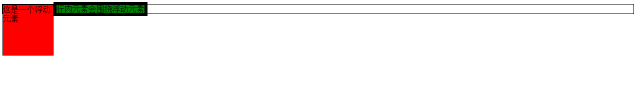
float元素后面跟着行内元素
<!DOCTYPE html>
<html>
<head>
<meta http-equiv="Content-Type" content="text/html; charset=utf-8">
<title></title>
</head>
<body>
<div style="border:1px solid;">
<div style="border:1px solid;width:100px;height:100px;float:left;background-color:red;">
这是一个浮动元素
</div>
<div style="border:6px solid;width:100px;height:100px;background-color:green;display:inline;">
行内元素会围绕浮动元素
</div>
</div>
</body>
</html>
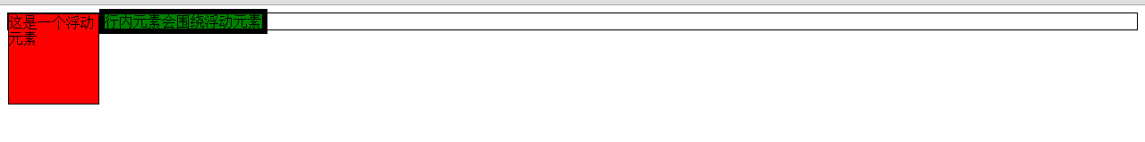
行内元素跟着float元素
<!DOCTYPE html>
<html>
<head>
<meta http-equiv="Content-Type" content="text/html; charset=utf-8">
<title></title>
</head>
<body>
<div style="border:1px solid;">

<div style="border:6px solid;width:100px;height:100px;background-color:green;display:inline;">
行内元素会围绕浮动元素
</div>
<div style="border:1px solid;width:100px;height:100px;float:left;background-color:red;">
这是一个浮动元素
</div>
</div>
</body>
</html>
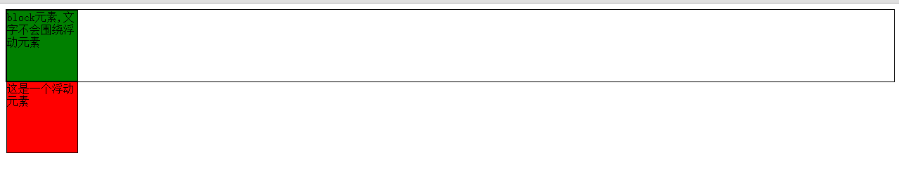
块状元素跟着float元素
<!DOCTYPE html>
<html>
<head>
<meta http-equiv="Content-Type" content="text/html; charset=utf-8">
<title></title>
</head>
<body>
<div style="border:1px solid;">
<div style="border:1px solid;width:100px;height:100px;background-color:green;">
block元素,文字不会围绕浮动元素
</div>
<div style="border:1px solid;width:100px;height:100px;float:left;background-color:red;">
这是一个浮动元素
</div>
</div>
</body>
</html>
总结
float元素后面跟块元素还是行内元素,对块元素和行内元素的影响是不同的,需要区别对待,但是要记住,如果有文字,必定围绕float元素例子1
<html>

<head>
<meta http-equiv="Content-Type" content="text/html; charset=utf-8">
<style type="text/css">
.img1 {
float:right
}
</style>
</head>
<body>
<p>在下面的段落中,我们添加了一个样式为 <b>float:right</b> 的图像。结果是这个图像会浮动到段落的右侧。</p>
<p>
<img class="img1" src="http://avatar.csdn.net/5/7/1/1_ccssddnnbbookkee.jpg" />
This is some text. This is some text. This is some text.
This is some text. This is some text. This is some text.
This is some text. This is some text. This is some text.
This is some text. This is some text. This is some text.
This is some text. This is some text. This is some text.
This is some text. This is some text. This is some text.
This is some text. This is some text. This is some text.
This is some text. This is some text. This is some text.
This is some text. This is some text. This is some text.
This is some text. This is some text. This is some text.
</p>

<p>在下面的段落中,图像没有使用float:right。img是行内元素,所以下面的文字就会和img在同一行,但是没有文字围绕图片的效果。</p>
<p>
<img src="http://avatar.csdn.net/5/7/1/1_ccssddnnbbookkee.jpg" />
This is some text. This is some text. This is some text.
This is some text. This is some text. This is some text.
This is some text. This is some text. This is some text.
This is some text. This is some text. This is some text.
This is some text. This is some text. This is some text.
This is some text. This is some text. This is some text.
This is some text. This is some text. This is some text.
This is some text. This is some text. This is some text.
This is some text. This is some text. This is some text.
This is some text. This is some text. This is some text.
</p>
</body>
</html>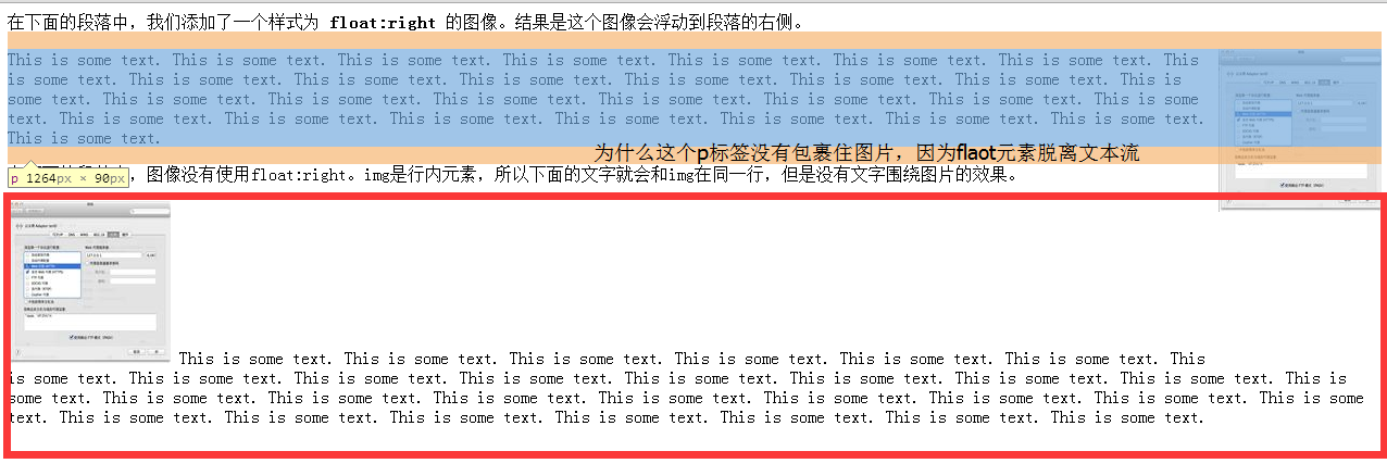
例子2
<html>
<head>
<meta http-equiv="Content-Type" content="text/html; charset=utf-8">
<style type="text/css">
ul{
float:left;
width:100%;
padding:0;
margin:0;
list-style-type:none;
}
a{
float:left;
width:7em;
text-decoration:none;
color:white;
background-color:purple;
padding:0.2em 0.6em;
border-right:1px solid white;
}
a:hover {background-color:#ff3300}
li {display:block}
</style>
</head>

<body>
<ul>
<li><a href="#">Link one</a></li>
<li><a href="#">Link two</a></li>
<li><a href="#">Link three</a></li>
<li><a href="#">Link four</a></li>
</ul>

<p>
在上面的例子中,我们把 ul 元素和 a 元素浮向左浮动。li 元素显示为行内元素(元素前后没有换行)。这样就可以使列表排列成一行。ul 元素的宽度是 100%,列表中的每个超链接的宽度是 7em(当前字体尺寸的 7 倍)。我们添加了颜色和边框,以使其更漂亮。
</p>

</body>
</html>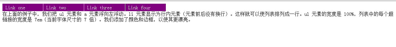
li是块元素,但是请注意一下在这个例子中它好像没有发挥它的作用。
假如把
ul换成
div
<html>
<head>
<meta http-equiv="Content-Type" content="text/html; charset=utf-8">
<style type="text/css">
a{
float:left;
width:7em;
text-decoration:none;
color:white;
background-color:purple;
padding:0.2em 0.6em;
border-right:1px solid white;
}
a:hover {background-color:#ff3300}
</style>
</head>

<body>
<div style="border: 1px solid;width:100%;float:left">
<div><a href="#">Link one</a></div>
<div><a href="#">Link two</a></div>
<div><a href="#">Link three</a></div>
<div><a href="#">Link four</a></div>
</div>

<p>
在上面的例子中,我们把 ul 元素和 a 元素浮向左浮动。li 元素显示为行内元素(元素前后没有换行)。这样就可以使列表排列成一行。ul 元素的宽度是 100%,列表中的每个超链接的宽度是 7em(当前字体尺寸的 7 倍)。我们添加了颜色和边框,以使其更漂亮。
</p>

</body>
</html>
例子3
<html>
<head>
<style type="text/css">
div.container{
width:100%;
margin:0px;
border:1px solid gray;
line-height:150%;
}
div.header,div.footer
{
padding:0.5em;
color:white;
background-color:gray;
clear:left;
}
h1.header
{
padding:0;
margin:0;
}
div.left
{
float:left;
width:160px;
margin:0;
padding:1em;
}
div.content
{
margin-left:190px;
border-left:1px solid gray;
padding:1em;
}
</style>
</head>
<body>

<div class="container">

<div class="header"><h1 class="header">W3School.com.cn</h1></div>

<div class="left"><p>"Never increase, beyond what is necessary, the number of entities required to explain anything." William of Ockham (1285-1349)</p></div>

<div class="content">
<h2>Free Web Building Tutorials</h2>
<p>At W3School.com.cn you will find all the Web-building tutorials you need,
from basic HTML and XHTML to advanced XML, XSL, Multimedia and WAP.</p>
<p>W3School.com.cn - The Largest Web Developers Site On The Net!</p></div>

<div class="footer">Copyright 2008 by YingKe Investment.</div>
</div>

</body>
</html>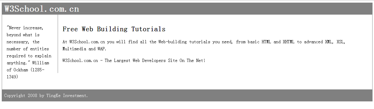

相关文章推荐
- Android Manifest 用法
- Android学习笔记(二九):嵌入浏览器
- 峰回路转,Firefox 浏览器即将重返 iOS 平台
- 峰回路转,Firefox 浏览器即将重返 iOS 平台
- Web布局连载——两栏固定布局(五)
- [div+css]晒晒最新制作专题推广页模板
- 小白观察:微软释放出其基于 Chromium 的 Edge 浏览器
- 设计更快的网页(三):字体和 CSS 调整
- 纯CSS制作的新闻网站中的文章列表
- 10条影响CSS渲染速度的写法与使用建议第1/3页
- BS项目中的CSS架构_仅加载自己需要的CSS
- 很不错的 CSS Hack 又学了一招
- 发一个css比较清爽的写法
- CSS expression控制图片自动缩放效果代码[兼容 IE,Firefox]
- css布局网页水平居中常用方法
- CSS经典技巧十则第1/2页
- 浏览器 cookie 限制
- css 兼容性问题this.style.cursor=''hand''
- IE6不能正常解析CSS文件问题的解决方法及原因分析
- 欲练CSS ,必先解决IE的一些细节分析