css笔记——杂记
2016-01-22 17:13
531 查看
####文本框内阴影####
####table####
####按需加载对应页面####
#####文本####
UI组件
1、button
2、checkbox & radio
3、panel
4、modal
5、progress
6、component
7、typography
8、listgroup
9、tabs
10、alert
11、tables
12、form
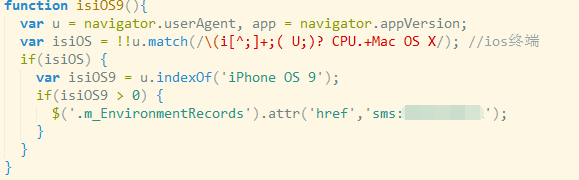
#检测移动端还是PC端
/*自适应设置*/
/*关于vertical-align*/
vertical-align的百分比值是相对于line-height计算的
vertical-align和line-height是一对好基友两个一起用近似垂直居中
vertical-align起作用的前提
-----探讨各种display值对vertical-align的影响
eg:
eg:
等同于
text-align:justify;任意数目列表两端对齐效果
.justify-fix{ display:inline-block; width:250px;}
容器:line-height:0;
元素:vertical-align:top;
此时图片可以实现两端对齐
/*文本框做字符串限制*/
方法一:
方法二:
完全垂直居中
根据定义:元素垂直中心点和父级基线上1/2x-height对齐 如果要完全垂直居中,则设置font-size:0;
1、:元素vertical-align 垂直对齐的位置和前后的元素都没有关系;
2、:元素vertical-align垂直对齐的位置与行高line-height没有关系,只与字体大小font-size有关
1、使用基线的问题在于图标偏上
2、使用顶线/底线的问题在于收其他内联元素影响,造成巨大定位偏差
3、使用中线也是不错的选择,但需要恰好的字体大小以及兼容性要求不高
4、使用文本底部较合适,不受行高以及其他内联元素的影响
html中的上标下标
上:sup
下:sub
<sup> 大概相当于 vertical-align:super 提高盒子基线到父级合适的上标基线位置
<sub> 大概相当于 vertical-align:sub 降低盒子的基线到父级合适的下标基线位置
//#######################
js
css3实现动画渐入效果
h2:hover{
transition:transform 3s;
transform:translate(50px , 100px);
}
h5标签
figure 以及 figcaption
trasition 在ie10里面才有效
@charset "utf-8"
动画延时
p标签的同辈元素
######js中checked####
只要记住,修改input的 checked or disabled 属性的时候,用prop就行
######变色背景#####
禁止选择文本:
input[type=text], textarea, input[type=email], input[type=url]{
box-shadow: inset 2px 2px 1px #ddd;
-webkit-box-shadow: inset 2px 2px 1px #ddd;
-moz-box-shadow: inset 2px 2px 1px #ddd;
-o-box-shadow: inset 2px 2px 1px #ddd;
}
####table####
<colgroup>
<col style="width:48px;">
<col>
<col>
<col>
<col>
<col>
<col style="width:48px;">
<col style="width:48px;">
</colgroup>

thead>tr>th

tbody>tr>td
####按需加载对应页面####
if(!!(window.attachEvent && !window.opera))
{document.execCommand("stop");} //IE
else
{window.stop();} //FF
#####文本####
.at{
background-color:pink;
width:270px;
height:170px;
display:-webkit-box;
overflow:hidden;
text-overflow:ellipsis;
-webkit-box-orient:vertical;
-webkit-line-clamp:4;

}
UI组件
1、button
2、checkbox & radio
3、panel
4、modal
5、progress
6、component
7、typography
8、listgroup
9、tabs
10、alert
11、tables
12、form
#检测移动端还是PC端
var mobileReg=/iphone/ipod/android.*mobile/windows.*phone/blackberry.*mobile/i;

if((mobileReg.test(window.navigator.userAgent.toLowerCase()))){
alert("移动设备!");
}
else{
alert("非移动设备!");
}

navigator.userAgent

//然后用indexOf找

//寻找页面中的iframe
window.opener.location.href
/*自适应设置*/
<script>
var PAGE_MAX_WIDTH = 1280,
BASE_FONT_SIZE = 50;
(function() {
function n() {
e.fontSize = Math.min(window.innerWidth / PAGE_MAX_WIDTH * BASE_FONT_SIZE, BASE_FONT_SIZE) + "px"
}
var e = document.documentElement.style;
window.addEventListener("load", n),
window.addEventListener("resize", n),
n();
}());
</script>
/*关于vertical-align*/
vertical-align的百分比值是相对于line-height计算的
vertical-align和line-height是一对好基友两个一起用近似垂直居中
vertical-align起作用的前提
-----探讨各种display值对vertical-align的影响
p{display:table-cell;vertical-align:middle;}/×那么p里面的内容居中对齐×/eg:
<div class="test-list">
<span>文字</span>
<img src="小公主.jpg">
</div>
.test-list>span{display:inline-block;width:210px;vertical-align:middle;}
.test-list>img{vertical-align:middle;}
eg:
{
line-height:30px;
vertical-align:-10%;
}
等同于
{
line-height:30px;
vertical-align:-3px;
}
text-align:justify;任意数目列表两端对齐效果
.justify-fix{ display:inline-block; width:250px;}
容器:line-height:0;
元素:vertical-align:top;
<p style="text-align:justify">
<img src="img/mm1.jpg" width="250">
<img src="img/mm1.jpg" width="250">
<img src="img/mm1.jpg" width="250">
<img src="img/mm1.jpg" width="250">
</p>
此时图片可以实现两端对齐
/*文本框做字符串限制*/
方法一:
<script type="text/javascript">
var flag = 0;

$(function () {
$("#username").keyup(function () {
var $this = $(this);
var value = $this.val();
if (value.length > 4) {
$this.val(value.substring(0, 4));
}
});
});
</script>
方法二:
$(function() {
$.fn.manhuaInputLetter = function(options) {
var defaults = {
len : 200,
showId : "show"
};
var options = $.extend(defaults,options);
var $input = $(this);
var $show = $("#"+options.showId);
$show.html(options.len);
$input.live("keydown keyup blur",function(e){
var content =$(this).val();
var length = content.length;
var result = options.len - length;
if (result >= 0){
$show.html(result);
}else{
$(this).val(content.substring(0,options.len))
}
});
}
});
完全垂直居中
根据定义:元素垂直中心点和父级基线上1/2x-height对齐 如果要完全垂直居中,则设置font-size:0;
1、:元素vertical-align 垂直对齐的位置和前后的元素都没有关系;
2、:元素vertical-align垂直对齐的位置与行高line-height没有关系,只与字体大小font-size有关
1、使用基线的问题在于图标偏上
2、使用顶线/底线的问题在于收其他内联元素影响,造成巨大定位偏差
3、使用中线也是不错的选择,但需要恰好的字体大小以及兼容性要求不高
4、使用文本底部较合适,不受行高以及其他内联元素的影响
html中的上标下标
上:sup
下:sub
<sup> 大概相当于 vertical-align:super 提高盒子基线到父级合适的上标基线位置
<sub> 大概相当于 vertical-align:sub 降低盒子的基线到父级合适的下标基线位置
//#######################
js
xx.split('/').pop() 或 xx.split('\\').pop()css3实现动画渐入效果
h2:hover{
transition:transform 3s;
transform:translate(50px , 100px);
}
h5标签
figure 以及 figcaption
trasition 在ie10里面才有效
@charset "utf-8"
动画延时
p标签的同辈元素
.test1 figcaption p:nth-of-type(1){transition-delay:0.05s;}
.test1 figcaption p:nth-of-type(2){transition-delay:0.1s;}
.test1 figcaption p:nth-of-type(3){transition-delay:0.15s;}
######js中checked####
只要记住,修改input的 checked or disabled 属性的时候,用prop就行
######变色背景#####
background-color: #fff;
animation:bgColor 1s linear 1s infinite alternate ;
-webkit-animation:bgColor 1s linear 1s infinite alternate ;
-moz-animation:bgColor 1s linear 1s infinite alternate ;
-o-animation:bgColor 1s linear 1s infinite alternate ;

@keyframes bgColor {
0%{border-color:#990000}
100%{border-color:#f36523 }
}

@keyframes bgColor {
0%{border-color:#f36523}
100%{border-color:#faaba1 }
}

@-webkit-keyframes bgColor {
0%{border-color:#f36523}
100%{border-color:#faaba1 }
}

@-moz-keyframes bgColor {
0%{border-color:#f36523}
100%{border-color:#faaba1 }
}
禁止选择文本:
-webkit-user-select:none

相关文章推荐
- OOCSS的概念和思路
- CSS各种居中布局方法汇总
- css的div垂直居中的方法,百分比div垂直居中
- 结合CSS3的布局新特征谈谈常见布局方法
- html/css基础篇——link和@inport详解以及脚本执行顺序探讨
- 时间轴CSS的Demo
- css3 border旋转时的动画应用
- 样式化复选框
- CSS3 transform对普通元素的N多渲染影响
- Amazing CSS Animation
- 利用 CSS 进行网页布局
- 手机wap应用alert自写样式
- div+CSS实现页面的布局要点记录
- css
- win7任务栏还原为xp样式
- CSS3实现3级动画菜单
- 设置navigationbar的标题样式和背景颜色
- CSS 的overflow:hidden 属性详细解释
- 给补充点内容“css中,id与class的区别”
- 漫谈CSS之盒子模型