How it's made species-in-pieces
2015-12-29 17:42
543 查看
转载地址:http://www.webhek.com/misc-res/species-in-pieces/#
BORN OUT OF TINKERING WITH A SIMPLE PROPERTY, THIS PROJECT IS UNABASHEDLY PART-DIGITAL EXPERIMENT. THE CORE TECHNOLOGY USED HERE IS JUST GOOD OLD CSS — NO CANVAS OR WEBGL WITCHCRAFT.
Since hearing about CSS polygons, I've been a little surprised at the lack of furore around the technology, so I wanted to create something which not only worked as a project in itself, but also pushed this underused
line of code as far as possible.
The shard-shifting capabilities work in webkit-browsers only, which of course is a limitation but at the same time, it works on mobile which are almost completely webkit-based. Firefox does support the clip-path property,
but as an SVG referenced shape and thus, the coding for movement works in an entirely different manner. I wanted to focus purely on the CSS route.
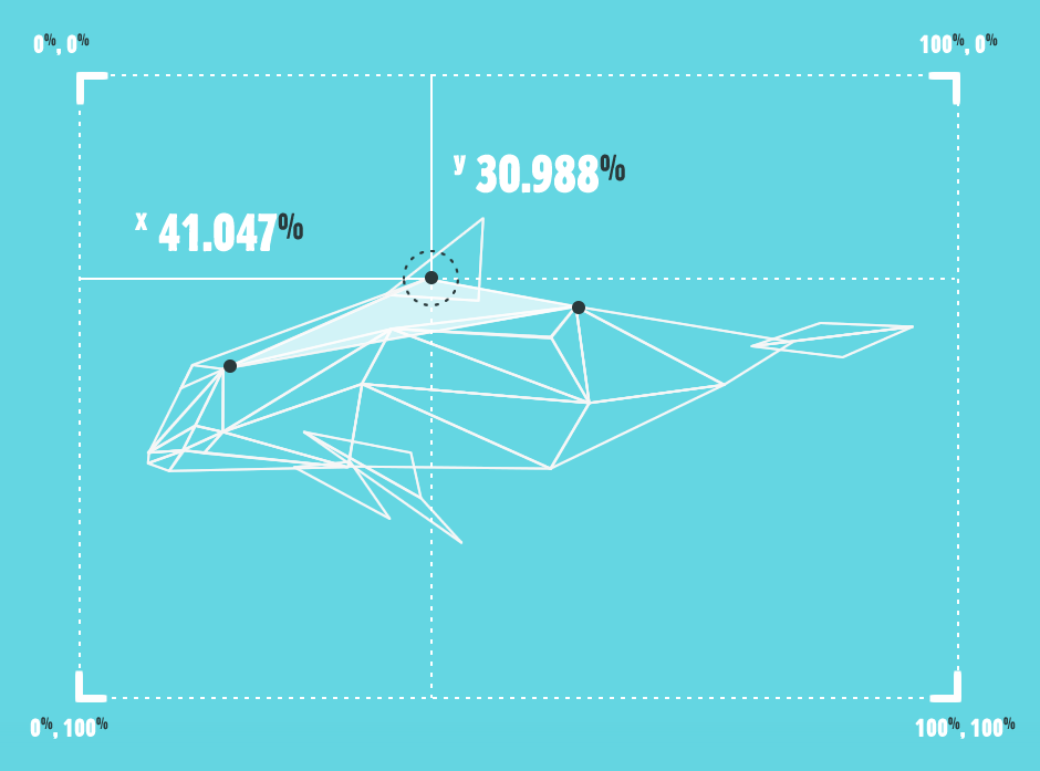
Not heard of it? Here, take a line:-webkit-clip-path: polygon( 40% 40%, 50% 60%, 60% 40% );
So, in essence — each shape is being morphed, moved and toyed with by a new set of co-ordinates, and as they are maintained as triangles throughout, this means 3 points, with CSS transitions to link up the movements. No
tricks or tools have been used to get the illustrated results, code-wise or graphically. Point by point, shape by shape, each one has been handcrafted via a personally-created tracing JS function after illustration.
If you have any questions on the technique or the project at all, please feel free to WHIP
ME A TWEET!
BORN OUT OF TINKERING WITH A SIMPLE PROPERTY, THIS PROJECT IS UNABASHEDLY PART-DIGITAL EXPERIMENT. THE CORE TECHNOLOGY USED HERE IS JUST GOOD OLD CSS — NO CANVAS OR WEBGL WITCHCRAFT.
Since hearing about CSS polygons, I've been a little surprised at the lack of furore around the technology, so I wanted to create something which not only worked as a project in itself, but also pushed this underused
line of code as far as possible.
The shard-shifting capabilities work in webkit-browsers only, which of course is a limitation but at the same time, it works on mobile which are almost completely webkit-based. Firefox does support the clip-path property,
but as an SVG referenced shape and thus, the coding for movement works in an entirely different manner. I wanted to focus purely on the CSS route.
Not heard of it? Here, take a line:-webkit-clip-path: polygon( 40% 40%, 50% 60%, 60% 40% );
So, in essence — each shape is being morphed, moved and toyed with by a new set of co-ordinates, and as they are maintained as triangles throughout, this means 3 points, with CSS transitions to link up the movements. No
tricks or tools have been used to get the illustrated results, code-wise or graphically. Point by point, shape by shape, each one has been handcrafted via a personally-created tracing JS function after illustration.
If you have any questions on the technique or the project at all, please feel free to WHIP
ME A TWEET!

相关文章推荐
- 利用redis写webshell
- Spring boot配合Spring session(redis)遇到的错误
- Java源码 SpringMVC Mybatis Shiro Bootstrap Rest Webservice
- VS 解决方案 从高版本降为地版本
- 2015年年终总结--迷茫中前进
- android5.1系统TvSettings为选择项添加背景颜色
- Linux "ls -l"文件列表权限详解
- 清空文件的内容 和 统计文件的大小的命令
- c++ Const关键字
- 庖丁解牛之UPack工作原理及实例分析(3)
- 25个Java机器学习工具&库
- 学习Makefile笔记
- KVM磁盘扩容
- Socket通讯采集推送LED(SER)
- 067_划分数
- 归档模式下redo丢失或损坏(inactive状态)
- Java API —— IO流小结
- 统一开启域客户端”windows time”服务
- Spring Web MVC
- 详解WordPress中添加和执行动作的函数使用方法