Android统计图表MPAndroidChart:动态添加数据更新【6】
2015-12-05 12:52
513 查看
Android统计图表MPAndroidChart:动态添加数据更新【6】
Android MPAndroidChart的LineDataSet代表一条统计图表中统计折线,一张统计图表可以同时存在若干条统计折线,其在内存中存储的模型类型数组,从0开始下标。
动态的往MPAndroidChart添加数据,就是增加往LineData里面增加Entry。
写一个例子加以说明。
先写一个LineChart布局,顶部的Button每点一次增加一个数据点:
<LinearLayout xmlns:android="http://schemas.android.com/apk/res/android"
xmlns:tools="http://schemas.android.com/tools"
android:layout_width="match_parent"
android:layout_height="match_parent"
android:orientation="vertical"
tools:context="zhangphil.chart.MainActivity" >
<Button
android:id="@+id/button"
android:layout_width="wrap_content"
android:layout_height="wrap_content"
android:layout_gravity="center_horizontal"
android:text="动态添加数据" />
<com.github.mikephil.charting.charts.LineChart
android:id="@+id/chart"
android:layout_width="match_parent"
android:layout_height="match_parent" />
</LinearLayout>
Java代码:
package zhangphil.chart;
import com.github.mikephil.charting.charts.LineChart;
import com.github.mikephil.charting.components.Legend;
import com.github.mikephil.charting.components.XAxis;
import com.github.mikephil.charting.components.XAxis.XAxisPosition;
import com.github.mikephil.charting.components.YAxis.AxisDependency;
import com.github.mikephil.charting.components.YAxis;
import com.github.mikephil.charting.components.Legend.LegendForm;
import com.github.mikephil.charting.data.Entry;
import com.github.mikephil.charting.data.LineData;
import com.github.mikephil.charting.data.LineDataSet;
import com.github.mikephil.charting.utils.ColorTemplate;
import android.app.Activity;
import android.graphics.Color;
import android.os.Bundle;
import android.view.View;
import android.widget.Button;
public class MainActivity extends Activity {
private LineChart mChart;
@Override
protected void onCreate(Bundle savedInstanceState) {
super.onCreate(savedInstanceState);
setContentView(R.layout.activity_main);
mChart = (LineChart) findViewById(R.id.chart);
mChart.setDescription("Zhang Phil @ http://blog.csdn.net/zhangphil"); mChart.setNoDataTextDescription("暂时尚无数据");
mChart.setTouchEnabled(true);
// 可拖曳
mChart.setDragEnabled(true);
// 可缩放
mChart.setScaleEnabled(true);
mChart.setDrawGridBackground(false);
mChart.setPinchZoom(true);
// 设置图表的背景颜色
mChart.setBackgroundColor(Color.LTGRAY);
LineData data = new LineData();
// 数据显示的颜色
data.setValueTextColor(Color.WHITE);
// 先增加一个空的数据,随后往里面动态添加
mChart.setData(data);
// 图表的注解(只有当数据集存在时候才生效)
Legend l = mChart.getLegend();
// 可以修改图表注解部分的位置
// l.setPosition(LegendPosition.LEFT_OF_CHART);
// 线性,也可是圆
l.setForm(LegendForm.LINE);
// 颜色
l.setTextColor(Color.WHITE);
// x坐标轴
XAxis xl = mChart.getXAxis();
xl.setTextColor(Color.WHITE);
xl.setDrawGridLines(false);
xl.setAvoidFirstLastClipping(true);
// 几个x坐标轴之间才绘制?
xl.setSpaceBetweenLabels(5);
// 如果false,那么x坐标轴将不可见
xl.setEnabled(true);
// 将X坐标轴放置在底部,默认是在顶部。
xl.setPosition(XAxisPosition.BOTTOM);
// 图表左边的y坐标轴线
YAxis leftAxis = mChart.getAxisLeft();
leftAxis.setTextColor(Color.WHITE);
// 最大值
leftAxis.setAxisMaxValue(90f);
// 最小值
leftAxis.setAxisMinValue(40f);
// 不一定要从0开始
leftAxis.setStartAtZero(false);
leftAxis.setDrawGridLines(true);
YAxis rightAxis = mChart.getAxisRight();
// 不显示图表的右边y坐标轴线
rightAxis.setEnabled(false);
// 每点击一次按钮,增加一个点
Button addButton = (Button) findViewById(R.id.button);
addButton.setOnClickListener(new View.OnClickListener() {
@Override
public void onClick(View v) {
addEntry();
}
});
}
// 添加进去一个坐标点
private void addEntry() {
LineData data = mChart.getData();
// 每一个LineDataSet代表一条线,每张统计图表可以同时存在若干个统计折线,这些折线像数组一样从0开始下标。
// 本例只有一个,那么就是第0条折线
LineDataSet set = data.getDataSetByIndex(0);
// 如果该统计折线图还没有数据集,则创建一条出来,如果有则跳过此处代码。
if (set == null) {
set = createLineDataSet();
data.addDataSet(set);
}
// 先添加一个x坐标轴的值
// 因为是从0开始,data.getXValCount()每次返回的总是全部x坐标轴上总数量,所以不必多此一举的加1
data.addXValue((data.getXValCount()) + "");
// 生成随机测试数
float f = (float) ((Math.random()) * 20 + 50);
// set.getEntryCount()获得的是所有统计图表上的数据点总量,
// 如从0开始一样的数组下标,那么不必多次一举的加1
Entry entry = new Entry(f, set.getEntryCount());
// 往linedata里面添加点。注意:addentry的第二个参数即代表折线的下标索引。
// 因为本例只有一个统计折线,那么就是第一个,其下标为0.
// 如果同一张统计图表中存在若干条统计折线,那么必须分清是针对哪一条(依据下标索引)统计折线添加。
data.addEntry(entry, 0);
// 像ListView那样的通知数据更新
mChart.notifyDataSetChanged();
// 当前统计图表中最多在x轴坐标线上显示的总量
mChart.setVisibleXRangeMaximum(5);
// y坐标轴线最大值
// mChart.setVisibleYRange(30, AxisDependency.LEFT);
// 将坐标移动到最新
// 此代码将刷新图表的绘图
mChart.moveViewToX(data.getXValCount() - 5);
// mChart.moveViewTo(data.getXValCount()-7, 55f,
// AxisDependency.LEFT);
}
// 初始化数据集,添加一条统计折线,可以简单的理解是初始化y坐标轴线上点的表征
private LineDataSet createLineDataSet() {
LineDataSet set = new LineDataSet(null, "动态添加的数据");
set.setAxisDependency(AxisDependency.LEFT);
// 折线的颜色
set.setColor(ColorTemplate.getHoloBlue());
set.setCircleColor(Color.WHITE);
set.setLineWidth(10f);
set.setCircleSize(5f);
set.setFillAlpha(128);
set.setFillColor(ColorTemplate.getHoloBlue());
set.setHighLightColor(Color.GREEN);
set.setValueTextColor(Color.WHITE);
set.setValueTextSize(10f);
set.setDrawValues(true);
return set;
}
}
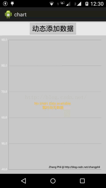
运行结果:
相关文章:
【1】《Android统计图表MPAndroidChart》链接地址:http://blog.csdn.net/zhangphil/article/details/47656521
【2】《基于Android MPAndroidChart实现腾讯QQ群数据统计报表核心功能》链接地址:http://blog.csdn.net/zhangphil/article/details/47685515
【3】《Android实现天气预报温度/气温折线趋势图》链接地址:http://blog.csdn.net/zhangphil/article/details/47702245
【4】《Android统计图表之柱状图(条形图)》链接地址:http://blog.csdn.net/zhangphil/article/details/47727913
【5】《Android MPAndroidChart之PieChart和数据结构以及模型【5】》链接地址:http://blog.csdn.net/zhangphil/article/details/50172817
【6】MPAndroidChart在github上的项目主页:https://github.com/PhilJay/MPAndroidChart
Android统计图表MPAndroidChart:动态添加数据更新【6】
Android MPAndroidChart的LineDataSet代表一条统计图表中统计折线,一张统计图表可以同时存在若干条统计折线,其在内存中存储的模型类型数组,从0开始下标。
动态的往MPAndroidChart添加数据,就是增加往LineData里面增加Entry。
写一个例子加以说明。
先写一个LineChart布局,顶部的Button每点一次增加一个数据点:
<LinearLayout xmlns:android="http://schemas.android.com/apk/res/android"
xmlns:tools="http://schemas.android.com/tools"
android:layout_width="match_parent"
android:layout_height="match_parent"
android:orientation="vertical"
tools:context="zhangphil.chart.MainActivity" >
<Button
android:id="@+id/button"
android:layout_width="wrap_content"
android:layout_height="wrap_content"
android:layout_gravity="center_horizontal"
android:text="动态添加数据" />
<com.github.mikephil.charting.charts.LineChart
android:id="@+id/chart"
android:layout_width="match_parent"
android:layout_height="match_parent" />
</LinearLayout>
Java代码:
package zhangphil.chart;
import com.github.mikephil.charting.charts.LineChart;
import com.github.mikephil.charting.components.Legend;
import com.github.mikephil.charting.components.XAxis;
import com.github.mikephil.charting.components.XAxis.XAxisPosition;
import com.github.mikephil.charting.components.YAxis.AxisDependency;
import com.github.mikephil.charting.components.YAxis;
import com.github.mikephil.charting.components.Legend.LegendForm;
import com.github.mikephil.charting.data.Entry;
import com.github.mikephil.charting.data.LineData;
import com.github.mikephil.charting.data.LineDataSet;
import com.github.mikephil.charting.utils.ColorTemplate;
import android.app.Activity;
import android.graphics.Color;
import android.os.Bundle;
import android.view.View;
import android.widget.Button;
public class MainActivity extends Activity {
private LineChart mChart;
@Override
protected void onCreate(Bundle savedInstanceState) {
super.onCreate(savedInstanceState);
setContentView(R.layout.activity_main);
mChart = (LineChart) findViewById(R.id.chart);
mChart.setDescription("Zhang Phil @ http://blog.csdn.net/zhangphil"); mChart.setNoDataTextDescription("暂时尚无数据");
mChart.setTouchEnabled(true);
// 可拖曳
mChart.setDragEnabled(true);
// 可缩放
mChart.setScaleEnabled(true);
mChart.setDrawGridBackground(false);
mChart.setPinchZoom(true);
// 设置图表的背景颜色
mChart.setBackgroundColor(Color.LTGRAY);
LineData data = new LineData();
// 数据显示的颜色
data.setValueTextColor(Color.WHITE);
// 先增加一个空的数据,随后往里面动态添加
mChart.setData(data);
// 图表的注解(只有当数据集存在时候才生效)
Legend l = mChart.getLegend();
// 可以修改图表注解部分的位置
// l.setPosition(LegendPosition.LEFT_OF_CHART);
// 线性,也可是圆
l.setForm(LegendForm.LINE);
// 颜色
l.setTextColor(Color.WHITE);
// x坐标轴
XAxis xl = mChart.getXAxis();
xl.setTextColor(Color.WHITE);
xl.setDrawGridLines(false);
xl.setAvoidFirstLastClipping(true);
// 几个x坐标轴之间才绘制?
xl.setSpaceBetweenLabels(5);
// 如果false,那么x坐标轴将不可见
xl.setEnabled(true);
// 将X坐标轴放置在底部,默认是在顶部。
xl.setPosition(XAxisPosition.BOTTOM);
// 图表左边的y坐标轴线
YAxis leftAxis = mChart.getAxisLeft();
leftAxis.setTextColor(Color.WHITE);
// 最大值
leftAxis.setAxisMaxValue(90f);
// 最小值
leftAxis.setAxisMinValue(40f);
// 不一定要从0开始
leftAxis.setStartAtZero(false);
leftAxis.setDrawGridLines(true);
YAxis rightAxis = mChart.getAxisRight();
// 不显示图表的右边y坐标轴线
rightAxis.setEnabled(false);
// 每点击一次按钮,增加一个点
Button addButton = (Button) findViewById(R.id.button);
addButton.setOnClickListener(new View.OnClickListener() {
@Override
public void onClick(View v) {
addEntry();
}
});
}
// 添加进去一个坐标点
private void addEntry() {
LineData data = mChart.getData();
// 每一个LineDataSet代表一条线,每张统计图表可以同时存在若干个统计折线,这些折线像数组一样从0开始下标。
// 本例只有一个,那么就是第0条折线
LineDataSet set = data.getDataSetByIndex(0);
// 如果该统计折线图还没有数据集,则创建一条出来,如果有则跳过此处代码。
if (set == null) {
set = createLineDataSet();
data.addDataSet(set);
}
// 先添加一个x坐标轴的值
// 因为是从0开始,data.getXValCount()每次返回的总是全部x坐标轴上总数量,所以不必多此一举的加1
data.addXValue((data.getXValCount()) + "");
// 生成随机测试数
float f = (float) ((Math.random()) * 20 + 50);
// set.getEntryCount()获得的是所有统计图表上的数据点总量,
// 如从0开始一样的数组下标,那么不必多次一举的加1
Entry entry = new Entry(f, set.getEntryCount());
// 往linedata里面添加点。注意:addentry的第二个参数即代表折线的下标索引。
// 因为本例只有一个统计折线,那么就是第一个,其下标为0.
// 如果同一张统计图表中存在若干条统计折线,那么必须分清是针对哪一条(依据下标索引)统计折线添加。
data.addEntry(entry, 0);
// 像ListView那样的通知数据更新
mChart.notifyDataSetChanged();
// 当前统计图表中最多在x轴坐标线上显示的总量
mChart.setVisibleXRangeMaximum(5);
// y坐标轴线最大值
// mChart.setVisibleYRange(30, AxisDependency.LEFT);
// 将坐标移动到最新
// 此代码将刷新图表的绘图
mChart.moveViewToX(data.getXValCount() - 5);
// mChart.moveViewTo(data.getXValCount()-7, 55f,
// AxisDependency.LEFT);
}
// 初始化数据集,添加一条统计折线,可以简单的理解是初始化y坐标轴线上点的表征
private LineDataSet createLineDataSet() {
LineDataSet set = new LineDataSet(null, "动态添加的数据");
set.setAxisDependency(AxisDependency.LEFT);
// 折线的颜色
set.setColor(ColorTemplate.getHoloBlue());
set.setCircleColor(Color.WHITE);
set.setLineWidth(10f);
set.setCircleSize(5f);
set.setFillAlpha(128);
set.setFillColor(ColorTemplate.getHoloBlue());
set.setHighLightColor(Color.GREEN);
set.setValueTextColor(Color.WHITE);
set.setValueTextSize(10f);
set.setDrawValues(true);
return set;
}
}
运行结果:
相关文章:
【1】《Android统计图表MPAndroidChart》链接地址:http://blog.csdn.net/zhangphil/article/details/47656521
【2】《基于Android MPAndroidChart实现腾讯QQ群数据统计报表核心功能》链接地址:http://blog.csdn.net/zhangphil/article/details/47685515
【3】《Android实现天气预报温度/气温折线趋势图》链接地址:http://blog.csdn.net/zhangphil/article/details/47702245
【4】《Android统计图表之柱状图(条形图)》链接地址:http://blog.csdn.net/zhangphil/article/details/47727913
【5】《Android MPAndroidChart之PieChart和数据结构以及模型【5】》链接地址:http://blog.csdn.net/zhangphil/article/details/50172817
【6】MPAndroidChart在github上的项目主页:https://github.com/PhilJay/MPAndroidChart

相关文章推荐
- Android开发日记(三)
- 【基于Jsoup】Android_App暴走笑话开发(二)
- Android Parcelable和Serializable的区别
- android - SharedPreferences
- Android 关于GridView那些事
- RecyclerView介绍(五)----实现点击效果以及动画
- 百度地图系列04——自定义Marker
- Android Training - 适配不同的屏幕(Lesson 2 - 适配不同屏幕密度)
- Android Training - 适配不同的屏幕(Lesson 1 - 支持不同的屏幕大小)
- Android 的ToggleButton, Spinner和Picker
- Android 清空activity栈的方法
- 关于this.context=context语句
- Android 学习之MeasureSpec类简介
- RecyclerView介绍(四)----实现瀑布流效果
- Android中常用控件分类总结
- Android 自定义属性的使用
- android 各国时区
- Android Training - 创建自定义的Views(Lesson 4 - 优化Views)
- Android Camera开发:扫描二维码,周期性循环自动聚焦auto focus挂掉原因分析(preview is not enabled)
- Android Training - 创建自定义的Views(Lesson 3 - 处理View的交互性)