5.x控件:FloatingActionButton、SnackBar、DrawerLayout、NavigationView
2015-12-01 20:43
567 查看
首先啥也别说,先引入support包。
FloatingActionButton其实就可以视作一个ImageButton,事实上他也是继承ImageButton。而SnackBar的使用方法和使用场景感觉和Toast有点相似。所以就写一个非常简单的例子,点击FAB,弹出SnackBar。
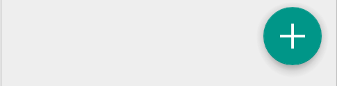
1、xml,FAB的背景颜色默认为theme的colorAccent,一般不用修改也搭调。
2、使用
1、在我的4.3(API18)真机,默认会有一个margin效果,而在5.0(API21)模拟器上则没有。

这个问题可以通过建立两个版本尺寸来解决,这也是常见的屏幕适配方案。
res/values/dimens.xml
res/values-v21/dimens.xml
然后修改xml增加两个margin属性
2、5.0以上版本还可能出现阴影无法显示的bug,通过增加一个属性快速解决。然而我在模拟器上并未出现这个bug…
我们先不理这两个bug,点击看一下效果。
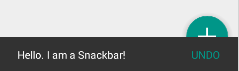
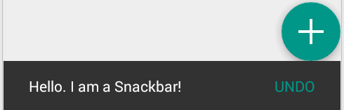
效果不咋地,SnackBar会覆盖FAB,理想的效果两者应该要协调工作,SnackBar会把FAB给顶上去才对。协调工作,把布局换成CoordinatorLayout如何。it works~~
不过这时又有个神奇的现象,我的真机默认的margin效果也没了,所以在CoordinatorLayout下直接设上一个margin值而不管版本就好啦~~
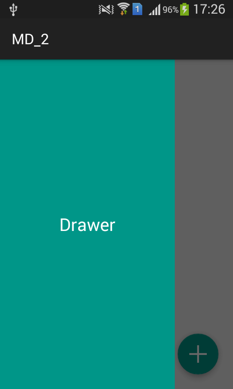
我们在上诉例子的基础上添加一个DrawerLayout,并且将FAB的监听改为弹出drawer。
1、修改xml,顶层布局设为DrawerLayout,此时CoordinatorLayout为content,RelativeLayout为drawer。
2、FAB呼出drawer
注意此时状态栏下面的AppBar是ActionBar而非Toolbar,如果我们将Toolbar添加到CoordinatorLayout中,呼出的菜单也会覆盖Toolbar。
NavigationView有两个最重要的属性,一个是
1、设置header,res/layout/nav_header
2、设置menu,res/menu/nva_menu
3、设置NavigationView
4、监听回调
menu也支持分组,在item里面嵌套一个menu即可,但是这个item就不再视作item了。
分组后会有一条横线

此时会有一个比较奇怪的现象,即使上面所有item处在同一个group,
最后NavigationView这个东东的好处是,一来标准化操作省事,二来checked状态会和theme关联,比如
compile 'com.android.support:design:22.2.1'
FloatingActionButton & SnackBar
这两者的使用都比较简单,所以一起说下。FloatingActionButton其实就可以视作一个ImageButton,事实上他也是继承ImageButton。而SnackBar的使用方法和使用场景感觉和Toast有点相似。所以就写一个非常简单的例子,点击FAB,弹出SnackBar。
1、xml,FAB的背景颜色默认为theme的colorAccent,一般不用修改也搭调。
<FrameLayout xmlns:android="http://schemas.android.com/apk/res/android"
xmlns:tools="http://schemas.android.com/tools"
android:layout_width="match_parent"
android:layout_height="match_parent"
tools:context=".MainActivity">

<android.support.design.widget.FloatingActionButton
android:id="@+id/fabBtn"
android:layout_width="wrap_content"
android:layout_height="wrap_content"
android:layout_gravity="bottom|right"
android:src="@drawable/ic_plus"/>

</FrameLayout>
2、使用
private FloatingActionButton fab;

@Override
protected void onCreate(Bundle savedInstanceState) {
super.onCreate(savedInstanceState);
setContentView(R.layout.activity_main);

fab = (FloatingActionButton) findViewById(R.id.fabBtn);
fab.setOnClickListener(new View.OnClickListener() {
@Override
public void onClick(View v) {
Snackbar.make(fab, "Hello. I am a Snackbar!", Snackbar.LENGTH_SHORT)
.setAction("Undo", new View.OnClickListener() {
@Override
public void onClick(View v) {
Toast.makeText(MainActivity.this, "undo", Toast.LENGTH_SHORT).show();
}
})
.show();

}
});
}
问题
这时有2个bug现象1、在我的4.3(API18)真机,默认会有一个margin效果,而在5.0(API21)模拟器上则没有。
这个问题可以通过建立两个版本尺寸来解决,这也是常见的屏幕适配方案。
res/values/dimens.xml
<dimen name="fab_margin_right">0dp</dimen>
<dimen name="fab_margin_bottom">0dp</dimen>
res/values-v21/dimens.xml
<dimen name="fab_margin_right">16dp</dimen>
<dimen name="fab_margin_bottom">16dp</dimen>
然后修改xml增加两个margin属性
android:layout_marginBottom="@dimen/fab_margin_bottom"
android:layout_marginRight="@dimen/fab_margin_right"
2、5.0以上版本还可能出现阴影无法显示的bug,通过增加一个属性快速解决。然而我在模拟器上并未出现这个bug…
app:borderWidth="0dp"
我们先不理这两个bug,点击看一下效果。
效果不咋地,SnackBar会覆盖FAB,理想的效果两者应该要协调工作,SnackBar会把FAB给顶上去才对。协调工作,把布局换成CoordinatorLayout如何。it works~~
不过这时又有个神奇的现象,我的真机默认的margin效果也没了,所以在CoordinatorLayout下直接设上一个margin值而不管版本就好啦~~
DrawerLayout & NavigationView
DrawerLayout
DrawerLayout顾名思义就是一个实现侧拉的布局,当它作为布局时,第一个子View是content,后面的子View是drawer,通过drawer的android:layout_gravity属性来指定其是左侧还是右侧拉。
我们在上诉例子的基础上添加一个DrawerLayout,并且将FAB的监听改为弹出drawer。
1、修改xml,顶层布局设为DrawerLayout,此时CoordinatorLayout为content,RelativeLayout为drawer。
<android.support.v4.widget.DrawerLayout
android:id="@+id/drawerLayout"
xmlns:android="http://schemas.android.com/apk/res/android"
android:layout_width="match_parent"
android:layout_height="match_parent">

<android.support.design.widget.CoordinatorLayout
android:layout_width="match_parent"
android:layout_height="match_parent">

<android.support.design.widget.FloatingActionButton
android:id="@+id/fabBtn"
android:layout_width="wrap_content"
android:layout_height="wrap_content"
android:layout_gravity="bottom|right"
android:layout_marginBottom="20dp"
android:layout_marginRight="20dp"
android:src="@drawable/ic_plus"/>

</android.support.design.widget.CoordinatorLayout>

<RelativeLayout xmlns:android="http://schemas.android.com/apk/res/android"
android:layout_width="240dp"
android:layout_height="match_parent"
android:layout_gravity="start"
android:background="?attr/colorAccent">

<TextView
android:layout_width="wrap_content"
android:layout_height="wrap_content"
android:layout_centerInParent="true"
android:text="Drawer"
android:textColor="#FFFFFF"
android:textSize="24sp"/>

</RelativeLayout>

</android.support.v4.widget.DrawerLayout>
2、FAB呼出drawer
mDrawerLayout.openDrawer(Gravity.LEFT);
注意此时状态栏下面的AppBar是ActionBar而非Toolbar,如果我们将Toolbar添加到CoordinatorLayout中,呼出的菜单也会覆盖Toolbar。
NavigationView
DrawerLayout的常见使用场景是作为App的导航栏,我们当然可以通过布局去实现一个可观的导航栏,但NavigationView可以视作是一种drawer menu的标准。NavigationView有两个最重要的属性,一个是
app:headerLayout,另外一个则是
app:menu。
1、设置header,res/layout/nav_header
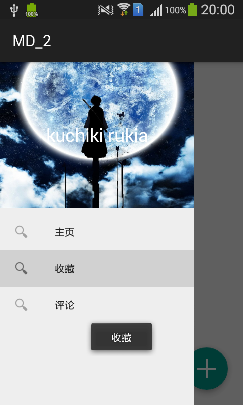
<?xml version="1.0" encoding="utf-8"?>
<RelativeLayout xmlns:android="http://schemas.android.com/apk/res/android"
android:layout_width="match_parent"
android:layout_height="192dp"
android:background="@drawable/nav_header_img">

<TextView
android:layout_width="wrap_content"
android:layout_height="wrap_content"
android:layout_centerInParent="true"
android:text="kuchiki rukia"
android:textColor="#FFFFFF"
android:textSize="24sp"/>

</RelativeLayout>
2、设置menu,res/menu/nva_menu
<?xml version="1.0" encoding="utf-8"?>
<menu xmlns:android="http://schemas.android.com/apk/res/android"
xmlns:app="http://schemas.android.com/apk/res-auto">
<group android:checkableBehavior="single">
<item
android:id="@+id/navItem1"
android:checked="true"
android:icon="@drawable/ic_action_search"
android:title="主页"/>
<item
android:id="@+id/navItem2"
android:icon="@drawable/ic_action_search"
android:title="收藏"/>
<item
android:id="@+id/navItem3"
android:icon="@drawable/ic_action_search"
android:title="评论"/>
</group>

</menu>
3、设置NavigationView
<android.support.design.widget.NavigationView
android:id="@+id/navigation"
android:layout_width="wrap_content"
android:layout_height="match_parent"
android:layout_gravity="start"
app:headerLayout="@layout/nav_header"
app:menu="@menu/nav_menu"/>
4、监听回调
nav = (NavigationView) findViewById(R.id.navigation);
nav.setNavigationItemSelectedListener(new NavigationView.OnNavigationItemSelectedListener() {
@Override
public boolean onNavigationItemSelected(MenuItem menuItem) {
menuItem.setChecked(true);
Toast.makeText(MainActivity.this, menuItem.getTitle(), Toast.LENGTH_SHORT).show();
return false;
}
});
menu
上面menu的group有个android:checkableBehavior="single"属性,配合menuItem的
menuItem.setChecked(true)方法,不难理解它的作用就是限制只能选中一个,该属性还有none、all值,默认是none,即
menuItem.setChecked(true)后也不会有背景色效果。如果不需要选中的背景色效果完全可以不用group。
menu也支持分组,在item里面嵌套一个menu即可,但是这个item就不再视作item了。
<item
android:title="分组">
<menu>
<item
android:id="@+id/navItem4"
android:icon="@drawable/ic_action_search"
android:title="设置"/>
<item
android:id="@+id/navItem5"
android:icon="@drawable/ic_action_search"
android:title="关于"/>
</menu>
</item>
分组后会有一条横线
此时会有一个比较奇怪的现象,即使上面所有item处在同一个group,
android:checkableBehavior="single"却不奏效,分组的内容更像是另外一个group。根据NavigationView的使用场景,必定是所有item中单选的,所以我更倾向于不要分组这个东东。
最后NavigationView这个东东的好处是,一来标准化操作省事,二来checked状态会和theme关联,比如
app:itemIconTint、
app:itemTextColor会自动关联
colorPrimary,这样效果也更加和谐。

相关文章推荐
- Spring4 AOP详解
- UI(二)
- x&(x-1)
- java web简单权限管理设计
- runtime实践之Method Swizzling
- 探索需求--设计前的质量之三
- CYC-多线程之详解
- apache 配置
- lodash用法系列(1),数组集合操作
- 12月1号 MacOS系统命令行操作方式
- ZigZag Conversion
- 探索需求——设计前的质量之一
- LightOJ 1275 - Internet Service Providers (简单数学)
- Android异步加载(二)
- 矩阵快速幂模板
- hadoop和spark搭建记录
- “留拍”剖析
- Netbeans8下 Weblogic EJB案例
- Reverse Integer
- OSPF 你懂多少之经典问题50 个