The CSS Box Model
2015-11-21 13:40
609 查看
简单介绍下css和模型
前言:走进盒子,看看里面的世界……
大多数初学者心中的盒子都是二维的,就像下面这样

那么你在firebug下面看到的就是这样的

具体代码就实是下面这样
firebug下的情况:

我们通常使用下列的方式来计算盒子的大小:
三维盒子

我们来看看几个比较特殊的例子
1、 默认width的块级盒子且position = [static | relative | absolute]
如果你没有声明一个宽度( Box of Width ),而且这个盒子的位置是静态(static),或者是相对的(relative),那么这个盒子(Box of Width)的宽度将会100%的填充在padding、border、width中,其是向内部延伸,而不是向外部。但是如果你明确的设置了一个盒子的宽度,那么这个盒子的填充通常将会是向外部。
如果不是太明白,可以将下面的代码复制进你喜欢的编辑器内,并运行它
效果图应该是这样的(为了让效果更易于明白,我把static的盒子margin-left设置为300px)

当你运行了这段代码,是不是更明白了呢
position属性为absolute的盒子的宽度是被内容撑大的,但是最终结果不尽如人意,原文处作者是这样解释的:
Absolutely positioned boxes that have no width set on them behave a bit strangely. Their width is only as wide as it needs to be to hold the content. So if the box contains a single word, the box is only as wide as that word renders. If it grows to two words, it’ll grow that wide.
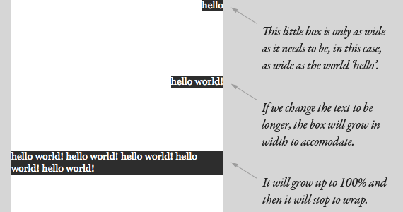
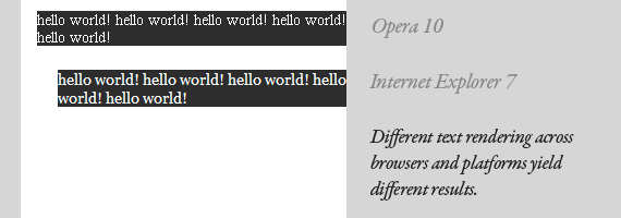
This should continue until the box is 100% of the parent’s width (the nearest parent with relative positioning, or browser window) and then begin to wrap. It feels natural and normal for boxes to expand vertically to accommodate content, but it just feels strange when it happens horizontally. That strange feeling is warranted, as there are plenty of quirks in how different browsers handle this, not to mention just the fact that text renders differently across platforms.
2、默认width且浮动的块级盒子

同样精准的行为也在没有设定宽度的浮动元素上被发现。这个盒子仅仅和他容纳的内容一样宽,直到和他的父亲元素一样(并不需要去进行相对位置摆放)。由于这些缺少Width属性的盒子有易碎的性质,所以我们不能轻易的拿走他们依赖的关键脚本,像是在整体的页面布局中。如果你悬浮一些列去当工具条,依靠一些元素(像是图片)去对保持宽度负责,那我想你是在找麻烦。
3、内联级元素
我们很容易就将块级元素抽象化为一个盒子,但是我们往往没有想到联机元素也是一个盒子,事实上确实如此。请将他们想象成一个非常非常长且非常非常细小的矩形,这些小矩形缠绕在每一行中。他们和其他的盒子一样,同样拥有margin, padding, border属性。
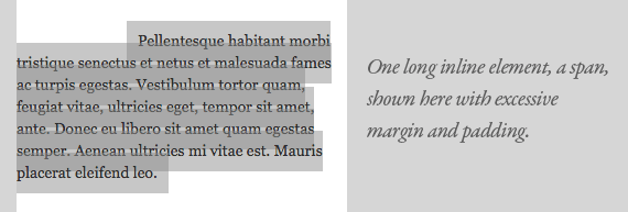
这种包装使得他变得模糊起来。也许你认为一个左边缘将一个盒子推到了右边是不可信的,但是这个第一行是作为这个盒子的开始。将背景属性设置为透明将能使你更加清晰的使用它。
参考以下博文:(感谢原博主的分享)
CHRIS COYIER原著
耀耀翻译版
节束语:人类绝大多数资料(原著)是英文文献,所以说学好你的英语吧,骚年们!不要尝试翻译,不要尝试翻译,不要尝试翻译!对比原著和翻译版你就知道了。。。。。。
前言:走进盒子,看看里面的世界……
Box Model
二维盒子大多数初学者心中的盒子都是二维的,就像下面这样
那么你在firebug下面看到的就是这样的
具体代码就实是下面这样
<!doctype html>
<html>
<head>
<meta charset="UTF-8">
<title>margin3</title>
<style style="text/css">
body{
margin: 0;
padding: 0;
}
.margin3-box{
margin: 10px;
background-color: blue;
border: 10px solid #0f9;
padding: 10px;
width: 240px;
height: 240px;
}
</style>
</head>
<body>
<div class="margin3-box"></div>
</body>
</html>
firebug下的情况:
我们通常使用下列的方式来计算盒子的大小:
| size | number |
|---|---|
| Box of Width | width + padding-left + padding-right + border-left + border-right |
| Box of Height | height + padding-top + padding-bottom + border-top + border-bottom |
如何设置我们的盒子呢?
如果你没有设定margin、padding或者是border,系统就会默认为0,但有的浏览器有自己的默认值(这些默认值不一定是0,所以我建议无论是否要使用这些值,请将他们他们重置为默认值)我们来看看几个比较特殊的例子
1、 默认width的块级盒子且position = [static | relative | absolute]
如果你没有声明一个宽度( Box of Width ),而且这个盒子的位置是静态(static),或者是相对的(relative),那么这个盒子(Box of Width)的宽度将会100%的填充在padding、border、width中,其是向内部延伸,而不是向外部。但是如果你明确的设置了一个盒子的宽度,那么这个盒子的填充通常将会是向外部。
如果不是太明白,可以将下面的代码复制进你喜欢的编辑器内,并运行它
<!doctype html>
<html>
<head>
<meta charset="UTF-8">
<title>margin2</title>
<style style="text/css">
body{
margin: 0;
padding: 0;
}
.margin2-box{
margin: 10px;
background-color: blue;
border: 10px solid #0f9;
padding: 10px;
width: 1000px;
}
.static{
position: static;
margin: 10px 0 10px 300px ;
background-color: red;
border: 10px solid #0f0;
padding: 10px;
/*top: 20px;
left: 20px;*/
}
.relative{
position: relative;
margin: 10px;
background-color: red;
border: 10px solid #0f0;
padding: 10px;
/*top: 20px;
left: 20px;*/
}
.absolute{
position: absolute;
margin: 10px;
background-color: red;
border: 10px solid #0f0;
padding: 10px;
top: 20px;
left: 20px;
}
</style>
</head>
<body>
<div class="margin2-box">
<div class="margin2-demo static"><pre>.static{
position: static;
margin: 10px 0 10px 300px;
background-color: red;
border: 10px solid #0f9;
padding: 10px;
/*top: 20px;
left: 20px;*/
}</pre></div>
<div class="margin2-demo relative"><pre>.relative{
position: relative;
margin: 10px;
background-color: red;
border: 10px solid #0f9;
padding: 10px;
/*top: 20px;
left: 20px;*/
}</pre></div>
<div class="margin2-demo absolute"><pre>.absolute{
position: absolute;
margin: 10px;
background-color: red;
border: 10px solid #0f9;
padding: 10px;
top: 20px;
left: 20px;
}</pre></div>
<div class="margin2-demo"></div>
</div>
</body>
</html>
效果图应该是这样的(为了让效果更易于明白,我把static的盒子margin-left设置为300px)
当你运行了这段代码,是不是更明白了呢
position属性为absolute的盒子的宽度是被内容撑大的,但是最终结果不尽如人意,原文处作者是这样解释的:
Absolutely positioned boxes that have no width set on them behave a bit strangely. Their width is only as wide as it needs to be to hold the content. So if the box contains a single word, the box is only as wide as that word renders. If it grows to two words, it’ll grow that wide.
This should continue until the box is 100% of the parent’s width (the nearest parent with relative positioning, or browser window) and then begin to wrap. It feels natural and normal for boxes to expand vertically to accommodate content, but it just feels strange when it happens horizontally. That strange feeling is warranted, as there are plenty of quirks in how different browsers handle this, not to mention just the fact that text renders differently across platforms.
2、默认width且浮动的块级盒子
<!doctype html>
<html>
<head>
<meta charset="UTF-8">
<title>margin4</title>
<style style="text/css">
body{
margin: 0;
padding: 0;
}
.margin4-box{
margin: 10px auto;
background-color: blue;
border: 10px solid #0f9;
padding: 10px;
width: 360px;
height: 240px;
}
.margin4-box div:first-child{
float: left;
background-color: red;
}
</style>
</head>
<body>
<div class="margin4-box">
<div>
hello world!
hello world!
hello world!
hello world!
hello world!
hello world!
hello world!
hello world!
hello world!
hello world!
hello world!
hello world!
hello world!
hello world!
hello world!
hello world!
hello world!
hello world!
hello world!
hello world!
hello world!
hello world!
hello world!
hello world!
hello world!
hello world!
hello world!
hello world!
hello world!
hello world!
hello world!
hello world!
hello world!
hello world!
hello world!
hello world!
hello world!
hello world!
hello world!
hello world!
hello world!
hello world!
hello world!
hello world!
hello world!
hello world!
hello world!
hello world!
hello world!
hello world!
hello world!
hello world!
hello world!
hello world!
hello world!
hello world!
hello world!
hello world!
hello world!
hello world!
hello world!
</div>
</div>
</body>
</html>
同样精准的行为也在没有设定宽度的浮动元素上被发现。这个盒子仅仅和他容纳的内容一样宽,直到和他的父亲元素一样(并不需要去进行相对位置摆放)。由于这些缺少Width属性的盒子有易碎的性质,所以我们不能轻易的拿走他们依赖的关键脚本,像是在整体的页面布局中。如果你悬浮一些列去当工具条,依靠一些元素(像是图片)去对保持宽度负责,那我想你是在找麻烦。
3、内联级元素
我们很容易就将块级元素抽象化为一个盒子,但是我们往往没有想到联机元素也是一个盒子,事实上确实如此。请将他们想象成一个非常非常长且非常非常细小的矩形,这些小矩形缠绕在每一行中。他们和其他的盒子一样,同样拥有margin, padding, border属性。
这种包装使得他变得模糊起来。也许你认为一个左边缘将一个盒子推到了右边是不可信的,但是这个第一行是作为这个盒子的开始。将背景属性设置为透明将能使你更加清晰的使用它。
参考以下博文:(感谢原博主的分享)
CHRIS COYIER原著
耀耀翻译版
节束语:人类绝大多数资料(原著)是英文文献,所以说学好你的英语吧,骚年们!不要尝试翻译,不要尝试翻译,不要尝试翻译!对比原著和翻译版你就知道了。。。。。。

相关文章推荐
- 怎么修改单选框radio默认样式
- div+css制作网页的一些分享
- CSS3 transition规范的实际使用经验
- 博客园样式设置
- 常用的前端JS、CSS控制的便捷效果
- CSS的几个思考
- css解决IE、Firefox兼容的div高度100%的问题
- css布局详解(二)——标准流布局(Nomal flow)
- Gulp解决发布线上文件(CSS和JS)缓存问题
- CSS渐变色
- 【CSS】block,inline和inline-block细节对比
- HTML优化数据显示页面样式;文本自动换行
- 南大软院大神养成计划——HTML和CSS基础课程(一)
- 昌大软院大神养成计划之网页设计之路第三天
- CSS进阶4: vertical-align 的使用
- CSS进阶3: inline-block 的前世今生
- CSS进阶1: 从头到尾了解清楚 浮动 的概念
- CSS中的盒模型
- CSS基础学习十四:盒子模型补充之display属性设置
- CSS3的新属性